Gray is Beautiful - The Design Ethos of Android 4.4 KitKat
- 1. Gray is beautiful. The future is here. Android KitKat 4.4 ŌĆó Released October 2013
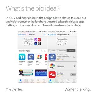
- 2. WhatŌĆÖs the big idea? In iOS 7 and Android, both, flat design allows photos to stand out, and color comes to the forefront. Android takes this idea a step further, so photos and active elements can take center stage. The big idea: Content is king.
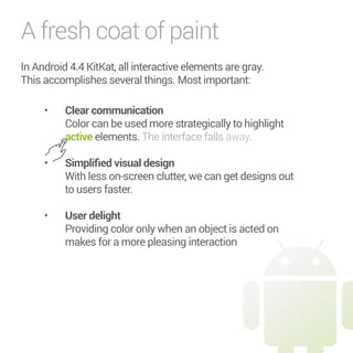
- 3. A fresh coat of paint In Android 4.4 KitKat, all interactive elements are gray. This accomplishes several things. Most important: ŌĆó Clear communication Color can be used more strategically to highlight active elements. The interface falls away. ŌĆó 5KORNKŲÆGFXKUWCNFGUKIP With less on-screen clutter, we can get designs out to users faster. ŌĆó 7UGTFGNKIJV Providing color only when an object is acted on makes for a more pleasing interaction
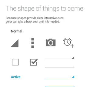
- 4. The shape of things to come Because shapes provide clear interactive cues, color can take a back seat until it is needed. Normal Active
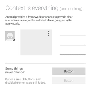
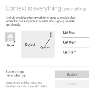
- 5. Context is everything (and nothing) Android provides a framework for shapes to provide clear interactive cues regardless of what else is going on in the app visually. Object Options Some things never change: Buttons are still buttons, and disabled elements are still faded.
- 6. Context is everything (and nothing) Android provides a framework for shapes to provide clear interactive cues regardless of what else is going on in the app visually. Object Options Some things never change: Buttons are still buttons, and disabled elements are still faded.
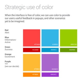
- 7. Strategic use of color When the interface is free of color, we can use color to provide our users useful feedback in popups, and other scenarios yet to be imagined. 4GF Alert Blue Information/ Active Green Success 1TCPIG Excitement Purple ??? (we can decide) #99CC00 #FF4444 #CC0000 #FFBB33 #AA66CC #9933CC #669900 #FF8800 #33B5E5 #0099CC
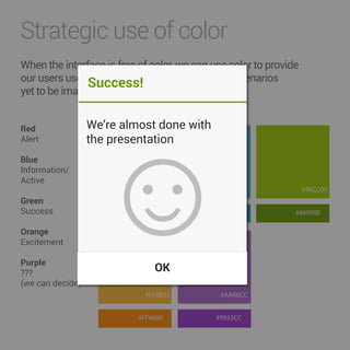
- 8. Strategic use of color When the interface is free of color, we can use color to provide our users useful feedback in popups, and other scenarios yet to be imagined. 4GF Alert Blue Information/ Active Green Success 1TCPIG Excitement Purple ??? (we can decide) #99CC00 ╩É #FF4444 5WEEGUUąø #CC0000 #FFBB33 #AA66CC #9933CC #669900 #FF8800 #33B5E5 #0099CC WeŌĆÖre almost done with the presentation OK
- 9. Questions?

