際際滷

際際滷Share a Scribd company logo
Quality is remembered
long after the price is forgotten
THE BRAND ANALYSIS
Beeing an historical effective high fashion brand, with its 609 stores worlwide, Gucci turned out to be
      one of the biggest settled fashion house in the world.We discover after Analysis, that Gucci is an
     atemporel or a brand thats out of time because it kept its iconic image with stability over the
  years.With its international expansion, Gucci prooved to be the most desirable luxury brand in the
world.It acquaint a brand personality, a social responsability for its social participation as well as an
         award function and a recognition within its high print media advertisements and magazines.
   We observe that Gucci is logo oriented and has its own status perception.their products are iconic.
BODONI
                                          One of my favorite Typefaces, Bodoni has an elegant and modern appearance in its
                                                      context.Like for Vogue, Bodoni is actually used within the fashion world.
                                                 Very Attracting, it gives a classy touch because of its well measured contrast.
                                         This serif typeface demonstrate best Gucci for a presentation since it gives a quality
                                                    and rafination to the whole presentation.Simple, memorable and effective.
                                                               It is dominant and present while beeing sober at the same time.


   Bodoni was a refined Italian type
   designer and printer at the Royal
         Press of the duke of Parma.
        He drew inspiration from the
  Baskerville for his Bodoni typeface
family, which features hairline serifs
   and heavy contrast between thick
                     and thin strokes.
10
          GUCCI
ADVERTISEMENTS
       ANALYSIS
ICONS
                   A billboard, a blue sky, a tree, a couple

                                                  INDEX
                                                       None

                                                SYMBOL
                                                   The logo

                                                   NAME
                                                     GUCCI

                         MEANING EVALUATION
  Its a good and strong ad because the message is clear
   and the product (clothing ) is in interaction with the
models which makes this ad successful.Its a high quality
                                           clothing store.

       TAXONOMY OF DESIGN ELEMENTS
  In this picture the stratas are the top head of the mod-
  els (1),elbow along with the horizontal of the womans
   shoulder (2) as well as the man shoulders (3). Another
                               strata is represented by the
              horizontal of the beginning of the purse (4).
  The veins start with the blue sky (1), the billboard (2),
the green tree (3), the man, (4), the woman (5) ,the purse
                                            (6), the logo (7)

                                           VARIATION
  Width variation because of the purse and the attitude.
ICONS
   A woman, a giant perfume bottle, a simple backround

                                                 INDEX
by Gucci the signature along with the new fragrance
                                    and the store adress.

                                              SYMBOL
                                                  The logo


                                                  NAME
                                       GUCCI by GUCCI

                        MEANING EVALUATION
This ad is strong, good and active because the product is
  in higher propotion comparing to the rest of the image
which makes the message even more clear along with an
 interaction with a model that makes it an active image.


       TAXONOMY OF DESIGN ELEMENTS
   In this picture the stratas are the models shoulder(1)
           along with the belt (2).The veins start with the
   brown backround(1), the woman (2),the dress (3), the
   perfume bottle (4), the slogan and finally the logo (5).


                                          VARIATION
                                          Length variation
ICONS
                             Banana trees, 3 women, 1 man

                                                   INDEX
                                                       None

                                                SYMBOL
                                                   The logo

                                                    NAME
                                                     GUCCI

                          MEANING EVALUATION
Its a good and strong ad because the message is clear and
                    the product (clothing and purses) is in
         interaction with the models which makes this ad
successful.The colors, the attitude and the colors makes it
              fashionable and high standard print media.


         TAXONOMY OF DESIGN ELEMENTS
          In this picture the stratas are the top head of the
models(1), and the shoulders of the left purple dress model
     (2).As well as the right beige dressed model where her
   shoulders and elbows horizontals are counted as stratas
      (3), the purple models belt (4), the typeface axe (5).
        The veins start with the green trees backround (1),
followed by the half model behind,(2) then the man and at
       the same level the right beige (3) and the left purple
                     women with the Gucci logo at the end.


                                            VARIATION
                                             width variation
ICONS
                      A man, a chair, a glass ground, a case

                                                    INDEX
                                                        None

                                                 SYMBOL
                                                    The logo

                                                     NAME
                                                      GUCCI

                           MEANING EVALUATION
             This ad is strong, good and active because the
    product is obvious and the target is clear as well as the
                            image Gucci wants to attribute.


         TAXONOMY OF DESIGN ELEMENTS
 In this picture the stratas starts with the floor base in the
backround (1), the modelss top head (2), his shoulders (3),
  the shoe positioned on the floor (4), the typeface axe (5).
The veins start with the backround (1), the ground (2), the
            man and the chair (3), the case (4), the logo (5).


                                             VARIATION
                                             Length variation
ICONS
       A woman s close up face, the products packshot,
                                            the typeface

                                                 INDEX
       The photographer and the make up artist names.

                                              SYMBOL
                               The logo on the packshot


                                                  NAME
                                  GUCCI , eau de parfum

                        MEANING EVALUATION
    This ad is good because the message is clear and the
  product is shown.But its not completely active because
even if the woman is there, in my opinion it doent have a
            direct relation to the meaning of the ad.If the
packshot wasnt visible, we wouldnt have know that its a
                 perfume ad which doesnt make it strong.


       TAXONOMY OF DESIGN ELEMENTS
The stratas in this ad are the top of the packshot (1) and
the typeface indexe (2).The veins start with the womans
  face (1), the graphic rectangle grey element behind the
             packshot (2), the packshot (3) and finally the
         photographer and the makeup artists name (4).


                                          VARIATION
                                          Volume variation
ICONS
  A woman, a leg with a high heel shoe, a part of a podium
                                          ground, the logo.

                                                   INDEX
       None because GUCCI doesnt need to add any other
information to his name to make it more clear.The message
                is clear and minimalistic at the same time.

                                                SYMBOL
    The glitter and the heels that refers to evening clothes


                                                    NAME
                                                     GUCCI

                          MEANING EVALUATION
    This ad is good and strong because the message is clear
     and the product is worn by the models which makes it
active.Gucci wants to show us a certain attitude within the
               woman wearing the product for the evening.


         TAXONOMY OF DESIGN ELEMENTS
   In this picture the visible stratas are the horizontal axe
 made by the womans elbow(1), and as well as the ground
  axe (2), the shoe base (3), the typeface (4).The veins with
the white backround (1), the ground (2), the model (3), the
    sparkling top (4), the leg and the shoe (5), the logo (6)


                                            VARIATION
                                             length variation
ICONS
 The sea, the mountain, a pool, a white edge, a man, 2 women.

                                                            INDEX
                                                                 None

                                                         SYMBOL
The Gucci sign on the purse and bracelet.The sun and sea that
                             represent the summer collection.

                                                             NAME
                                                                 none

                                MEANING EVALUATION
         Its a good ad because we obviously can know that is a
   fashionable clothing summer collection ad and its active as
        well because of the relation between the people and the
 product that exists.It might not be a strong one for the simple
      fact that the name doesnt appear which make this ad not
    legible by everyone.But i think Gucci doent need to put his
                      name anymore.The iconic signs says it all.


             TAXONOMY OF DESIGN ELEMENTS
     In this picture the stratas are the mans top head (1) and
 shoulders (2), the left woman top head (3) and her shoulders
                    (4) as well as the right models top head (5).
               As for the veins, they start with the blue sky (1),
  the mouintain (2), the white wall (3), the man (4), the white
pants (5), the grey ground (6), the blue water (7), the 2 women
                                                                   (8).
                                                    VARIATION
       Width variation because of the spread disposition of the layout.
ICONS
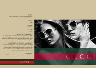
              A black backround, a couple wearing sunglasses,
                                            graphic element.

                                                            INDEX
                                                                 None

                                                         SYMBOL
                                                            The logo

                                                             NAME
                                                              GUCCI

                                MEANING EVALUATION
 Its a good and strong ad because the message is clear and the
 product (sun glasses ) is in interaction with the models which
makes this ad successful, active and straight to the point using
                                 the Gucci attitude atmosphere.


             TAXONOMY OF DESIGN ELEMENTS
 In this picture the stratas are the woman and mans top head
               axe (1) and the graphic iconic Gucci stripes (2).
    The veins start with the black backround (1), the man and
 woman on the same layer (2), followed by the grpahic rectan-
                      gle element and the Gucci logo on top (3).


                                                    VARIATION
       Width variation because of the spread disposition of the layout.
ICONS
                         A white backround, a woman, a purse.

                                                        INDEX
                                                            None

                                                     SYMBOL
           The logo and the Gucci design pattern on the purse


                                                         NAME
                                                          GUCCI

                               MEANING EVALUATION
      This ad is Good, strong and direct because the product is
 visible in the center of the layout and its in interaction with a
                                  model.Its a purse ad for Gucci


             TAXONOMY OF DESIGN ELEMENTS
 In this picture the stratas are the models top head (1), elbow
Models axe (2) and her hips (3) as well as the typeface axe (4).
  The veins start with the white backround (1), the model (2),
    the white dress (3) , The purse and the logo overlaping (4).


                                                 VARIATION
                                                Lenght variation
ICONS
             A dark green backround, the hoola hoops, Rihana,
                                            a purse, typeface.

                                                        INDEX
      The campaign purpose, the details, text and explanation


                                                      SYMBOL
The logo, the heart on the purse, rihanna (testamonial symbol)


                                                         NAME
                                  GUCCI, tattoo heart collection


                               MEANING EVALUATION
  Its a good ad because there is a relation between the title and
  the product shown in the ad, ITs a strong one because there is
  a direct relation and good explanation for the purpose of this
campaign and the combination of the symbols gathered togeth-
                                     er for this ad makes it more
   comprehensible.( a star defending a cause wearing whats ex-
                                                        plained.

             TAXONOMY OF DESIGN ELEMENTS
  In this picture the stratas start from the top of her head (1),
     the begining of her dress (2), the beginning of the bag (3).
   As for the Veins, we start with the backround (1), the hoola
hoops (2), rihana (3), the white dress (4), the purse (5), the text
                                                      and logo (6)


                                                  VARIATION
                                                 Width variation
5
ADVERTISEMENTS
 WITH CHANGING
     ELEMENTS
before
before
ANAlYSIS               before
    By changing the testimonial figure of this ad,
Gucci looses his main function, the Award function
                    which the brand is known for.
before
before


                                      ANAlYSIS
           By adding a simple color to this ad, the goal of
         Gucci here goes from the mens wear to the arrival
                              of new buisness laptop cases.
Utopia
                                                                              PRADA
                                                                              DIOR

                                                                                LOUIS VUITTON
                                                                              FENDI   GUCCI


                                ANAlYSIS                 critical
                                                                                         BURBERRY
                                                                                                playful
  GUCCI direct competitors should be logo manias
competitors and which the image is highly effective
       for the brand itself.Iconic figures, prices and
   high printed media and specialy iconic products
      are the main reasons of this choice.Therefore,
   Gucci, comparing to the others, is situated in the
    utopical standart but not totally.Gucci gives an
  image of "show off" which doesnt make it playful.


                                                                    practical
Utopia

                                                                       CHANEL
                                                                                                GUCCI
                                                                    TODS
                                                                             LONGINES
                                                                             WATCHES
                                                                                                        BURBERRY
                                                                                                           BURTON

                                 ANAlYSIS                critical                       EVIAN LS             playful
GUCCI comparing to these brands keeps its standard                              EVIAN IT
    within its high utopical image and purpose.As we                                NESPRESSO
 already analysed above, Gucci 's main identity is its                                                   ADDIDAS ORIGINAL
 visual recognition where its placement in this chart.                                                   BILLABONG
                                                                     ADDIDAS
                                                                     FOOTBALL


                                                                            PANTENE


                                                                             practical
JENNIFER EL HAJJ
             MASTER GD
SEMIOTICS PRESENTATION
More Related Content

Gucci advertisement analysis

  • 1. Quality is remembered long after the price is forgotten
  • 2. THE BRAND ANALYSIS Beeing an historical effective high fashion brand, with its 609 stores worlwide, Gucci turned out to be one of the biggest settled fashion house in the world.We discover after Analysis, that Gucci is an atemporel or a brand thats out of time because it kept its iconic image with stability over the years.With its international expansion, Gucci prooved to be the most desirable luxury brand in the world.It acquaint a brand personality, a social responsability for its social participation as well as an award function and a recognition within its high print media advertisements and magazines. We observe that Gucci is logo oriented and has its own status perception.their products are iconic.
  • 3. BODONI One of my favorite Typefaces, Bodoni has an elegant and modern appearance in its context.Like for Vogue, Bodoni is actually used within the fashion world. Very Attracting, it gives a classy touch because of its well measured contrast. This serif typeface demonstrate best Gucci for a presentation since it gives a quality and rafination to the whole presentation.Simple, memorable and effective. It is dominant and present while beeing sober at the same time. Bodoni was a refined Italian type designer and printer at the Royal Press of the duke of Parma. He drew inspiration from the Baskerville for his Bodoni typeface family, which features hairline serifs and heavy contrast between thick and thin strokes.
  • 4. 10 GUCCI ADVERTISEMENTS ANALYSIS
  • 5. ICONS A billboard, a blue sky, a tree, a couple INDEX None SYMBOL The logo NAME GUCCI MEANING EVALUATION Its a good and strong ad because the message is clear and the product (clothing ) is in interaction with the models which makes this ad successful.Its a high quality clothing store. TAXONOMY OF DESIGN ELEMENTS In this picture the stratas are the top head of the mod- els (1),elbow along with the horizontal of the womans shoulder (2) as well as the man shoulders (3). Another strata is represented by the horizontal of the beginning of the purse (4). The veins start with the blue sky (1), the billboard (2), the green tree (3), the man, (4), the woman (5) ,the purse (6), the logo (7) VARIATION Width variation because of the purse and the attitude.
  • 6. ICONS A woman, a giant perfume bottle, a simple backround INDEX by Gucci the signature along with the new fragrance and the store adress. SYMBOL The logo NAME GUCCI by GUCCI MEANING EVALUATION This ad is strong, good and active because the product is in higher propotion comparing to the rest of the image which makes the message even more clear along with an interaction with a model that makes it an active image. TAXONOMY OF DESIGN ELEMENTS In this picture the stratas are the models shoulder(1) along with the belt (2).The veins start with the brown backround(1), the woman (2),the dress (3), the perfume bottle (4), the slogan and finally the logo (5). VARIATION Length variation
  • 7. ICONS Banana trees, 3 women, 1 man INDEX None SYMBOL The logo NAME GUCCI MEANING EVALUATION Its a good and strong ad because the message is clear and the product (clothing and purses) is in interaction with the models which makes this ad successful.The colors, the attitude and the colors makes it fashionable and high standard print media. TAXONOMY OF DESIGN ELEMENTS In this picture the stratas are the top head of the models(1), and the shoulders of the left purple dress model (2).As well as the right beige dressed model where her shoulders and elbows horizontals are counted as stratas (3), the purple models belt (4), the typeface axe (5). The veins start with the green trees backround (1), followed by the half model behind,(2) then the man and at the same level the right beige (3) and the left purple women with the Gucci logo at the end. VARIATION width variation
  • 8. ICONS A man, a chair, a glass ground, a case INDEX None SYMBOL The logo NAME GUCCI MEANING EVALUATION This ad is strong, good and active because the product is obvious and the target is clear as well as the image Gucci wants to attribute. TAXONOMY OF DESIGN ELEMENTS In this picture the stratas starts with the floor base in the backround (1), the modelss top head (2), his shoulders (3), the shoe positioned on the floor (4), the typeface axe (5). The veins start with the backround (1), the ground (2), the man and the chair (3), the case (4), the logo (5). VARIATION Length variation
  • 9. ICONS A woman s close up face, the products packshot, the typeface INDEX The photographer and the make up artist names. SYMBOL The logo on the packshot NAME GUCCI , eau de parfum MEANING EVALUATION This ad is good because the message is clear and the product is shown.But its not completely active because even if the woman is there, in my opinion it doent have a direct relation to the meaning of the ad.If the packshot wasnt visible, we wouldnt have know that its a perfume ad which doesnt make it strong. TAXONOMY OF DESIGN ELEMENTS The stratas in this ad are the top of the packshot (1) and the typeface indexe (2).The veins start with the womans face (1), the graphic rectangle grey element behind the packshot (2), the packshot (3) and finally the photographer and the makeup artists name (4). VARIATION Volume variation
  • 10. ICONS A woman, a leg with a high heel shoe, a part of a podium ground, the logo. INDEX None because GUCCI doesnt need to add any other information to his name to make it more clear.The message is clear and minimalistic at the same time. SYMBOL The glitter and the heels that refers to evening clothes NAME GUCCI MEANING EVALUATION This ad is good and strong because the message is clear and the product is worn by the models which makes it active.Gucci wants to show us a certain attitude within the woman wearing the product for the evening. TAXONOMY OF DESIGN ELEMENTS In this picture the visible stratas are the horizontal axe made by the womans elbow(1), and as well as the ground axe (2), the shoe base (3), the typeface (4).The veins with the white backround (1), the ground (2), the model (3), the sparkling top (4), the leg and the shoe (5), the logo (6) VARIATION length variation
  • 11. ICONS The sea, the mountain, a pool, a white edge, a man, 2 women. INDEX None SYMBOL The Gucci sign on the purse and bracelet.The sun and sea that represent the summer collection. NAME none MEANING EVALUATION Its a good ad because we obviously can know that is a fashionable clothing summer collection ad and its active as well because of the relation between the people and the product that exists.It might not be a strong one for the simple fact that the name doesnt appear which make this ad not legible by everyone.But i think Gucci doent need to put his name anymore.The iconic signs says it all. TAXONOMY OF DESIGN ELEMENTS In this picture the stratas are the mans top head (1) and shoulders (2), the left woman top head (3) and her shoulders (4) as well as the right models top head (5). As for the veins, they start with the blue sky (1), the mouintain (2), the white wall (3), the man (4), the white pants (5), the grey ground (6), the blue water (7), the 2 women (8). VARIATION Width variation because of the spread disposition of the layout.
  • 12. ICONS A black backround, a couple wearing sunglasses, graphic element. INDEX None SYMBOL The logo NAME GUCCI MEANING EVALUATION Its a good and strong ad because the message is clear and the product (sun glasses ) is in interaction with the models which makes this ad successful, active and straight to the point using the Gucci attitude atmosphere. TAXONOMY OF DESIGN ELEMENTS In this picture the stratas are the woman and mans top head axe (1) and the graphic iconic Gucci stripes (2). The veins start with the black backround (1), the man and woman on the same layer (2), followed by the grpahic rectan- gle element and the Gucci logo on top (3). VARIATION Width variation because of the spread disposition of the layout.
  • 13. ICONS A white backround, a woman, a purse. INDEX None SYMBOL The logo and the Gucci design pattern on the purse NAME GUCCI MEANING EVALUATION This ad is Good, strong and direct because the product is visible in the center of the layout and its in interaction with a model.Its a purse ad for Gucci TAXONOMY OF DESIGN ELEMENTS In this picture the stratas are the models top head (1), elbow Models axe (2) and her hips (3) as well as the typeface axe (4). The veins start with the white backround (1), the model (2), the white dress (3) , The purse and the logo overlaping (4). VARIATION Lenght variation
  • 14. ICONS A dark green backround, the hoola hoops, Rihana, a purse, typeface. INDEX The campaign purpose, the details, text and explanation SYMBOL The logo, the heart on the purse, rihanna (testamonial symbol) NAME GUCCI, tattoo heart collection MEANING EVALUATION Its a good ad because there is a relation between the title and the product shown in the ad, ITs a strong one because there is a direct relation and good explanation for the purpose of this campaign and the combination of the symbols gathered togeth- er for this ad makes it more comprehensible.( a star defending a cause wearing whats ex- plained. TAXONOMY OF DESIGN ELEMENTS In this picture the stratas start from the top of her head (1), the begining of her dress (2), the beginning of the bag (3). As for the Veins, we start with the backround (1), the hoola hoops (2), rihana (3), the white dress (4), the purse (5), the text and logo (6) VARIATION Width variation
  • 18. ANAlYSIS before By changing the testimonial figure of this ad, Gucci looses his main function, the Award function which the brand is known for.
  • 20. before ANAlYSIS By adding a simple color to this ad, the goal of Gucci here goes from the mens wear to the arrival of new buisness laptop cases.
  • 21. Utopia PRADA DIOR LOUIS VUITTON FENDI GUCCI ANAlYSIS critical BURBERRY playful GUCCI direct competitors should be logo manias competitors and which the image is highly effective for the brand itself.Iconic figures, prices and high printed media and specialy iconic products are the main reasons of this choice.Therefore, Gucci, comparing to the others, is situated in the utopical standart but not totally.Gucci gives an image of "show off" which doesnt make it playful. practical
  • 22. Utopia CHANEL GUCCI TODS LONGINES WATCHES BURBERRY BURTON ANAlYSIS critical EVIAN LS playful GUCCI comparing to these brands keeps its standard EVIAN IT within its high utopical image and purpose.As we NESPRESSO already analysed above, Gucci 's main identity is its ADDIDAS ORIGINAL visual recognition where its placement in this chart. BILLABONG ADDIDAS FOOTBALL PANTENE practical
  • 23. JENNIFER EL HAJJ MASTER GD SEMIOTICS PRESENTATION