Hawk Visual Reading
âĒDownload as KEY, PDFâĒ
0 likesâĒ183 views

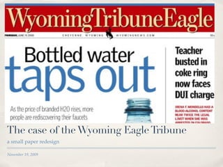
The Wyoming Eagle Tribune redesigned their newspaper with an emphasis on clean typography using few fonts and colors, tight cropped images, and punchy headlines. The redesign focused on using big, bold typography and a simple color palette of sky blue, brick red, and sand brown. It also reduced the number of stories on the front page to keep it uncluttered and highlight the most relevant content above the fold.


Hawk Visual Reading
- 1. The case of the Wyoming Eagle Tribune a small paper redesign November 19, 2009
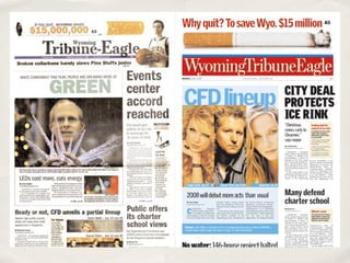
- 5. This design is all about . . . âĪ Big, clean typography âĪ Minimal color palette (three colors) âĪ Tight crops âĪ Emphasis on punchy, relevant headline words
- 6. In your face type âĪ Simple typography - all heads in one very serviceable family ( like GrifïŽth Gothic)
- 7. Bold color âĪ Simple color palette - 3 1/2 colors: âĪ sky blue(s) âĪ brick red âĪ sand brown
- 8. Bold images âĪ Reducing the story count on the front page âĪ Tight crops âĪ Just a few elements above the fold âĪ Uncluttered
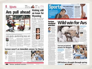
- 9. Stories that sell âĪ âSell storiesâ rather than simply write headlines âĪ This requires a casual, every- day writing style with frequent use of âusâ language. This may go against textbook journalism philosophy, but itâs obvious that it speaks to readers, and thatâs what matters âĪ More section fronts to display content and quick-read material