Hyphenate Logo Concepts
- 1. Good afternoon. Here are your logos.
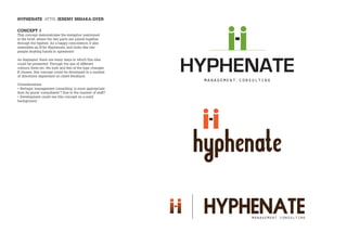
- 2. HYPHENATE ATTN. JEREMY MIHAKA-DYER CONCEPT 1 This concept demonstrates the metaphor mentioned in the brief, where the two parts are joined together through the hyphen. As a happy coincidence, it also resembles an H for Hyphenate, and looks like two people shaking hands in agreement. As displayed, there are many ways in which this idea could be presented. Through the use of different colours, fonts etc, the look and feel of the logo changes. If chosen, this concept could be developed in a number of directions dependant on client feedback. Considerations: âĒ Perhaps âmanagement consultingâ is more appropriate than its plural âconsultantsâ? Due to the number of staff? âĒ Development could see this concept on a solid background.
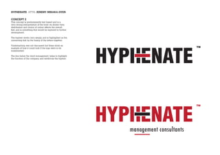
- 3. HYPHENATE ATTN. JEREMY MIHAKA-DYER CONCEPT 2 This concept is predominantly text-based and is a very strong interpretation of the brief. As shown here, distribution and choice of colour affects the overall feel, and is something that would be explored in further development. The hyphen works very simply, and is highlighted as the connecting link by the fusing of the letters together. Trademarking was not discussed but these show an example of how it could look if the logo were to be trademarked. The line below the word management, helps to highlight the function of the company, and reinforces the hyphen.
- 4. HYPHENATE ATTN. JEREMY MIHAKA-DYER CONCEPT 3 This concept takes the hyphen, and uses it to form part of a whole, by flipping it 90Ë. The negative space (or white space) within these shapes makes the letter H, which nicely connects it to the name of the company. Using different colours for each shape suggests different parts of an organisation coming together to form a whole entity. Or, using one colour, unifies the shape, and adding the circle brings the people element into it. Both of these could be developed further, using different fonts and colours to create different effects.


