ICT photoshop final powerpoint
Download as pptx, pdf0 likes541 views

The document provides information and tutorials for creating a pop album cover using Photoshop. It discusses different genres of music and their common visual styles. It then outlines techniques for creating lighting effects, warping images, and applying textures. The author tests different effects and decides on a zombie-themed cover to portray modern pop. Key skills learned include using layers, blurs, blending modes, and manipulating photos. Feedback indicates modern pop covers often depict sadness, so the author combines gothic colors and a apocalyptic theme in the final cover.


ICT photoshop final powerpoint
- 1. RESEARCHING THE BRIEF BY: NATHAN YUNG
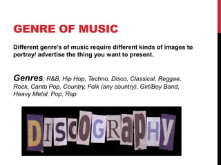
- 2. GENRE OF MUSIC Different genre‟s of music require different kinds of images to portray/ advertise the thing you want to present. Genres: R&B, Hip Hop, Techno, Disco, Classical, Reggae, Rock, Canto Pop, Country, Folk (any country), Girl/Boy Band, Heavy Metal, Pop, Rap
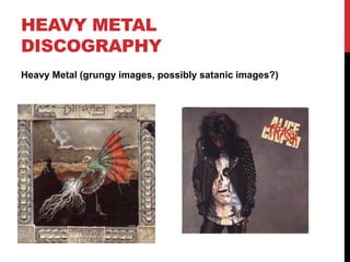
- 3. HEAVY METAL DISCOGRAPHY Heavy Metal (grungy images, possibly satanic images?)
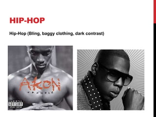
- 4. HIP-HOP Hip-Hop (Bling, baggy clothing, dark contrast)
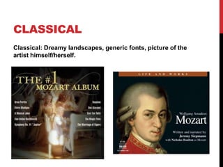
- 5. CLASSICAL Classical: Dreamy landscapes, generic fonts, picture of the artist himself/herself.
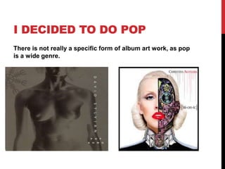
- 6. I DECIDED TO DO POP There is not really a specific form of album art work, as pop is a wide genre.
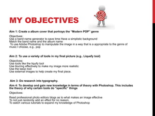
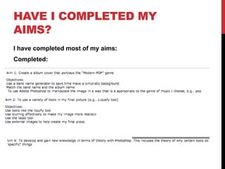
- 8. MY OBJECTIVES Aim 1: Create a album cover that portrays the “Modern POP” genre Objectives: Use a band name generator to save time Have a simplistic background Match the band name and the album name To use Adobe Photoshop to manipulate the image in a way that is a appropriate to the genre of music I choose, e.g.. pop Aim 2: To use a variety of tools in my final picture (e.g.. Liquefy tool) Objectives: Use tools like the liquify tool Use blurring effectively to make my image more realistic Use the lasso tool Use external images to help create my final piece. Aim 3: Do research into typography. Aim 4: To develop and gain new knowledge in terms of theory with Photoshop. This includes the theory of why certain tools do “specific” things Objectives: Read professional photo editors blogs as to what makes an image effective To not just randomly add an effect for no reason. To watch various tutorials to expand my knowledge of Photoshop
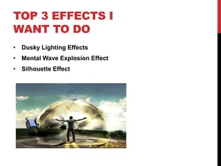
- 9. TOP 3 EFFECTS I WANT TO DO • Dusky Lighting Effects • Mental Wave Explosion Effect • Silhouette Effect
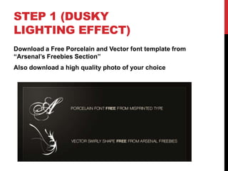
- 11. STEP 1 (DUSKY LIGHTING EFFECT) Download a Free Porcelain and Vector font template from “Arsenal‟s Freebies Section” Also download a high quality photo of your choice
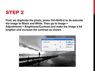
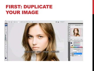
- 12. STEP 2 First, we duplicate the photo, press Ctrl-Shift-U to de-saturate the image to Black and White. Then go to Image > Adjustments > Brightness/Contrast and make the image a bit brighter and increase the contrast as shown.
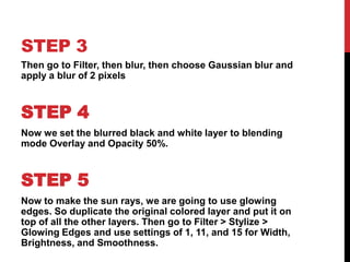
- 13. STEP 3 Then go to Filter, then blur, then choose Gaussian blur and apply a blur of 2 pixels STEP 4 Now we set the blurred black and white layer to blending mode Overlay and Opacity 50%. STEP 5 Now to make the sun rays, we are going to use glowing edges. So duplicate the original colored layer and put it on top of all the other layers. Then go to Filter > Stylize > Glowing Edges and use settings of 1, 11, and 15 for Width, Brightness, and Smoothness.
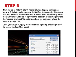
- 14. STEP 6 Now we go to Filter > Blur > Radial Blur and apply settings as shown. This is to make the sun light effect less generic. Make sure that you have set the blur method to Zoom. Also importantly move the Blur Center until it‟s roughly in the position of the image where the “person or object” is understanding, for example: where the „sun‟ is going to be. Once you‟ve got it, apply the Radial Blur again by pressing Ctrl+F (to repeat the last filter used).
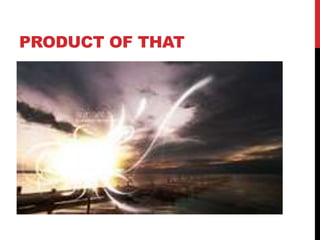
- 15. PRODUCT OF THAT
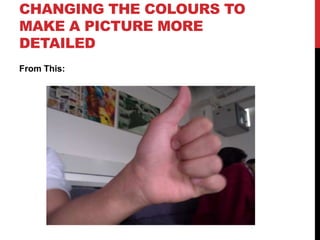
- 16. CHANGING THE COLOURS TO MAKE A PICTURE MORE DETAILED From This:
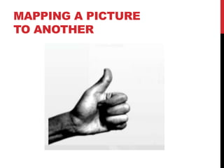
- 17. MAPPING A PICTURE TO ANOTHER
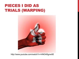
- 18. PIECES I DID AS TRIALS (WARPING) http://www.youtube.com/watch?v=iHNO4Sgnw5E
- 19. SKILLS I LEARNT FROM THIS: • Different Filters • Blurs: Such as a Gaussian blur • Mapping photos from a different photo to wrap a picture around another • Changing contrasts • Blending in colours and patterns
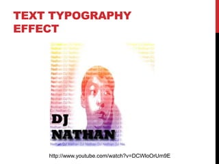
- 20. TEXT TYPOGRAPHY EFFECT http://www.youtube.com/watch?v=DCWloOrUm9E
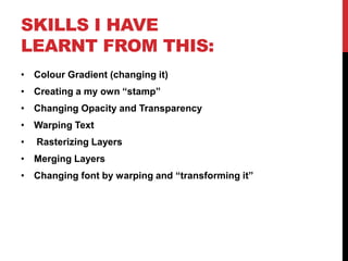
- 21. SKILLS I HAVE LEARNT FROM THIS: • Colour Gradient (changing it) • Creating a my own “stamp” • Changing Opacity and Transparency • Warping Text • Rasterizing Layers • Merging Layers • Changing font by warping and “transforming it”
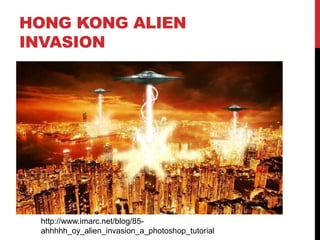
- 22. HONG KONG ALIEN INVASION http://www.imarc.net/blog/85- ahhhhh_oy_alien_invasion_a_photoshop_tutorial
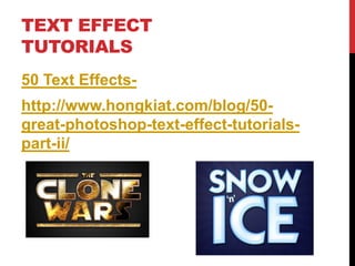
- 23. TEXT EFFECT TUTORIALS 50 Text Effects- http://www.hongkiat.com/blog/50- great-photoshop-text-effect-tutorials- part-ii/
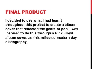
- 24. FINAL PRODUCT I decided to use what I had learnt throughout this project to create a album cover that reflected the genre of pop. I was inspired to do this through a Pink Floyd album cover, as this reflected modern day discography.
- 25. STEP BY STEP
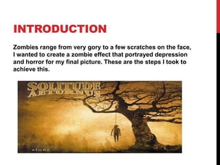
- 26. INTRODUCTION Zombies range from very gory to a few scratches on the face, I wanted to create a zombie effect that portrayed depression and horror for my final picture. These are the steps I took to achieve this.
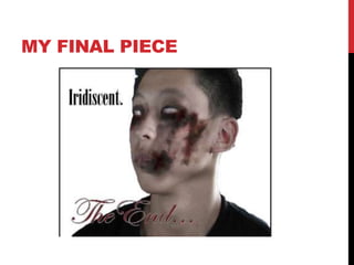
- 27. MY FINAL PIECE
- 29. WHY I DID THIS? This was to create a background which acted like a layer which would show the contrast within the following layer which would be created. Without this the following layer would be to dark to create a zombie like effect.
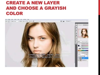
- 30. CREATE A NEW LAYER AND CHOOSE A GRAYISH COLOR
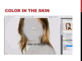
- 31. COLOR IN THE SKIN
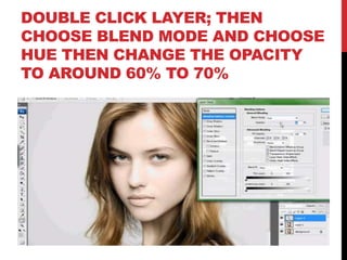
- 32. DOUBLE CLICK LAYER; THEN CHOOSE BLEND MODE AND CHOOSE HUE THEN CHANGE THE OPACITY TO AROUND 60% TO 70%
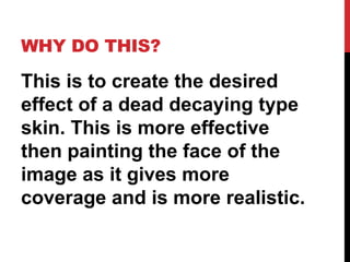
- 33. WHY DO THIS? This is to create the desired effect of a dead decaying type skin. This is more effective then painting the face of the image as it gives more coverage and is more realistic.
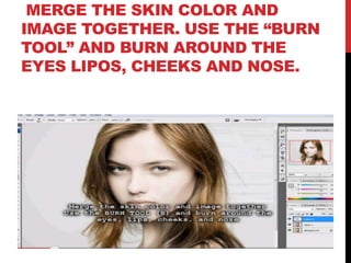
- 34. MERGE THE SKIN COLOR AND IMAGE TOGETHER. USE THE “BURN TOOL” AND BURN AROUND THE EYES LIPOS, CHEEKS AND NOSE.
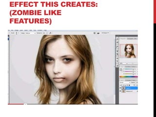
- 35. EFFECT THIS CREATES: (ZOMBIE LIKE FEATURES)
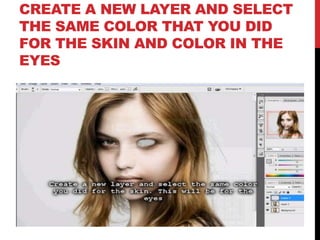
- 36. CREATE A NEW LAYER AND SELECT THE SAME COLOR THAT YOU DID FOR THE SKIN AND COLOR IN THE EYES
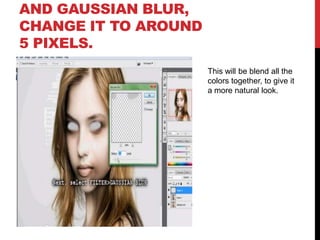
- 37. AND GAUSSIAN BLUR, CHANGE IT TO AROUND 5 PIXELS. This will be blend all the colors together, to give it a more natural look.
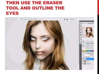
- 38. THEN USE THE ERASER TOOL AND OUTLINE THE EYES
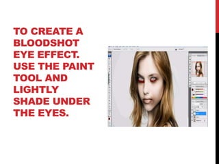
- 39. TO CREATE A BLOODSHOT EYE EFFECT. USE THE PAINT TOOL AND LIGHTLY SHADE UNDER THE EYES.
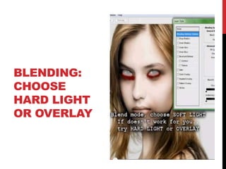
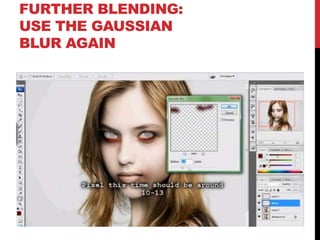
- 41. FURTHER BLENDING: USE THE GAUSSIAN BLUR AGAIN
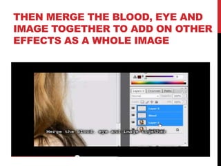
- 42. THEN MERGE THE BLOOD, EYE AND IMAGE TOGETHER TO ADD ON OTHER EFFECTS AS A WHOLE IMAGE
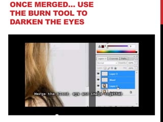
- 43. ONCE MERGED… USE THE BURN TOOL TO DARKEN THE EYES
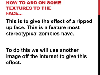
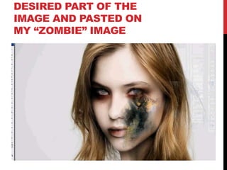
- 44. NOW TO ADD ON SOME TEXTURES TO THE FACE… This is to give the effect of a ripped up face. This is a feature most stereotypical zombies have. To do this we will use another image off the internet to give this effect.
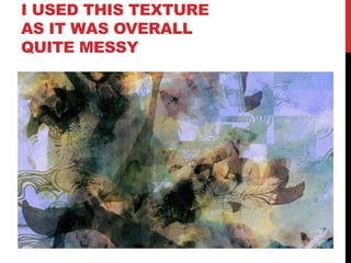
- 45. I USED THIS TEXTURE AS IT WAS OVERALL QUITE MESSY
- 46. DESIRED PART OF THE IMAGE AND PASTED ON MY “ZOMBIE” IMAGE
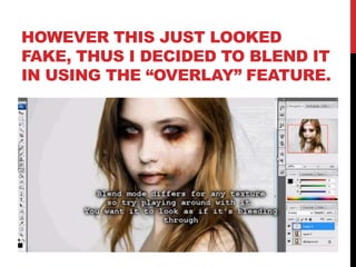
- 47. HOWEVER THIS JUST LOOKED FAKE, THUS I DECIDED TO BLEND IT IN USING THE “OVERLAY” FEATURE.
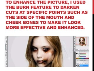
- 48. TO ENHANCE THE PICTURE, I USED THE BURN FEATURE TO DARKEN CUTS AT SPECIFIC POINTS SUCH AS THE SIDE OF THE MOUTH AND CHEEK BONES TO MAKE IT LOOK MORE EFFECTIVE AND ENHANCED.
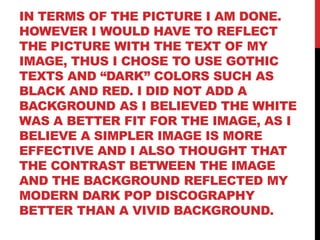
- 49. IN TERMS OF THE PICTURE I AM DONE. HOWEVER I WOULD HAVE TO REFLECT THE PICTURE WITH THE TEXT OF MY IMAGE, THUS I CHOSE TO USE GOTHIC TEXTS AND “DARK” COLORS SUCH AS BLACK AND RED. I DID NOT ADD A BACKGROUND AS I BELIEVED THE WHITE WAS A BETTER FIT FOR THE IMAGE, AS I BELIEVE A SIMPLER IMAGE IS MORE EFFECTIVE AND I ALSO THOUGHT THAT THE CONTRAST BETWEEN THE IMAGE AND THE BACKGROUND REFLECTED MY MODERN DARK POP DISCOGRAPHY BETTER THAN A VIVID BACKGROUND.
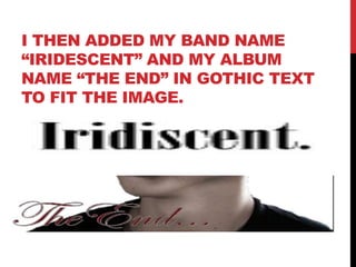
- 50. I THEN ADDED MY BAND NAME “IRIDESCENT” AND MY ALBUM NAME “THE END” IN GOTHIC TEXT TO FIT THE IMAGE.
- 51. I ENLARGED THE TEXT AND OUTLINED THE TEXTS TO MAKE IT SHARPER TO THE EYE. I ALSO TRIED TO WARP THE TEXTS, HOWEVER IT DID NOT SUIT MY ALBUM SO I DECIDED TO JUST OUTLINE THE TEXTS ADD SOME SHADING AND USE GOTHIC FONTS.
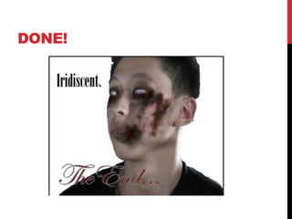
- 52. DONE!
- 53. EVALUATION
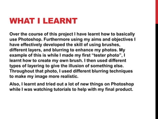
- 54. WHAT I LEARNT Over the course of this project I have learnt how to basically use Photoshop. Furthermore using my aims and objectives I have effectively developed the skill of using brushes, different layers, and blurring to enhance my photos. My example of this is while I made my first “tester photo”, I learnt how to create my own brush. I then used different types of layering to give the illusion of something else. Throughout that photo, I used different blurring techniques to make my image more realistic. Also, I learnt and tried out a lot of new things on Photoshop while I was watching tutorials to help with my final product.
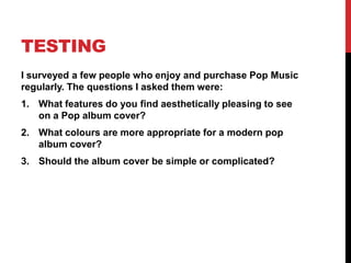
- 55. TESTING I surveyed a few people who enjoy and purchase Pop Music regularly. The questions I asked them were: 1. What features do you find aesthetically pleasing to see on a Pop album cover? 2. What colours are more appropriate for a modern pop album cover? 3. Should the album cover be simple or complicated?
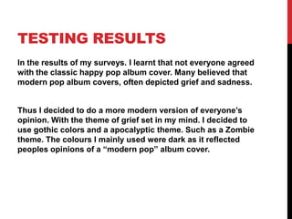
- 56. TESTING RESULTS In the results of my surveys. I learnt that not everyone agreed with the classic happy pop album cover. Many believed that modern pop album covers, often depicted grief and sadness. Thus I decided to do a more modern version of everyone‟s opinion. With the theme of grief set in my mind. I decided to use gothic colors and a apocalyptic theme. Such as a Zombie theme. The colours I mainly used were dark as it reflected peoples opinions of a “modern pop” album cover.
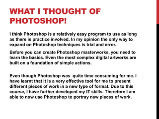
- 57. WHAT I THOUGHT OF PHOTOSHOP! I think Photoshop is a relatively easy program to use as long as there is practice involved. In my opinion the only way to expand on Photoshop techniques is trial and error. Before you can create Photoshop masterworks, you need to learn the basics. Even the most complex digital artworks are built on a foundation of simple actions. Even though Photoshop was quite time consuming for me. I have learnt that it is a very effective tool for me to present different pieces of work in a new type of format. Due to this course, I have further developed my IT skills. Therefore I am able to now use Photoshop to portray new pieces of work.
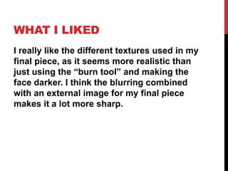
- 58. WHAT I LIKED I really like the different textures used in my final piece, as it seems more realistic than just using the “burn tool” and making the face darker. I think the blurring combined with an external image for my final piece makes it a lot more sharp.
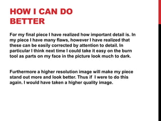
- 59. HOW I CAN DO BETTER For my final piece I have realized how important detail is. In my piece I have many flaws, however I have realized that these can be easily corrected by attention to detail. In particular I think next time I could take it easy on the burn tool as parts on my face in the picture look much to dark. Furthermore a higher resolution image will make my piece stand out more and look better. Thus if I were to do this again. I would have taken a higher quality image.
- 60. HAVE I COMPLETED MY AIMS? I have completed most of my aims: Completed:
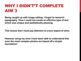
- 61. WHY I DIDN'T’T COMPLETE AIM 3 Being caught up with image editing. I forgot to research typography. Thus I could not create an effective type of text which was unique and aesthetically pleasing. This shows that I must pay attention to every aspect of aims. However using my aims I have been able to understand that even the most complex photos are based off a simple foundation!
- 62. THANK YOU!