IM2 online ID presentation
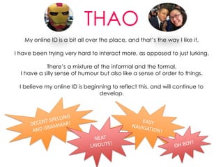
- 1. THAO My online ID is a bit all over the place, and thatˇŻs the way I like it. I have been trying very hard to interact more, as opposed to just lurking. ThereˇŻs a mixture of the informal and the formal. I have a silly sense of humour but also like a sense of order to things. I believe my online ID is beginning to reflect this, and will continue to develop.
- 2. THAO My ID mission? IˇŻd like to be seen as someone who is results-driven and professional, but with a sense of humour. IˇŻm inspired by people like Noelle Stevenson, aka Gingerhaze, who strike a balance between work and personal online. Gingerhaze is known for her utterly silly, hilarious webcomics based on films, characters and actors. She has an awesome sense of individual style and voice.
- 3. MY ID HUB This is my Glossi page.
- 4. MY ID HUB MAP This is how my Glossi page relates to all of my other platforms/sites.
- 5. What a post looks like: The title and header:
- 6. Humble beginnings: Terribly fun terrible hashtag humour: More project-focused:
- 8. My own meme examples: The title and header:
- 11. Below are examples of contributions IˇŻve made on Pool, and comments:
- 12. The coolest interactions IˇŻve had on Twitter so far!
- 13. OTHER COMMUNITIES Creative communities such as Etsy will be useful to my ID, as I can join themed groups, or ˇ®teamsˇŻ, allowing me to interact with both creators and enthusiasts. Specific aspects of large humour and media communities sites such as Cracked.com and The AV Club may also be useful; I'd like to expand my network, my skills, and plain have fun by taking part in these communities.
- 14. LINKS TO BLOG POSTS IM2 category (contains Social Media Explorations, reading and lecture notes, stray observations relevant to social media): http://raws.adc.rmit.edu.au/~s3331863/blog2/?cat=94 Summary Post: http://raws.adc.rmit.edu.au/~s3331863/blog2/?p=2060 Self Assessment Post: http://raws.adc.rmit.edu.au/~s3331863/blog2/?p=2087
Editor's Notes
- Originally I was on flavors.me, but found that Glossi suited my needs better in a visual sense. Glossi is a really aesthetically appealing and engaging ID hub, and works well with what I do in that you can look at all of my content at once, or filter ¨C so just looking at images, just looking at videos, just looking at articles IˇŻve shared. Always with the Twitter feed on the side, too. Glossi truly works as the centre of online experience. It has an awesomely chaotic look about it; itˇŻs organised chaos, encapsulating the whole nature of being online. The perfect way to represent an online ID. IˇŻve noticed that since beginning this course, itˇŻs been harder to choose which platform/site to list as my main one. Do I want people to see my formal portfolio (Wordpress), or my conversational style (Twitter), or my videos (Vimeo) more? Therefore, itˇŻs been very cool and felt very natural to be passing around a single URL instead.
- Add status examples underneath


