In what ways does your media product use
Download as pptx, pdf0 likes141 views

The document discusses the conventions of a DigiPak and advertisement for a music product. It provides examples of DigiPaks and advertisements the author referenced, and outlines conventions they followed such as including the artist name and track listing. The author's final DigiPak includes the artist's face, follows conventions on fonts and colors, and aims to visually link to the advertisement. The advertisement conventions focused on clear fonts, theme continuity with the DigiPak, and appropriate images. The author believes their ancillary work followed most conventions and created a visual link between the DigiPak and advertisement without challenging conventions.
In what ways does your media product use
- 1. In what ways does your media product use , develop or challenge forms and conventions of real media products? I’ve already talked about the conventions of a music video and given examples of which I followed, but what did I do for my DigiPak and Advertisement?
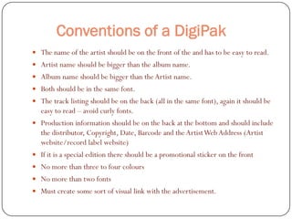
- 2. Conventions of a DigiPak  The name of the artist should be on the front of the and has to be easy to read.  Artist name should be bigger than the album name.  Album name should be bigger than the Artist name.  Both should be in the same font.  The track listing should be on the back (all in the same font), again it should be easy to read – avoid curly fonts.  Production information should be on the back at the bottom and should include the distributor, Copyright, Date, Barcode and the Artist Web Address (Artist website/record label website)  If it is a special edition there should be a promotional sticker on the front  No more than three to four colours  No more than two fonts  Must create some sort of visual link with the advertisement.
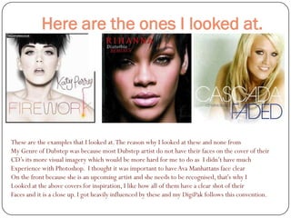
- 3. Here are the ones I looked at. These are the examples that I looked at. The reason why I looked at these and none from My Genre of Dubstep was because most Dubstep artist do not have their faces on the cover of their CD’s its more visual imagery which would be more hard for me to do as I didn’t have much Experience with Photoshop. I thought it was important to have Ava Manhattans face clear On the front because she is an upcoming artist and she needs to be recognised, that's why I Looked at the above covers for inspiration, I like how all of them have a clear shot of their Faces and it is a close up. I got heavily influenced by these and my DigiPak follows this convention.
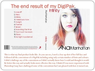
- 4. The end result of my DigiPak. This is what my final product looks like. As you can see, I used a close up shot of her full face and Followed all the conventions of a DigiPak including using only certain number of fonts and colours. I didn’t challenge any of the conventions as I didn’t actually know how I could and thought it would Be better this way and actually looks more effective this way. I think if I was more experienced with Photoshop I may have challenged some of the conventions but I am pleased with how it turned out.
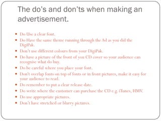
- 5. The do’s and don’ts when making an advertisement.  Do Use a clear font.  Do Have the same theme running through the Ad as you did the DigiPak.  Don’t use different colours from your DigiPak.  Do have a picture of the front of you CD cover so your audience can recognise what do buy.  Do be careful where you place your font.  Don't overlap fonts on top of fonts or in front pictures, make it easy for your audience to read.  Do remember to put a clear release date.  Do write where the customer can purchase the CD e.g. iTunes, HMV.  Do use appropriate pictures.  Don’t have stretched or blurry pictures.
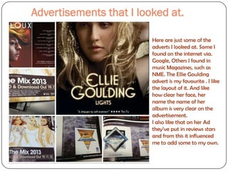
- 6. Advertisements that I looked at. Here are just some of the adverts I looked at. Some I found on the internet via. Google, Others I found in music Magazines, such as NME. The Ellie Goulding advert is my favourite . I like the layout of it. And like how clear her face, her name the name of her album is very clear on the advertisement. I also like that on her Ad they’ve put in reviews stars and from this it influenced me to add some to my own.
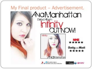
- 7. My Final product – Advertisement.
- 8. My thoughts.. I think that looking back at the conventions and do’s and don’ts etc. I did follow most of the conventions in my ancillary work, I didn’t challenge any of the conventions. I kept a running theme of colours (Red, white and black) I also kept to using only two fonts, both of which were used on my DigiPak and Advertisement. I hope that the visual links between the two are clear, because to me it does look like it is. I also made sure that I used different pictures of the artist on the advertisement but made sure it was similar enough to recognise her – I think it helped that she was wearing the same outfit which also helps with reaching our target audience because you can see her clearly. I am pleased with how my ancillary work came out, I know that I was in fact quite nervous for it because of my lack of experience with Photoshop but I do like final outcomes.