Income Inequality: Measuring the Gap
- 1. DataPost Income Inequality Measuring the Gap Date last updated: December 8, 2017 Federal Reserve Bank of San Francisco Education & Outreach
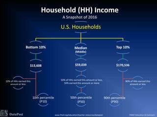
- 2. Household (HH) Income A Snapshot of 2016 U.S. Households Bottom 10% $13,608 10th percentile (P10) 10% of HHs earned this amount or less Median (Middle) $59,039 Top 10% $170,536 90th percentile (P90) 90% of HHs earned this amount or less DataPost 50th percentile (P50) 50% of HHs earned this amount or less, 50% earned this amount or more www.frbsf.org/education/teacher-resources/datapost FRBSF Education & Outreach
- 3. $0K $50K $100K $150K $200K 10th (P10) 90th (P90) This means that household income at the 90th percentile is over 12 times household income at the 10th percentile. In 1990, the P90/P10 ratio was 10.12. DataPost Source: U.S. Census Bureau, pre-tax/transfer HH income in 2016 CPI-U-RS adjusted dollars U.S. Household Income in 2016 P10 = $13,608 P90 = $170,536 The P90/P10 Ratio A Measure of Income Inequality = = 12.53 P90 $170,536 P10 $13,608 One way to highlight the difference between the high end and the low end of the income distribution is to create a ratio of the 90th and 10th percentiles. www.frbsf.org/education/teacher-resources/datapost FRBSF Education & Outreach
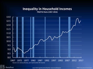
- 4. 8.0 8.5 9.0 9.5 10.0 10.5 11.0 11.5 12.0 12.5 13.0 1967 1972 1977 1982 1987 1992 1997 2002 2007 2012 2017 Inequality in Household Incomes P90/P10 Ratio (1967ŌĆō2016) Source: U.S. Census Bureau, pre-tax/transfer HH income DataPost www.frbsf.org/education/teacher-resources/datapost FRBSF Education & Outreach
- 5. 8.0 8.5 9.0 9.5 10.0 10.5 11.0 11.5 12.0 12.5 13.0 1967 1972 1977 1982 1987 1992 1997 2002 2007 2012 2017 Annotated Chart Notes Inequality in Household Incomes P90/P10 Ratio (1967ŌĆō2016) Source: U.S. Census Bureau, pre-tax/transfer HH income Starting in 1975 income inequality in the U.S. started to pick up quite substantially. Between 1967 and 1979, the household income distribution was up and down, but largely flat. 12.53 in 2016 (See slide 3) DataPost 10.12 in 1990 (See slide 3) The trend accelerated during and after the Great Recession. www.frbsf.org/education/teacher-resources/datapost FRBSF Education & Outreach
- 6. What are the Facts? 1. In 2016, what percentage of U.S. households earned $170,536 or more? (See slides 2 or 3) 2. In 2016, what income level was at the 10th percentile? (See slides 2 or 3) 3. What was the P90/P10 ratio in the year you were born? (See slide 4) 4. In which year was the P90/P10 ratio the lowest? The highest? (See slide 4) 5. What has been the trend in the P90/P10 ratio since 1975? (See slide 4) 6. What does the P90/P10 ratio tell us about household incomes? View in-depth talks on income inequality by visiting the FRBSF Economics in Person video series DataPost www.frbsf.org/education/teacher-resources/datapost FRBSF Education & Outreach
Editor's Notes
- Data source: https://www.census.gov/content/dam/Census/library/publications/2017/demo/P60-259.pdf (Table A-2)
- Data source: https://www.census.gov/content/dam/Census/library/publications/2017/demo/P60-259.pdf (Table A-2)
- Data source: https://www.census.gov/content/dam/Census/library/publications/2017/demo/P60-259.pdf (Table A-2)
- Data source: https://www.census.gov/content/dam/Census/library/publications/2017/demo/P60-259.pdf (Table A-2)


