Influitive_Brandguide
- 1. 1 VISUALBRANDGUIDELINES VISUAL BRAND GUIDELINES I N F L U I T I V E . C O M
- 3. 3 VISUALBRANDGUIDELINES TA B L E O F C O N T E N T S 1. Our Logo 2. Logo Spacing 3. Influitive Icon 4. Dos and Don'ts 5. Other ways to use the logo 6. Colors 7. Typography 8. Buttons and CTAs 9. Icons 10. Photography 11. Putting it all together 16. Resources
- 4. VISUALBRANDGUIDELINES 1 THIS IS OUR LOGO We usually use this version, without the tagline. Icon Wordmark Tagline But, if you must, go ahead and use the version with the tagline. If the logo appears smaller than 1” or 200 pixels wide, do not use this version.
- 5. 2 VISUALBRANDGUIDELINES GIVE IT SOME SPACE Safety space around the logo is determind by the radius of the icon.
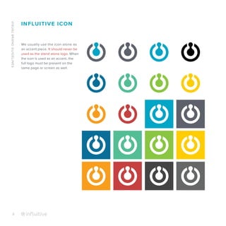
- 6. VISUALBRANDGUIDELINES 3 INFLUITIVE ICON We usually use the icon alone as an accent piece. It should never be used as the stand alone logo. When the icon is used as an accent, the full logo must be present on the same page or screen as well.
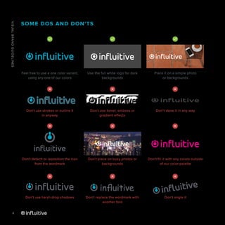
- 7. 4 VISUALBRANDGUIDELINES SOME DOS AND DON'TS Feel free to use a one color variant, using any one of our colors Don't use strokes or outline it in anyway Don't detach or reposition the icon from the wordmark Don't use harsh drop shadows Use the full white logo for dark backgrounds Don't use bevel, emboss or gradient effects Don't place on busy photos or backgrounds Don't replace the wordmark with another font Place it on a simple photo or backgrounds Don't skew it in any way Don't fill it with any colors outside of our color palette Don't angle it influitive
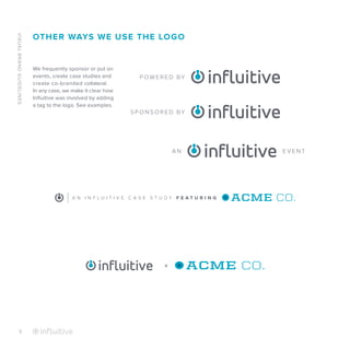
- 8. VISUALBRANDGUIDELINES 5 OTHER WAYS WE USE THE LOGO P OW E R E D BY S P O N S O R E D BY A N E V E N T A N I N F L U I T I V E C A S E S T U D Y F E A T U R I N G + We frequently sponsor or put on events, create case studies and create co-branded collateral. In any case, we make it clear how Influitive was involved by adding a tag to the logo. See examples.
- 9. 6 VISUALBRANDGUIDELINES COLORS WE USE INFLUITIVE TEAL CMYK 76 15 16 0 RGB 08 165 197 HEX #08a5c5 PMS 3125C YELLOW CMYK 0 19 100 0 RGB 255 204 0 HEX #ffcc00 PMS 123C LIME CMYK 51 0 99 0 RGB 139 197 65 HEX #8bc541 PMS 2292C RED CMYK 16 89 78 5 RGB 197 65 64 HEX #c54040 PMS 2033C INFLUITIVE CHARCOAL CMYK 65 55 45 20 RGB 93 98 107 HEX #5d626b PMS 431C ORANGE CMYK 0 45 100 0 RGB 249 157 28 HEX #f99d1c PMS 1375C CMYK 67 60 59 44 RGB 68 68 68 HEX #444444 CMYK 60 51 51 20 RGB 102 102 102 HEX #666666 CMYK 44 36 36 1 RGB 150 150 150 HEX #969696 CMYK 17 12 13 0 RGB 208 210 211 HEX #d0d2d3 CMYK 5 4 4 0 RGB 238 238 238 HEX #ededed DARK BLUE CMYK 90 51 23 3 RGB 4 111 154 HEX #046f99 PMS 307C SEAFOAM CMYK 65 0 55 0 RGB 83 190 149 HEX #53be95 PMS 3385C Primary Colors Secondary Colors Greys This is the main color palette we use across all of our materials. We use these colors for everything from type to overlaying and multiplying over photos and patterns. Please don't use colors against each other if they appear too harsh. TEXT TEXT TEXT Reserved for Call to action buttons
- 10. VISUALBRANDGUIDELINES 7 Aa Aa TYPOGRAPHY Proxima Nova Proxima Nova Regular Text, -15 to +20pt Kerning, Title Cased Titles, Light, Regular, Semibold C A P P E D S M A L L T I T L E S + 1 5 0 t o + 2 0 0 P T . K E R N I N G B O L D RBno2.1a DISPLAY TITLES ONLY CAPPED or uncapped 0 to +15pt. Kerning Helvetica Regular Text or Titles, Mainly used in PowerPoint -15 to +20pt Kerning, Title Cased Titles RBno2.1a Weights Weights Weights Helvetica BCDEFGHIJKLMNO PQ RSTU V W X Y Z BCDEFGHIJKLMNO PQRSTUV W X YZ Aa B C D E F G H I J K L M N O P Q R S T U V W X Y Z abcdefghijklmnopqrstuvwxyz abcdefghijklmnopqrstuvwxyz a b c d e f g h i j k l m n o p q r s t u v w x y z Light Light Light Book Regular Regular Medium Bold Semibold Bold Bold Black We use various fonts for different campaigns and purposes, but our main 3 fonts use are; Proxima Nova, RBno2.1a and Helvetica. Each is used as follows:
- 11. 8 VISUALBRANDGUIDELINES We use one main call to action. It should always appear in our brand orange unless it doesn't work with the background color. In such instances, we would use a more simple oulined version. Simple CTAs, used mainly on pictures or dark backgrounds. Proxima Nova Title Cased, Light OUR BUTTONS AND CTAs Learn MoreRead The Case Study ORANGE CMYK 0 45 100 0 RGB 249 157 28 HEX #f99d1c SHADOW ORANGE CMYK 0 60 100 1 RGB 223 125 39 HEX #e07d27 15px 15px Learn MoreRead The Case Study Main CTA Simplified CTA
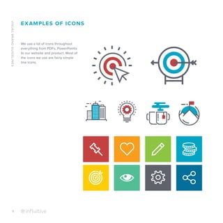
- 12. VISUALBRANDGUIDELINES 9 EXAMPLES OF ICONS We use a lot of icons throughout everything from PDFs, PowerPoints to our website and product. Most of the icons we use are fairly simple line icons.
- 13. 10 VISUALBRANDGUIDELINES PHOTOGRAPHY In terms of photography, we like using original, scenic images which we will then overlay with one of our brand colors. We DO NOT use generic corporate shots with white backgrounds. Instead, images with warm tones, smiling faces and natural poses are ones we look for. Structure of our photos 1. Color images turned into greyscale. Never overlay our brand colors onto a color photo. 2. Adjustment Layer: Exposure 3. Multiply 100%, #8bc541 0.00 Exposure Offset Gamma Correction +0.26 1.30
- 19. 16 VISUALBRANDGUIDELINES RESOURCES Logo in EPS format - influitive.box.com/logoEPS Logo in Jpeg - influitive.box.com/logoJPEG Logo in PNG - influitive.box.com/logoPNG Influitive Icon - influitive.box.com/iconPNG Colors (ASE file) - influitive.box.com/colorsASE PowerPoint Template - influitive.box.com/powerpointtemplate Icons - influitive.box.com/icons


