It's a Mobile Mobile Mobile World
1 like1,160 views

Christopher Cochran presented on designing for a mobile world at the WordCamp Baltimore conference on September 8, 2012. He discussed how the web is increasingly accessed through mobile devices and the importance of optimizing websites for mobile. Specifically, he emphasized designing based on the needs and capabilities of mobile users, using techniques like responsive design, fluid grids, adaptive images and media queries to create flexible and lightweight experiences.

It's a Mobile Mobile Mobile World
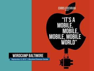
- 1. CHRIS COCHRAN presents ˇ°ITˇŻS A MOBILE, MOBILE, MOBILE, MOBILE WORLDˇ± WordCamp Baltimore September 8, 2012 Maryland Science Center
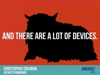
- 2. And there are a lot of Devices. CHRISTOPHER COCHRAN #wcbalt @tweetsfromchris 2012
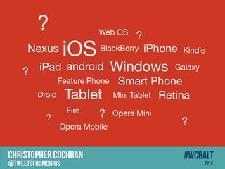
- 3. ? Web OS ? Nexus iOS BlackBerry iPhone Kindle ? iPad android Windows Galaxy Feature Phone Smart Phone Droid Tablet Mini Tablet Retina Fire ? Opera Mini ? Opera Mobile ? CHRISTOPHER COCHRAN #wcbalt @tweetsfromchris 2012
- 4. WHY CARE CHRISTOPHER COCHRAN @tweetsfromchris ? #wcbalt 2012
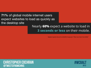
- 5. 71% of global mobile internet users expect websites to load as quickly as the desktop site Nearly 60% expect a website to load in 3 seconds or less on their mobile. Source: Equation Research on behalf of Compuware ˇ°What Users Want From Mobileˇ± CHRISTOPHER COCHRAN #wcbalt @tweetsfromchris 2012
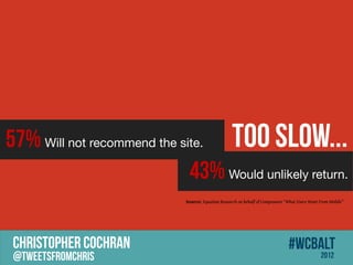
- 6. 57% Will not recommend the site. Too Slow... 43% Would unlikely return. Source: Equation Research on behalf of Compuware ˇ°What Users Want From Mobileˇ± CHRISTOPHER COCHRAN #wcbalt @tweetsfromchris 2012
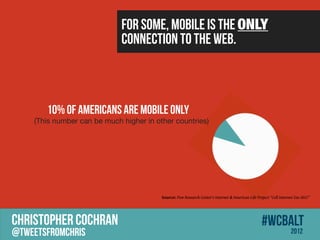
- 7. For some, mobile is the ONLY connection to the web. 10% of Americans Are Mobile Only (This number can be much higher in other countries) Source: Pew Research Center's Internet & American Life Project ˇ°Cell Internet Use 2012ˇ± CHRISTOPHER COCHRAN #wcbalt @tweetsfromchris 2012
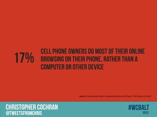
- 8. Cell phone owners do most of their online 17% browsing on their phone, rather than a computer or other device Source: Pew Research Center's Internet & American Life Project ˇ°Cell Internet Use 2012ˇ± CHRISTOPHER COCHRAN #wcbalt @tweetsfromchris 2012
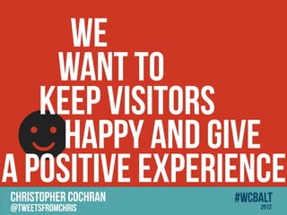
- 9. WE WANT TO KEEP VISITORS ? HAPPY AND Give A POSITIVE EXPERIENCE CHRISTOPHER COCHRAN #wcbalt @tweetsfromchris 2012
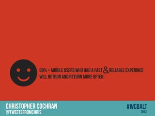
- 10. ? & 80% + mobile users who had A fast Reliable experince Will Retrun and return more often. CHRISTOPHER COCHRAN #wcbalt @tweetsfromchris 2012
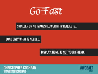
- 11. Go Fast Smaller or no images (lower http requests). Load only what is needed. display: none; is NOT your friend. CHRISTOPHER COCHRAN #wcbalt @tweetsfromchris 2012
- 12. Be Precise CHRISTOPHER COCHRAN #wcbalt @tweetsfromchris 2012
- 13. WHO is the USER? CHRISTOPHER COCHRAN #wcbalt @tweetsfromchris 2012
- 14. Designing for the USER is Designing for the BUSINESS. CHRISTOPHER COCHRAN #wcbalt @tweetsfromchris 2012
- 15. What is IMPORTANT to the user? CHRISTOPHER COCHRAN #wcbalt @tweetsfromchris 2012
- 16. START with the LEAST Common Denominator. ACCESSIBLE , LEAN, CLEAN, LIGHTWEIGHT CHRISTOPHER COCHRAN #wcbalt @tweetsfromchris 2012
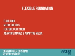
- 17. Flexible Foundation Fluid Grid Media Queries Feature Detection Adaptive Images & Adaptive Media CHRISTOPHER COCHRAN #wcbalt @tweetsfromchris 2012
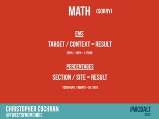
- 18. MATH (Sorry) ems target / context = result 28px / 16px = 1.75em Percentages section / site = result 100(645px / 960px) = 67.1875 CHRISTOPHER COCHRAN #wcbalt @tweetsfromchris 2012
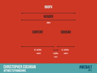
- 19. 960px HEADER 100% CONTENT SIDEBAR 67.1875% 31.1875% (645px) 1.635% (300px) (15px) CHRISTOPHER COCHRAN #wcbalt @tweetsfromchris 2012
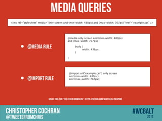
- 20. Media Queries <link rel="stylesheet" media="only screen and (min-width: 480px) and (max-width: 767px)" href=/slideshow/its-a-mobile-mobile-mobile-world/14216641/"example.css" /> @media only screen and (min-width: 480px) and (max-width: 767px) { ? @media rule body { width: 436px; } } @import url(/slideshow/its-a-mobile-mobile-mobile-world/14216641/"example.css") only screen ? @import rule and (min-width: 480px) and (max-width: 767px); Great tool for ˇ°the other browsersˇ±: https://github.com/scottjehl/Respond CHRISTOPHER COCHRAN #wcbalt @tweetsfromchris 2012
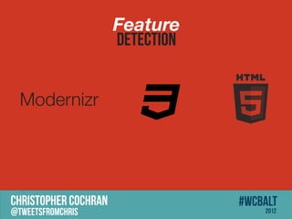
- 21. Feature DETECTION Modernizr CHRISTOPHER COCHRAN #wcbalt @tweetsfromchris 2012
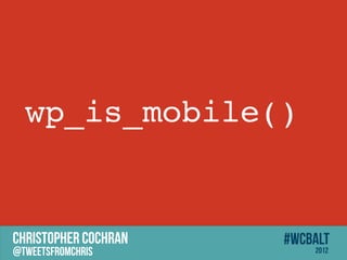
- 22. wp_is_mobile() CHRISTOPHER COCHRAN #wcbalt @tweetsfromchris 2012
- 23. ADAPTIVE MEDIA CHRISTOPHER COCHRAN #wcbalt @tweetsfromchris 2012
- 24. CHRISTOPHER COCHRAN #wcbalt @tweetsfromchris 2012
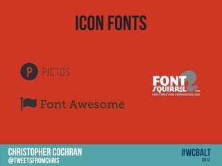
- 25. Icon Fonts Font Awesome CHRISTOPHER COCHRAN #wcbalt @tweetsfromchris 2012
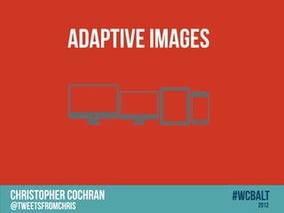
- 26. Adaptive Images CHRISTOPHER COCHRAN #wcbalt @tweetsfromchris 2012
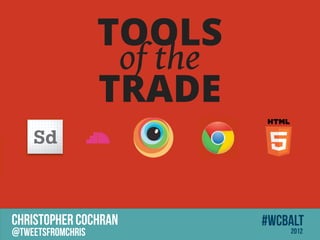
- 27. TOOLS of the TRADE CHRISTOPHER COCHRAN #wcbalt @tweetsfromchris 2012
- 28. MOBILE FIRST = CONTENT FIRST = USER FIRST CHRISTOPHER COCHRAN #wcbalt @tweetsfromchris 2012
- 29. The Web Is Not A Fixed Medium CHRISTOPHER COCHRAN #wcbalt @tweetsfromchris 2012