


More Related Content
Similar to Lecture 5 & 6 Advance CSS.pptx for web (20)
More from ZahraWaheed9 (15)


Recently uploaded (20)


Lecture 5 & 6 Advance CSS.pptx for web
- 2. 2 ID & CLASS SELECTORS ŌĆó ID Selector: ’é¦ The id selector is used to specify a style for a single, unique element. ’é¦ The id selector uses the id attribute of the HTML element, and is defined with a "#". ’é¦ The style rule below will be applied to the element with id="para1": ŌĆó Class Selector: ’é¦ The class selector is used to specify a style for a group of elements. Unlike the id selector, the class selector is most often used on several elements. ’é¦ This allows you to set a particular style for many HTML elements with the same class. ’é¦ The class selector uses the HTML class attribute, and is defined with a dot "." .center {text-align:center;} It will be used as.. p.center {text- align:center;}
- 3. 3 ŌĆó Example: <!DOCTYPE html> <html> <head> <style type="text/css"> #para1 { text-align:center; color:red; } </style> </head> <body> <p id="para1">Hello World!</p> <p>This paragraph is not affected by the style.</p> </body> </html>
- 4. 4 GROUPING SELECTORS ’é¦ In style sheets there are often elements with the same style. To avod the code repeating, we can group them. ’é¦ Here is an example to change the size of an image using CSS. CSS DIMENSIONS img.normal { height:auto; } img.big { height:40%; } img.small { height:10%; } <body> <img class="normal" src=/slideshow/lecture-5-6-advance-css-pptx-for-web/275557020/"logocss.gif" width="95" height="84" /><br /> <img class="big" src=/slideshow/lecture-5-6-advance-css-pptx-for-web/275557020/"logocss.gif" width="95" height="84" /><br /> <img class="small" src=/slideshow/lecture-5-6-advance-css-pptx-for-web/275557020/"logocss.gif" width="95" height="84" /> </body> CSS code using classes
- 5. 5 CSS DISPLAY AND VISIBILITY ’é¦ The display property specifies if/how an element is displayed. (none, block) ’üČHiding an element can be done by setting the display property to "none" ’é¦ The visibility property specifies if an element should be visible or hidden. ’üČHiding of an element can also be done by setting visibility property to "hidden" ’é¦ Syntax:
- 6. 6 CSS FLOAT ’é¦ With CSS float, an element can be pushed to the left or right, allowing other elements to wrap around it. ’é¦ Float is very often used for images, but it is also useful when working with layouts. ’é¦ Elements are floated horizontally, this means that an element can only be floated left or right, not up or down. ’é¦ If an image is floated to the right, a following text flows around it, to the left ’é¦ Here is example code to float multiple images on a web page. <style type="text/css"> .thumbnail { float:left; width:110px; height:90px; margin:5px; } </style> <body> <h3>Image Gallery</h3> <img class="thumbnail" src=/slideshow/lecture-5-6-advance-css-pptx-for-web/275557020/"klematis_small.jpg" width="107" height="90"> <img class="thumbnail" src="klematis2_small.jpg" width="107" height="80"> <img class="thumbnail" src="klematis3_small.jpg" width="116" height="90"> <img class="thumbnail" src="klematis4_small.jpg" width="120" height="90"> <img class="thumbnail" src=/slideshow/lecture-5-6-advance-css-pptx-for-web/275557020/"klematis_small.jpg" width="107" height="90">
- 7. 7 POSITIONING ELEMENTS ’é¦ The CSS positioning properties allow you to position an element. ’é¦ It can also place an element behind another, and specify what should happen when an element's content is too big. ’é¦ Elements can be positioned using the top, bottom, left, and right properties. ’é¦ However, these properties will not work unless the position property is set first. ’üČThey also work differently depending on the positioning method. ’é¦ There are four different positioning methods. ’é¦ Static Positioning: ’üČHTML elements are positioned static by default. ’üČA static positioned element is always positioned according to the normal flow of the page. ’üČStatic positioned elements are not affected by the top, bottom, left, and right properties. ’é¦ Fixed Positioning ’üČAn element with fixed position is positioned relative to the browser window. ’üČIt will not move even if the window is scrolled. ’üČFixed positioned elements can overlap other elements.
- 8. 8 ’é¦ Relative Positioning ’üČA relative positioned element is positioned relative to its normal position. ’üČThe content of relatively positioned elements can be moved and overlap other elements, ’üČbut the reserved space for the element is still preserved in the normal flow. ’üČRelatively positioned elements are often used as container blocks for absolutely positioned elements. ’é¦ Absolute Positioning ’üČAn absolute position element is positioned relative to the first parent element that has a position other than static. If no such element is found, the containing block is <html>: ’üČAbsolutely positioned elements are removed from the normal flow. The document and other elements behave like the absolutely positioned element does not exist.
- 9. Asma Sajid ; College of Computer Science & Information Studies, GCUF 9 All CSS Positioning Properties
- 10. 10 ADDING EFFECTS TO IMAGES (1) ŌĆó Transparent Image Effect ’é¦ The CSS3 property for transparency is opacity. ’é¦ We can set value for opacity. ’é¦ The opacity property can take a value from 0.0 - 1.0. A lower value makes the element more transparent. ’üČIE9, Firefox, Chrome, Opera, and Safari use the property opacity for transparency. ’é¦ IE8 and earlier use filter:alpha(opacity=x). ’üČThe x can take a value from 0 - 100. A lower value makes the element more transparent.
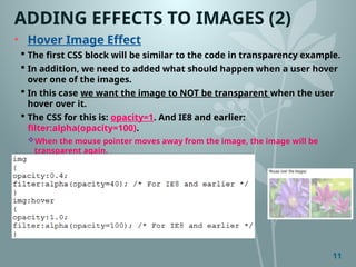
- 11. 11 ADDING EFFECTS TO IMAGES (2) ŌĆó Hover Image Effect ’é¦ The first CSS block will be similar to the code in transparency example. ’é¦ In addition, we need to added what should happen when a user hover over one of the images. ’é¦ In this case we want the image to NOT be transparent when the user hover over it. ’é¦ The CSS for this is: opacity=1. And IE8 and earlier: filter:alpha(opacity=100). ’üČWhen the mouse pointer moves away from the image, the image will be transparent again. ŌĆó Syntax:
- 12. 12 CREATING IMAGE SPRITES ŌĆó Image Sprites ’é¦ An image sprite is a collection of images put into a single image. ’é¦ A web page with many images can take a long time to load and generates multiple server requests. ’é¦ Using image sprites will reduce the number of server requests and save bandwidth. ’é¦ Instead of using three separate images, we use single image. (a.jpg) ’é¦ following example the CSS specifies which part of the ŌĆ£a.jpg" image to show: ’é¦ SYNTAX: ’üČ <img class="home" src=/slideshow/lecture-5-6-advance-css-pptx-for-web/275557020/"img_trans.gif" /> - Only defines a small transparent image because the src attribute cannot be empty. The displayed image will be the background image we specify in CSS. ’üČ width:46px;height:44px; - Defines the portion of the image we want to use ’üČ background:url(/slideshow/lecture-5-6-advance-css-pptx-for-web/275557020/img_navsprites.gif) 0 0; - Defines the background image and its position (left 0px, top 0px)
- 13. 13 EXAMPLE- STRIPES ŌĆó Navigation List ’é¦ We will use an HTML list, because it can be a link and also supports a background image. ’é¦ Explanation; #navlist{position:relative;} - position is set to relative to allow absolute positioning inside it #navlist li{margin:0;padding:0;list-style:none;position:absolute;top:0;} - margin and padding is set to 0, list-style is removed, and all list items are absolute positioned. #navlist li, #navlist a{height:44px;display:block;} - the height of all the images are 44px
- 14. 14 ŌĆó Positioning ’é¦ Now start to position and style for each specific part: #home{left:0px;width:46px;} - Positioned all the way to the left, and the width of the image is 46px #home{background:url(/slideshow/lecture-5-6-advance-css-pptx-for-web/275557020/img_navsprites.gif) 0 0;} - Defines the background image and its position (left 0px, top 0px) #prev{left:63px;width:43px;} - Positioned 63px to the right (#home width 46px + some extra space between items), and the width is 43px. #prev{background:url('/slideshow/lecture-5-6-advance-css-pptx-for-web/275557020/img_navsprites.gif') -47px 0;} - Defines the background image 47px to the right (#home width 46px + 1px line divider) #next{left:129px;width:43px;}- Positioned 129px to the right (start of #prev is 63px + #prev width 43px + extra space), and the width is 43px. #next{background:url('/slideshow/lecture-5-6-advance-css-pptx-for-web/275557020/img_navsprites.gif') no-repeat -91px 0;} - Defines the background image 91px to the right (#home width 46px + 1px line divider + #prev width 43px + 1px line divider )
- 15. 15 ŌĆó Adding Hover Effect.. ? ’é¦ We only add three lines of code to add the hover effect: Explanation ’é¦ Since the list item contains a link, we can use the :hover pseudo-class ’é¦ #home a:hover{background: transparent url(img_navsprites_hover.gif) 0 -45px;} ’üČFor all three hover images we specify the same background position, only 45px further down