際際滷

際際滷Share a Scribd company logo
Library Analytics Toolkit | Harvard Library Lab
Carli Spina
The Project                     The colorful bar at
                                the top of the page
                                                                                                          This slider zooms
                                                                                                          in on data to see
                                                                                                                                       Next Steps
The original goal of this                                                                                                              Now that we have completed the initial
                                allows users to navigate                                                  deeper level trends
project was to create a                                                                                                                phase of the Explorer, we hope to continue to
                                between subject areas                                                     within subject areas.
standalone interactive          by clicking on the                                                        The search box also
                                                                                                                                       expand on this work by adding:
analytics dashboard that        corresponding color.                                                      lets users search            	 E-resource usage data: In our
would provide detailed          This will then zoom in                                                    for specific subject         discussions we found this to be one of the
and real-time information       to offer more details                                                     headings to dive             most sought after types of library data
about library usage             about the narrow subject                                                  immediately to the
events. After researching       area selected. The Key                                                    data they need. At           	 Expenditure information by
the types of analytics          shows the color for each                                                  each level, opacity          subject: To help collection development
needed by Harvard               subject.                                                                  of the colors shows          staff in their work with the collection, we
libraries, it was decided                                                                                 circulation levels.          hope to add a financial component to this
that the initial phase of the                                                                                                          dashboard
project would focus on           This graph provides                                                                                   	 Other library usage metrics:
collection and circulation       an overview of how
                                                                                                                                       Once the intial collection development
statistics to facilitate         the total number of                                                      This bar graph shows
                                                                                                          total circulation for each   component is fully developed, we hope
collection development           items in a subject area
                                 has changed since                                                        year since the second        to add components to track reference,
decisions. This led to the
                                 2000. Clicking on a                                                      half of 2002, allowing       instruction, physical location, and other
Harvard Library Explorer.                                                                                 users to see changes         library metrics within a single, real-time,
                                 line zooms in on that
                                 subject.                                                                 over time at a glance.       online dashboard


               Find Out More:                                               Acknowledgments:
                                                                            This project would not have been possible without funding from the Harvard Library Lab. We would
               Try it yourself: http://librarylab.law.harvard.edu/toolkit   also like to thank Rosten W00 and Sha Hwang for their data visualization and web development work.
               or watch a demonstration: http://youtu.be/Tz1M0c4iH1I        The Library Anayltics Toolkit team also includes Kim Dulin, Jeff Goldenson and Paul Deschner.

More Related Content

Library Analytics Toolkit Poster

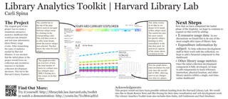
  • 1. Library Analytics Toolkit | Harvard Library Lab Carli Spina The Project The colorful bar at the top of the page This slider zooms in on data to see Next Steps The original goal of this Now that we have completed the initial allows users to navigate deeper level trends project was to create a phase of the Explorer, we hope to continue to between subject areas within subject areas. standalone interactive by clicking on the The search box also expand on this work by adding: analytics dashboard that corresponding color. lets users search E-resource usage data: In our would provide detailed This will then zoom in for specific subject discussions we found this to be one of the and real-time information to offer more details headings to dive most sought after types of library data about library usage about the narrow subject immediately to the events. After researching area selected. The Key data they need. At Expenditure information by the types of analytics shows the color for each each level, opacity subject: To help collection development needed by Harvard subject. of the colors shows staff in their work with the collection, we libraries, it was decided circulation levels. hope to add a financial component to this that the initial phase of the dashboard project would focus on This graph provides Other library usage metrics: collection and circulation an overview of how Once the intial collection development statistics to facilitate the total number of This bar graph shows total circulation for each component is fully developed, we hope collection development items in a subject area has changed since year since the second to add components to track reference, decisions. This led to the 2000. Clicking on a half of 2002, allowing instruction, physical location, and other Harvard Library Explorer. users to see changes library metrics within a single, real-time, line zooms in on that subject. over time at a glance. online dashboard Find Out More: Acknowledgments: This project would not have been possible without funding from the Harvard Library Lab. We would Try it yourself: http://librarylab.law.harvard.edu/toolkit also like to thank Rosten W00 and Sha Hwang for their data visualization and web development work. or watch a demonstration: http://youtu.be/Tz1M0c4iH1I The Library Anayltics Toolkit team also includes Kim Dulin, Jeff Goldenson and Paul Deschner.