


Line best fit 2012-13 edmodo
- 1. Scatter Plots How do I make a scatter plot?
- 2. What is a scatter plot? Study Time Grades • Collection of ordered pairs 2 4 2 6 • Shows relationship 5 6 7 8 between 2 different 7 9.5 sets of data Scatter Plot • Shows what kind of 10 7, 9.5 relationship exists 8 6, 8 Test Scores 5, 7 6 4, 6 between the data 4 2 2, 2 0 0 1 2 3 4 5 6 7 8 Study Time
- 3. 3 Types of Correlation/Association • Positive - as one value goes up, the other goes up Positive 10 8 Test Scores 6 4 2 0 0 1 2 3 4 5 6 7 8 Study Time
- 4. 3 Types of Correlation/Association • Negative - as one value goes up, the other goes down Negative 14 Number of Clothes Items 12 10 8 6 4 2 0 0 20 40 60 80 100 Temperature
- 5. 3 Types of Correlation/Association • No correlation - as one value goes up, the other neither goes up or down
- 6. FITTING A LINE TO DATA 8 There are several ways to line Usually, there is no single 6 find the line through all for a that passes of best fit the givenpoints, data points. In data set of so you try to find 4 this line that you will use a the lesson, best fits the data. graphicalbest-fitting line. This is called the best-fitting approach. 2 line. –8 –6 –4 –2 0 2 4 6 –2 –4 –6 –8
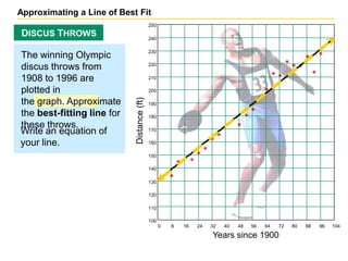
- 7. Approximating a Line of Best Fit 250 DISCUS THROWS 240 230 The winning Olympic discus throws from 220 1908 to 1996 are 210 plotted in 200 Distance (ft) the graph. Approximate 190 the best-fitting line for 180 these throws. Write an equation of 170 your line. 160 150 140 130 120 110 100 0 8 16 24 32 40 48 56 64 72 80 88 96 104 Years since 1900
- 8. DETERMINING THE CORRELATION/ASSOCIATION OF X AND Y In this scatter plot, x and y have a positive association, which means that the points can be approximated by a line with a positive slope. Examples: Age and Height Temperature and ice cream sales Time elapsed and miles travelled
- 9. DETERMINING THE CORRELATION/ASSOCIATION OF X AND Y In this scatter plot, x and y have a negative association, which means that the points can be approximated by a line with a negative slope. Examples: Car age and car value Temperature and hot chocolate sales Miles travelled and distance to destination
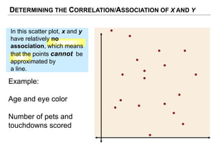
- 10. DETERMINING THE CORRELATION/ASSOCIATION OF X AND Y In this scatter plot, x and y have relatively no association, which means that the points cannot be approximated by a line. Example: Age and eye color Number of pets and touchdowns scored
- 11. DETERMINING THE CORRELATION/ASSOCIATION OF X AND Y TYPES OF CORRELATION Positive Association Negative Association No Association