Logo competition-show
- 1. Team: LEO Team members: Tran Thuy Linh Class: VISK2012B Tran Thi Hoai Thuong Le Thi Thuy Quynh Nguyen Thi Thu Thao Nguyen Duy Phuoc Logo Competition MKT 220
- 2. Outline ïą The meaning of Keukaâs logo & IS VNUâs logo ï§ Colors (Nguyen Duy Phuoc) ï§ Shapes (Le Thi Thuy Quynh) ïą The new logo designed by our team (Tran Thuy Linh) ï§ Shapes ï§ Colors ï§ The meaning of the logo ïą New T-shirt designed by our team ï§ Front (Tran Thi Hoai Thuong & Nguyen Thi Thu Thao) ï§ Back
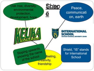
- 3. Oak tree, diversity, environmental protection, development, hope Peace, communicati on, earth Emotion, feeling, creativity, friendship Color s Shap e Shield, âISâ stands for International School
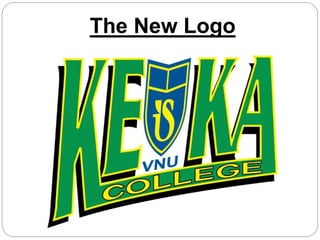
- 4. The New Logo
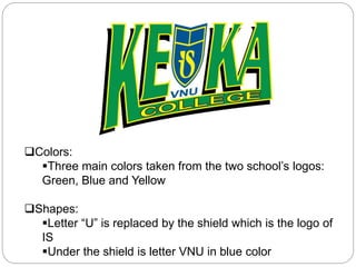
- 5. ïąColors: ï§Three main colors taken from the two schoolâs logos: Green, Blue and Yellow ïąShapes: ï§Letter âUâ is replaced by the shield which is the logo of IS ï§Under the shield is letter VNU in blue color
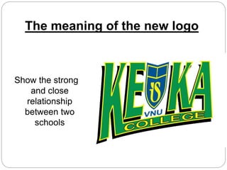
- 6. The meaning of the new logo Show the strong and close relationship between two schools
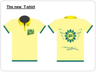
- 7. How about the new T-shirt ?
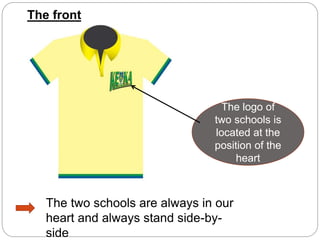
- 8. The front The logo of two schools is located at the position of the heart The two schools are always in our heart and always stand side-by- side
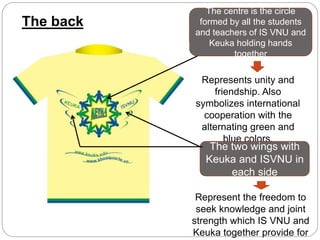
- 9. The back The centre is the circle formed by all the students and teachers of IS VNU and Keuka holding hands together Represents unity and friendship. Also symbolizes international cooperation with the alternating green and blue colors. The two wings with Keuka and ISVNU in each side Represent the freedom to seek knowledge and joint strength which IS VNU and Keuka together provide for
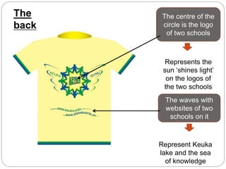
- 10. The back The centre of the circle is the logo of two schools Represents the sun âshines lightâ on the logos of the two schools The waves with websites of two schools on it Represent Keuka lake and the sea of knowledge
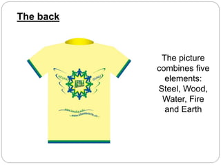
- 11. The picture combines five elements: Steel, Wood, Water, Fire and Earth The back
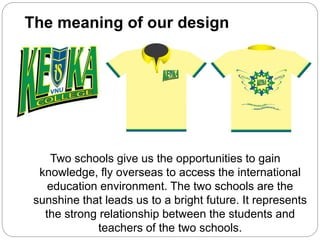
- 12. The meaning of our design Two schools give us the opportunities to gain knowledge, fly overseas to access the international education environment. The two schools are the sunshine that leads us to a bright future. It represents the strong relationship between the students and teachers of the two schools.
- 13. The new T-shirt
- 14. References ï Keuka LogoFile:Keuka-150x99-Clean.gif, WikiPedia, 2011, viewed 16 Oct 2012, <http://en.wikipedia.org/wiki/File:Keuka-150x99- Clean.gif> ï IS-VNU Logo, Google, Viewed 16 Oct 2012, <https://www.google.com.vn/search?hl=en&noj=1 &prmd=imvns&tbm=isch&source=univ&sa=X&ei= dcl- UImCCNCPiAf3yIGwAg&ved=0CGIQsAQ&biw=1 366&bih=607&q=IS-VNU%20logo&orq=IS- VNU++logo>
- 15. Thank you for listening!

