Mag analysis
•Download as PPTX, PDF•
0 likes•125 views

The document summarizes the layout styles of the front covers, contents pages, and double page spreads of two magazines - NME and Vive Le Rock. For NME, the front cover uses a red, white, and black color scheme with a full-page lead image. The contents page lists features with images and descriptions. The double page spread uses a large split image with explanatory text. For Vive Le Rock, the front cover also uses red, black, and white with text placed at the bottom, and the contents page and double page spread prioritize images related to articles over other design elements.

Mag analysis
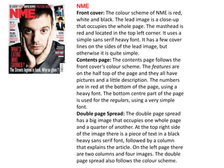
- 1. NME Front cover: The colour scheme of NME is red, white and black. The lead image is a close-up that occupies the whole page. The masthead is red and located in the top left corner. It uses a simple sans serif heavy font. It has a few cover lines on the sides of the lead image, but otherwise it is quite simple. Contents page: The contents page follows the front cover’s colour scheme. The features are on the half top of the page and they all have pictures and a little description. The numbers are in red at the bottom of the page, using a heavy font. The bottom centre part of the page is used for the regulars, using a very simple font. Double page Spread: The double page spread has a big image that occupies one whole page and a quarter of another. At the top right side of the image there is a piece of text in a black heavy sans serif font, followed by a column that explains the article. On the left page there are two columns and four images. The double page spread also follows the colour scheme.
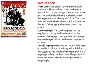
- 2. VIVE LE ROCK Front cover: The colour scheme is red, black and white. The masthead is red and uses a heavy font. The lead image is a black and white picture, and the lead line is at the bottom of the page and uses a heavy serif font. The cover lines are under the lead line. It has a banner at the top of the page and another one at the bottom. Contents Page: The contents page has the regulars at the top and the features at the bottom of the page. The right side of the page has two images related to the most important articles. Double page spread: Most of the left side page is used by a column of writing. What is left of this page and the whole of the right page has a big image related to the article. The photo is in black and white. This double page spread is very simple.