Magazine analysis
Download as pptx, pdf0 likes108 views

The document summarizes the analysis of a magazine front cover created for a college music magazine. The creator found that the picture worked well to suit the music and college genre. The masthead and name also worked well to draw attention. The red, black, and white color scheme was effective. One challenge was ensuring layers like a cut-out head aligned correctly. Creating effects on a picture and effective text layout were skills learned. Overall, the creator was pleased with appealing to the target student audience interested in music.
1 of 10
Download to read offline

Ad
Recommended
Ques 1
Ques 1Amie Carpenter
?
The document discusses the author's learning experience in designing magazine covers for a school magazine and music magazine. For the school magazine, the author initially rushed the cover design but learned to properly position cover lines and models through multiple revisions. For the music magazine, the author applied these lessons, researching popular magazines and focusing on selecting an attention-grabbing cover image with space around the models. The author realized the importance of research and revisions in creating a professionally designed magazine cover.School magazine evaluation
School magazine evaluationChristinaSmithmedia
?
The student created a school magazine as media coursework to prepare for a final music magazine project. They took photos around the school for the magazine but found the photo shoot and using Photoshop difficult due to their limited experience. While the front cover and sections seem authentic, some photos were blurry and the student wishes they captured more pictures of students and teachers to make the magazine more realistic.Q7 ppttttttt
Q7 pptttttttjackgogerty
?
The student improved significantly in their skills from their preliminary task to their final magazine project. They learned to use Photoshop more proficiently to edit photos and design pages. Their research abilities improved to make the final magazine more authentic. Time management skills also strengthened over the course of the project. Photos were taken with better lighting and location variety. Layout and design conventions like color palettes, rule of thirds, and multi-column contents pages enhanced the professional look of the final magazine compared to the preliminary version.Question 7
Question 7Rhopkinschs
?
Rebecca Hopkins reflects on what she has learned from creating school magazines and her music magazine. She learned how to use Photoshop better and gained confidence with the tools. Researching magazine layouts taught her the proper terminology and how to structure different sections. Comparing her first draft to the final product showed her improved ability to design for her audience and create a more visually appealing magazine.Question 7
Question 7radhiasalim
?
The document discusses the progression from the author's preliminary task to their full music magazine product. They felt they learned a lot, as they became familiar with programs like Photoshop and InDesign through the preliminary task. This made creating the magazine less time consuming. Feedback from the preliminary task also helped improve the magazine. Specifically, the author chose darker, more serious colors and layouts for the magazine based on feedback that their college magazine was too bright and unappealing. Overall, doing the preliminary task helped the author learn skills but they also felt some aspects of the magazine were rushed due to time constraints.School Magazine Evaluation
School Magazine Evaluationhhunjan07
?
The document evaluates a school magazine project, highlighting its adherence to existing magazine conventions and the challenges faced due to missed classes. It discusses the process of researching, designing, and editing the magazine, including feedback from peers that influenced its layout and content. The magazine aims to effectively represent the school while ensuring it remains engaging and relevant for its audience.Evaluation question 7
Evaluation question 7Mistress-Abbie
?
The document reflects on what the author has learned from their preliminary task to their full magazine product. They discuss improving skills with Photoshop like using layers and photo editing. They also learned to properly plan photos by considering things like body positioning. The author improved at directing models, choosing appropriate outfits, and using colors and text styles fitting for their target audience. Overall, the author gained valuable experience in planning, design, and using tools like Photoshop to create a polished final product.Evaluation of magazine
Evaluation of magazine Shahnaaz96
?
Shahnaaz Begum discusses the design choices made for the masthead and images used on the magazine cover for Plumstead Manor 6th Form. The masthead "manors 6th form" is short and catchy in red to match the school colors. Pictures of the modern school building and students working and socializing were selected to appeal to youth and portray the educational yet social environment. For the final magazine cover, a close-up shot of a single student may be a better main focal image.question 7
question 7sumayaaa
?
The document discusses the progression of skills and learning from an initial preliminary magazine assignment in college to a full magazine product. For the preliminary assignment, the author had no experience with design software like Photoshop and InDesign. The preliminary magazine had low quality photos and design. However, for the full magazine, the author's skills with design software improved greatly and they were able to fully utilize tools like image manipulation and application of industry techniques. This resulted in a higher quality product that received positive feedback, showing the extensive learning and improvement throughout the process.Evaluation q7
Evaluation q7mollymedia
?
The document discusses improvements made from a preliminary magazine project to the main project. For the main project, more time and effort was put into planning compositions, locations, and costumes, resulting in a higher quality front cover image that was more interesting and engaging. Additionally, colors and fonts were chosen that complemented each other and the rock theme. Images in the main project used varied angles and shots of different models in locations, while the preliminary project used similar images. Overall, lessons were learned about creating a professional magazine that would appeal to audiences.My College Magazine
My College Magazinehanspanner
?
The document describes the design process for a college magazine cover and contents page. The student created a name for the magazine combining "uni" and "verse" to represent university life. For the cover, they used images and designed text boxes in Photoshop, adding effects like strokes, beveling, and shadows to make elements stand out. For the contents page, the student replicated the color scheme and design techniques to maintain consistency across pages.Evaluating my front and back cover
Evaluating my front and back coverlauren8908
?
The document describes the front and back covers of a school magazine created by the author. For the front cover, the author used the school's colors of blue and white with orange headings. Models are pictured in the library smiling to convey a friendly atmosphere. The back cover continues the color scheme and includes the school logo and pictures taken by the author around the school to illustrate contents like a badminton class. Creating the magazine improved the author's photography, Photoshop, and design skills.2. initial plans done
2. initial plans done brooklynwhiteley1
?
The document provides initial plans and research for creating a magazine focused on nightlife photography. It includes mind maps of ideas for three potential magazine themes: Skate Magazine, Nightlife Magazine, and Portrait Photography Magazine. For each theme, it considers colors, fonts, image/text layout, and overall layout. It also includes mood boards analyzing example nightlife photography images and how they will influence the final product. A schedule outlines the plan over 5 weeks, including specific tasks for research, production experiments, production, and evaluation. A bibliography lists research sources.Question 7 evaluation
Question 7 evaluationAndrew Adega
?
The author learned several things from creating a preliminary magazine task and then a full music magazine:
1) The front cover needs to have a mid shot focus on the artist rather than a long shot.
2) Items like the masthead, sell lines, and contents page need to be positioned according to magazine conventions.
3) The design needs to be tailored to the genre of music being featured.Photo shoot
Photo shoottilda1700
?
The document summarizes photos taken for a music magazine cover. Initially, photos were taken using a red scarf and black jacket, but they were overexposed. Additional photos used a red t-shirt but lacked personality. Inspired by other magazine covers using red lipstick, the photographer had the subject pose with comical red lips. These photos captured the fun, silly personality desired and incorporated the popular color red based on surveys.The making of my magazine front cover
The making of my magazine front coverclarkelucy2051
?
Lucy Clarke outlines her process in creating a magazine front cover, detailing her decision-making in choosing angles, backgrounds, and elements to align with magazine conventions. She emphasizes adjustments made from her original plan, including the inclusion of a teacher for encouragement and a focus on appropriate color themes. The final product integrates various elements, aiming for a professional look while showcasing student achievements, though she notes challenges encountered during photo selection and composition.Preliminary task photos and sketch
Preliminary task photos and sketchChloeBakerMedia
?
Chloe Baker created initial sketches for the front cover of a student magazine, including a headshot of a student and the school badge. She also sketched the contents page with a repeated school badge and ordered menu. Some photos were rejected for various reasons - one was upside down, another didn't fit the magazine theme, a directions photo was low quality, and a construction photo wasn't suitable to promote the school.Q7
Q7Jaiydeen Deeble
?
This reflection summarizes the progression of the student's Photoshop skills over three magazine cover designs. The first cover lacked defined lines and a consistent color scheme. The second improved on expression but had a pixelated image. The final cover incorporated background elements and better cropping to make a more professional design. The student felt they successfully constructed a media product and improved Photoshop skills through choosing appropriate software and considering target audience feedback.Preliminary task photos and sketch
Preliminary task photos and sketchChloeBakerMedia
?
The document summarizes Chloe Baker's preliminary work on a task to design a magazine for her school. It includes sketches of ideas for the front cover featuring a student photo and school badge. It also sketches a contents page with repeated school badge. Photos that were not used are explained, such as one taken the wrong way or with an undesired background. Original ideas for the magazine name are listed, such as "Haydon weekly" and "Haydon Magazine".unforgettable...susana angel
unforgettable...susana angelcojowadigphoto
?
The document reflects on the author's experiences in a digital photography class and emphasizes the significance of unforgettable moments captured through photography. The author shares personal insights about their favorite pictures and the skills learned, such as focusing and lighting. Overall, the author expresses a desire to improve their photography techniques and appreciation for different styles.Equivalents project summary
Equivalents project summary lily_newton
?
The document summarizes the student's work during an art and design course. They learned drawing skills like tone and mark making by drawing from still lifes. They researched artists like Matisse and incorporated elements of his style into their own work. Later in the course, the student explored color and different materials, learning about techniques like collage and safety protocols for working with steel and wood. Overall, the course helped improve the student's drawing abilities and introduced them to new mediums and concepts in art.Question 7
Question 7nehajasmine
?
The document discusses the improvements made from the preliminary magazine cover task to the final music magazine cover. Key areas of improvement included conducting research on conventions for magazine styles, colors, images and layouts targeted towards the intended audience. Additional improvements were adding elements like sell lines, mastheads and centering the cover image based on research findings. The model's pose and clothing were also adjusted to look more professional based on research.Digital Photography
Digital Photographycojowadigphoto
?
The document discusses Arnold's experience taking digital photographs in a class. It includes several photos Arnold took at various locations like the beach and on a cruise. Arnold critiques his own photos, noting issues like overexposure, dates appearing in the frame, and backgrounds he does not like. He explains that photography allows him to remember good memories. Arnold also discusses learning skills like focusing and lighting in the class, and critiques his favorite photo of his dog, while expressing interest in learning to photograph vehicles.Digital Photography
Digital Photographycojowadigphoto
?
The document discusses the key things the author has learned about digital photography. They learned that good focus, background, and lighting are important for taking quality photos. The author also learned photo editing techniques from Kodak and how to fix existing photos. Their favorite photos show interesting colors and subjects like people making funny faces.Pictures for my school based magazine
Pictures for my school based magazineZahra Khan
?
The document discusses pictures that could be used for a school-based magazine focused on exam study tips. It analyzes several photos taken by the author in school environments that feature students studying. For each photo, it explains why the photo would work well for the magazine's purpose and audience. It also describes minor edits made in Photoshop to improve the photos, such as increasing brightness, saturation, and contrast to make the images more eye-catching. The goal is to select pictures that portray effective studying and resources available to students to help motivate them during exam preparation.Futuro simple_in Thai
Futuro simple_in ThaiBlahBie Biie
?
futuro simple ???????????????
?????????????????????????????
???????????????????????????? ?????????????????????????????? @zhangbiah ???Album cover presentation
Album cover presentationAlice Stone
?
The document discusses and analyzes the album covers of Ed Sheeran's "+", Two Door Cinema Club's "Tourist History", and Arctic Monkeys' "Whatever People Say, That's What I'm Not". It notes that Ed Sheeran's album cover links to his iconic hair color and features a simple drawn image of his face. Two Door Cinema Club's cover shows their quirky music style but is also quite simple. Arctic Monkeys' cover depicts a rebellious, edgy, smoking image and is plain, though it does not clearly represent their music.Magazine photoshoot
Magazine photoshootAlice Stone
?
Jess will pose as an indie singer on the magazine's front cover wearing Dr Dre beats, a denim jacket, tights and a casual dress. Her makeup will be dark eyes, red lips, and natural for the main face, while her hair will be down and natural for the cover shot, and down/messy in a bun for inside photos. Extreme close-ups of features like hair, eyes and lips will be used for the cover, while inside shots include a full body long shot, medium shot and close-up.Oakmont Initiative
Oakmont Initiativebgoggin31
?
The Haverford Partnership for Economic Development (HPED) has submitted a revised proposal to Haverford Township to enhance the Oakmont business district. The proposal focuses on the Oakmont district because a comprehensive plan is already in place, infrastructure improvements are scheduled by the YMCA, and a new parking lot is being constructed. The HPED proposes matching funds to install brick pavers along curbs on Darby and Eagle Roads, which would complement planned decorative lighting in the area and enhance the district for increased traffic from the 2013 U.S. Open golf tournament nearby. Renderings showcase the planned improvements.»§¬√”Œ ≤˙ŒÔ—› æ
»§¬√”Œ ≤˙ŒÔ—› æroadqu
?
»§¬√”Œ «π˙ƒ⁄ ◊øÓ¬√”Œ–›œ–≥¢µ˛≥ß ÷ª˙”¶”√£¨Ã·π©∫√≥‘°¢∫√ÕÊ°¢∫√ø¥µƒ–›œ–æ∞µ„–≈œ¢£¨÷ß≥÷≥“± ≥ßµº∫Ω∫Õº¥ ±∑÷œÌ°£”√ªßø…“‘Õ®π˝»»µ„°¢◊®º≠°¢÷˜Ã‚”Œµ»∑Ω Ω∑¢œ÷÷‹±flµƒ¬√”Œ∫√»•¥¶£¨≤¢œÌ ‹”≈ª›»Ø∏£¿˚°£”¶”√µƒ≥« –µº”Œπ¶ƒ‹∞Ô÷˙”√ªß«·À…≤È’“À˘‘⁄≥« –µƒÃÿ…´æ∞µ„£¨÷¬¡¶”⁄¥Ú‘Ï ∫œ∏ˆ»À–Ë«Ûµƒ¬√”Œ∑¢œ÷∆Ωî°£More Related Content
What's hot (17)
question 7
question 7sumayaaa
?
The document discusses the progression of skills and learning from an initial preliminary magazine assignment in college to a full magazine product. For the preliminary assignment, the author had no experience with design software like Photoshop and InDesign. The preliminary magazine had low quality photos and design. However, for the full magazine, the author's skills with design software improved greatly and they were able to fully utilize tools like image manipulation and application of industry techniques. This resulted in a higher quality product that received positive feedback, showing the extensive learning and improvement throughout the process.Evaluation q7
Evaluation q7mollymedia
?
The document discusses improvements made from a preliminary magazine project to the main project. For the main project, more time and effort was put into planning compositions, locations, and costumes, resulting in a higher quality front cover image that was more interesting and engaging. Additionally, colors and fonts were chosen that complemented each other and the rock theme. Images in the main project used varied angles and shots of different models in locations, while the preliminary project used similar images. Overall, lessons were learned about creating a professional magazine that would appeal to audiences.My College Magazine
My College Magazinehanspanner
?
The document describes the design process for a college magazine cover and contents page. The student created a name for the magazine combining "uni" and "verse" to represent university life. For the cover, they used images and designed text boxes in Photoshop, adding effects like strokes, beveling, and shadows to make elements stand out. For the contents page, the student replicated the color scheme and design techniques to maintain consistency across pages.Evaluating my front and back cover
Evaluating my front and back coverlauren8908
?
The document describes the front and back covers of a school magazine created by the author. For the front cover, the author used the school's colors of blue and white with orange headings. Models are pictured in the library smiling to convey a friendly atmosphere. The back cover continues the color scheme and includes the school logo and pictures taken by the author around the school to illustrate contents like a badminton class. Creating the magazine improved the author's photography, Photoshop, and design skills.2. initial plans done
2. initial plans done brooklynwhiteley1
?
The document provides initial plans and research for creating a magazine focused on nightlife photography. It includes mind maps of ideas for three potential magazine themes: Skate Magazine, Nightlife Magazine, and Portrait Photography Magazine. For each theme, it considers colors, fonts, image/text layout, and overall layout. It also includes mood boards analyzing example nightlife photography images and how they will influence the final product. A schedule outlines the plan over 5 weeks, including specific tasks for research, production experiments, production, and evaluation. A bibliography lists research sources.Question 7 evaluation
Question 7 evaluationAndrew Adega
?
The author learned several things from creating a preliminary magazine task and then a full music magazine:
1) The front cover needs to have a mid shot focus on the artist rather than a long shot.
2) Items like the masthead, sell lines, and contents page need to be positioned according to magazine conventions.
3) The design needs to be tailored to the genre of music being featured.Photo shoot
Photo shoottilda1700
?
The document summarizes photos taken for a music magazine cover. Initially, photos were taken using a red scarf and black jacket, but they were overexposed. Additional photos used a red t-shirt but lacked personality. Inspired by other magazine covers using red lipstick, the photographer had the subject pose with comical red lips. These photos captured the fun, silly personality desired and incorporated the popular color red based on surveys.The making of my magazine front cover
The making of my magazine front coverclarkelucy2051
?
Lucy Clarke outlines her process in creating a magazine front cover, detailing her decision-making in choosing angles, backgrounds, and elements to align with magazine conventions. She emphasizes adjustments made from her original plan, including the inclusion of a teacher for encouragement and a focus on appropriate color themes. The final product integrates various elements, aiming for a professional look while showcasing student achievements, though she notes challenges encountered during photo selection and composition.Preliminary task photos and sketch
Preliminary task photos and sketchChloeBakerMedia
?
Chloe Baker created initial sketches for the front cover of a student magazine, including a headshot of a student and the school badge. She also sketched the contents page with a repeated school badge and ordered menu. Some photos were rejected for various reasons - one was upside down, another didn't fit the magazine theme, a directions photo was low quality, and a construction photo wasn't suitable to promote the school.Q7
Q7Jaiydeen Deeble
?
This reflection summarizes the progression of the student's Photoshop skills over three magazine cover designs. The first cover lacked defined lines and a consistent color scheme. The second improved on expression but had a pixelated image. The final cover incorporated background elements and better cropping to make a more professional design. The student felt they successfully constructed a media product and improved Photoshop skills through choosing appropriate software and considering target audience feedback.Preliminary task photos and sketch
Preliminary task photos and sketchChloeBakerMedia
?
The document summarizes Chloe Baker's preliminary work on a task to design a magazine for her school. It includes sketches of ideas for the front cover featuring a student photo and school badge. It also sketches a contents page with repeated school badge. Photos that were not used are explained, such as one taken the wrong way or with an undesired background. Original ideas for the magazine name are listed, such as "Haydon weekly" and "Haydon Magazine".unforgettable...susana angel
unforgettable...susana angelcojowadigphoto
?
The document reflects on the author's experiences in a digital photography class and emphasizes the significance of unforgettable moments captured through photography. The author shares personal insights about their favorite pictures and the skills learned, such as focusing and lighting. Overall, the author expresses a desire to improve their photography techniques and appreciation for different styles.Equivalents project summary
Equivalents project summary lily_newton
?
The document summarizes the student's work during an art and design course. They learned drawing skills like tone and mark making by drawing from still lifes. They researched artists like Matisse and incorporated elements of his style into their own work. Later in the course, the student explored color and different materials, learning about techniques like collage and safety protocols for working with steel and wood. Overall, the course helped improve the student's drawing abilities and introduced them to new mediums and concepts in art.Question 7
Question 7nehajasmine
?
The document discusses the improvements made from the preliminary magazine cover task to the final music magazine cover. Key areas of improvement included conducting research on conventions for magazine styles, colors, images and layouts targeted towards the intended audience. Additional improvements were adding elements like sell lines, mastheads and centering the cover image based on research findings. The model's pose and clothing were also adjusted to look more professional based on research.Digital Photography
Digital Photographycojowadigphoto
?
The document discusses Arnold's experience taking digital photographs in a class. It includes several photos Arnold took at various locations like the beach and on a cruise. Arnold critiques his own photos, noting issues like overexposure, dates appearing in the frame, and backgrounds he does not like. He explains that photography allows him to remember good memories. Arnold also discusses learning skills like focusing and lighting in the class, and critiques his favorite photo of his dog, while expressing interest in learning to photograph vehicles.Digital Photography
Digital Photographycojowadigphoto
?
The document discusses the key things the author has learned about digital photography. They learned that good focus, background, and lighting are important for taking quality photos. The author also learned photo editing techniques from Kodak and how to fix existing photos. Their favorite photos show interesting colors and subjects like people making funny faces.Pictures for my school based magazine
Pictures for my school based magazineZahra Khan
?
The document discusses pictures that could be used for a school-based magazine focused on exam study tips. It analyzes several photos taken by the author in school environments that feature students studying. For each photo, it explains why the photo would work well for the magazine's purpose and audience. It also describes minor edits made in Photoshop to improve the photos, such as increasing brightness, saturation, and contrast to make the images more eye-catching. The goal is to select pictures that portray effective studying and resources available to students to help motivate them during exam preparation.Viewers also liked (14)
Futuro simple_in Thai
Futuro simple_in ThaiBlahBie Biie
?
futuro simple ???????????????
?????????????????????????????
???????????????????????????? ?????????????????????????????? @zhangbiah ???Album cover presentation
Album cover presentationAlice Stone
?
The document discusses and analyzes the album covers of Ed Sheeran's "+", Two Door Cinema Club's "Tourist History", and Arctic Monkeys' "Whatever People Say, That's What I'm Not". It notes that Ed Sheeran's album cover links to his iconic hair color and features a simple drawn image of his face. Two Door Cinema Club's cover shows their quirky music style but is also quite simple. Arctic Monkeys' cover depicts a rebellious, edgy, smoking image and is plain, though it does not clearly represent their music.Magazine photoshoot
Magazine photoshootAlice Stone
?
Jess will pose as an indie singer on the magazine's front cover wearing Dr Dre beats, a denim jacket, tights and a casual dress. Her makeup will be dark eyes, red lips, and natural for the main face, while her hair will be down and natural for the cover shot, and down/messy in a bun for inside photos. Extreme close-ups of features like hair, eyes and lips will be used for the cover, while inside shots include a full body long shot, medium shot and close-up.Oakmont Initiative
Oakmont Initiativebgoggin31
?
The Haverford Partnership for Economic Development (HPED) has submitted a revised proposal to Haverford Township to enhance the Oakmont business district. The proposal focuses on the Oakmont district because a comprehensive plan is already in place, infrastructure improvements are scheduled by the YMCA, and a new parking lot is being constructed. The HPED proposes matching funds to install brick pavers along curbs on Darby and Eagle Roads, which would complement planned decorative lighting in the area and enhance the district for increased traffic from the 2013 U.S. Open golf tournament nearby. Renderings showcase the planned improvements.»§¬√”Œ ≤˙ŒÔ—› æ
»§¬√”Œ ≤˙ŒÔ—› æroadqu
?
»§¬√”Œ «π˙ƒ⁄ ◊øÓ¬√”Œ–›œ–≥¢µ˛≥ß ÷ª˙”¶”√£¨Ã·π©∫√≥‘°¢∫√ÕÊ°¢∫√ø¥µƒ–›œ–æ∞µ„–≈œ¢£¨÷ß≥÷≥“± ≥ßµº∫Ω∫Õº¥ ±∑÷œÌ°£”√ªßø…“‘Õ®π˝»»µ„°¢◊®º≠°¢÷˜Ã‚”Œµ»∑Ω Ω∑¢œ÷÷‹±flµƒ¬√”Œ∫√»•¥¶£¨≤¢œÌ ‹”≈ª›»Ø∏£¿˚°£”¶”√µƒ≥« –µº”Œπ¶ƒ‹∞Ô÷˙”√ªß«·À…≤È’“À˘‘⁄≥« –µƒÃÿ…´æ∞µ„£¨÷¬¡¶”⁄¥Ú‘Ï ∫œ∏ˆ»À–Ë«Ûµƒ¬√”Œ∑¢œ÷∆Ωî°£Trafficking in persons_2012_web
Trafficking in persons_2012_webCathy Manaka
?
The document is the 2012 Global Report on Trafficking in Persons published by the United Nations Office on Drugs and Crime (UNODC). It provides information on trafficking patterns, flows, victims, and traffickers globally and by region based on officially reported data. Key findings include that at least 136 nationalities were trafficked to 118 countries between 2007-2010, and the percentage of detected child victims increased from 20% in 2003-2006 to 27% in 2007-2010. Regional trends and challenges to effective responses are also examined, such as low conviction rates compared to other crimes. The report aims to further understanding of human trafficking to strengthen policies and criminal justice responses.Album cover presentation
Album cover presentationAlice Stone
?
The document discusses and analyzes the album covers of Ed Sheeran's "+", Two Door Cinema Club's "Tourist History", and Arctic Monkeys' "Whatever People Say, That's What I'm Not". It notes that Ed Sheeran's album cover links to his iconic hair color and features a simple drawn image of his face. Two Door Cinema Club's cover shows their quirky music style but is also quite simple. Arctic Monkeys' cover depicts a rebellious, edgy, smoking image and is plain, though it does not clearly represent their music.Science fusion 2012 Presentation
Science fusion 2012 PresentationNiall ? Dochartaigh
?
The document describes the components of an educational program including student and teacher digital materials, lessons, projects, assessments, and leveled readers and inquiry resources. It provides interactive digital content for students, a teacher digital management center, equipment kits, and print materials to support teachers.Social mediamarketing worldwide
Social mediamarketing worldwideMassimo Vologni
?
Il documento di Massimo Vologni discute l'importanza di un approccio strategico al social media marketing per le aziende italiane che desiderano internazionalizzarsi. Sottolinea che ci sono differenze culturali e comportamentali significative tra i vari mercati, che richiedono una comprensione approfondita degli strumenti e dei social network locali. Inoltre, mette in guardia contro l'idea errata che tradurre contenuti in inglese sia sufficiente per superare le barriere nei mercati esteri.Appunti modulo conoscere per vendere
Appunti modulo conoscere per vendereMassimo Vologni
?
Il documento tratta l'importanza della gestione delle informazioni commerciali e il ruolo evolutivo della direzione commerciale nell'era digitale. Viene evidenziato come l'accesso a informazioni aggiornate possa fornire alle aziende un vantaggio competitivo e come strumenti come il CRM siano essenziali per monitorare le performance. Il testo propone anche strategie per raccogliere e interpretare dati utili a supporto delle decisioni commerciali.Final internship presentation doucet_t
Final internship presentation doucet_tthibault_doucet
?
The document summarizes an internship presentation about redundancy for automation controllers. It discusses the internship objectives of developing prototypes to study redundancy techniques and their performances. It then covers key topics like definitions of redundancy, examples of standby redundancy modes, the two prototypes developed focusing on validation and modeling, and concludes with lessons learned around studying redundancy techniques and gaining experience with new technologies and methodologies.PEMBUATAN BLOW MOLDING
PEMBUATAN BLOW MOLDINGAnna Yanz
?
Blow molding adalah proses membentuk plastik dengan meniup udara ke dalam cetakan untuk membentuk bentuk yang diinginkan. Proses ini digunakan untuk memproduksi barang seperti botol dan wadah plastik. Terdapat dua jenis blow molding: extrusion blow molding yang melibatkan ekstrusi plastik cair ke dalam tiub dan injeksi blow molding yang melibatkan injeksi plastik cair ke dalam cetakan. Kedua-dua proses melibatkan tiHistory of Computer Technology
History of Computer TechnologyDanz Magdaraog
?
The document traces the evolution of early calculating devices and computers from the abacus to the modern microprocessor. It discusses the development of calculating machines like the slide rule and Pascal's calculator. It then covers early mechanical computers invented by figures like Babbage and Hollerith. It outlines the progression from vacuum tube computers to transistor computers to integrated circuit computers. It concludes by discussing the development of the microprocessor and ambitions for artificial intelligence in fifth generation computing.Ad
Similar to Magazine analysis (20)
charles simpson's media cw
charles simpson's media cwsimpo123
?
This document is a report by Charlie Simpson about creating a school magazine and music magazine for an A-level media coursework project. Charlie discusses drafting a front cover and contents page for the school magazine to gain experience with software and magazine layout conventions. Feedback from potential readers helped determine content ideas. For the school magazine, Charlie edited photos in Photoshop and learned about layout and design. Audience research informed the target demographic of 15-19 year olds for the music magazine. Front and contents page research of other magazines provided ideas on design and formatting.Evaluation question 7
Evaluation question 7Mistress-Abbie
?
The document reflects on what the author has learned from their preliminary task to their full magazine product. They discuss improving skills with Photoshop like using layers and photo editing. They also learned to properly plan photos by considering things like body positioning. The author improved at directing models, choosing appropriate outfits, and using colors and text styles fitting for their target audience. Overall, the author gained valuable experience in planning, design, and using tools like Photoshop to create a polished final product.Preliminary task, school magazine compared to music[1]
Preliminary task, school magazine compared to music[1]billiewilson_
?
The document compares a student's preliminary school magazine to their music magazine, outlining key improvements:
1) Photography was improved with better equipment, time, and subject matter for the music magazine, allowing for more professional-looking images.
2) Layout and design were more conventional and appealing in the music magazine, with single focal images, consistent typography, and proper conventions like page numbers.
3) Experience with the preliminary task helped the student recognize needed changes like simplified designs, proper cropping, and adherence to magazine layout standards in their music magazine.Media q1 as
Media q1 asStephanie Barker
?
The document discusses how the author designed their magazine to both follow conventions of real music magazines like NME and Q Magazine, while also challenging those conventions. The author took inspiration from layouts, photography styles, and article types from those magazines, but adapted elements to make the magazine more inclusive of both genders and to stand out visually. Key elements borrowed include using bold colors, centered headshots, and varied photo sizes, but the author added their own stylistic touches like wider color palettes and different props in photos.Magazine evaluation
Magazine evaluationBef_Watson
?
1. The document describes how the author's music magazine uses similar conventions and layout techniques as the magazine Kerrang!, including placing the lead article on the left third, adding a tagline, placing the masthead at the top over the main image, and including "free posters" at the bottom.
2. The magazine represents a solo female screamo artist in her late teens/early 20s to appeal to its target demographic. Photos portray her performing alone in rock/metal-inspired clothing.
3. Bauer Media would be a suitable distributor as they distribute the similar magazine Kerrang! and the author's magazine focuses on upcoming talent alongside larger bands, filling a gap in theQuestion 7
Question 7laurengreene29
?
By doing the preliminary school magazine task, the author learned important lessons that helped in creating their music magazine. They learned to research the target audience and genre to design the magazine around. For the music magazine, the author analyzed layouts and designs of existing rock magazines to guide their own. The preliminary task taught the importance of an eye-catching cover to grab attention, so the author featured a band's lead singer. Sticking to a consistent color scheme of black, white, and gray throughout also helped the pages appear cohesive and professional.q7
q7sumayaaa
?
The document discusses the progression of skills and learning from the author's preliminary college magazine task to their full music magazine product. For the college magazine, the author lacked photo editing and design skills and it showed in the low-quality black-and-white front cover and contents page. However, for the music magazine, the author's photo shop and InDesign abilities improved greatly and they were able to fully utilize the software's tools to create high-quality images, an eye-catching color cover, and well-designed layout that looked like a real magazine. The positive feedback on the music magazine showed that the author had learned how to effectively apply their new terminology knowledge and design skills.Front cover & contents evaluation
Front cover & contents evaluationbethhupchurchh
?
- The document evaluates the front cover and contents page of a magazine about dance.
- On the front cover, the author notes some improvements could be made such as making the masthead bigger and bolder. They also included competitions to attract readers.
- For the contents page, the author chose pastel pink and blue colors that appeal to their target audience of teenage girls. They structured the page clearly but would add more context to the photos next time.Shannons Evaluation
Shannons Evaluationgranshan06
?
1. The document describes the planning and creation of a music magazine targeted towards 16-20 year olds of mixed gender.
2. Research on other magazines informed the target genres of indie music and the magazine's design.
3. Photos of friends posing as a band were taken to populate the magazine. Conventions like mastheads, cover lines, and layout were followed to achieve a professional look.Shannons Evaluation
Shannons Evaluationgranshan06
?
- The document discusses the planning and construction of a music magazine targeted towards 16-20 year olds of mixed gender.
- Research on other magazines informed the target genres of indie music and conventions like placement of cover lines and masthead.
- Photos were taken of friends posing as a band to feature in the magazine, with consideration for costumes, locations, and lighting.
- The magazine was constructed using Photoshop, Publisher, and a digital camera to achieve a professional look and feel.Media evaluation
Media evaluationjazzkm
?
The feedback Jazz Kamara-Marsh received on their music magazine praised the photography, color scheme, and representation of the jazz genre. Some suggestions included making the contents page landscape, adjusting image sizes, and adding more color or photos. Jazz made improvements based on this feedback, such as adding a second page to the contents and correcting the barcode size. Overall, the feedback was positive and helped Jazz further refine their magazine to better represent the genre of jazz music.College Magazine
College Magazinewhateverestt
?
The document describes the process of designing the cover for a college magazine project. The designer used herself as the model for the cover photo, editing it to be black and white. Different brushes and effects were tried before settling on using the "color bend" tool to make the image bolder. Logos and mastheads were created referencing music themes. A quote from an interview inside the magazine was used as the cover line. Additional design elements like barcodes, dates, and prices were added. A double-page contents spread continued the bold color theme and included band photos styled as camera film.Evaluation
Evaluationdavidrpollard
?
The document discusses the process of designing magazines for a college course. It describes creating a music magazine aimed at teenagers to fill a gap in magazines catering to chart/pop music. It also created a college magazine appealing to prospective college students. The document reflects on lessons learned, such as using bold colors and simple layouts to attract younger audiences, and editing images for professional-looking magazines.Looking back at the preliminary task what do
Looking back at the preliminary task what dobethgeorge96
?
From my preliminary task to the final magazine product, I learned how to better use my camera equipment and manage lighting and backdrops. I also improved at managing human resources like models, having to find someone specifically fitting for an indie pop magazine. Time management was more important for the final product, allowing for retakes if needed. My creative decisions changed significantly from the preliminary task, requiring audience research on indie pop genres. Problem solving for image editing was needed due to my model's frizzy hair not cutting out cleanly. Props like a guitar and costumes like a bright Hawaiian shirt helped achieve the indie pop aesthetic.Evaluation
Evaluationbethbethbethsmedia
?
The document discusses the design and creation of a music magazine called Relentless. Key points include choosing a dominant main image to feature the artist, using eye-catching colors and fonts in strips and headings to attract readers, and including competitions and regular issues to incentivize purchases and subscriptions. The target audience is described as those interested in alternative music genres like indie, rock, and metal.Music eva
Music evalukeleeks8
?
The document discusses Luke Leeks' process of learning design programs like Photoshop and Quark Xpress to create a college magazine and music magazine. For the music magazine, Luke studied existing magazines to determine structure and style elements to include. Through trial and error on both projects, Luke improved his skills with the programs and feels he created professional-looking magazines.Media evaluation q1
Media evaluation q1Michel Cooke
?
The document summarizes the evaluation of a music magazine media product created by the author. They began by researching various music magazines and genres to understand conventions. For their own magazine, the author paid attention to layout, titles, images, writing style, and color schemes. They applied lessons from other magazines but also took some unconventional approaches. The overall goal was to create a magazine that fit the intended genre and audience.Evaluation Activity 1
Evaluation Activity 1Marakesh Jarvis
?
The document summarizes the ways in which the author's magazine cover and layout uses, develops, and challenges conventions of real media products. Specifically:
- The cover design takes inspiration from magazines like "Little White Lies" but adds a gradient effect and uses two circles instead of one.
- Photographs were taken in natural light on location instead of in a studio to give an indie feel.
- The contents page draws from the layout of "CLASH" magazine but uses a white background and different font styles.
- Individual band member photos on the contents page are inspired by shots of HAIM, while group shots against a graffiti wall develop the indie aesthetic.
- The double pageE7
E7stephlg17
?
The document reflects on the learning and improvements made by the author in creating a music magazine compared to an earlier school magazine, including gaining skills in photography, layout, fonts, image manipulation, writing style, and considering factors like costumes and styles to portray bands. Techniques learned included using lighting equipment, higher resolution camera settings, photo editing tools, and an informal yet appropriate writing tone. The music magazine featured a simple but effective layout with one main photo, space for additional elements, and section divisions to aid navigation.Evaluation 2
Evaluation 2davidrpollard
?
The document discusses the process of designing magazines for a college course. It describes creating a music magazine aimed at teenagers to fill a gap in magazines catering to chart/pop music. It also created a college magazine appealing to prospective college students. Key learnings included using simple backgrounds and colors that complemented images to direct attention. Formats from other magazines like NME and New were inspirations. The final magazines featured informal language and bold colors to attract teenage audiences.Ad
Magazine analysis
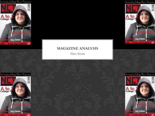
- 1. MAGAZINE ANALYSIS Alice Stone
- 2. THE BRIEF The brief was to make a magazine front cover for a college magazine, I chose to do a college magazine that involved a lot of music influences and was mainly about music for college students.
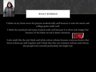
- 3. WHAT WORKED I think on my front cover the picture worked really well because it suits the music and college genre really well. I think the masthead and name worked really well because it is short and snappy but because of the black on red it draws attention. I also really like the red, black and white colour scheme because everyone knows that those colours go well together and I think that they are common colours and colours that people look towards particularly the bright red.
- 4. WHAT DIDN°ØT WORK SO WELL? Sometimes on my magazine front cover I have used black over dark areas of the picture so it hasn°Øt showed up very well.
- 5. MOST DIFFICULT? The part I found most difficult was the amount of layers and making sure they were all right for example I cut the head out of the body and moved it about the writing at the top so it stood out, but I found that part very difficult to get it lined up correctly.
- 6. WHAT WAS EASY? I found the masthead easy because I already had practise with it before so I knew how to do it.
- 7. WHAT I LEARNT I learnt ®C how to put effects onto a picture. Use text effectively on a magazine A lot about the layout of a magazine Colours that work on a magazine to get attention Conventions of a magazine Things that have to be on a magazine New things on Photoshop Good idea of what works and what doesn°Øt for future work.
- 8. IF I WAS TO DO IT AGAIN I WOULD°≠ If I was to do my whole magazine front cover again I would use a picture of a band with their instruments and make it look very professional. I would also change my layout slightly so that things were clearer but I would mostly keep it the same because I am very pleased with it overall and I think that it looks good and will appeal to the target audience of students particularly ones with an interest in music.
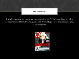
- 9. COMPARISON°≠ I would compare my magazine to a magazine like °ÆQ°Ø because I got my idea for the masthead from this magazine and it would appeal to the same audience as my magazine
- 10. OVERALL°≠ Overall I am very pleased with my magazine front cover, I think that it is perfect for the audience that I am appealing to and has a lot of variety from a musical point of view within it.