
Analysis of NME
- 2. NME
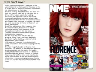
- 3. NME: Front cover NMEí»s front cover features ití»s masthead in the upper left corner of the magazine, the colour of this is usually white or red but occasionally conforms to the colour scheme of the image. The main heading of this front page is in black and bold, it is the only black text on the cover and so brings in the readers eyes to the heading. The text of the magazine is placed around the images as to avoid obstructing the actual image itself, this also allows the text to have a background and make it stand out more, in this case the use of the white text on top of the red of Florenceí»s hair Brings out the text. One of the subheadings of the magazine lists A number of artists, these will all be artists commonly featured in the magazine so the bring attention to them, this also allows potential readers to understand the genres Included in the magazine. For this cover that have included that it is a Special Edition Cover, this urges readers to buy it as it implies that they are one of a kind And limited in their numbers. NME features ití»s barcode in the bottom right corner which allows it to avoid overlapping with the image. The Main image featured is of Florence from Florence + The Machine, in the image she maintains direct eye contact with the reader, her head is slightly tilted and this can be seen as a display of submissiveness etc. which is catering to the Male hegemony. Her outfit is white which matches the house colour scheme of NME and allows the main title to have a complimenting background. The red of her hair provides the red common of a NME front cover.
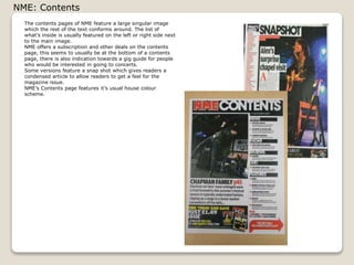
- 4. NME: Contents The contents pages of NME feature a large singular image which the rest of the text conforms around. The list of whatí»s inside is usually featured on the left or right side next to the main image. NME offers a subscription and other deals on the contents page, this seems to usually be at the bottom of a contents page, there is also indication towards a gig guide for people who would be interested in going to concerts. Some versions feature a snap shot which gives readers a condensed article to allow readers to get a feel for the magazine issue. NMEí»s Contents page features ití»s usual house colour scheme.
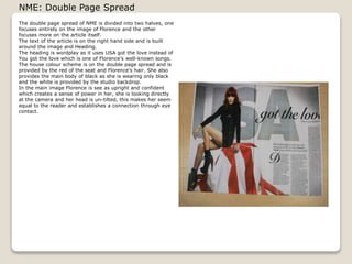
- 5. NME: Double Page Spread The double page spread of NME is divided into two halves, one focuses entirely on the image of Florence and the other focuses more on the article itself. The text of the article is on the right hand side and is built around the image and Heading. The heading is wordplay as it uses USA got the love instead of You got the love which is one of Florenceí»s well-known songs. The house colour scheme is on the double page spread and is provided by the red of the seat and Florenceí»s hair. She also provides the main body of black as she is wearing only black and the white is provided by the studio backdrop. In the main image Florence is see as upright and confident which creates a sense of power in her, she is looking directly at the camera and her head is un-tilted, this makes her seem equal to the reader and establishes a connection through eye contact.