Media Local Newspaper Analysis
- 1. Newspaper Analysis Henry Curtis
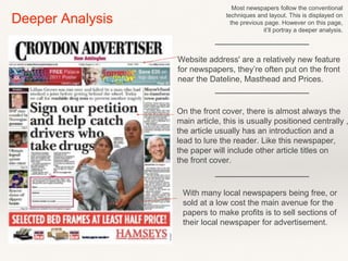
- 2. Masthead Price Inside Articles (Fillers) Advertisement Date & Website Main Article Headline Image & Image Lead (Linked to Article) Introduction (Main Article Lead) Front Cover Analysis
- 3. Most newspapers follow the conventional techniques and layout. This is displayed on the previous page. However on this page, it’ll portray a deeper analysis. Deeper Analysis Website address' are a relatively new feature for newspapers, they’re often put on the front near the Dateline, Masthead and Prices. On the front cover, there is almost always the main article, this is usually positioned centrally , the article usually has an introduction and a lead to lure the reader. Like this newspaper, the paper will include other article titles on the front cover. With many local newspapers being free, or sold at a low cost the main avenue for the papers to make profits is to sell sections of their local newspaper for advertisement.
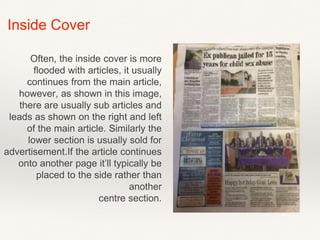
- 4. Inside Cover Often, the inside cover is more flooded with articles, it usually continues from the main article, however, as shown in this image, there are usually sub articles and leads as shown on the right and left of the main article. Similarly the lower section is usually sold for advertisement.If the article continues onto another page it’ll typically be placed to the side rather than another centre section.
- 5. This is another local newspaper, ‘Leader’ from Brighton and Hove, appears much less chaotic than other local newspapers. I feel this is achieved by the limited colours, they’ve only used blue, other than the advertisement in the bottom right hand cover, of which would’ve been done to stand out. This is another local newspaper which has more than one article on the front cover. Similarly it includes a large image for the main article which again is placed centrally. The tidy affect is also achieved by the font and it’s size, although it does range in size. It doesn’t range between to many different scales.
- 6. This is the inside front cover of the Brighton and Hove Newspaper, ‘Leader’. This shows a variety in layout, as the is inside cover doesn’t contain any articles but instead a contents page, untraditionally it also contains a list of emergency service numbers and address’ and other local ‘clubs’, which display the date, times and location. However it does meet conventions with the lower half being used for advertisement, and as you can see the colour scheme continues with some highlights and sectioning .
- 7. This is the inside front cover of the Coventry Telegraph, this shows a different approach to the layout. It continues it’s colour scheme which again is blue, it contains no adverts but had contacts of the newspaper and the articles. This is a more busy inside front cover, with the article’s squished adjacently. It has a range of font sizes to capture the reader to the main story however I despite having plenty of information on the page, it doesn’t look over crowded.


