Media pitch 1
•Download as PPTX, PDF•
0 likes•184 views

The document outlines a plan for a new magazine targeted at people aged 16-25. Key details include: - The magazine will be called "Stripped" and will have an alternative lifestyle focus, encouraging social issues and community involvement. - It will have 12 pages and be distributed for free with the local Northern Echo newspaper. - Research was conducted on magazine styles, topics, and the target audiences. Mockups were created and feedback received. - The budget and estimated profits show the magazine can be commercially viable through advertising revenue.


Media pitch 1
- 2. Brief “You have been commissioned by the Northern Echo to produce a new magazine or newspaper product. Your product could be in any style or genre but it must be self financed through sales or advertising. You must also produce your magazine for a specified audience segment within the 16 to 25 age group.”
- 3. How I intend to meet this brief o Needs to be tasteful, yet exciting enough to engage my young audience. o Articles need to apply to both target age groups. o Needs to be formal. o Articles can‟t be too niche.
- 4. My Aims o Alternative lifestyle magazine o Given away for free with the Northern Echo o Encourage young people to stand up for what they believe in o Encourage young people to be interested in social issues o Encourage young people to want to get involved in community life
- 5. Genre Research Limited sell lines Close image of face Typewriter font branding Very simple Focus is more on image
- 6. Handwritten font – personal Influence for „Is it My Fault?‟ Black and white image – enforces serious and emotional tone Written in 1st person – connects the audience Simple layout – more focus on the emotive meaning of the article rather than distractions from colour etc. Short paragraphs on each page – easier to read
- 7. Images of people in realistic, lively poses – window to the future self Formal language – makes it more believable Influence for confidence article Simple fonts used – easier to read Young adult models – relatable Serious tone when discussing the serious issues on confidence – makes it seem very important Bright pastel colours used – connotes with happiness
- 8. I have realised from this research that magazines are themed around what the article is about, if it’s about happiness, bright colours are used and vice versa. I am going to take this idea and apply it to my own magazine.
- 9. My audience o Aged 17-21 o 60% female, 40% male o Indie Scenesters, Creatives and Young Alts o Socioeconmic groups C2, C1 &B
- 10. Secondary audience I also have to consider the Northern Echo audience, who are: o Local o Older, possibly just over middle aged o Interested in community o A mixture of genders o Have a caring attitude towards their readers
- 11. Audience Considerations o Age – more likely to prefer bigger image to text ratio. However, I realised that this wouldn‟t be problem with my audience after magazine research, but still decided on using a small number of columns. o Socioeconmic group – although parents have money, they may not. I had to consider pricing schemes and what I could charge for my magazine, leading me to distributing it for free. o Looked at my audiences interests and decided on the articles I could write from there, e.g. equality and confidence issues.
- 12. PCC • I researched into the Press Complaints Commission so I would be aware of the regulations I need to follow. • To make sure I don‟t break any of the rules set by them regarding harassment, accuracy, privacy, intrusion into grief/shock etc. I came up with 5 golden rules. 1. Make sure all information included is genuine & accurate 2. Make sure that I am writing sensitively when discussing rape and sexual assault 3. When researching articles, I must make sure I‟m not intrusive 4. I must make sure that the locations I shoot in are definitely accessible 5. I must make sure that all the places I am visiting for shoots, or interviews are safe.
- 13. Content research I researched various areas for my articles to make sure they were all genuine and interesting: oInternet oFamily/friends opinions oBooks on the subject – e.g. Psychology
- 14. Mock ups I created mock ups using all of my research and known considerations on InDesign. “Although orange may be associated with happiness and other positive emotions, the juxtaposition between this and the dark subject matter works well” I think the first image is particularly striking and strong when linked with the content of the article and I think it is a particularly effective introductory image. “I think the design of the first mock up looks a bit "basic" and amateurish when compared to the second” The language is appropriate. It keeps the a formal tone but does in a nondictatorial way appropriate for the type of magazine that it is.
- 15. “The majority of the language use is appropriate, however there are instances where the formality drops and the tone seems less serious” “I don't think the images show the subject well enough.” “The interview is appropriate and works in the article because it is from a professional with a great knowledge of the subject. It helps legitimize the points made prior and afterward in the article.” I prefer the second font much more, as I believe it comes across as more sophisticated while not appearing as too 'old' for the target demographic
- 16. What I‟m taking forward From this feedback, I will be taking forward various things to make sure my ideas apply to my audience: o I will be using the 1st image, or an image similar, that is serious and emotive o I will be keeping the same article, but will tweak the grammar o I will be keeping the border from my 2nd mock up o I will be keeping the handwritten font o I will also be keeping the 2 columns
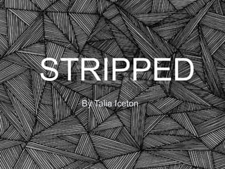
- 17. STRIPPED • The word „stripped‟ connotes with a form of „nakedness‟, showing that the magazine is simple and stripped back from the mainstream. • It will have 12 pages. • It will have 5 advertisements • The front cover with be 350g and the inside pages will be 150g. • It will be free with the Northern Echo • It will be alternative lifestyle
- 18. Branding I will brand my magazine through the use of the American Typewriter font, which is related to a newspaper theme and shows the audience that this is more serious It will mainly be black & white apart from the few splashes of colour in the confidence article. This will also brand my magazine.
- 19. Flat plans – Front Cover Aims o Dark o Intriguing image o Black background, white text o Limited sell lines
- 20. Flat plans – Contents Page Aims o Masthead with magazine title o Simple o Opposite of front page – white background with black text o Bright images
- 21. Flat Plans – DPS 1 Aims o Bright o Fun o Encourages confidence and happiness o 1st person narrative o Formal yet friendly
- 22. Flat plans - DPS 2 Aims o Dark o Serious o 3rd person narrative o Formal
- 23. Flat Plans – DPS 3 Newspaper theme 2nd person narrative Formal Humorous Black & white
- 24. Personnel Expenditure Makeup assistants, ÂŁ2 Lighting 20 assistants, ÂŁ2 20 Researchers, ÂŁ130 Journalists, ÂŁ3 00 Photographer s, ÂŁ340 Subeditors, ÂŁ1 Models, ÂŁ110 65 Total - ÂŁ1485
- 25. Equipment Expenditure Travel, ÂŁ30 Indemnity Insurance, ÂŁ60 0 Studio space rental, ÂŁ80 Lighting studio kit, ÂŁ110 Camera, ÂŁ240 Total - ÂŁ1060
- 26. Total Expenditure Personnel, ÂŁ1, 485 Printing, ÂŁ3,88 8.40 Equipment , ÂŁ1,060 Total - ÂŁ6433.40
- 27. Commercial Viability o Budget of ÂŁ8400 after advertising o Spent ÂŁ6433.40 altogether Advert type Rate DPS ÂŁ2000 Full page ÂŁ1000 Quarter page ÂŁ400 Inside front ÂŁ2500 Back page ÂŁ3000
- 28. Profit ÂŁ1475.95
- 29. Recap o I aimed to create a magazine that fit both audiences, through interesting articles that were tasteful and not necessarily age specific. o I wanted my magazine to be alternative lifestyle and I believe I‟ve done this through choosing articles which wouldn‟t be featured in a mainstream magazine o I also wanted to encourage young people to stand up for what they believe in, again something I believe I‟ve done through the opinionated articles.
- 30. Conclusion oI have decided to create an alternative lifestyle magazine which discusses the social issues that are going on in the world. oThere is a gap in the market for these type of magazines so I believe that it will be successful.