Music Magazine Research
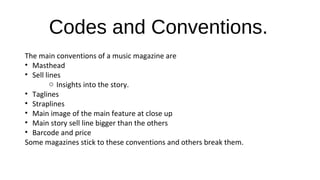
- 1. Codes and Conventions. The main conventions of a music magazine are âĒ Masthead âĒ Sell lines o Insights into the story. âĒ Taglines âĒ Straplines âĒ Main image of the main feature at close up âĒ Main story sell line bigger than the others âĒ Barcode and price Some magazines stick to these conventions and others break them.
- 2. Front Covers
- 3. âĒ This magazine sticks to the main conventions of magazines. It has a masthead with the strapline âthe worldâs greatest music magazineâ under it, which is repeated on almost every issue of Q magazine. âĒ The main image is a close up of Amy Winehouse, who is the main feature of the issue, the sell line about her story is bigger than the others, and this is because it is the main feature and the one that the editor wanted the audience to be most drawn to. âĒ The contrasting colour show that the content is more important than the brand itself, in addition to Amy covering the Q. âĒ The colour of red shows excitement and passion, something that Q magazine would want to portray in the presentation of their brand. âĒ The camera is at eye level which draws the reader in as it seems like Amy Winehouse is looking at you and speaking directly to you.
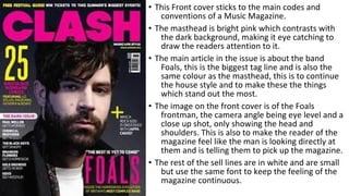
- 4. âĒ This Front cover sticks to the main codes and conventions of a Music Magazine. âĒ The masthead is bright pink which contrasts with the dark background, making it eye catching to draw the readers attention to it. âĒ The main article in the issue is about the band Foals, this is the biggest tag line and is also the same colour as the masthead, this is to continue the house style and to make these the things which stand out the most. âĒ The image on the front cover is of the Foals frontman, the camera angle being eye level and a close up shot, only showing the head and shoulders. This is also to make the reader of the magazine feel like the man is looking directly at them and is telling them to pick up the magazine. âĒ The rest of the sell lines are in white and are small but use the same font to keep the feeling of the magazine continuous.
- 5. âĒ This magazine cover breaks the usual codes and conventions of a music magazine as it doesnât have any sell lines and doesnât have a close up image of the main article in the issue. âĒ The magazine has the usual masthead of the magazine and only has the sell line of the main story, which is 30 years of AC DC. The main image does link to this as the image is of a cannon, which is AC DCs well known logo. âĒ The tagline under the masthead is âHigh Voltage Rock ânâ Rollâ, this is the tagline for Classic Rock magazine and is on almost every issue of the magazine.
- 6. âĒ This magazine also breaks the codes and conventions of music magazines as it again only has the one sell line about the subject on the cover; this issue being Jimi Hendrix. âĒ It again has the same tagline as it is the same magazine company. âĒ The colours attract the focus of the buyers and readers of the magazine as they are bright and vibrant. âĒ The Tag line for the main story draws the reader in as it gives a sense of mystery to the article, making the reader of the front cover wanting to find out more, meaning they will buy the magazine so they can read on about âthe kidnapping of Jimi Hendrix.â âĒ The Masthead is in the house style of the magazine, being the same on every issue of the Classic Rock magazine.
- 8. âĒ The contents page for this Q magazine is simple to navigate through, easy to read and nicely laid out. âĒ It has the monthly features that appear in every issue at the bottom and the features of this issue at the top, so they are easy to see and find. âĒ This issue was about âWomen In Musicâ so there is a special section on the features of this topic to make the main topic of the magazine easy to find, as this would probably be the main reason for the reader to pick up the magazine. âĒ The main article in this issue was an interview with Adele, so this is the image on the contents page with a small teaser about what the article is about. âĒ The Q Review is at the bottom of the contents page where it is in every issue. This is a reoccurring feature in the magazine.
- 9. âĒ This contents page also sticks to the main conventions of a music magazine and sticks to the house style of Q magazine. âĒ It has the monthly features at the bottom so the regular readers know where to look straight away and the issues features at the top of the page. The Q Review is also in the same place as in every issue. This also continues the house style of the Magazine as well as using the red and white for the numbers and keeping font is the same as the font on the cover. âĒ The issue is an Oasis special so the section on Oasis is in the middle of the list of features. âĒ The main image relates to the issue as it is one of the main features. âĒ These Magazines have a more controlling voice as they are laid out in a more sectioned way, telling you where to look.
- 10. âĒ This contents page is from VIBE magazine. It sticks to the main codes and conventions of the typical contents page of a magazine. âĒ The page is easy to navigate around as it is very simple and not cluttered with useless information. âĒ The features of the issue are labelled down the left hand side of the page with the heading of âcontentsâ at the top of the page in the typical style of VIBE magazine. This is continuing the house style of the magazine as it is the same in almost every issue. âĒ The only image on the page is of the two people that the main article in the issue is about, Nicki Minaj and Shanell. The image is full length of them being stood in a studio. This is to keep the main focus on them and the features of the magazine, instead of causing other distractions. âĒ The plain white background makes the page look simple and professional.
- 11. âĒ This contents page is also from VIBE magazine and it also sticks to the typical codes and conventions of a contents page. âĒ It has a simple layout with only one image and the only writing being the content of this article. this simple style fits with the house style of VIBE magazine, being plain and simple, making it easy to read. âĒ The image is of the subject of the main article, and her being in a studio keeps the focus on her and the writing, similar to the other contents page from VIBE. âĒ The way these two contents pages are laid out gives the reader the control of how they want to read the magazine. They donât give the magazine a controlling voice but a laid back, easy going voice that allows the reader to read and navigate through the issue in an easy, calming way.
- 13. âĒ This double page spread is from an article about Lady GaGa. It has a picture of her on the left page with no writing on it. âĒ The right page has lots of writing on with information about her. âĒ The use of colour is minimal as the only thing in colour is the big L across the writing in red. The use of the colour red is because it has connotations of passion and is a vibrant colour. âĒ The minimal use of colour would fit with the house style of the magazine. âĒ The reader is kept interested by the interviewer asking Lady GaGa interesting questions. âĒ The reader would also be kept interested by the magazine by the image on the left page. She is only wearing chains and covering her breasts with her hands, making it a provocative image.
- 14. âĒ This double page spread is similar to the other one. It has an image on the left page and text on the right. This is slightly different as it has text on the image, as well as a little introduction into the article. âĒ The text on the right is laid out differently as there is a quote from the article in the middle. âĒ The article is also different as there is an insert of an image on the right side. This will be an image that relates to a certain part of the text in the article. âĒ This article is also different to the other one because there is more colour. This is because it is from a different magazine with a different house style.
- 15. âĒ This article is similar to the first two page spread as there is a whole page image with no writing on and minimal colour on the article. âĒ The image is on the right side of the spread with the writing on the left page. The article is laid out in the same style as the Lady GaGa article. âĒ The colour yellow is used as it is bright and eye catching. This highlights the main points of the article which the editor wants you too read. âĒ The image is of the bands guitar and amp. This would be interesting to the target audience of the article as small details like this are important to some fans.
- 16. âĒ This article is different to the others. âĒ It has the text on the left page and the image on the right. âĒ The main heading is a quote, from Justin Bieber, whom the article is about talking about one of the questions asked by the interviewer. âĒ The spread is also different in this way too as the article is in question and answer form, unlike the other spreads in previous articles. âĒ The article is similar to the second double page spread as it has little inserts in the middle of the text. There is an image in the middle which has relevance to one of the questions in the article and also a list of âdemandsâ which Justin Bieber makes. These would interest the target audience who are interested in everything that he does.
- 17. Similarities! âĒ The Front covers have many similarities as most magazine editors stick to the usual conventions of a magazine, this making the readers feel comfortable in what theyâre reading. âĒ The contents pages are also similar to each other as they tend to be easy to read and navigate through to make them as informative as possible. âĒ The double page spreads are all different to each other as there are many different ways to lay them out. The articles can be structured in a variety of different ways and they can be laid out differently, with many images or just one.


