


More Related Content
What's hot (17)
Similar to Music Magazines Analysis (20)


Music Magazines Analysis
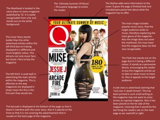
- 1. The âUltimate Summer Of Musicâ The Skyline adds extra information to the â Persuasive language to entice cover. It gives the page a finished look and The Masthead is located in the the reader. included persuasive text about what the same place on every magazine magazine has to offer. published by âQâ. It is easily recognisable from a far and stands out on the white background. The main image includes popular music icons, that the target audience relate to music, therefore explaining the The Cover Story stands main genre of the magazine. bolder than the other Also the image does not cover advertised articles within the the masthead, this may mean left third due to it being that the magazine does not feel displayed in a different and very recognisable. much brighter colour. This attracts not only music fans The Flash box stands out on the but Jessie J fans to buy the page due to it being a different magazine. colour. It stands as a persuasive device, encouraging the reader to buy the magazine and be up The left third is used well in to date on what music to listen advertising the main articles to. Also it appeals to the target within the magazine. This is audience. affective as the way magazines are displayed in A side story is advertised claiming that shops mean the this is the ârock star in death threat!â. This has first part they would see. been printed in such small writing as the magazine may not want to come across as a gossip magazine. Also it has been placed on the far side of the The barcode is displayed at the bottom of the page so that it magazine, meaning that it would be the doesnât interfere with the cover story. Also it is placed on the last thing the readers see on the main front so that it is not covering the advertisement that is page as we read left to right. usually on the back page of the magazine.
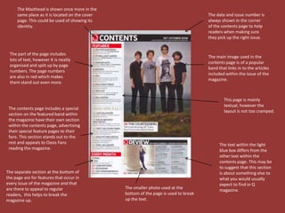
- 2. The Masthead is shown once more in the same place as it is located on the cover The date and issue number is page. This could be used of showing its always shown in the corner identity. of the contents page to help readers when making sure they pick up the right issue. The part of the page includes The main image used in the lots of text, however it is neatly contents page is of a popular organised and split up by page band that links in to the articles numbers. The page numbers included within the issue of the are also in red which makes magazine. them stand out even more. This page is mainly textual, however the The contents page includes a special layout is not too cramped. section on the featured band within the magazine have their own section within the contents page, advertising their special feature pages to their fans. This section stands out to the rest and appeals to Oasis Fans The text within the light reading the magazine. blue box differs from the other text within the contents page. This may be to suggest that this section The separate section at the bottom of is about something else to the page are for features that occur in what you would usually every issue of the magazine and that expect to find in Q are there to appeal to regular The smaller photo used at the magazine. readers, this helps to break the bottom of the page is used to break magazine up. up the text.
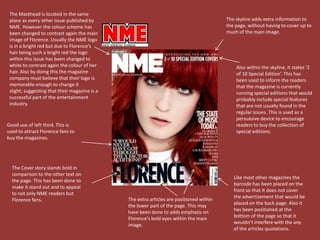
- 3. A whole page has been used to display the main image. This clearly shows that there is some The blue shapes used within the importance within the picture and it has been band may be used to suggest that the purposely posed. Also the fact that the image is in band sings songs to do with bad or a dated looking picture may suggest that the band sad situations as blue can be related within the article has a vintage style. with that emotion. The bold black title contrasts against the white background and page looking picture making it stand out. A quotation has been used within the middle of the text to break up Drop caps are used the page. Also it to show where the has been printed text starts. Also in blue to match printed in the same the colour blue links to the scheme of the overall theme of the page. Further drop caps are band. used to show the start of a new subject to do with the band. The blue shapes have been used to contrast against the light background.
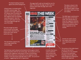
- 4. The Masthead is located in the same place as every other issue published by The skyline adds extra information to NME. However the colour scheme has the page, without having to cover up to been changed to contrast again the main much of the main image. image of Florence. Usually the NME logo is in a bright red but due to Florenceâs hair being such a bright red the logo within this issue has been changed to white to contrast again the colour of her Also within the skyline, it states â2 hair. Also by doing this the magazine of 10 Special Editionâ. This has company must believe that their logo is been used to inform the readers memorable enough to change it that the magazine is currently slight, suggesting that their magazine is a running special editions that would successful part of the entertainment probably include special features industry. that are not usually found in the regular issues. This is used as a persuasive device to encourage Good use of left third. This is readers to buy the collection of used to attract Florence fans to special editions. buy the magazines. The Cover story stands bold in comparison to the other text on Like most other magazines the the page. This has been done to barcode has been placed on the make it stand out and to appeal front so that it does not cover to not only NME readers but The extra articles are positioned within the advertisement that would be Florence fans. the lower part of the page. This may placed on the back page. Also it have been done to adds emphasis on has been positioned at the Florenceâs bold eyes within the main bottom of the page so that it image. wouldnât interfere with the any of the articles quotations.
- 5. The black heading contrasts The page itself is split up through the use of a against the white background. table. This breaks the page up with rows and The date is shown in the columns that make the page seem more top right hand corner of A Band Index is included within organised. the contents page to show the NME contents page. This the reader what issue they appeals to the target audience are reading. as it allows them to quickly and easily find the section within the magazine they are probably The NME logo is positioned in most interested in. Also this the same place as the front section is split away from the cover. This may be done to rest of the page through the show the magazineâs identity use of the table. and to show readers how it is different compared to other music magazines on the The main image has been market. used to break up the page and to further advertise one of the main cover stories within the issue. Arrows are used to show the readers what articles The text below supports the were advertised on the main image within the cover. contents page. This section of the table layout The flash box used is placed at the bottom of the page so that it A further flash box is has lots of text within doesnât interfere with the rest of the page. The purpose of it is to used to advertise it, however it is not cramped. advertise the magazines subscription as well as promoting a more articles that The use of the bold black website that allows you to subscribe to any magazine on the would appeal to the headings contrast again the market. It uses persuasive language when it stats â..for just ÂĢ5.57 readers of NME white background making this a month..â suggesting that this is a good deal. magazine. section look organised.
- 6. The text used within the article title is bold and reflects Lily Allenâs The overall colour scheme links into the magazines look. personality. Also it links in to the The red and black used on NME magazines front cover colour of her hair and links into Lily Allenâs shirt that she is wearing in the complements the black stripes on picture. her shirt. Whole page used to display the main image. This clearly shows that the image has some importance and is purposely posed. This mid shot of Lily Allen shows off her fashion sense which Drop cap used to show may be one of things where the article starts. people criticise as well her personality. Lily Allenâs name is printed in a Magazines colour scheme different font as well as the NME colours red to link in with the colour The text within the main double page scheme. Also it informs the spread looks very small in comparison to readers who the article is about. the large title and main image. However it does include a lot of information or what could be seen as gossip on people views and opinions of Lily Allen.