5
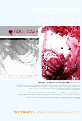
- 1. TAKE CARE CURATORIAL BROCHURE. SPRING 2008, Freelance Designer In 2008, I was commissioned to produce a marketing piece for a curatorial project, Take Care. Above (right) is the illustrational texture I designed to illustrate the essence of the artists’ work presented in the exhibit. By utilizing the texture within the logo and as a textural element I muted the importance of this illustration to refocus the attention to art exhibit itself. Throughout the brochure (pictured left) the illustration is carried throughout as a textural echo - the intent was to accent the overall design of the publication rather than detract from the samples of artist work. In May 2009, I was contracted to design a coordinating exhibit catalog, for the first exhibit showing. The catalog will be published late August 2009. 319.750.0733 meghannethompson @ mac .com
