PerabathiniH-Oct222015
?
0 likes?210 views

This document describes research into developing automatic metrics to evaluate graphical user interface (GUI) aesthetics. It outlines 8 proposed metrics like visual clutter, color range, and symmetry. Two studies were conducted to validate these metrics by having participants rate the aesthetics of webpages and mobile apps, and correlating these ratings with scores from the proposed metrics. The results showed the metrics explained around 50% of the variance in aesthetics ratings for webpages, but were less successful for mobile apps. Future work is needed to further validate the metrics and account for different genres before the metrics can be implemented in an evaluation tool for designers.


PerabathiniH-Oct222015
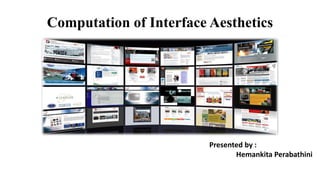
- 1. Computation of Interface Aesthetics Presented by : Hemankita Perabathini
- 2. Outline I Like What I See ®C Interface Aesthetics ? Introduction ? Motivations ? Our Approach ? Related Work ? Metrics ? Case Studies - Evaluation ? Future Work ? Conclusion
- 3. Introduction ? People prefer attractive interfaces. ? Designers strive to outmatch competitors, and create apps and websites that stand out. ? However, significant expenses on design are unaffordable to small companies; instead, they could adopt automatic tools of interface aesthetics evaluation, a cheaper strategy to good design. ? This paper describes an important step towards such a tool; it presents eight automatic metrics of graphical user interface (GUI) aesthetics. ? We tested the metrics in two exploratory studies. The results confirm past results and suggest the metrics are valid and reliable enough to be widely discussed, and possibly, to be embedded in our prospective GUI evaluation tool, tLight.
- 4. Motivations ? There is no doubt visual aesthetics matters in interface design. ? However, small companies, start-ups and individual developers often cannot afford hiring a design agency and do their design themselves. In such cases, even well-detailed design guidelines are of limited help, since, to be applied properly, they require extensive training. ? Concrete GUI evaluation tools could exemplify abstract design guidelines, and drive and substantiate design choices. The tools would be based on specific quality metrics that represent specific GUI design aspects.
- 5. Our Approach In this paper, we extend earlier work and describe and test in two studies eight GUI aesthetics metrics: ? Visual clutter ? Color range ? Number of dominant colors ? Figure ground contrast ? Contour congestion ? Symmetry ? Grid quality ? White space We based the metrics on the psychological investigations of what people see as complex and unappealing, and HCI investigations of webpage aesthetics. In addition to this, we have replicated the phenomenon of consistent and lasting immediate impressions on two types of stimuli (webpages and mobile apps) using a between-subjects experimental design.
- 6. Related Work Past attempts to automatically account for visual aesthetics of GUIs consisted of two steps: ? Gathering user scores of GUI aesthetics ? Matching them against computed scores of a set of automatic metrics. Collecting Aesthetics Scores : It is largely the initial phase that determines if a one-time visitor converts to a user or goes to competitors. While considering the initial use phase itself, aesthetics impressions could be further subdivided into the immediate-first (formed at a glance), deliberate-first (long enough for reading titles and processing images) and overall (after performing several tasks) impressions Measuring Aesthetics Automatically: Earlier-proposed measures could be generally categorized in element-based and pixel-based. ? Element-based measures require knowing the organizational principles (e.g., which GUI elements can contain other elements) and basic elements of GUI (e.g., buttons, links or paragraphs of text). ? Pixel-based measures take GUI screenshots as an input instead of GUI-underlying code. GUI screenshots might represent better what the user sees, which is why pixel based metrics are considered advantageous to element based metrics.
- 7. Complexity Roots of Aesthetics Several studies have explored what complexity means in HCI and listed three types of complexity: ? Visual complexity ? Information design complexity ? Task complexity Visual complexity strongly relates to immediate aesthetics perception, and many HCI studies focused on exploring and leveraging this type of complexity.
- 8. Metrics Visual clutter describes the effort to introduce a new, visually prominent object to a scene and is quantified with several measures (CL1-CL4). Color variability (measures CV1-CV5) consists of two aspects that humans perceive separately: number of dominant colors (the colors a human can easily differentiate and name) and color range (the colors a human cannot differentiate without zooming in, and which are often used for smoothing edges and color gradients)
- 9. Figure-ground contrast describes differences in luminance or color of adjacent lines. Smaller differences lead to higher mental effort needed to recognize objects or to read text.
- 10. Contour congestion describes the mental effort needed to differentiate spatially proximal lines. We operationalized contour congestion as the proportion of congested contours to all contours. In this approach, all contour pixels that have neighbors in a 20-pixel vicinity are marked as congested. Well-organized information requires less cognitive effort to process. Symmetry and regular visual layout might serve for such a purpose in HCI. ? The past measure was too noisy and favored GUIs with fewer objects. ? Here, we measured block symmetry, which considers the position of GUI visual blocks, relative to the central vertical axis. First, we partitioned a GUI screenshot into visual blocks. Second, we considered separately the blocks that contained the central vertical axis and blocks that did not.
- 11. The grid quality and white space metrics describe the quality of GUI layout. Higher quality helps the user to quickly navigate within the GUI and is seen as an important aesthetic aspect of GUI. ? We considered several existing measures of alignment and regularity of document layouts, and implemented those that did not require a high precision detector of GUI block positions. ? We first sliced a GUI screenshots in visual blocks. We then assumed the non-covered proportion of screenshot to reflect badly distributed content and took it as the white space metric. .
- 12. Study 1 Stimuli : 300 screen shots of different webpages. Participants : 62 participants (40 had technical background and 21 having significant experience in visual or GUI design) Design : We adopted a one-way between-subjects experimental design with exposure duration (150ms vs. 4s) as an independent factor and visual aesthetics as a continuous dependent variable. Participants were randomly assigned to either the 150ms or 4s condition. Results :Our best-fit linear regression model accounted for 49% of variance in the ratings of immediate-first aesthetics, which is comparable to the past results for similar stimuli. This seems to suggest that people rely on similar GUI aspects in judging beauty, regardless of exposure duration.
- 13. Study 2 Stimuli : We collected 300 screenshots of 75 iPhone apps. Participants : 53 participants (34 had technical background and 42 having no significant experience in visual or GUI design) Design : The experimental design and procedure mirrored Study 1, with the exception of the stimuli and test device Results : When the effect of app genre was considered, the fit of the models went up (17% in the 150ms condition and 32% in the 4s condition). We also applied the same to the Android app screenshots. The amount of explained variance in the Android app aesthetics only dropped down to 30% relative to 36%.
- 14. Future Work However, reaching the final goal requires several more steps: ? Considering the effect of website or app genre on aesthetics ? Testing the metrics on aesthetics ratings gathered in more realistic usage contexts, and possibly, with users less technically literate than in the current studies
- 15. Conclusion This paper presented two validation studies of eight automatic metrics of GUI aesthetics. The metrics performed fairly well for websites (Study 1), but were more problematic for mobile apps (Study 2). Each metric accounted for a unique GUI design aspect and could be translated in a design guideline. This work has advanced us towards the final goal of implementing the metrics in tLight, a software tool for helping non-professional designers in creating more appealing and competitive GUIs, and speeding up GUI development cycles.