


Pitch
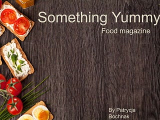
- 1. Something Yummy Food magazine By Patrycja Bochnak
- 2. Ī«Ī»You have been commissioned by the Northern Echo to produce a new magazine or newspaper product. Your product could be in any style or genre but it must be self financed through sales or advertising. You must also produce your magazine for a specified audience segment within the 16 to 25 age groupĪ»Ī». My Brief
- 3. How I intend to meet this brief ? ?Made a magazine that is self financed through advertising. ?Chosen genre of magazine that there is a gap in the market for.
- 4. Why this type of magazine? ?I have chosen this genre because I think there is a gap in the market for good, quality food magazine. I would like to create something different for young people (16-25). ?I also love to cook for my self or even for friends and family. ?I have good knowledge on this topic as well.
- 5. Audience profile ?Age ©C 17-25 ?Mixed gender ?Education status ©C college/ university students ?Usually on low income if employed ?Buying behavior ©C magazine priced between ?1 - ?3 ?Tribe ©Ctrendies
- 6. Secondary Audience ?Secondary audience includes parents and people who love to cook. ?In order to keep the secondary audience happy there must be: ? No Taboo language ?No nudity ?No inappropriate content
- 8. Food on front cover Passive imagery Bright, lively colours Sans serif font Step by step how to article Fun, informal language 2nd person narrative Passive imagery Food ©C studio based photo- shoots
- 9. My Idea 1. NAME Something Yummy Good length ©Cother title such as Fine Cooking includes 2 words Easy to rememberEasy relatable to the genre - Relates to the food
- 10. Mock upĪ»s 1
- 11. 2
- 12. Positive response Negative response -Nice fonts -Presentation goes really well together -Lots of useful information -Good the title style -Nice, professional imagery -Healthy-eating tips really good idea -Too basic -Too simple -Would add healthy-eating jokes- to make it more interesting -Make it more colourful -Add more images
- 13. Positive response Negative response -Better scheme colour ©C more eye catching -Looks more professional -All images are really nice -Lots of useful information -Good recipes -Really good idea with eat well plate - Would add some jokes (make it more informal and suitable for TA) - Add more images - Change the font
- 14. Flat plans Front cover ?Imagery ©C positive ?Different fonts and different colours used for the sell lines around the image. ?3 colours pallete that is consider through out red, green and yellow ?Black / grey fonts ?Layout ©C simple, chic
- 15. Content page ? Imagery ©C positive, passive ? Layout ©C Simple ? Magazine logo on content page on the top ? Colour scheme ©C brown, creamy and red ? Use one or two images in order to make the page draw attention to certain articles ? Fonts ©C simple, black - similar to the cover page
- 16. Double page spread 1 You are what you eat! ? Bold white heading ? Two column (lots of breakout boxes with recipes) ? Colour scheme ©C Brown, Green, yellow ? More than 2 images in order to allow balance image to the text ratio ? Language- 2nd person narrative in order to make connection to the target audience. Informal language ? Layout- broken up, explosive
- 17. Double page spread 2 Yummy 2 dinners for less than ?5 ? Different header to DPS1, more fancy in brown colour ? Lots of colours used on this DPS in order to make it eye catching and interesting ? More than 2 images in order to allow balance image to the text ratio ? Images present the theme of the double page spread ? Colour scheme ©C orange, green and brown in order to relate this article to the food
- 18. Double page spread 3 The best 5 restaurants in Darlington ? Fonts ©C header ©C modern, unusual, sans serif, thin and brown ? Colours- different to the last two DPS, more dark colours. Based on brown, creamy and blue colours ? Imagery ©C pictures of different restaurants located in Darlington, passive imagery ? Language- 2nd person narrative, informal language ? Layout ©C mix of images and text. No columns
- 19. Commercial Viability ?Pages ©C 16 ?Adverts ©C 40 % of the magazine ?Quality of the magazine ©C Not so expensive paper but mixed with higher quality papier for the front and back page. ?Quality of paper- 90 gm/ Matt paper ?Size of magazine ©C A4
- 21. Printing costs
- 22. Income: As briefed my magazineĪ»s income will generate from: ? Selling advertising slots Back cover - ?2,450 Inside front - ?2,250 Full page = ?1,900 Half page - ?900 Total income: ?8400
- 23. I believe my product will fill gap in the market, gain interest and meet Northern EchoĪ»s brief. Conclusion ! ? Will make profit for the magazine ? The profit is generate through advertisement ? It is suitable for my Target audiences ? It is really interesting