1 of 1
Download to read offline
Recommended
Story-Board
Story-BoardJessicaPethrus
Ěý
The document outlines a photo shoot plan for a magazine cover featuring a model. The first photo is a close-up of her face looking directly at the camera to catch readers' attention. Additional photos include close-ups from different angles, one with the model holding a guitar, and an outdoor medium close-up shot to showcase a variety of styles and angles of the model.Magazine
MagazineJessicaPethrus
Ěý
Victoria describes her rise to fame from a normal town girl to an international pop star as like a rollercoaster. While she loves making music and bringing joy to fans, the constant press attention and lack of privacy have been difficult to adjust to. Victoria donates over half her income to charity and works to maintain a normal family life despite her celebrity status. While grateful for her success, she finds meditation and keeping some aspects of her private life personal to be important for maintaining balance with her new lifestyle and fame.Manipulating the Photos
Manipulating the PhotosJessicaPethrus
Ěý
The document provides instructions for editing photos in steps. It describes using tools like the lasso, smudge, and blur tools to edit eyelashes and blend lines. It also details making selections around the lips and teeth then adjusting hue/saturation to change the colors. High pass filtering at 2 pixels is used to sharpen layers that were duplicated until the desired sharpness was reached. The last photos mainly involved tone and sharpness adjustments.Organisation of location
Organisation of locationJessicaPethrus
Ěý
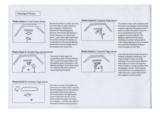
The document outlines the plans for photographing a pop star for the cover and spreads in a magazine. The actor will be the document creator's sister. Photos for the cover and double page spread will be shot inside the conservatory for consistent lighting from all angles. The cover will be a close-up while the spread will include a backdrop. Interior shots will also include props like a guitar to match the artist's genre of pop and R&B. An outdoor shot with a leopard jacket is also planned.Manupulating the photos
Manupulating the photosJessicaPethrus
Ěý
The document describes photo editing techniques used on multiple photos.
1) For the first photo, the artist duplicated layers and used blending modes, high pass filtering, and masking to sharpen eyes and apply makeup like eyelashes and lips.
2) For the second photo, they used tools like lasso and smudge to modify eyelashes, and spot healing, masking, and hue adjustments to modify eyes, blemishes, and lip color.
3) The same sharpening techniques from the first two photos were applied to additional photos, while one photo also had color tone adjusted.Manipulating the Photos
Manipulating the PhotosJessicaPethrus
Ěý
The document provides instructions for editing photos in steps. It describes using tools like the lasso, smudge, blur and erase tools to edit eyelashes, blemishes and skin. It also details making selections around the lips and teeth then adjusting hue/saturation to change their colors. High pass filtering at 2 pixels is used on layers set to overlay blending mode to sharpen portraits.Organisation of location
Organisation of locationJessicaPethrus
Ěý
The document outlines the plans for photographing a pop star for the cover and spreads in a magazine. The actor will be the document creator's sister. Photos for the cover and double page spread will be shot inside the conservatory for consistent lighting from all angles. The cover will be a close-up while the spread will include a backdrop. Interior shots will also include props like a guitar to match the artist's genre of pop and R&B. An outdoor shot with a leopard jacket is also planned.Chap. 4 the search for sound business ideaEntrepreneurship Chapter 4
Chap. 4 the search for sound business ideaEntrepreneurship Chapter 4Franklin Go
Ěý
The document discusses sound business ideas and innovation. It explains that a sound business idea is an economic opportunity that is within the entrepreneur's reach and will provide desirable returns. It also discusses the importance of creativity in developing sound business ideas and outlines various techniques that can be used like brainstorming to generate new ideas.Organisation of location
Organisation of locationJessicaPethrus
Ěý
The document outlines the planned photography shoot for a magazine cover and article featuring a pop star artist. The actor, who is the photographer's sister, will be photographed inside the conservatory and outside in the garden. The front cover shoot will be a close-up of the actor in a fur hoodie, while the double page spread will be a close-up of her from behind in a tank top. The additional contents page photos will show different outfits and include a red guitar prop in two shots.Front cover of magazine
Front cover of magazineJessicaPethrus
Ěý
The document provides information on health, fitness, education, and college activities. It includes tips on easy exercises from a personal trainer, details on new enrichment activities being offered at a college including kayaking, information on an art competition in April and how to apply, advice on preparing for exams and getting good grades from examiners and top students, and details on who won student awards in 2010. It also provides guidance on how to apply to UCAS and write the best application form.Evaluation
EvaluationJessicaPethrus
Ěý
The document discusses the design and target audience of a music magazine the author created using InDesign. They took inspiration from magazines like Vogue and Elle to appeal to their target audience of 16-50 year olds who prefer fashion magazines. The magazine was designed to look sophisticated like these publications in order to attract and keep the interest of readers who enjoy viewing images over reading about music genres that may not interest them. Through the process, the author learned valuable skills in using InDesign and conducting audience research to inform the magazine's creation.Organisation of Location
Organisation of LocationJessicaPethrus
Ěý
The document discusses photography plans for a magazine spread featuring a pop star sister. It will take place in the artist's conservatory to allow light from all angles. The front cover photo will be a close-up without a backdrop, while the double page interior spread will include a close-up of the subject with a partial backdrop visible. Close-ups are chosen to create a feeling of connection between the subject and the reader of the magazine.Analysing of front cover, double page spread and contnents page
Analysing of front cover, double page spread and contnents pageJessicaPethrus
Ěý
The magazine has a varied target audience of teens and adults. While the content seems aimed at older teens, the bold graphics and cover styles make it appealing to younger audiences as well. Each issue has a distinctive masthead color that connects it to the cover artist's style. Advertisements like free CD offers are used to attract potential new subscribers.
Mock of College Magazine
Mock of College MagazineJessicaPethrus
Ěý
This college magazine contains photos and puff pieces about various college events and people. The front cover displays a large photo and the inside pages provide more photos along with short, positive articles about different parts of college life. Page numbers are included to help navigate the magazine contents.Reflection on Planning Process
Reflection on Planning ProcessJessicaPethrus
Ěý
The document reflects on the planning process for a music magazine. While some documents like a diary PowerPoint took longer than expected, the mockups were created in Publisher and the real magazine was produced in InDesign. Photos for the magazine were taken by the author's sister, who was the focus of the magazine. Two photos required a backdrop and lighting since they were closeups. A mood board was easy to create since the author knew they wanted a formal, classic look inspired by Vogue magazine. Therefore, only a few colors were used to maintain consistency across the photos and text. The overall layout was in Vogue's style but the contents focused on music, aiming to attract the target audience that prefers fashion magazines.Reflection on Planning Process
Reflection on Planning ProcessJessicaPethrus
Ěý
The document reflects on the planning process for a music magazine. While some documents like a diary PowerPoint took longer than expected, the mockups were created in Publisher and the real magazine was produced in InDesign. Photos for the magazine were taken by the author's sister, who was the focus of the magazine. Two photos required a backdrop and lighting since they were closeups. A mood board was easy to create since the author knew they wanted a formal, classic look inspired by Vogue magazine. Therefore, only a few colors were used to maintain consistency across the photos and text. The overall layout was in Vogue's style but the contents focused on music, aiming to attract the target audience that prefers fashion magazines.Flat Plan
Flat PlanJessicaPethrus
Ěý
This document contains two flat plans that layout the structure and ordering of pages for a music magazine. The first flat plan lists 58 pages in a specific order, including sections for a music chart, photos, editor's letter, festivals and concerts, biography, and advertisements. The second flat plan lists the same 58 pages in a different ordering, with sections for a weekly music chart, double page spreads, photos, reviews, news, and horoscopes.Mastead design
Mastead designJessicaPethrus
Ěý
The document discusses choosing a font for a mast head. The author chose the middle font because they felt it looked the best and was bold without needing to be in bold formatting. They will use a blue color for the mast head so that the font stands out brightly against it.Mast-Head Design
Mast-Head DesignJessicaPethrus
Ěý
The document discusses choosing a font for a mast head. The author chose the middle font because they felt it looked the best and was bold without needing to be in bold formatting. They will use a blue color for the mast head so that the font stands out brightly against it.


Mock of front cover of magazine 2
Mock of front cover of magazine 2JessicaPethrus
Ěý
This document outlines the layout and structure for a magazine spread, including a masthead with the artist's photo and publication details, a contents page listing sections, and a double-page celebrity interview. The interview spread features a large photo of the singer on the left with quotes from their answers on the right to entice readers to learn more about the Q&A on the facing page.Mock of front cover of magazine 1
Mock of front cover of magazine 1JessicaPethrus
Ěý
This magazine document contains information about a music and celebrity magazine including a free CD offer, photos of models and artists, and preview of interview and article contents on music stars. The document shows the magazine's masthead, date and price, contents page organized by category with photos and descriptions of articles, a full page artist interview with pull quotes, and a full page photo of a musician.Find 'Your Tribe' Analysis
Find 'Your Tribe' AnalysisJessicaPethrus
Ěý
The document summarizes the results of a personality questionnaire called "Find Your Tribe" that aimed to help the author understand their own personality type and that of their target audience. The author's results identified them as a "Smart urban" personality type that wants a good job and cares about style. As a result, the author plans to create a more classy magazine, using Vogue as a style model for its smart and classy layouts and language.More Related Content
More from JessicaPethrus (20)
Organisation of location
Organisation of locationJessicaPethrus
Ěý
The document outlines the planned photography shoot for a magazine cover and article featuring a pop star artist. The actor, who is the photographer's sister, will be photographed inside the conservatory and outside in the garden. The front cover shoot will be a close-up of the actor in a fur hoodie, while the double page spread will be a close-up of her from behind in a tank top. The additional contents page photos will show different outfits and include a red guitar prop in two shots.Front cover of magazine
Front cover of magazineJessicaPethrus
Ěý
The document provides information on health, fitness, education, and college activities. It includes tips on easy exercises from a personal trainer, details on new enrichment activities being offered at a college including kayaking, information on an art competition in April and how to apply, advice on preparing for exams and getting good grades from examiners and top students, and details on who won student awards in 2010. It also provides guidance on how to apply to UCAS and write the best application form.Evaluation
EvaluationJessicaPethrus
Ěý
The document discusses the design and target audience of a music magazine the author created using InDesign. They took inspiration from magazines like Vogue and Elle to appeal to their target audience of 16-50 year olds who prefer fashion magazines. The magazine was designed to look sophisticated like these publications in order to attract and keep the interest of readers who enjoy viewing images over reading about music genres that may not interest them. Through the process, the author learned valuable skills in using InDesign and conducting audience research to inform the magazine's creation.Organisation of Location
Organisation of LocationJessicaPethrus
Ěý
The document discusses photography plans for a magazine spread featuring a pop star sister. It will take place in the artist's conservatory to allow light from all angles. The front cover photo will be a close-up without a backdrop, while the double page interior spread will include a close-up of the subject with a partial backdrop visible. Close-ups are chosen to create a feeling of connection between the subject and the reader of the magazine.Analysing of front cover, double page spread and contnents page
Analysing of front cover, double page spread and contnents pageJessicaPethrus
Ěý
The magazine has a varied target audience of teens and adults. While the content seems aimed at older teens, the bold graphics and cover styles make it appealing to younger audiences as well. Each issue has a distinctive masthead color that connects it to the cover artist's style. Advertisements like free CD offers are used to attract potential new subscribers.Mock of College Magazine
Mock of College MagazineJessicaPethrus
Ěý
This college magazine contains photos and puff pieces about various college events and people. The front cover displays a large photo and the inside pages provide more photos along with short, positive articles about different parts of college life. Page numbers are included to help navigate the magazine contents.Reflection on Planning Process
Reflection on Planning ProcessJessicaPethrus
Ěý
The document reflects on the planning process for a music magazine. While some documents like a diary PowerPoint took longer than expected, the mockups were created in Publisher and the real magazine was produced in InDesign. Photos for the magazine were taken by the author's sister, who was the focus of the magazine. Two photos required a backdrop and lighting since they were closeups. A mood board was easy to create since the author knew they wanted a formal, classic look inspired by Vogue magazine. Therefore, only a few colors were used to maintain consistency across the photos and text. The overall layout was in Vogue's style but the contents focused on music, aiming to attract the target audience that prefers fashion magazines.Reflection on Planning Process
Reflection on Planning ProcessJessicaPethrus
Ěý
The document reflects on the planning process for a music magazine. While some documents like a diary PowerPoint took longer than expected, the mockups were created in Publisher and the real magazine was produced in InDesign. Photos for the magazine were taken by the author's sister, who was the focus of the magazine. Two photos required a backdrop and lighting since they were closeups. A mood board was easy to create since the author knew they wanted a formal, classic look inspired by Vogue magazine. Therefore, only a few colors were used to maintain consistency across the photos and text. The overall layout was in Vogue's style but the contents focused on music, aiming to attract the target audience that prefers fashion magazines.Flat Plan
Flat PlanJessicaPethrus
Ěý
This document contains two flat plans that layout the structure and ordering of pages for a music magazine. The first flat plan lists 58 pages in a specific order, including sections for a music chart, photos, editor's letter, festivals and concerts, biography, and advertisements. The second flat plan lists the same 58 pages in a different ordering, with sections for a weekly music chart, double page spreads, photos, reviews, news, and horoscopes.Mastead design
Mastead designJessicaPethrus
Ěý
The document discusses choosing a font for a mast head. The author chose the middle font because they felt it looked the best and was bold without needing to be in bold formatting. They will use a blue color for the mast head so that the font stands out brightly against it.Mast-Head Design
Mast-Head DesignJessicaPethrus
Ěý
The document discusses choosing a font for a mast head. The author chose the middle font because they felt it looked the best and was bold without needing to be in bold formatting. They will use a blue color for the mast head so that the font stands out brightly against it.Mock of front cover of magazine 2
Mock of front cover of magazine 2JessicaPethrus
Ěý
This document outlines the layout and structure for a magazine spread, including a masthead with the artist's photo and publication details, a contents page listing sections, and a double-page celebrity interview. The interview spread features a large photo of the singer on the left with quotes from their answers on the right to entice readers to learn more about the Q&A on the facing page.Mock of front cover of magazine 1
Mock of front cover of magazine 1JessicaPethrus
Ěý
This magazine document contains information about a music and celebrity magazine including a free CD offer, photos of models and artists, and preview of interview and article contents on music stars. The document shows the magazine's masthead, date and price, contents page organized by category with photos and descriptions of articles, a full page artist interview with pull quotes, and a full page photo of a musician.Find 'Your Tribe' Analysis
Find 'Your Tribe' AnalysisJessicaPethrus
Ěý
The document summarizes the results of a personality questionnaire called "Find Your Tribe" that aimed to help the author understand their own personality type and that of their target audience. The author's results identified them as a "Smart urban" personality type that wants a good job and cares about style. As a result, the author plans to create a more classy magazine, using Vogue as a style model for its smart and classy layouts and language.