Power Point Design Mechanics
- 1. ?
- 3. ?
- 5. One of the worst things most do when making a presentation using PowerPoint is to stick every word of what they want to say actually on the PowerPoint. Meaning that you actually have nothing additional to say because its all up on the slide for you. Similar to reading off the PowerPoint, this additional phase of word dumping will quickly send audiences to sleep. In addition your audience will be able to read faster than you can talk so this will mean that they would have finished reading the slide before you finished verbalizing it, and will most likely be sitting there waiting for you to finish off reading, by which time they may have gone to sleep. This invariably makes it easier not to rehearse or remember a presentation but will turn people off straight away. This is a lazy approach to doing presentations and speeches and it will show that you havenĪ»t really prepared and basically winging most of the points and using to jog your memory. So donĪ»t do it is the simple rule. One of the worst things most do when making a presentation using PowerPoint is to stick every word of what they want to say actually on the PowerPoint. Meaning that you actually have nothing additional to say because its all up on the slide for you. Similar to reading off the PowerPoint, this additional phase of word dumping will quickly send audiences to sleep. In addition your audience will be able to read faster than you can talk so this will mean that they would have finished reading the slide before you finished verbalizing it, and will most likely be sitting there waiting for you to finish off reading, by which time they may have gone to sleep. This invariably makes it easier not to rehearse or remember a presentation but will turn people off straight away. This is a lazy approach to doing presentations and speeches and it will show that you havenĪ»t really prepared and basically winging most of the points and using to jog your memory. So donĪ»t do it is the simple rule. Classic Mistakes
- 6. Try to avoid: Excessive Bullet Points in your presentations and not forgetting those annoying sound effects and fly-in entrance effects Classic Mistakes
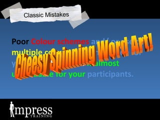
- 8. Poor Colour schemes and/ or use of multiple colours in a single slide for your text that make it almost unreadable for your participants. Cheesy Spinning Word Art! Classic Mistakes
- 10. Required Skills Presentation Skills Content Management Design skills Visual Thinking
- 11. Required Skills Web & Desktop Technology
- 12. 1. Delivery You need salesmanship and marketing skills
- 13. 2. Content
- 14. Text Highlights
- 15. News headlines
- 16. ?
- 17. Incredible speed Up to 250,000 photos Full-screen editing
- 18. Your basic Quote on a slide!
- 19. ?
- 20. Mark James Normand Managing Director Mark Sales Manager James Marketing Manager Normand Product Manager Mark Jr. Sales Executive James Jr Marketing Executive Jimmy Marketing Executive Marcus Admin Assistant Jones Admin Assistant Norman Clerical Your basic Org Chart!
- 21. Fitting it all on the slide Arena Ang Director Mark Normand Chairman Lisa M CEO Deepa CFO Gareth Poh Director Bruce Poh Director Azman Manager Salmon Manager Eric Executive
- 22. Fitting it all on the slide
- 23. Use motion paths
- 24. Design
- 25. Your typical ║▌║▌▀Ż layout!
- 26. ?
- 27. ?
- 28. ?
- 29. Inspiration
- 31. Visual Thinking
- 32. PSA Corporation is looking deeper in these areas: - Customer Loyalty Profit Market Leadership Growth Employee Commitment Leadership Capability Global Citizenship example slide ready to make-over just using gridsĪŁ
- 33. Basic Layout 1
- 34. ?
- 35. Corporate Accountability and Governance Ethics, Privacy and Supply Chain Environmental Responsibility Products, Operations Community Investment and Involvement Investment, Volunteerism, Public Policy and Shareholder relations Social and Business Improvement Areas A typical bullet and sub-bullet listingĪŁ
- 36. Basic Layout 2
- 37. ?


