Presentation of contents page images
0 likes470 views
presentation for the contents page images of my magazine for AS Media Studies coursework (all images taken by myself, Lauren Whittingham).
1 of 10


Recommended
Why did I chose the pictures?
Why did I chose the pictures?CrazyMel
╠²
The document summarizes the photographer's selection of photos from a photoshoot for a music magazine. The photographer chose a mid-shot of the main star for the cover as it was well-lit with good focus. A photo showing the model with headphones was selected for a double page spread to modernize the magazine. The photographer's favorite shot used different colors from the lighting to hit the lens, but had a yellow patch that may cause issues. An over the shoulder shot of the model writing was also picked for its unusual viewpoint linking to the music theme.Perou powerpoint !
Perou powerpoint !fraances
╠²
Perou is a British portrait, fashion and music photographer known for photographing celebrities like Vivienne Westwood, Lily Allen, and Jessie J. Some key photographs included studio shots of Westwood models for her 2005 campaign with her logo in the corner, bright colorful shots of Lily Allen from 2009, and recent pictures of Jessie J in unusual clothing with shadow effects against a bright background from 2011. The reviewer comments on techniques like backgrounds, lighting, camera angles, and expressions that make Perou's photographs effective.Task 1
Task 1Dan Bell
╠²
This document discusses different types of photography applications and provides examples for each. It covers advertising, fashion, photojournalism, portraits, studio portraits, architecture, illustration, and medical photography. For each type, it analyzes the lighting, lenses, post-production techniques, and examples of famous and current photographers working in that field. The intended uses of the photos for each application are also described.Presentation1
Presentation1AmyGharibian
╠²
The document discusses the layout conventions of 3 movie magazines and how they prominently feature images of actors to promote upcoming film releases. It also discusses the layout of 3 music magazines and how they feature appropriate images of musicians to match their brand identities. Finally, it proposes the concept of a new magazine that would combine movies and music by profiling film soundtracks and discussing how they are composed and how they inspire films. The target audience for this new magazine would be middle-aged adults but may also attract some younger adults.Photo shoot two
Photo shoot twoSophieArthur
╠²
The photos rely mainly on how the models are dressed and posed, with some props like a tent. However, the background setting is not ideal as there are houses visible and no festival stages. To better suit the music genre target audience, the photos will be edited to remove houses from the background and crop tighter to focus on the models and props that would be recognized at music festivals.Architecture work sheet
Architecture work sheetSarahMurrayy
╠²
Callan Hammond took four photographs around Manchester and Blackpool. The document analyzes each photo individually. Photo 1 shows the reflection of trees in a brick building's windows. Photo 2 was taken on a sunny day in Blackpool and has good depth of field. Photo 3 is a colorful metal staircase in Manchester with incredible depth and bright colors. Photo 4 features a mysterious figure in an archway of an old building and has a black and white filter. Overall, the photographer effectively applied the rule of thirds in composing shots with central focal points.Still image analysis
Still image analysisehills2010
╠²
In this document, 7 still images from a music video are described:
1) An establishing shot shows the video was filmed in London by the London Eye in the background.
2) A mid shot includes the background scene of a bridge with lights, creating atmosphere, while the singer has low key lighting.
3) Tracking is used as the singer walks toward the camera on the bridge, now with high key lighting focused on her to make her dominant.
4) A wide shot uses low key lighting to show inside and outside a room.Photoshoot one
Photoshoot oneSophieArthur
╠²
The document summarizes a photo shoot for a magazine. The photos of the main model will be used for the central image on the front cover and are intended to portray the genre of music featured in the magazine, such as through the model's poses and clothing. This is meant to increase interest from the target audience by clearly representing the music genre.Coraline analysissss
Coraline analysissssmolruby505
╠²
This title sequence for a children's film uses dark and scary music at first to portray the dolls being taken apart as something negative, though they are then remade. The music starts tense and increases and decreases in volume and pace to make the audience feel nervous. Voices of children singing also indicate it is for children. Later the music becomes more upbeat and cheerful, suggesting the film has a dark twist but ends happily. The setting is confusing but seems to involve a factory or bedroom where dolls are mended. Close-up shots allow the audience to see details of the stitching, which may be important to the film. The titles are written in stitching, emphasizing sewing and dolls.Best Photos
Best Photoslaurenjewell
╠²
The document discusses several photographs for use in a publication. The first photograph is a medium close-up but is dull with cut-off elbows. The second receives praise for its direct gaze and close-up nature, making it suitable for the front cover. Subsequent photos are evaluated for their lighting, composition and suitability for different sections of the publication like the front cover or contents page. Direct gaze, close-up shots and clear lighting are preferred qualities.Dps analyse
Dps analyseSMorris97
╠²
The document provides details on the layout and design of a magazine article promoting a behind-the-scenes documentary on a 1950s television show. Images, captions, and quotes are used to give readers an insider view into the production and intrigue them to learn more. Stylistic elements like borders, color scheme, and page numbers maintain the publication's brand and guide readers through the article. The target audience of the magazine, which focuses on television and radio listings, makes it a good fit for advertising the behind-the-scenes documentary.Coraline presentation (using art of the title)
Coraline presentation (using art of the title)LauraKN
╠²
This is my textual analysis of Coraline includes the different fonts used and why they are used, also the movement of the titles and what effect it has on the viewer. It also includes the different shots used, how it's effective, and the order of the titles.Photoshoot 3
Photoshoot 3SophieArthur
╠²
The photographer summarized the second photoshoot of their main model for a music magazine. Wide shots of the model by a guitar will likely be used for the front cover, while medium shots of her holding the guitar could feature inside. Some background editing may be needed using cloning tools to make settings like brick walls appear more appropriate for the genre. Final photos were taken between trees and on a bench holding the guitar to allow flexibility in layout.Layout design for fireflies poster
Layout design for fireflies posterJack Sanders
╠²
This document provides information about a music video for the song "Fireflies" by Owl City. It describes the main image as a low-angle shot of a male sleeping in bed with faded fireflies in the background, representing the song's title and theme of insomnia. It also mentions the single's release date by Owl City and includes social media links and a positive fan quote to promote the song and artist.Landscape photography unit 3
Landscape photography unit 3yngmina
╠²
This document discusses various landscape photographs and provides analysis of how they were likely taken. It examines elements like leading lines, reflections, symmetry, and the use of long exposures. Technical details like aperture, shutter speed, ISO, and time of day are considered for how they impact the final image. The photographs cover a range of locations and styles, from rural scenes to urban architecture, during both day and night.Q1 comparing ancillary
Q1 comparing ancillaryginagoodall
╠²
The document discusses conventions used in movie posters and magazine covers. Some key conventions mentioned include:
1) The movie title is always the largest text to clearly identify the film.
2) Movie posters often use white text/background for contrast and visibility.
3) Horror posters commonly feature close-up or mid-shot facial images to showcase expressions.
4) Magazines consistently place the masthead as the largest text for brand recognition.
5) Both use prominent central images and text to attract attention and promote featured films/stories.Title design
Title designBrad25
╠²
The document discusses a title design for a TV drama called "The Street." The designer drew a graffiti version of the title "The Street" on a wall and took a photo of the drawing. An alternative title design was to place the words "The Street" over an image of the actual street where the drama would be set. Two images of the graffiti drawing are presented as one possible title design choice.Cameras and photography 
Cameras and photography keeshaA
╠²
The document discusses different types of cameras and photographic techniques. It describes digital cameras, SLR cameras, aperture, shutter speed, ISO, and how they affect photographs. Digital cameras allow deleting and adjusting photos easily while SLR cameras require consideration of aperture, shutter speed, and ISO to achieve clear, artistic shots. Aperture controls depth of field and shutter speed controls light exposure. The document also covers portrait, cityscape, close-up photography and examples of each type of photo. It discusses the work of photographers Irving Penn and Margaret Bourke-White and how their black and white photos conveyed messages.Media album cover research
Media album cover researchChris Jones
╠²
The document discusses the conventions of rock album covers and analyzes the covers of three albums: Muse's Absolution, Foo Fighters' Wasting Light, and Pink Floyd's Dark Side of the Moon. It notes that rock album covers typically feature the band name and album title and include abstract images vaguely related to the themes of the album. The analysis then describes elements like camerawork, mise-en-scene, background, and design for the covers of each album, highlighting how they represent the themes and styles of the bands and albums.


5 ca - mona lisa
5 ca - mona lisarhettteacher
╠²
How can painting help your child? Let's study about the Mona Lisa and find out. Come join me at www.rhett-teacher.com9 ca - world snacks
9 ca - world snacksrhettteacher
╠²
If there is one thing that rhett teacher loves the most, it is eating! Let's enjoy snacks from around the world. Visit me at www.rhett-teacher.comFYP presentation
FYP presentationzatiafzan
╠²
The document summarizes a student's final year project presentation on visual illusions and how people's perceptions can be manipulated by what they see. The project aims to show users that their interpretations of images can change depending on viewing distance or perspective. It involves projecting video onto a mannequin that will appear to change from a woman to a man, demonstrating how makeup can transform appearances. Users will trigger the video by walking towards the mannequin, and an audio message will play afterward to further explain the concept that what you see is not always what you get.
Advokatfirmaet Vogt & Wiig AS - En presentasjon av v├źr personskadeavdeling
Advokatfirmaet Vogt & Wiig AS - En presentasjon av v├źr personskadeavdelingLawfirm
╠²
En presentason av Advokatfirmaet Vogt & Wiigs personskadeavdeling. Presentasjonen beskriver hovedreregler, huskelister, erstatningsposter samt hva v├źre advokater kan bist├ź med av hjelp vedr├Ėrende trafikkskade, yrkesskade, pasientskade, i bistandssaker, n├źr det gjelder voldsoffererstatning, annen forsikringsrett, flyulykker eller ulykker p├ź sj├Ėen.Rajzok k├®sz├Łt├®se android rendszerben
Rajzok k├®sz├Łt├®se android rendszerbenR├│bert Mo├│r
╠²
Android programoz├Īs Appinventor seg├Łts├®g├®val
La otra cara del Ogro (Exposici├│n sobre Napole├│n)bitacorapedromorgan
╠²
Muestra de parte de la exposici├│n sobre propaganda y contrapropaganda durante las guerras napole├│nicas desarrollada en Tolosa del 17 de diciembre de 2010 a 8 de enero de 2011Men & womenŌĆÖs ministry Spiritual Assessment 
Men & womenŌĆÖs ministry Spiritual Assessment Phoebeluz Santos
╠²
An Assessment of Spiritual Maturity for Men and Women concern with their Spiritual Status...done in a small independent Church for Weekly Activity
Resources coming from Professors from Philippine Missionary Institute: Ms. Miriam Aboy and Ptr. Estores. Syntesized by Ptra.Phoebe SantosMore Related Content
What's hot (11)
Coraline analysissss
Coraline analysissssmolruby505
╠²
This title sequence for a children's film uses dark and scary music at first to portray the dolls being taken apart as something negative, though they are then remade. The music starts tense and increases and decreases in volume and pace to make the audience feel nervous. Voices of children singing also indicate it is for children. Later the music becomes more upbeat and cheerful, suggesting the film has a dark twist but ends happily. The setting is confusing but seems to involve a factory or bedroom where dolls are mended. Close-up shots allow the audience to see details of the stitching, which may be important to the film. The titles are written in stitching, emphasizing sewing and dolls.Best Photos
Best Photoslaurenjewell
╠²
The document discusses several photographs for use in a publication. The first photograph is a medium close-up but is dull with cut-off elbows. The second receives praise for its direct gaze and close-up nature, making it suitable for the front cover. Subsequent photos are evaluated for their lighting, composition and suitability for different sections of the publication like the front cover or contents page. Direct gaze, close-up shots and clear lighting are preferred qualities.Dps analyse
Dps analyseSMorris97
╠²
The document provides details on the layout and design of a magazine article promoting a behind-the-scenes documentary on a 1950s television show. Images, captions, and quotes are used to give readers an insider view into the production and intrigue them to learn more. Stylistic elements like borders, color scheme, and page numbers maintain the publication's brand and guide readers through the article. The target audience of the magazine, which focuses on television and radio listings, makes it a good fit for advertising the behind-the-scenes documentary.Coraline presentation (using art of the title)
Coraline presentation (using art of the title)LauraKN
╠²
This is my textual analysis of Coraline includes the different fonts used and why they are used, also the movement of the titles and what effect it has on the viewer. It also includes the different shots used, how it's effective, and the order of the titles.Photoshoot 3
Photoshoot 3SophieArthur
╠²
The photographer summarized the second photoshoot of their main model for a music magazine. Wide shots of the model by a guitar will likely be used for the front cover, while medium shots of her holding the guitar could feature inside. Some background editing may be needed using cloning tools to make settings like brick walls appear more appropriate for the genre. Final photos were taken between trees and on a bench holding the guitar to allow flexibility in layout.Layout design for fireflies poster
Layout design for fireflies posterJack Sanders
╠²
This document provides information about a music video for the song "Fireflies" by Owl City. It describes the main image as a low-angle shot of a male sleeping in bed with faded fireflies in the background, representing the song's title and theme of insomnia. It also mentions the single's release date by Owl City and includes social media links and a positive fan quote to promote the song and artist.Landscape photography unit 3
Landscape photography unit 3yngmina
╠²
This document discusses various landscape photographs and provides analysis of how they were likely taken. It examines elements like leading lines, reflections, symmetry, and the use of long exposures. Technical details like aperture, shutter speed, ISO, and time of day are considered for how they impact the final image. The photographs cover a range of locations and styles, from rural scenes to urban architecture, during both day and night.Q1 comparing ancillary
Q1 comparing ancillaryginagoodall
╠²
The document discusses conventions used in movie posters and magazine covers. Some key conventions mentioned include:
1) The movie title is always the largest text to clearly identify the film.
2) Movie posters often use white text/background for contrast and visibility.
3) Horror posters commonly feature close-up or mid-shot facial images to showcase expressions.
4) Magazines consistently place the masthead as the largest text for brand recognition.
5) Both use prominent central images and text to attract attention and promote featured films/stories.Title design
Title designBrad25
╠²
The document discusses a title design for a TV drama called "The Street." The designer drew a graffiti version of the title "The Street" on a wall and took a photo of the drawing. An alternative title design was to place the words "The Street" over an image of the actual street where the drama would be set. Two images of the graffiti drawing are presented as one possible title design choice.Cameras and photography
Cameras and photography keeshaA
╠²
The document discusses different types of cameras and photographic techniques. It describes digital cameras, SLR cameras, aperture, shutter speed, ISO, and how they affect photographs. Digital cameras allow deleting and adjusting photos easily while SLR cameras require consideration of aperture, shutter speed, and ISO to achieve clear, artistic shots. Aperture controls depth of field and shutter speed controls light exposure. The document also covers portrait, cityscape, close-up photography and examples of each type of photo. It discusses the work of photographers Irving Penn and Margaret Bourke-White and how their black and white photos conveyed messages.Media album cover research
Media album cover researchChris Jones
╠²
The document discusses the conventions of rock album covers and analyzes the covers of three albums: Muse's Absolution, Foo Fighters' Wasting Light, and Pink Floyd's Dark Side of the Moon. It notes that rock album covers typically feature the band name and album title and include abstract images vaguely related to the themes of the album. The analysis then describes elements like camerawork, mise-en-scene, background, and design for the covers of each album, highlighting how they represent the themes and styles of the bands and albums.Viewers also liked (20)
5 ca - mona lisa
5 ca - mona lisarhettteacher
╠²
How can painting help your child? Let's study about the Mona Lisa and find out. Come join me at www.rhett-teacher.com9 ca - world snacks
9 ca - world snacksrhettteacher
╠²
If there is one thing that rhett teacher loves the most, it is eating! Let's enjoy snacks from around the world. Visit me at www.rhett-teacher.comFYP presentation
FYP presentationzatiafzan
╠²
The document summarizes a student's final year project presentation on visual illusions and how people's perceptions can be manipulated by what they see. The project aims to show users that their interpretations of images can change depending on viewing distance or perspective. It involves projecting video onto a mannequin that will appear to change from a woman to a man, demonstrating how makeup can transform appearances. Users will trigger the video by walking towards the mannequin, and an audio message will play afterward to further explain the concept that what you see is not always what you get.Advokatfirmaet Vogt & Wiig AS - En presentasjon av v├źr personskadeavdeling
Advokatfirmaet Vogt & Wiig AS - En presentasjon av v├źr personskadeavdelingLawfirm
╠²
En presentason av Advokatfirmaet Vogt & Wiigs personskadeavdeling. Presentasjonen beskriver hovedreregler, huskelister, erstatningsposter samt hva v├źre advokater kan bist├ź med av hjelp vedr├Ėrende trafikkskade, yrkesskade, pasientskade, i bistandssaker, n├źr det gjelder voldsoffererstatning, annen forsikringsrett, flyulykker eller ulykker p├ź sj├Ėen.Rajzok k├®sz├Łt├®se android rendszerben
Rajzok k├®sz├Łt├®se android rendszerbenR├│bert Mo├│r
╠²
Android programoz├Īs Appinventor seg├Łts├®g├®valLa otra cara del Ogro (Exposici├│n sobre Napole├│n)bitacorapedromorgan
╠²
Muestra de parte de la exposici├│n sobre propaganda y contrapropaganda durante las guerras napole├│nicas desarrollada en Tolosa del 17 de diciembre de 2010 a 8 de enero de 2011Men & womenŌĆÖs ministry Spiritual Assessment
Men & womenŌĆÖs ministry Spiritual Assessment Phoebeluz Santos
╠²
An Assessment of Spiritual Maturity for Men and Women concern with their Spiritual Status...done in a small independent Church for Weekly Activity
Resources coming from Professors from Philippine Missionary Institute: Ms. Miriam Aboy and Ptr. Estores. Syntesized by Ptra.Phoebe SantosRunMob Presentation 2013
RunMob Presentation 2013RunMob
╠²
RunMob is a leading mobile entertainment provider that develops, publishes, and distributes a wide variety of mobile content across different platforms. This includes mobile games, apps, videos, music, magazines, comics and more. RunMob works with carriers and operators to provide this content and aims to make it available on as many devices as possible. It utilizes various distribution methods including preloading on devices, app stores, online hosting, and partnerships with TV stations, media companies, and ISPs.December 3
December 3hh1neke
╠²
The document is a reading log and homework assignment sheet for a student. It includes assignments for the week of December 3rd that require the student to read for 30 minutes each weekday and complete math, Spanish, wordly wise, and spelling activities. It notes there is no discovery group on Thursday and reminds students about an upcoming winter concert and gift exchange deadlines.
Runmob arabic games
Runmob arabic gamesRunMob
╠²
The document contains contact information for RunMob, including their website http://www.RunMob.com, email for sales inquiries at sales@RunMob.com, and two international phone numbers +1 (920) RUN 8MOB and +1 920 786 8662. This information is repeated several times throughout the document.3 ca - homer
3 ca - homerrhettteacher
╠²
WOW, I can draw Homer Simpson! This amazing blogger shows the steps how to draw Homer. Let's learn with me at ww.rhett-teacher.comCommercial buildingsdr
Commercial buildingsdrCharles Champagne
╠²
1) Commercial buildings account for about half of US peak electricity demand and represent a large potential for demand response.
2) For mid-to-large commercial buildings to participate in demand response, it needs to be cost-effective, convenient, and maintain building control.
3) Demand response technology can help make participation more cost-effective by automating load reduction, increase convenience by reducing manual effort, and maintain building control through integrated systems that pre-define load reduction strategies.
Turbo toasters website
Turbo toasters websitewjd92112
╠²
This document provides instructions for navigating the website of the Turbo Toasters Toastmasters club. It details the various pages and sections that can be accessed publicly or by logging in, including pages for club news, leaving messages, viewing member profiles, accessing the duty roster and brainstorming forum. Links to external sites like Google Docs and WikiSpaces are also used for sharing documents and schedules. The document guides users through the login process and posting information to the site.
Similar to Presentation of contents page images (20)
Photos
Photoslaurastraw
╠²
The document contains notes from a student discussing photos they took for a music magazine project. For the cover photo, they selected a mid-shot that fits conventions and allows the scene and attitude to come through. They also chose a photo for a double page spread that has "nose room." Photos of the artist playing guitar or tilted away were rejected as not fitting the desired image. Other photos were considered for the contents page based on angles, lighting, and how they fit conventions of being rebellious or powerful.Choosing images
Choosing imagesFrancesca Emmingham
╠²
The document discusses selecting photographs for a magazine article about a band. The author chooses several photos they took of the band performing that show the passion and togetherness of the band. The photos would be used and edited for the magazine's cover, contents page, a double page feature, and to supplement an article. The author describes how they would edit the photos, such as by adjusting lighting, saturation, and cropping, to make them suitable illustrations for the magazine.Photography studies
Photography studiescaitlinp
╠²
The document discusses selecting photography for a music magazine. It examines several photos of bands and analyzes the composition, lighting, angles, and other techniques used in each. The photos could be used as feature images, on contents pages, or within articles. However, the document notes each photo may influence page design depending on its colors, tones, and focus. Overall, the document considers how various photographic styles and techniques can effectively represent bands and fit with the magazine's design.Photos
Photosdaniellewalka24
╠²
The document summarizes the photographer's evaluation of 10 images taken for a music magazine. The photographer assessed whether each image would be successful or unsuccessful for the magazine based on factors like framing, focus on the subject, inclusion of space for magazine elements, and adherence to music magazine conventions. Overall, the photographer found some images worked well due to clear framing and focus on the subject, while others were less successful due to issues like backgrounds distracting from the subject or not leaving space for magazine elements. The photographer was able to learn from each image to improve their shooting style for the magazine.Altered photos
Altered photosasmediag12
╠²
The document discusses choosing photos for a music magazine. The author selects a photo for the contents page that features a band in an indie rock setting to appeal to the target audience. Another photo is chosen for the front cover due to its plain background, angled shot of the subject looking at the camera, and rebellious facial expression. A third photo is picked for a double-page spread for also having the subject look directly at the camera on a plain background to allow text, as desired by the audience.Altered photos
Altered photosasmediag12
╠²
The document discusses choosing photos for a music magazine. The author selects a photo for the contents page that features a band in an indie rock setting to appeal to the target audience. Another photo is chosen for the front cover due to its plain background, angled shot of the subject looking at the camera, and rebellious facial expression. A third photo is picked for a double-page spread for also having the subject look directly at the camera on a plain background to allow text, as desired by the audience.Analysis of my photo shoot
Analysis of my photo shootali_carter_
╠²
The document summarizes photos that were rejected and used for a photoshoot. Rejected photos were taken outside with dull lighting and lacked contrast, making cover text difficult to read. Good photos used a black backdrop with natural and flash lighting, achieving contrast. Photos of models looking away gave a mysterious feel, while direct eye contact drew attention for the cover. Used photos included festival shots and portraits with serious and relaxed expressions.Pre Production
Pre ProductionHazel Doyle
╠²
Hazel Doyle is preparing for a photo shoot for a metal/screamo band. She found some existing band photos inspiring for ideas. She likes photos that reflect the band's laidback style, including casual poses. Photos that stand out include one with the band on a car and another with fireworks in the background. Most photos have bold colors that catch the eye. The photos show action shots and atypical poses beyond just serious images. Hazel is also looking at Kerrang! magazine for layout inspiration, noting its recognizable overlapping masthead and bold cover lines announcing topics. She presents some early masthead ideas using a font fitting the rock/metal genre, including the name "ROCK UK" for a UK bandsFinal images selected for music magazine
Final images selected for music magazinecaseyp227
╠²
The document discusses selecting final images for a music magazine. It analyzes several potential photos based on whether they follow conventions like having direct address to the camera and conveying attitude reflective of rock music. The author ultimately selects the middle image of the third set discussed. They feel this image best draws attention to the subjects with lighting, uses a background that provides context, and conveys rock attitude through both the subjects' positioning and expressions.3. research(2)
3. research(2)AlicjaMorawska
╠²
This album cover features an iconic underwater image of a naked baby reaching for a dollar bill on a fishing hook. The controversial image became one of the most famous album covers ever due to the visible male genitalia. The photo was taken in a pool, with lighting from above creating unique patterns on the baby's body from the water's movement. Only the band name and album title are included in text, keeping the design simple and letting the provocative image stand out.Justification of photos
Justification of photosezreen_b
╠²
This document provides justifications for several photos being considered for use in a rock music magazine. It analyzes various shots in terms of composition, lighting, atmosphere, and how well they represent themes of power, darkness and rebellion associated with rock music. While some shots captured the intended mood, others proved too casual or distracting. Establishing shots needed a clear focal point. Ultimately, the photos selected needed to effectively portray the magazine's style and engage readers.Task 4 final images review work sheet
Task 4 final images review work sheetdanhops888
╠²
The photographer took a series of 10 photos of a band for a music magazine. For each photo, they described the theme and reasoning for choices in composition, posing, and editing. Common techniques included using the rule of thirds, varying expressions, and cropping for focus. The photographer was generally satisfied but felt some photos could be improved with different editing or locations.Original photos
Original photost014468
╠²
This document discusses selecting photos for an album cover. The author considered but rejected earlier photos because they were blurred from camera movement and looked staged. The chosen cover photo was natural, clear, and improved on positioning while avoiding too much movement. It was edited in Photoshop to fit the indie music genre style.Photography planning
Photography planningmillerjess
╠²
The document discusses photography plans for a magazine cover and spreads. For the cover, the writer wants a studio shot of two models in contrasting black and white tones, positioned in front of the magazine's red masthead. For inside spreads, they suggest using concert photos on the contents page to depict live music reviews. They select two location shots of the models looking at the camera for a double-page article spread, wearing dark clothes in a simple background to represent touring. Flash will be used to enhance the subjects.Photography planning
Photography planningmillerjess
╠²
The document outlines plans for photography for a magazine cover and spreads. For the cover, the writer wants a studio shot of two models in contrasting black and white tones positioned in front of the magazine's red masthead. For inside spreads, they want to use concert photos on the contents page for variety. They select two location shots of the models looking at the camera for a double-page spread to show them in a more casual, on-tour setting compared to the formal studio cover shot. Flash will be used to enhance the models in the foreground.Contact sheet- Studio
Contact sheet- StudioEmilyRoseMedia
╠²
The document discusses selecting photos for use in a music genre project. Several photos are considered and either selected or rejected for different reasons. The photos selected show strong eye contact, simplicity, and focus on the models to represent the indie genre for the double page spread. Other photos are rejected for issues like the models not being ready, faces not being clear, lighting being too dark, or not fitting the needed style.Photographical Analysis DPS
Photographical Analysis DPSFallon Young
╠²
This document discusses and analyzes several potential images for use in a magazine focused on rock/metal music. It considers images of a band, evaluating factors like atmosphere, style, focus, and suitability for different pages. While one image is deemed too distracting for a cover, others are praised for their rebellious feel, alternative style, and potential to attract attention on a double page spread through an inspiring location and model positioning. Minor criticisms are also noted to improve future photoshoots.Recently uploaded (20)
The Splitting of the Moon (Shaqq al-Qamar).pdf
The Splitting of the Moon (Shaqq al-Qamar).pdfMirza Gazanfar Ali Baig
╠²
This article explores the miraculous event of the Splitting of the Moon (Shaqq al-Qamar) as recorded in Islamic scripture and tradition. Drawing from the Qur'an, authentic hadith collections, and classical tafsir, the article affirms the event as a literal miracle performed by Prophet Muhammad ’Ę║ in response to the QurayshŌĆÖs demand for a sign. It also investigates external historical accounts, particularly the legend of Cheraman Perumal, a South Indian king who allegedly witnessed the miracle and embraced Islam. The article critically examines the authenticity and impact of such regional traditions, while also discussing the lack of parallel astronomical records and how scholars have interpreted this event across centuries. Concluding with the theological significance of the miracle, the article offers a well-rounded view of one of IslamŌĆÖs most discussed supernatural events.Understanding-the-Weather.pdf/7th class/social/ 2nd chapter/Samyans Academy n...
Understanding-the-Weather.pdf/7th class/social/ 2nd chapter/Samyans Academy n...Sandeep Swamy
╠²
Weather shapes our world and daily lives. This presentation explores how we measure weather conditions and use predictions to prepare for various weather events. "A change in the weather is sufficient to create the world and oneself anew." - Marcel Proust, French novelist by sandeep swamy
Sri Guru Arjun Dev Ji .
Sri Guru Arjun Dev Ji .Balvir Singh
╠²
Principal Satbir Singh writes ŌĆ£Kaba and Kitab i.e. Building Harmandir Sahib and Compilation of Granth Sahib gave Sikhs a central place of worship and a Holy book is the single most important reason for Sikhism to flourish as a new religion which gave them a identity which was separate from HinduŌĆÖs and MuslimŌĆÖs.
KNN,Weighted KNN,Nearest Centroid Classifier,Locally Weighted Regression
KNN,Weighted KNN,Nearest Centroid Classifier,Locally Weighted RegressionGlobal Academy of Technology
╠²
KNN
Weighted KNN
Nearest Centroid Classifier
Locally Weighted RegressionPrimary Bash in Richmond 2025 - Literacy.pdf
Primary Bash in Richmond 2025 - Literacy.pdfFaye Brownlie
╠²
A 2 hour session focusing on whole class, inclusive literacy practices for all learners. EVALUATION AND MANAGEMENT OF OPEN FRACTURE
EVALUATION AND MANAGEMENT OF OPEN FRACTUREBipulBorthakur
╠²
class on open fracture , for MS orthopaedics TechSoup - Microsoft Discontinuation of Selected Cloud Donated Offers 2025.05...
TechSoup - Microsoft Discontinuation of Selected Cloud Donated Offers 2025.05...TechSoup
╠²
Thousands of nonprofits rely on donated Microsoft 365 Business Premium and Office 365 E1 subscriptions. In this webinar, TechSoup discuss Microsoft's May 14 announcement that the donated versions of these licenses would no longer be available to nonprofits after July 1, 2025, and which options are best for nonprofits moving forward as they transition off these licenses.
How to Add a Custom Menu, List view and FIlters in the Customer Portal Odoo 18
How to Add a Custom Menu, List view and FIlters in the Customer Portal Odoo 18Celine George
╠²
To create a new menu in the "My Accounts" portal and set up a list/form view in Odoo 18, follow these steps. For Example- The custom menu has now been added to the "Fleet" customer portal.Protest - Student Revision Booklet For VCE English
Protest - Student Revision Booklet For VCE Englishjpinnuck
╠²
The 'Protest Student Revision Booklet' is a comprehensive resource to scaffold students to prepare for writing about this idea framework on a SAC or for the exam. This resource helps students breakdown the big idea of protest, practise writing in different styles, brainstorm ideas in response to different stimuli and develop a bank of creative ideas.0b - THE ROMANTIC ERA: FEELINGS AND IDENTITY.pptx
0b - THE ROMANTIC ERA: FEELINGS AND IDENTITY.pptxJuli├Īn Jes├║s P├®rez Fern├Īndez
╠²
Powerpoint introductorio en ingl├®s sobre el Romanticismo.Unit Kali NetHunter is the official Kali Linux penetration testing platform f...
Unit Kali NetHunter is the official Kali Linux penetration testing platform f...ChatanBawankar
╠²
Kali NetHunter is the official Kali Linux penetration testing platform for Android devices. Decision Tree-ID3,C4.5,CART,Regression Tree
Decision Tree-ID3,C4.5,CART,Regression TreeGlobal Academy of Technology
╠²
Machine Learning
Decision Tree
Problems on Decision Tree
Regression Analysis-Machine Learning -Different Types
Regression Analysis-Machine Learning -Different TypesGlobal Academy of Technology
╠²
Regression
Linear Regression
Multiple Linear Regression
Polynomial Regression
Logistics RegressionOdoo 18 Point of Sale PWA - Odoo ║▌║▌▀Żs
Odoo 18 Point of Sale PWA - Odoo ║▌║▌▀ŻsCeline George
╠²
Progressive Web Apps (PWA) are web applications that deliver an app-like experience using modern web technologies, offering features like offline functionality, installability, and responsiveness across devices. Unit 1 Tools Beneficial for Monitoring the Debugging Process.pdf
Unit 1 Tools Beneficial for Monitoring the Debugging Process.pdfChatanBawankar
╠²
Unit 1 Tools Beneficial for Monitoring the Debugging Process.pdf
How to Configure Credit Card in Odoo 18 Accounting
How to Configure Credit Card in Odoo 18 AccountingCeline George
╠²
Odoo 18 allows businesses to manage credit card payments efficiently within the Accounting module. HereŌĆÖs how you can configure a credit card as a payment method.KNN,Weighted KNN,Nearest Centroid Classifier,Locally Weighted Regression
KNN,Weighted KNN,Nearest Centroid Classifier,Locally Weighted RegressionGlobal Academy of Technology
╠²
Presentation of contents page images
- 1. ╠²
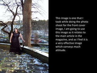
- 2. This image is one that I took while doing the photo shoot for the front cover image, I am going to use this image as it relates to the main article in the magazine, and as I feel it is a very effective image which conveys much attitude.
- 3. I took this image to relate to the coverline 'STRUM - the best guitars on the block'. I like the dramatic angle in this photo and the lighting effects. ╠²
- 4. Again this relates to the ŌĆśStrumŌĆÖ coverline. I do like the angle of this photo as I feel it shows off the guitars to their full advantage.
- 5. I took this photo to relate to the coverline 'METALLICA - What we do nowadays'. This picture is supposed to convey a classic Metallica album, which, by it being played on a modern iPhone, suggesting that it is still well known and loved today, as are Metallica. The iPhone also connotes modern-day, therefore suggesting that the article will tell the audience what's going on with Metallica now. I do not like this photo as it is not ŌĆśclose-upŌĆÖ enough in my opinion.
- 6. This photo is for the same coverline as in the last slide, I love the interesting angle on this photo. Moreover it is clearer than any of the other photos I have taken for this coverline.
- 7. This photo was taken for the same coverline as the last two slides, I like the angle on this photo, and it is also pretty clear, however I donŌĆÖt think it is as interesting as the last photo and think there is too much ŌĆśglareŌĆÖ coming off of the iPhone screen.
- 8. I may use this picture to relate to the coverline ŌĆśAvenged Sevenfold ŌĆō Nightmare 2010 TourŌĆÖ as this is a picture from their Manchester gig for the tour. This is the clearest picture I got from the gig.
- 9. Again, this is to relate to the Avenged Sevenfold coverline.
- 10. ╠²