Presentation of Indian rupee symbol
- 1. Currency Symbol for Indian Rupee
- 2. Design Philosophy The design philosophy of the symbol is derived from the Devanagari script, a traditional script deeply rooted in our Indian culture. The symbol also seamlessly integrates the Latin script which is widely used around the world. This amalgamation traverses boundaries across cultures giving it a universal identity, at the same time symbolizing our cultural values and ethos at a global platform. Simplicity of the visual form and imagery creates a deep impact on the minds of the people. And makes it easy to recognize, recall and represent by all age groups, societies, religions and cultures.
- 4. Direct communication The symbol is designed using the Devanagari letter âRaâ and Roman capital letter âRâ. The letters are derived from the word Rupiah in Hindi and Rupees in English both denote the currency of India. The derivation of letters from these words conveys the association of the symbol with currency rupee. The symbol straightforwardly communicates the message of currency for both Indian and foreign nationals. In other words, a direct relationship is established between the symbol and the rupee.
- 7. Shiro Rekha The use of Shiro Rekha (the horizontal top line) in Devanagari script is unique to India. Devanagari script is the only script where letters hang from the top line and does not sit on a baseline. The symbol preserves this unique and essential feature of our Indian script which is not seen in any other scripts in the world. It also clearly distinguishes itself from other symbols and establishes a sign of Indian origin. It explicitly states the Indianess of the symbol.
- 8. Tricolor The two horizontal lines with an equal negative white space (imaginary space) between them create a foreground and background effect of three strips (tricolor). The strips subtly represent the tricolor of our Indian national ïŹag ïŹying at the top.
- 9. Equality sign The horizontal lines also denote the arithmetic sign âequal toâ. For a common man, a quick indicator of his/her countries economy is the comparison of currency values. In other words, a countries economy is deïŹned with respect to the currency value. One always compares once economy (currency value) with the other nations currency, it is always relative to the other. The arithmetic sign denotes that relationship of comparison of currency values. The equality sign also signiïŹes a balanced economy, our economy should be secured and stable forever.
- 11. Harmony in design The symbol is designed in harmony with the other existing currency symbols of the world. It forms a part of the family and at the same retaining its individuality. It does not stand out radically but is in unison with other symbols. This uniformity establishes a clear understanding and association of the symbol with currency across the globe.
- 14. Familiarity of visual form The interplay of letter âRaâ and âRâ makes it comprehendible for both local and global people. Familiarity of the visual form accentuates the recognition of the symbol and quickly registers in the peopleâs mind. It also makes the sign very easy to adapt.
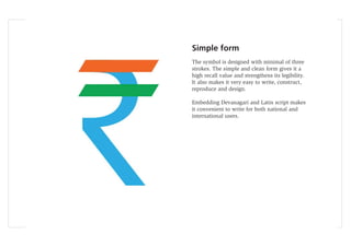
- 16. Simple form The symbol is designed with minimal of three strokes. The simple and clean form gives it a high recall value and strengthens its legibility. It also makes it very easy to write, construct, reproduce and design. Embedding Devanagari and Latin script makes it convenient to write for both national and international users.
- 17. Design The symbol is easy for the Devanagari and Latin type designers to design. Similarity of form with letters âRaâ and âRâ makes the symbol effortless to design.
- 18. Reverse effect The symbol works very well with inverse color. It does not affect the legibility of symbol even at smaller sizes.
- 19. Balance The left inclination of the letter âRaâ is visually balanced using the two horizontal strokes inclined on the opposite direction. Both the visual forces are balanced to make the symbol stable and ïŹrm. The symbol stands on a single stroke without any imbalance. Numerals The symbol naturally blends with the Arabic and Devanagari numerals.
- 22. Symbol for Paisa The symbol for paisa can also be designed using the same concept. It would be in harmonious with the proposed rupee symbol as one family.
- 23. Applications The symbol can be easily reproduced using various mediums. It can be applied or printed on any surface without losing its visual form. It is highly legible even at smaller sizes.
- 37. Acknowledgement I am thankful to IDC, IIT Bombay for the guidance and support. I also thank my parents and friends for their help and encouragement.


