Presentation2
âĒDownload as PPTX, PDFâĒ
0 likesâĒ549 views

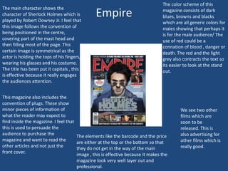
The magazine cover features Robert Downey Jr. as Sherlock Holmes in the center surrounded by plugs advertising other articles. The capitalized title engages attention. The elements like price and barcode are unobtrusively placed. The cover uses conventions like prominent central imagery and plugs to attract readers.

Presentation2
- 2. The main character shows the character of Sherlock Holmes which is played by Robert Downey Jr. I feel that this image follows the convention of being positioned in the centre, covering part of the mast head and then filling most of the page. This certain image is symmetrical as the actor is holding the tops of his fingers, wearing his glasses and his costume. The title has been put it capitals , this is effective because it really engages the audiences attention. This magazine also includes the convention of plugs. These show minor pieces of information of what the reader may expect to find inside the magazine. I feel that this is used to persuade the audience to purchase the magazine and want to read the other articles and not just the front cover. Empire The color scheme of this magazine consists of dark blues, browns and blacks which are all generic colors for males showing that perhaps it is for the male audience/ The use of red could be a connation of blood , danger or death. The red and the light grey also contracts the text so its easier to look at the stand out. The elements like the barcode and the price are either at the top or the bottom so that they do not get in the way of the main image , this is effective because it makes the magazine look very well layer out and professional. We see two other films which are soon to be released. This is also advertising for other films which is really good.
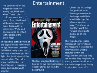
- 3. The colors used on this magazine cover are mainly red, black and white. These colors could represent fear , blood , fore , death and all the other content thatâs featured In a horror film. White and black can also be linked to the colors of the killers mask The sub title at the bottom of the page is linked to the main image. The words used like âRETURNSâ really stand out because it has been put in a light blue font instead of the normal white. This helps show that this film is a franchise and is making a come back and is worth viewing Entertainment One of the first things that you look at on the magazine cover is the image and this is how it takes up the whole magazine page. This shows us that they want the viewers attention to mainly be on the image. There is a banner that is included at the very top of the magazine it includes the information of what is featured within the magazine but because they are articles they are places at The font used is effective as it is the top and in small font so bold so its eye catching because the main image is not having it really stands out from the its attention taken off it. background
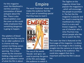
- 4. For this magazine cover the Masthead is red this could be a connotation of blood and gore about the film. There is also blood splatters over the cover so this could really emphasize that something dangerous is going to happen. The splatters of blood show how the film may be for an older audience as it is a horror and may contain horrifying scenes so it is Is like a preview warning. This is then shown by the character holding a big sword and gives an audience a sense of what the film is about. Empire The word âExclusiveâ shows and makes the audience feel like this is part of something special that they have to read it. The Tagline on the magazine shows how popular the magazine is , which will encourage the people to purchase it. The fact the the magazine is popular and her head is covering the masthead also shows that it is a very well known magazine. The use of character who is Uma Thurman may attract people who like her to watch the film. The cover star that is featured on the front page of the magazine is a direct address at the image is she is looking straight into the camera so it looks like she is looking at the audience. This The use of the words could also suggest that she is âbloodyâ and âgoryâ are used to portray the genre important and that the film is about her. of the film and engage the audience to watch it.