ºÝºÝߣ

ºÝºÝߣShare a Scribd company logo
Our school magazine by Chloe Debnam and Emily Morley


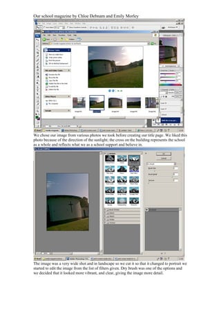
We chose our image from various photos we took before creating our title page. We liked this
photo because of the direction of the sunlight; the cross on the building represents the school
as a whole and reflects what we as a school support and believe in.


The image was a very wide shot and in landscape so we cut it so that it changed to portrait we
started to edit the image from the list of filters given. Dry brush was one of the options and
we decided that it looked more vibrant, and clear, giving the image more detail.
Our school magazine by Chloe Debnam and Emily Morley


We then selected our font for the main title and selected pink, because it stands out, and we
though that it would appeal to the girl readers.


We put sub headings to the left of the page in white which also stands out from the
pink background therefore giving it a clear and interesting; in this screen shot the
caption understanding your GCSE’S.
Our school magazine by Chloe Debnam and Emily Morley


This is the same as the last print screen but with a different caption 16+ choice, this
shows the target audience as well as the choices on offer.


This is also the same as the last two slides. Revision tips.
Our school magazine by Chloe Debnam and Emily Morley


This shows what freebee the reader will receive we thought that red was a good
choice of colour because the readers will notice it straight away.


We put where it came from and the price of the magazine.
Our school magazine by Chloe Debnam and Emily Morley


Then we selected the bar code from the internet, Google images. We then copied and
pasted.


We then pasted it to paint and reduced the size.
Our school magazine by Chloe Debnam and Emily Morley


And copied it into the front cover.


To create a transparent sidebar we then selected colour overlay. We thought that this
was effective because the subtitles would stand out.
Our school magazine by Chloe Debnam and Emily Morley


We selected the colour pink, the same as the title.


This is when we made the bar transparent using the side bar.
Our school magazine by Chloe Debnam and Emily Morley


We selected the logo from the priory website www.priorycofe.com


Copied and pasted into Photoshop.
Our school magazine by Chloe Debnam and Emily Morley


We then cut around the logo using the lasso tool.


This shows it being cut.
Our school magazine by Chloe Debnam and Emily Morley


We then transferred it into another layer.


And moved it to the left side.
Our school magazine by Chloe Debnam and Emily Morley


We then used the background eraser to blend it into the background.


This shows us erasing the logo.
Our school magazine by Chloe Debnam and Emily Morley


We change the colour from red to yellow because the colour red was to sharp and
clashed with the background. We chose yellow because it was clear and we thought
that it catches the readers eye.
Our school magazine by Chloe Debnam and Emily Morley


We changed the text so that it read ‘with this issue get your free parenting guide’; we
did this because we thought that it was easier to understand.

More Related Content

Print screens media_school_front_cover[1]

  • 1. Our school magazine by Chloe Debnam and Emily Morley We chose our image from various photos we took before creating our title page. We liked this photo because of the direction of the sunlight; the cross on the building represents the school as a whole and reflects what we as a school support and believe in. The image was a very wide shot and in landscape so we cut it so that it changed to portrait we started to edit the image from the list of filters given. Dry brush was one of the options and we decided that it looked more vibrant, and clear, giving the image more detail.
  • 2. Our school magazine by Chloe Debnam and Emily Morley We then selected our font for the main title and selected pink, because it stands out, and we though that it would appeal to the girl readers. We put sub headings to the left of the page in white which also stands out from the pink background therefore giving it a clear and interesting; in this screen shot the caption understanding your GCSE’S.
  • 3. Our school magazine by Chloe Debnam and Emily Morley This is the same as the last print screen but with a different caption 16+ choice, this shows the target audience as well as the choices on offer. This is also the same as the last two slides. Revision tips.
  • 4. Our school magazine by Chloe Debnam and Emily Morley This shows what freebee the reader will receive we thought that red was a good choice of colour because the readers will notice it straight away. We put where it came from and the price of the magazine.
  • 5. Our school magazine by Chloe Debnam and Emily Morley Then we selected the bar code from the internet, Google images. We then copied and pasted. We then pasted it to paint and reduced the size.
  • 6. Our school magazine by Chloe Debnam and Emily Morley And copied it into the front cover. To create a transparent sidebar we then selected colour overlay. We thought that this was effective because the subtitles would stand out.
  • 7. Our school magazine by Chloe Debnam and Emily Morley We selected the colour pink, the same as the title. This is when we made the bar transparent using the side bar.
  • 8. Our school magazine by Chloe Debnam and Emily Morley We selected the logo from the priory website www.priorycofe.com Copied and pasted into Photoshop.
  • 9. Our school magazine by Chloe Debnam and Emily Morley We then cut around the logo using the lasso tool. This shows it being cut.
  • 10. Our school magazine by Chloe Debnam and Emily Morley We then transferred it into another layer. And moved it to the left side.
  • 11. Our school magazine by Chloe Debnam and Emily Morley We then used the background eraser to blend it into the background. This shows us erasing the logo.
  • 12. Our school magazine by Chloe Debnam and Emily Morley We change the colour from red to yellow because the colour red was to sharp and clashed with the background. We chose yellow because it was clear and we thought that it catches the readers eye.
  • 13. Our school magazine by Chloe Debnam and Emily Morley We changed the text so that it read ‘with this issue get your free parenting guide’; we did this because we thought that it was easier to understand.