Course Project 1 for Coursera Statistical Inference
- 1. Comparison of the Exponential Distribution and the Central Limit Theorem John Slough II 9 Jan 2015 We were asked to investigate the exponential distribution and compare it with the Central Limit Theorem (CLT). First I will show two plots that show the theoretical mean and variance of the exponential distribution, compared with the cumulative means and variances. This is a very good way to see the CLT at work. Second, I will show a histogram of the empirical values of the 40 means of the exponential distribution and superimpose the normal curve over that data. This will give a good idea of whether or not the distribution is normal. Lastly, I will show a QQ plot of the data with the Normal line, another way to assess normality. set.seed(123) lambda=.2 n=40 nsim=10000 expdist = rep(NA,nsim) for (i in 1:nsim){ expdist[i] = mean(rexp(n,lambda)) } empiricalmean=mean(expdist) theoreticalmean=1/lambda empiricalvariance=var(expdist) theoreticalvariance=1/((lambda^2)*n) cumulativemean=cumsum(expdist) / seq_along(expdist) cumvar=cumsum((expdist-empiricalmean)^2)/(seq_along(expdist)-1) I ran a simulation of 40 samples for the exponential distribution, and took the mean of each sample. This was iterated 10ˆ{4} times. I obtained an empirical mean of 4.9955518. The theoretical mean is just 1/lambda, where lambda=0.2. The result is 5. As you can see, they are almost identical. The empirical variance is 0.6116623 and the theoretical variance is 0.625, obtained by the formula (1/lambdaˆ2)/n. They are also very similar. The following plot displays the cumulative emperical means of the samples of 40 exponentially distributed values. According to the CLT, these should converge to the theoretical mean, and we do see this happening as the iterations increase. plot(seq_along(expdist),cumulativemean,type="l",lty=1,lwd=1, main=expression("Means of 40 exp"(lambda*"=0.2")),xlab="Iteration" ,ylab="Mean") abline(h=theoreticalmean,col="salmon",lwd=1) legend("bottomright", legend=c("Theoretical Mean","Empirical Mean"), col=c("salmon","black"), lty=c(1,1),lwd=c(2,2),cex=.8,bty="n") 1
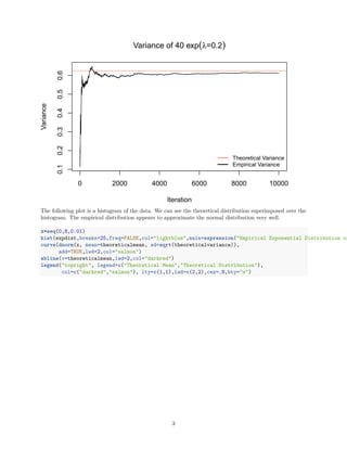
- 2. 0 2000 4000 6000 8000 10000 4.804.905.005.10 Means of 40 exp(╬╗=0.2) Iteration Mean Theoretical Mean Empirical Mean The next plot is similar to the previous one, however it shows the variances of the means of the 40 exponentially distributed values. As with the previous plot, the more iterations, the closer the emperical variance gets to the theoretical variance. plot(seq_along(expdist),cumvar,type="l",lty=1,lwd=1, main=expression("Variance of 40 exp"(lambda*"=0.2")), xlab="Iteration",ylab="Variance") abline(h=theoreticalvariance,col="salmon",lwd=1) legend("bottomright", legend=c("Theoretical Variance", "Empirical Variance"), col=c("salmon","black"), lty=c(1,1),lwd=c(2,2),cex=.8,bty="n") 2
- 3. 0 2000 4000 6000 8000 10000 0.10.20.30.40.50.6 Variance of 40 exp(╬╗=0.2) Iteration Variance Theoretical Variance Empirical Variance The following plot is a histogram of the data. We can see the theoretical distribution superimposed over the histogram. The empirical distribution appears to approximate the normal distribution very well. x=seq(0,8,0.01) hist(expdist,breaks=25,freq=FALSE,col="lightblue",main=expression("Empirical Exponential Distribution of curve(dnorm(x, mean=theoreticalmean, sd=sqrt(theoreticalvariance)), add=TRUE,lwd=2,col="salmon") abline(v=theoreticalmean,lwd=2,col="darkred") legend("topright", legend=c("Theoretical Mean","Theoretical Distribution"), col=c("darkred","salmon"), lty=c(1,1),lwd=c(2,2),cex=.8,bty="n") 3
- 4. Empirical Exponential Distribution of Means of 40 exp(╬╗=0.2) Value Density 2 3 4 5 6 7 8 0.00.10.20.30.40.5 Theoretical Mean Theoretical Distribution Another way to assess normality is with QQ plots. If the data are approximately normally distributed, then the data points should fall on the normal line. They do. qqnorm(expdist,pch=16,cex=.8,col="lightblue") qqline(expdist,col="salmon",lwd=2) legend("bottomright", legend=c("Empirical Values","Normal Line"), col=c("lightblue","salmon"),pch=c(16,NA), lwd=c(NA,2),lty=c(NA,1),cex=.8,bty="n") 4
- 5. ŌłÆ4 ŌłÆ2 0 2 4 2345678 Normal QŌłÆQ Plot Theoretical Quantiles SampleQuantiles Empirical Values Normal Line Conclusion From the above plots, we can see that as the iterations increase, the empirical means and variances tend towards the theoretical mean and variance. Also, the distribution of the means is approximately normal. This is essentially what the CLT states should occur. 5
![Comparison of the Exponential Distribution and the
Central Limit Theorem
John Slough II
9 Jan 2015
We were asked to investigate the exponential distribution and compare it with the Central Limit Theorem
(CLT).
First I will show two plots that show the theoretical mean and variance of the exponential distribution,
compared with the cumulative means and variances. This is a very good way to see the CLT at work.
Second, I will show a histogram of the empirical values of the 40 means of the exponential distribution and
superimpose the normal curve over that data. This will give a good idea of whether or not the distribution is
normal. Lastly, I will show a QQ plot of the data with the Normal line, another way to assess normality.
set.seed(123)
lambda=.2
n=40
nsim=10000
expdist = rep(NA,nsim)
for (i in 1:nsim){
expdist[i] = mean(rexp(n,lambda))
}
empiricalmean=mean(expdist)
theoreticalmean=1/lambda
empiricalvariance=var(expdist)
theoreticalvariance=1/((lambda^2)*n)
cumulativemean=cumsum(expdist) / seq_along(expdist)
cumvar=cumsum((expdist-empiricalmean)^2)/(seq_along(expdist)-1)
I ran a simulation of 40 samples for the exponential distribution, and took the mean of each sample. This was
iterated 10ˆ{4} times. I obtained an empirical mean of 4.9955518. The theoretical mean is just 1/lambda,
where lambda=0.2. The result is 5. As you can see, they are almost identical. The empirical variance is
0.6116623 and the theoretical variance is 0.625, obtained by the formula (1/lambdaˆ2)/n. They are also very
similar.
The following plot displays the cumulative emperical means of the samples of 40 exponentially distributed
values. According to the CLT, these should converge to the theoretical mean, and we do see this happening
as the iterations increase.
plot(seq_along(expdist),cumulativemean,type="l",lty=1,lwd=1,
main=expression("Means of 40 exp"(lambda*"=0.2")),xlab="Iteration"
,ylab="Mean")
abline(h=theoreticalmean,col="salmon",lwd=1)
legend("bottomright", legend=c("Theoretical Mean","Empirical Mean"),
col=c("salmon","black"), lty=c(1,1),lwd=c(2,2),cex=.8,bty="n")
1](https://image.slidesharecdn.com/38e7a1b6-67f4-49b4-9b8a-9ddb6a261468-150722191734-lva1-app6892/85/Course-Project-1-for-Coursera-Statistical-Inference-1-320.jpg)


