Q1
Download as PPT, PDF0 likes111 views
The document discusses conventions used in the student's music magazine cover design, including placing the masthead and headline on the left third, including a selling line at the top, and using bright colors to draw attention to plugs and exclusive content. It also compares the design to conventions in actual music magazine Q, showing similarities like headline placement but differences like more white space. Details of the interior design like the contents page layout and double-page feature spread are also described.
1 of 7
Download to read offline


Recommended
Evaluating my music magazine
Evaluating my music magazineKristi Hewitt
╠²
This document analyzes the codes and conventions used in real music magazines and how the author's mock music magazine "Chart Poppers!" adheres to and challenges these forms. The author examines the front cover, contents page, and double-page spread layouts in real magazines and compares them to her own magazine. She aimed to follow typical magazine conventions like using bright colors, cover lines, and celebrity images while also adding uniqueness through her own design choices and focus on a particular artist. The author concludes that sticking to familiar codes helps potential readers but her individualized elements make the magazine feel fresh.Components of a magazine!
Components of a magazine!naomipalfreman36
╠²
The document outlines the key components of a magazine front cover, including:
1) The masthead which displays the magazine's name and establishes its brand.
2) A main cover image that represents the target audience and main story.
3) Cover lines that frame the image and provide more context about stories.
4) Additional elements like issue number, price, and barcode for consumer information.Q1 media
Q1 mediamilliebevan
╠²
The document summarizes the layout and design choices for the front cover and interior pages of a student-created music magazine. On the front cover, the main image features the faces of the featured artist group. The masthead is bold to attract attention. Throughout the magazine, original artist, band, and event names are used to challenge conventions. Inside pages follow typical magazine layouts like a double-page artist interview spread in columns, but some unconventional design elements are included, such as using an artist's logo as the background image. The contents page lists features on one side and page numbers on the other for easy scanning.Evaluation q 1
Evaluation q 1nakarinpawut
╠²
This document discusses how the media product uses and develops conventions of real magazines. It summarizes the key components of magazines like covers, mastheads, images, text layouts. For each component, it provides examples of how it incorporates typical magazine conventions, such as using bold colors and fonts for visual appeal and readability. It also discusses some unconventional elements, like a non-structured contents page, that aim to make the product unique while still relating to readers. Overall, the document shows an understanding of magazine conventions and how the media product both draws from and challenges real magazines.Evaluation of music magazine
Evaluation of music magazineChrisIzuRuSmith
╠²
The document summarizes how the student's magazine follows media conventions for the front cover, contents page, and double-page spreads. It discusses the target audience as younger people interested in music. The magazine would be distributed in stores like supermarkets and published by a large company like IPC. The student learned skills in editing photos and following industry conventions to create a professional-looking magazine.Q1 media
Q1 mediamilliebevan
╠²
The document summarizes the layout and design choices for the front cover and inside pages of a student-designed music magazine. On the front cover, the designer followed conventions like featuring the main artist and having a bold masthead, but challenged expectations by making it look professionally designed. Inside, they included original artist names and events. The double-page spread followed an interview format and included photos to engage readers. While some design elements like the background image challenged conventions, the overall layout was typical for a music magazine.Focus group home magazine
Focus group home magazinesrelliott22
╠²
The document summarizes the findings from a focus group of 20 women aged 25-60 from Kent regarding preferences for magazine content and design. Key points:
- 5 members read regional magazines occasionally, while others prefer magazines like Vogue, Elle, and Cosmopolitan.
- They want a regional magazine focused on home and interior design featuring clear writing and elegant visuals.
- Preferences included simple, elegant covers and a contents page like Now magazine.
- House Beautiful was favored as a model for style and content over an existing regional magazine.Magzine evaluation hydes
Magzine evaluation hydesSabriya_
╠²
The document describes the development process for magazine pages created by the author. It summarizes the codes and conventions used on different page types, including the front cover, contents page, and double page spreads. For the front cover, conventions included featuring the main subject in a medium close-up, using the largest font for their name, and including other details like the brand, website, and price. The contents page typically lists stories and their summaries, and may include an editor's message. Double page spreads normally feature a large central photograph with an impactful quote and summary of the story in different stylistic elements to distinguish questions from answers.Anotate music magazines
Anotate music magazinesnatashatandy100
╠²
The document discusses the design elements of magazine covers, using the cover of Kerrang! magazine as an example. It explains that the masthead font is the largest and boldest to catch readers' attention. For Kerrang!, the unique cracked font indicates the genre of loud rock music covered. Color schemes and band member positioning are also designed to attract buyers. Cover lines and positioning statements describe the magazine's contents to encourage purchases.Contents 1
Contents 1zoetoase
╠²
The document discusses the layout and design of a magazine page. It summarizes that the important information like the issue number and date are in a bright yellow box for emphasis. The contents section lists 8 article categories in a black and yellow color scheme to make the types of articles easily identifiable. A dominant image draws attention, while the masthead at the top centers the page's contents around the magazine's brand in a worn font consistent with the cover.Analysis of general magazine front covers
Analysis of general magazine front coverssrelliott22
╠²
The document summarizes the common codes and conventions found on the front covers of regional magazines. These typically include a masthead in a font representing the magazine's ideology, a main cover image featuring the cover star, bold contrasting color schemes, sell lines to attract the target audience, and the barcode and price. Additional elements mentioned are dates of issue, recognizable logos, landmarks from the region in images, and simplistic layouts. The purpose of these elements is to clearly identify the magazine, showcase its content, and appeal to the target readership.Analysing a Contents Page
Analysing a Contents Pagejennagrieves
╠²
The contents page summarizes all the articles and features within the latest issue of Kerrang! magazine. It uses images, headings, and short blurbs to entice readers and allow them to easily find content of interest. The layout is organized with the main band image at the top and additional preview photos below divided into columns. The design aims to quickly engage readers while maintaining Kerrang!'s stylistic brand elements of bold fonts, colors, and exclamation points.Contents 3
Contents 3zoetoase
╠²
The document summarizes the layout and design of the contents page of the NME (New Musical Express) magazine. It describes the key elements on the page including the masthead at the top which uses a unique red font, the contents text on the right which lists articles under different subheadings, and the band index on the left with artist names and page numbers. It also discusses the central dominant image of the band Kasabian, the subscription section at the bottom with a yellow color scheme, and the overall formal, structured composition and black, white, red, and yellow color scheme of the page.Magazine conventions
Magazine conventionsannabelle parish
╠²
The document discusses various conventions commonly found on magazine covers and throughout magazines. Some key conventions mentioned include the masthead displaying the magazine title, issue date and number, main and sub headlines highlighting major stories, and price and barcode locations. Front covers also typically feature prominent images and eye-catching designs to draw readers' attention to stories inside. Throughout the magazine, common elements are sidebars, article spreads across pages, tags and quotes drawing readers in, and bylines crediting authors. Exclusive stories and interviews are also highlighted as appealing to readers.Question 1
Question 1Samstudd
╠²
The document discusses the conventions used in media products and how the author's magazine challenges and develops some of those conventions. Some of the common conventions the magazine uses include a masthead, features, columns, images and page numbers positioned at the top of the page. However, it challenges conventions by placing the main image across a double page spread rather than splitting it, and by having a male model on the cover rather than a female to challenge gender norms. The magazine also includes unconventional elements like social media links to better engage its target audience. Overall, the magazine draws from standard industry conventions but also adapts them to better suit its specific purpose and audience.Evaluation question 1
Evaluation question 1asmediab15
╠²
This document discusses how the student's media product uses and develops conventions of real music magazines.
The front cover includes elements commonly found on music magazines like the masthead, date/issue number/price, and a medium shot of the cover artist. However, the image does not overlap the title since this is the first issue. The main cover line stands out in a different color and larger font to draw attention.
The contents page lists articles in a left column and features a large image on the right, making it easy to read. It also includes social media info to promote the magazine to its target audience. Article pages continue the color scheme and include things like pull quotes, a three-column layout, and boldFocus group
Focus group10riccinie
╠²
The document summarizes the findings from a focus group conducted to inform the design of a regional magazine. Key findings included:
- Participants preferred a balance of images and text in articles.
- They responded more positively to a house style that seemed traditional and contemporary rather than targeting younger audiences.
- Layouts that were simple, clear and avoided being too busy were preferred for things like covers and contents pages.
- The focus group helped identify a preferred magazine name of "Inside" over other options.Evaluation question 1
Evaluation question 1jack manderson
╠²
This document discusses how the media product uses and develops conventions of real magazines. It analyzes several design elements:
- The masthead, images, cover lines, and dates/issue numbers follow magazine conventions to create brand awareness and inform readers.
- Columns, page numbers, and anchor text are used to organize content and guide readers through the magazine in a clear, readable way.
- Features like social media links and pull quotes engage younger audiences and fulfill their needs, adapting conventions for the target demographic.
While most elements conform to magazine standards, unconventional aspects like larger cover images and two-column layouts are meant to stand out and enhance the reading experience. Overall conventions are both challenged and supportedPresentation15555555
Presentation15555555Amna Shahzad
╠²
The document discusses how the author addressed their target audience of teenagers and young adults in their music magazine. Some of the techniques used were:
- A prominent red masthead to attract attention.
- Images of models similar to the target audience on the cover to draw them in.
- Directly addressing the audience to make them feel important.
- Including free giveaways and an affordable price.
- Using bold colors, headlines, and pull quotes consistently throughout to guide the reader's eye.
- Incorporating plenty of images with minimal text as preferred by the target demographic.
The author aimed to make the magazine appealing visually and content-wise for their young adult audiencePresentation15555
Presentation15555Amna Shahzad
╠²
The document discusses how the author addressed their target audience of teenagers and young adults in their music magazine. Some of the techniques used were:
- A prominent red masthead to stand out
- Models on the cover that represent the target audience
- Using "FREE" giveaways and an affordable price to attract readers
- Placing images and text in a way that makes it easy to read
- Consistent use of colors like red and black throughout
The author analyzes design elements like headings, images, pull quotes and uses techniques like bold fonts and central placement to guide the reader's attention and keep the target audience engaged.Contents page overview
Contents page overviewrachaeldrake_
╠²
Each contents page from We Love Pop magazine maintains the brand's signature style through consistent layout and design elements that allow readers to easily identify each issue as belonging to the magazine. Key recurring visuals include the "We Love This" masthead at the top, photos of featured artists, a letter from the editor, and the "Inside This Month" section listing articles. While the color scheme and smaller details vary, the overall structure and features remain the same across issues to reinforce the magazine's brand identity and attract its target audience of young female pop fans.Ancillary task summary
Ancillary task summary10riccinie
╠²
The document summarizes common conventions used in billboards and webpages for regional magazines. Billboards typically feature large, contrasting images that accurately represent the magazine alongside the magazine name in a prominent font. They also include promotional text to intrigue readers. Webpages commonly include social media links, menu tabs for navigation, images advertising features, and search bars. They also offer special subscriptions deals and make subscribing conveniently accessible from the homepage.Analysis of regional magazines feature pages
Analysis of regional magazines feature pagessrelliott22
╠²
The document discusses the codes and conventions of regional magazine feature pages. It notes that these pages typically include articles linked to the local area through interviews, local profiles, and questionnaires. Images are used to visualize articles and the color schemes are bold with contrasting hues. Sans serif fonts aid readability. Common article topics include celebrities, local figures, regional profiles, art, wildlife, and questionnaires.Presentation1.pptx
Presentation1.pptxtonieastup
╠²
The document summarizes the analysis of magazine covers and contents pages from Glamour and Rolling Stone magazines. Key points include:
- Magazine covers feature large mastheads, celebrity images to grab attention, limited use of fonts, and plain backgrounds to focus on text and images.
- Contents pages split content into "features" and "regulars" sections, leading with features to excite readers. Images accompany text to make content look interesting.
- Layouts aim to attract readers' attention with prominent images and limit distractions from excessive text or fonts that take away from the focal points.RPS
RPSzoetoase
╠²
The document discusses reader profiles from music magazines NME and KERRANG!. It notes that NME's profile uses a collage of images and statistics about gender and ages to represent its audience. KERRANG!'s profile includes basic information about the magazine and reader's lifestyles, including median age, age range, gender, and hobbies. Based on researching these profiles, the author decides their own profile will include target audience images, price, release frequency, statistics, lifestyle facts, article focuses, and a basic color scheme, keeping it simple and straight to the point.Working title complete
Working title completeEmilyPlenty
╠²
The document discusses potential titles for a new music magazine. The working title is "Overload," which is meant to convey that the magazine will be packed with images, gossip and information. While "Overload" grabs attention, it does not clearly indicate the music genres covered. The author plans to choose a one-word masthead in line with popular music magazine conventions, and will further develop the title as the magazine concept progresses.Magazine Conventions
Magazine Conventionslucycoates1
╠²
This document analyzes the layout and design elements of the front cover of a music magazine called NME. It discusses several key aspects of the cover:
1. The masthead is large and bold in red to stand out. Its stamp style and placement in the top left is typical for NME covers.
2. The main image uses direct eye contact to engage viewers and convey the seriousness and confidence of the featured band.
3. Unusual layout elements like reversed order of cover lines are used to attract interest and maintain NME's daring reputation with readers.
4. Bold colors like red and black are used to stimulate quick decisions and draw attention, reflecting NME's focus on new andFCD 2
FCD 2zoetoase
╠²
The magazine cover uses bold colors and fonts to attract attention. The skyline features famous artists' names in white that stand out against the black background. The masthead is the largest red font that connotes awareness in a demanding tone. The main sell line below uses a specialized font and teases an exclusive opportunity to see the featured band of the issue. Overall the cover employs attention-grabbing design elements to appeal to its target audience of 16-24 year old females interested in new artists, concerts, and gossip.Flat plans
Flat plansrebeccaharrington12
╠²
The document outlines the sections and layout of a magazine, including the masthead, lead stories, features, editorials, regular sections, and page numbers. It contains the menu strip at the top, section headers and cover lines for the feature section. The regulars section includes headlines and quotes. Features include columns of articles, pull quotes, sidebars, captions, bylines and inset shots.
More Related Content
What's hot (20)
Anotate music magazines
Anotate music magazinesnatashatandy100
╠²
The document discusses the design elements of magazine covers, using the cover of Kerrang! magazine as an example. It explains that the masthead font is the largest and boldest to catch readers' attention. For Kerrang!, the unique cracked font indicates the genre of loud rock music covered. Color schemes and band member positioning are also designed to attract buyers. Cover lines and positioning statements describe the magazine's contents to encourage purchases.Contents 1
Contents 1zoetoase
╠²
The document discusses the layout and design of a magazine page. It summarizes that the important information like the issue number and date are in a bright yellow box for emphasis. The contents section lists 8 article categories in a black and yellow color scheme to make the types of articles easily identifiable. A dominant image draws attention, while the masthead at the top centers the page's contents around the magazine's brand in a worn font consistent with the cover.Analysis of general magazine front covers
Analysis of general magazine front coverssrelliott22
╠²
The document summarizes the common codes and conventions found on the front covers of regional magazines. These typically include a masthead in a font representing the magazine's ideology, a main cover image featuring the cover star, bold contrasting color schemes, sell lines to attract the target audience, and the barcode and price. Additional elements mentioned are dates of issue, recognizable logos, landmarks from the region in images, and simplistic layouts. The purpose of these elements is to clearly identify the magazine, showcase its content, and appeal to the target readership.Analysing a Contents Page
Analysing a Contents Pagejennagrieves
╠²
The contents page summarizes all the articles and features within the latest issue of Kerrang! magazine. It uses images, headings, and short blurbs to entice readers and allow them to easily find content of interest. The layout is organized with the main band image at the top and additional preview photos below divided into columns. The design aims to quickly engage readers while maintaining Kerrang!'s stylistic brand elements of bold fonts, colors, and exclamation points.Contents 3
Contents 3zoetoase
╠²
The document summarizes the layout and design of the contents page of the NME (New Musical Express) magazine. It describes the key elements on the page including the masthead at the top which uses a unique red font, the contents text on the right which lists articles under different subheadings, and the band index on the left with artist names and page numbers. It also discusses the central dominant image of the band Kasabian, the subscription section at the bottom with a yellow color scheme, and the overall formal, structured composition and black, white, red, and yellow color scheme of the page.Magazine conventions
Magazine conventionsannabelle parish
╠²
The document discusses various conventions commonly found on magazine covers and throughout magazines. Some key conventions mentioned include the masthead displaying the magazine title, issue date and number, main and sub headlines highlighting major stories, and price and barcode locations. Front covers also typically feature prominent images and eye-catching designs to draw readers' attention to stories inside. Throughout the magazine, common elements are sidebars, article spreads across pages, tags and quotes drawing readers in, and bylines crediting authors. Exclusive stories and interviews are also highlighted as appealing to readers.Question 1
Question 1Samstudd
╠²
The document discusses the conventions used in media products and how the author's magazine challenges and develops some of those conventions. Some of the common conventions the magazine uses include a masthead, features, columns, images and page numbers positioned at the top of the page. However, it challenges conventions by placing the main image across a double page spread rather than splitting it, and by having a male model on the cover rather than a female to challenge gender norms. The magazine also includes unconventional elements like social media links to better engage its target audience. Overall, the magazine draws from standard industry conventions but also adapts them to better suit its specific purpose and audience.Evaluation question 1
Evaluation question 1asmediab15
╠²
This document discusses how the student's media product uses and develops conventions of real music magazines.
The front cover includes elements commonly found on music magazines like the masthead, date/issue number/price, and a medium shot of the cover artist. However, the image does not overlap the title since this is the first issue. The main cover line stands out in a different color and larger font to draw attention.
The contents page lists articles in a left column and features a large image on the right, making it easy to read. It also includes social media info to promote the magazine to its target audience. Article pages continue the color scheme and include things like pull quotes, a three-column layout, and boldFocus group
Focus group10riccinie
╠²
The document summarizes the findings from a focus group conducted to inform the design of a regional magazine. Key findings included:
- Participants preferred a balance of images and text in articles.
- They responded more positively to a house style that seemed traditional and contemporary rather than targeting younger audiences.
- Layouts that were simple, clear and avoided being too busy were preferred for things like covers and contents pages.
- The focus group helped identify a preferred magazine name of "Inside" over other options.Evaluation question 1
Evaluation question 1jack manderson
╠²
This document discusses how the media product uses and develops conventions of real magazines. It analyzes several design elements:
- The masthead, images, cover lines, and dates/issue numbers follow magazine conventions to create brand awareness and inform readers.
- Columns, page numbers, and anchor text are used to organize content and guide readers through the magazine in a clear, readable way.
- Features like social media links and pull quotes engage younger audiences and fulfill their needs, adapting conventions for the target demographic.
While most elements conform to magazine standards, unconventional aspects like larger cover images and two-column layouts are meant to stand out and enhance the reading experience. Overall conventions are both challenged and supportedPresentation15555555
Presentation15555555Amna Shahzad
╠²
The document discusses how the author addressed their target audience of teenagers and young adults in their music magazine. Some of the techniques used were:
- A prominent red masthead to attract attention.
- Images of models similar to the target audience on the cover to draw them in.
- Directly addressing the audience to make them feel important.
- Including free giveaways and an affordable price.
- Using bold colors, headlines, and pull quotes consistently throughout to guide the reader's eye.
- Incorporating plenty of images with minimal text as preferred by the target demographic.
The author aimed to make the magazine appealing visually and content-wise for their young adult audiencePresentation15555
Presentation15555Amna Shahzad
╠²
The document discusses how the author addressed their target audience of teenagers and young adults in their music magazine. Some of the techniques used were:
- A prominent red masthead to stand out
- Models on the cover that represent the target audience
- Using "FREE" giveaways and an affordable price to attract readers
- Placing images and text in a way that makes it easy to read
- Consistent use of colors like red and black throughout
The author analyzes design elements like headings, images, pull quotes and uses techniques like bold fonts and central placement to guide the reader's attention and keep the target audience engaged.Contents page overview
Contents page overviewrachaeldrake_
╠²
Each contents page from We Love Pop magazine maintains the brand's signature style through consistent layout and design elements that allow readers to easily identify each issue as belonging to the magazine. Key recurring visuals include the "We Love This" masthead at the top, photos of featured artists, a letter from the editor, and the "Inside This Month" section listing articles. While the color scheme and smaller details vary, the overall structure and features remain the same across issues to reinforce the magazine's brand identity and attract its target audience of young female pop fans.Ancillary task summary
Ancillary task summary10riccinie
╠²
The document summarizes common conventions used in billboards and webpages for regional magazines. Billboards typically feature large, contrasting images that accurately represent the magazine alongside the magazine name in a prominent font. They also include promotional text to intrigue readers. Webpages commonly include social media links, menu tabs for navigation, images advertising features, and search bars. They also offer special subscriptions deals and make subscribing conveniently accessible from the homepage.Analysis of regional magazines feature pages
Analysis of regional magazines feature pagessrelliott22
╠²
The document discusses the codes and conventions of regional magazine feature pages. It notes that these pages typically include articles linked to the local area through interviews, local profiles, and questionnaires. Images are used to visualize articles and the color schemes are bold with contrasting hues. Sans serif fonts aid readability. Common article topics include celebrities, local figures, regional profiles, art, wildlife, and questionnaires.Presentation1.pptx
Presentation1.pptxtonieastup
╠²
The document summarizes the analysis of magazine covers and contents pages from Glamour and Rolling Stone magazines. Key points include:
- Magazine covers feature large mastheads, celebrity images to grab attention, limited use of fonts, and plain backgrounds to focus on text and images.
- Contents pages split content into "features" and "regulars" sections, leading with features to excite readers. Images accompany text to make content look interesting.
- Layouts aim to attract readers' attention with prominent images and limit distractions from excessive text or fonts that take away from the focal points.RPS
RPSzoetoase
╠²
The document discusses reader profiles from music magazines NME and KERRANG!. It notes that NME's profile uses a collage of images and statistics about gender and ages to represent its audience. KERRANG!'s profile includes basic information about the magazine and reader's lifestyles, including median age, age range, gender, and hobbies. Based on researching these profiles, the author decides their own profile will include target audience images, price, release frequency, statistics, lifestyle facts, article focuses, and a basic color scheme, keeping it simple and straight to the point.Working title complete
Working title completeEmilyPlenty
╠²
The document discusses potential titles for a new music magazine. The working title is "Overload," which is meant to convey that the magazine will be packed with images, gossip and information. While "Overload" grabs attention, it does not clearly indicate the music genres covered. The author plans to choose a one-word masthead in line with popular music magazine conventions, and will further develop the title as the magazine concept progresses.Magazine Conventions
Magazine Conventionslucycoates1
╠²
This document analyzes the layout and design elements of the front cover of a music magazine called NME. It discusses several key aspects of the cover:
1. The masthead is large and bold in red to stand out. Its stamp style and placement in the top left is typical for NME covers.
2. The main image uses direct eye contact to engage viewers and convey the seriousness and confidence of the featured band.
3. Unusual layout elements like reversed order of cover lines are used to attract interest and maintain NME's daring reputation with readers.
4. Bold colors like red and black are used to stimulate quick decisions and draw attention, reflecting NME's focus on new andFCD 2
FCD 2zoetoase
╠²
The magazine cover uses bold colors and fonts to attract attention. The skyline features famous artists' names in white that stand out against the black background. The masthead is the largest red font that connotes awareness in a demanding tone. The main sell line below uses a specialized font and teases an exclusive opportunity to see the featured band of the issue. Overall the cover employs attention-grabbing design elements to appeal to its target audience of 16-24 year old females interested in new artists, concerts, and gossip.Viewers also liked (6)
Flat plans
Flat plansrebeccaharrington12
╠²
The document outlines the sections and layout of a magazine, including the masthead, lead stories, features, editorials, regular sections, and page numbers. It contains the menu strip at the top, section headers and cover lines for the feature section. The regulars section includes headlines and quotes. Features include columns of articles, pull quotes, sidebars, captions, bylines and inset shots.aanvraagformulier evenementenloket Heist 2014
aanvraagformulier evenementenloket Heist 2014UPoliteia
╠²
Standaard invuldocument voor aanvraag evenementen in Heist-op-den-Berg. Magazine conventions
Magazine conventionsrebeccaharrington12
╠²
The document discusses the layout and design elements of magazine covers. It explains that magazine covers typically feature a masthead at the top left, cover line, kicker, secondary lead, caption, and other text elements. The document analyzes a specific magazine cover, noting its use of color, fonts, style, space, and how it follows typical conventions like the rule of thirds in photo placement while varying the location of some text elements. In conclusion, it states the cover is bright and eye-catching while packing in a lot of information without any dead space.Studiedag 'Integriteit bevrijdt! 10 jaar ambtelijk integriteitsbeleid in Vlaa...
Studiedag 'Integriteit bevrijdt! 10 jaar ambtelijk integriteitsbeleid in Vlaa...UPoliteia
╠²
Op 4 december 2013 vond de studiedag 'Integriteit bevrijdt! 10 jaar ambtelijk integriteitsbeleid in Vlaanderen' plaats. Hier vind je de presentaties terug van:
- Kathleen Lambrechts, bestuursco├Črdinator, Stad Antwerpen - Tien jaar bouwen aan integriteit in't stad: van buiten naar binnen
- ir. Yves Rubens, afdelingshoofd Stafdienst, Departement Mobiliteit en Openbare Werken - Werken aan een cultuur van verantwoordelijkheid en betrokkenheid bij het Departement MOW: hefbomen en valkuilen
- Erik Balbaert, integriteitsco├Črdinator, Regie der Gebouwen - De kracht van een positief integriteitsbeleid om een mentaliteitsverandering tot stand te brengen: het verhaal van de Regie der Gebouwen
- Prof. Jeroen Maesschalck, Leuvens Instituut voor Criminologie (LINC), Faculteit Rechtsgeleerdheid KU Leuven - 10 jaar ambtelijk integriteitsbeleid in Vlaanderen: enkele reflectiesBart van Steenberghe - Getting things done & Outlook
Bart van Steenberghe - Getting things done & OutlookUPoliteia
╠²
Presentatie Bart Van Steenberghe t.g.v. studiedag Sssst hier werkt menSimilar to Q1 (20)
Evaluation
EvaluationMoodSmash
╠²
The document summarizes how the magazine uses conventions of real magazines. It discusses design elements like the cover image establishing artist importance, coverlines attracting attention, and flash words hooking readers. Interior elements discussed include the masthead, menu strips advertising exclusives, headline placement, and inset images promoting content. The document also addresses representing the target audience through the black, white, and red color palette symbolizing emotions relevant to the emo/scene subculture.Evaluation
EvaluationMoodSmash
╠²
The document summarizes how the magazine uses conventions of real magazines. It discusses design elements like the cover image establishing artist importance, coverlines attracting attention, and flash words hooking readers. Interior elements discussed include the masthead, menu strips advertising exclusives, headline placement, and inset images promoting content. The document also addresses representing the target audience through the black, white, and red color palette symbolizing emotions relevant to the emo/scene subculture.Luke Pearson- AS Media Evaluation
Luke Pearson- AS Media Evaluationguest5ede6c
╠²
The document discusses the media product the author created, a jazz rock music magazine called "Pure Sounds". They used conventions from real magazines like Kerrang! and Q for the front cover, contents page, and double page articles. The target audience is teenagers to 30-year-olds. It would be distributed through newsagents like real magazines. The author learned about using photo editing software and improving their use of design elements like color and fonts from their preliminary task.Evaluation Question 5
Evaluation Question 5040807
╠²
The document summarizes changes made to the magazine mock-up based on audience feedback received during preliminary testing. For the front cover, a skyline banner and modifications to the layout and design of text blocks were implemented. The contents page was improved by increasing image and text sizes to remove empty spaces. The double page spread saw changes like adding a pull quote, inline quote, and additional images. Across sections, minor details and consistency of style and formatting were enhanced.Question one
Question oneEllieLott
╠²
The document summarizes the ways in which the author's music magazine cover, contents page, and double-page spread use conventions from Billboard magazine. For the cover, the author models the main image, masthead, cover lines, barcode/price, and date placement after Billboard. The contents page includes magazine staples like page numbers, titles, and descriptions of featured stories. The double-page spread adopts Billboard's practice of a large artist image and interview format but includes more text over two pages rather than one full image. Overall, the author emulates established magazine conventions while adding their own style.Liam Media Evaluation
Liam Media Evaluationablizz
╠²
The document provides an analysis of a music magazine media product created by the author. It discusses conventions used and challenged in the magazine's design, how it represents its target audience of 16-25 year olds, and how the author has improved their skills in areas like Photoshop and taking their own photos from an initial school magazine project. Key points covered include the magazine's urban style aimed at younger readers, use of bold fonts and minimal text, and distribution through mainstream publishers to reach a wide audience interested in various music genres.Evaluation Question 1
Evaluation Question 1Josh Webb
╠²
AS media evaluations question 1.
In what ways does your media product use, develop or challenge forms and conventions of real media products? - Josh Webb
Evaluation Q1
Evaluation Q1JamieEgan0
╠²
- The document discusses how the student's media product uses conventions of real magazines in its construction.
- For the front cover, conventions included masthead placement, tagline, artist image, and color scheme. The contents page followed conventions like masthead, images, headings, and ads.
- The double-page article layout used conventions such as column structure for the interview, enlarged quote, and page numbers. However, it challenged conventions somewhat by placing some text on the image page.
- Overall, the student aimed to mimic real magazine styles and layouts to make the media product seem realistic while also experimenting with some unconventional placements.Media Evaluation Lewis Cooke
Media Evaluation Lewis Cookeguest8e34681
╠²
The document provides details about a student's media magazine project. It discusses the design conventions used in the magazine, including placing the title in the top left corner of the cover and using left-to-right reading. It also discusses representing the target audience of 16-25 year olds interested in indie music. The student learned new skills in Photoshop and how magazines are increasingly distributed online. Overall, the progression from the preliminary project to the final magazine improved the professional design and layout.My Media Evaluation
My Media Evaluationdaniellaaaaa
╠²
Daniella created a magazine called UK Charts targeting teenage girls aged 13-25. She researched real music magazines to develop an appropriate layout, color scheme, and conventions for her magazine. This included a catchy masthead, cover image, and cover lines to attract her audience. Through trial and error using tools like Publisher, Paint, and Picnik, she learned how to effectively design and edit images for her magazine. She also gained insight into planning and refining her magazine based on feedback from her target audience. Overall, Daniella felt the process helped her create a more polished magazine compared to her preliminary task.Media Evaluation - Question One.
Media Evaluation - Question One.Emily Richardson
╠²
In what ways does your media product use, develop and challenge forms and conventions on real media products?In what ways does your media product use, develop, or challenge forms and con...
In what ways does your media product use, develop, or challenge forms and con...meganfellowes
╠²
The document discusses the codes and conventions used in the author's media products for an indie magazine, including the front cover, contents page, and double page article spread. Key elements mentioned are using colors like red, white, black, and yellow that are recognized in indie magazines. Images, headings, and promotional elements are positioned following conventions. Fonts and layout are also used consistently across pages to tie the magazine together as a brand. The double page spread further develops conventions with colors, direct address, drop caps and quotes to engage readers.Media question 1 edited
Media question 1 editedFayeVictoria
╠²
1. The document discusses how the author's magazine product uses and develops conventions of real magazines.
2. Key conventions used include placing a barcode and issue number on the cover to look professional, using cover lines and selling points to attract buyers, and employing a grid system on the cover with important information at the top.
3. Internally, conventions like quotes, photos, and headers are used on the content page, while the feature article employs pull quotes, headlines, and a photo to match styles seen in example magazines like NME.Question 1
Question 1Annnnnnnaaaaaaaaaa
╠²
This document discusses the use of color in the design of a music magazine cover. It begins by explaining the choice of a light grey background color to reflect indie music styles. Black, red and white are also used. Kickers and cover lines are in red and white respectively. Yellow is used for "flashes" to draw attention. The masthead is in black to stand out from other text. Graphic features and borders are also included to highlight certain elements. Conventions like the masthead, menu strip, selling line, date line and bar code are included in typical locations with appropriate colors. The main image features an artist holding a microphone in casual clothing. Color choices are meant to be consistent throughout the magazine.In what ways does your media product use, develop and challenge forms and con...
In what ways does your media product use, develop and challenge forms and con...laurb96
╠²
The document discusses how the media product follows conventions of real magazines. It describes using consistent colors, fonts, and branding throughout the magazine to show continuity. Key elements like the masthead, skyline, headlines, and main image are placed in conventional locations on the front cover to attract readers. Interior pages also feature consistent branding and design elements as well as conventional article formats like columns, questions and answers, and drop caps. The document analyzes how these formal elements make the media product look professional and realistic like actual magazines.Question 1 powerpoint
Question 1 powerpointAnnnnnnnaaaaaaaaaa
╠²
This document discusses the use of color in the design of a music magazine cover. It begins by explaining the choice of grey, black, red and white as the main colors used, as they work well together and fit the style of indie music. The background is a light grey to not be overpowering. Black is used for the masthead to make it stand out from the text. Red is used for headlines and kickers to draw attention. White is used for cover text and the menu strip for simplicity. Graphic features and flashes use colors like red, yellow and black for visual interest. The conventions of mastheads, headlines, images, captions and menus are included and positioned consistently with real magazines. Color choices create aQuestion 1
Question 1Zara Smalley
╠²
The document discusses how a student magazine project utilizes and challenges conventions of real magazines. It describes how the cover uses symbolic codes like the model's shocked facial expression to emphasize the masthead. While the cover lines are typically on the left, they are on the right. The contents page follows conventions like using columns and folios to list articles, but challenges conventions by having more white space. The double page spread includes typical magazine elements like a headline, pull quote, columns and images, but differs from researched magazines in its use of color and layout.Evaluation Of Music Magazine
Evaluation Of Music Magazinekelsea66
╠²
The document evaluates a music magazine created by Kelsea as part of a preliminary task. The magazine, called POPPIN, targets teenage girls and combines music and fashion content. Kelsea discusses the codes and conventions used in the magazine's front cover, contents page, and double page spread to make it appear like a realistic publication and appeal to its target demographic. Feedback from 20 people indicated the colorful layout was most attractive and they felt the magazine targeted females and teenagers. Kelsea reflects on learning how to use new software and represent ideas visually through photos.Harry seager
Harry seagerafrench14
╠²
The document provides details about the design and content of a magazine coursework project. It describes how the student used conventions from real magazines for the front cover, contents page, and double page spread layout. This included using large cover images, section headings on the contents page, and columns of text and images on the double page spread. The intended audience is described as teenagers and young adults, and the color scheme and article topics were chosen to attract this demographic. Feedback from peers praised the color scheme and engaging article topics. The student also reflects on using software like Word, Publisher, Paint, and Fireworks to design the magazine pages.Evaulation For Coursework
Evaulation For Courseworkrachaelyoung
╠²
This document discusses how the author's music magazine uses conventions of real magazines to appeal to its target audience of teenagers and young adults. Some conventions it uses include large central images, catchy headlines and taglines, freebies and competitions to attract readers. The magazine also employs a consistent color scheme and fonts throughout to establish its house style and make it feel more professional. Images of young, relatable bands are featured to represent and engage the target social group.Recently uploaded (10)
The Tupperware Project of 2025: Here to save the day!
The Tupperware Project of 2025: Here to save the day!jambrose615
╠²
The Tupperware Project of 2025: Here to save the day!The Relationship Between Stressful Environment and Academic Performance Among...
The Relationship Between Stressful Environment and Academic Performance Among...AJHSSR Journal
╠²
ABSTRACT : This study aimed to deduce the academic performance of the University of Mindanao Criminology
students and its relationship with stressful environments and mediated by their psychological well-being. The
stratified simple random sampling technique selected 300 Criminology students as respondents. The study utilized
an adapted questionnaire to gather the needed data. The study used Mean, Pearson Product Moment Correlation,
Medgraph using Sobel z-test, and path analysis to analyze the collected data. The study disclosed that the
Criminology students' psychological well-being and academic performance are high. On the other hand, the
stressful environment they experienced was rated moderately. A significant correlation was observed between the
stressful environment and the academic performance of Criminology. Furthermore, there is a significant
correlation between the stressful environment and the psychological well-being of Criminology students and the
psychological well-being and academic performance of the Criminology students. The mediation test revealed
that psychological well-being fully mediated the relationship between the stressful environment the Criminology
students experience and their academic performance.
KEYWORDS - stressful environment, academic performance, psychological wellbeing, mediation.Buy Facebook Reactions Boost Your Posts Instantly Sociocosmos.pdf
Buy Facebook Reactions Boost Your Posts Instantly Sociocosmos.pdfSocioCosmos
╠²
Looking to increase engagement on your Facebook posts? Sociocosmos offers a reliable and efficient way to buy Facebook reactions. Get the reactions you need to make your content stand out and reach a wider audience. Enhance your social proof and create a buzz around your posts with our easy-to-use service. We provide genuine reactions, ensuring a natural and organic look for your profile. Discover how Sociocosmos can help you amplify your Facebook presence today.GRAB Market Expansion of Online Transportation Businesses in Indonesia
GRAB Market Expansion of Online Transportation Businesses in IndonesiaAJHSSR Journal
╠²
ABSTRACT: This research aims to determine the impact of market expansion carried out by Grab, an online
transportation service provider company from Singapore, on the online transportation business in Indonesia. The
research method used in preparing this thesis is a descriptive method, with data collection techniques in the form
of literature reviews sourced from various literature such as books, journals, articles, official internet sites, news
portals, and reports related to this research. The results of this research show that the market expansion activities
carried out by Grab in Indonesia have had an impact, namely the enactment of the latest regulations and laws
regarding online transportation business operations in Indonesia. Apart from that, the presence of Grab in
Indonesia also revives competition in the online transportation business in Indonesia in the initial process of its
development, several experts believed the science of International Relations covered all relations between
countries, was very dynamic and developed in accordance with the conditions of the natural environment and the
conditions of the human social environment. In Schwarzenbeger's opinion, International Relations is the subject
of sociology which studies international society. In this way, the science of International Relations in a general
sense does not only cover politics, but also includes other elements such as social, economic, cultural, defense
and security, tourism, and cultural exchange. (Perwita & Yani, 2005). The dynamic scope of International
Relations science and the increasing development of the times have finally given rise to other elements of
International RelationŌĆÖs science. One of them is the element of international trade which is part of the economic
element of the science of International Relations. Barro (2003) explains that economic growth is closely related
to the openness of a country's economy, where international trade will have a positive and significant impact on
economic growth. Therefore, almost every country has carried out international trade activities. The driving
factors why countries carry out activities are differences in natural resources, differences in production factors,
different economic conditions, not all countries can produce certain goods, the existence of a profit motive in
trade, and competition between nations.
Keywords: GRAB, Online Transportation, Business Service, E-commerce, IndonesiaBoost Your Local Rankings with a Comprehensive Local SEO Audit
Boost Your Local Rankings with a Comprehensive Local SEO AuditOutreach Digital Marketing
╠²
A comprehensive Local SEO Audit evaluates your online presence to identify strengths and weaknesses, ensuring your business is easily discoverable by local customers. Key elements include auditing your Google Business Profile, checking NAP consistency, optimizing on-page SEO for local pages, conducting local keyword research, performing a technical SEO audit, assessing content relevance, reviewing social media engagement, analyzing local traffic metrics, auditing local citations, and evaluating backlinks for local authority.Carnival Across The Globe: Social Media Insights
Carnival Across The Globe: Social Media InsightsUNICEPTA
╠²
UNICEPTA analyzed the public discourse on social media throughout the year regarding various Carnival festivities across the globe. Which carnival generates the most engagement on social media? Which countries are in the focus of the public?
Carnival captivates millions worldwide, but which festivities spark the most engagement on social media? UNICEPTA analyzed global public discourse throughout the year to uncover which Carnival celebrations generate the highest buzz online. From Rio to Cologne, from Mardi Gras to Barranquilla - our data-driven insights reveal which countries dominate the conversation and how regional traditions shape engagement. Discover the key trends, cultural significance, and social media impact of the worldŌĆÖs most celebrated Carnivals.Buy Linkedin Accounts - High-Quality Accounts
Buy Linkedin Accounts - High-Quality AccountsBusiness
╠²
In todayŌĆÖs competitive job market, having a strong LinkedIn presence is essential for both individuals and businesses. Whether youŌĆÖre looking to enhance your professional network, promote your brand, or connect with potential clients, buying LinkedIn accounts can be a strategic move. Purchasing pre-established accounts allows you to leverage existing connections and credibility, providing an instant boost to your online visibility.
When you buy LinkedIn accounts, you gain access to a platform with millions of professionals across various industries. This enables you to tap into new opportunities, engage with industry leaders, and showcase your expertise. ItŌĆÖs an effective way to save time and effort in building a network from scratch.iNum_ The Global Phone Number Initiative.pdf
iNum_ The Global Phone Number Initiative.pdfInum viip Business
╠²
Upgrade your communication with the best mobile VoIP phones and enhance the efficiency of your support and sales team. Get a quick set-up on any device you already have and start smarter communication.Amplifying Black Voices: The Power of Social Media Listening & Inclusive Mark...
Amplifying Black Voices: The Power of Social Media Listening & Inclusive Mark...Jasper Colin
╠²
As Black History Month 2025 wraps up, social media has only scratched the surface of how different generations engage with Black culture, history, and representation.Legal Differences and Implications Untitled document.pdf
Legal Differences and Implications Untitled document.pdfzoe lucy
╠²
Analyzes how different cryptocurrencies are classified under securities law and the legal implications for Initial Coin Offerings (ICOs).
Q1
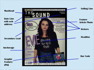
- 1. Masthead Secondary Lead Graphic Feature/ plug Selling Line Feature Article Photo Headline Bar Code Date Line with web address Kickers Anchorage
- 2. In what way does your media product use,develop or challenge forms and conventions of real media products? One of the conventions I used in my music magazine was the use of the left third. In case of the magazine being displayed horizontally on a shelf, I put the headline and masthead on the left hand side. These are some of the most important things on the front cover so putting them on the left third will help attract the target audience. Another convention I used was a selling line along the top of my magazine. I felt this was an important thing to include as it entices people to read and buy the magazine. I chose not to have a menu strip on my magazine as I felt the over have enough information on it already and I did not want to overwhelm the audience. The plug I used was brightly coloured, advertising a free poster, this is something I wanted on the front cover as catches the audiences eye. Other ŌĆ£buzzŌĆØ words such as ŌĆ£exclusiveŌĆØ and ŌĆ£winŌĆØ are also coloured in bright yellow, making them stand out from the other text. This will help influence the audiences decision in buying the magazine. My music magazines front cover also has a centred image with the use of direct mode of address. This is used commonly in magazines as the artist is looking directly down the camera, it makes it feel more personal and helps create a relationship with the reader. My style was intended to create a cult feel so I chose some moody shots and kept the colour scheme quite dark but I thought it was important to add some more feminine colours as I wanted to concentrate on some of the bigger female indie artists like Florence, Haim and Paloma Faith.
- 3. Here you can see the similarities between my magazine to a issues of Q magazine. Both headlines are on the left third. The feature article photographs are both medium shots. It differs as Qs header is only in the top left third where as mine starts in the left third but carries on into the centre Another difference is that my magazine cover has more dead space that the Q cover which is packed text. This is because I did not want to overwhelm the reader.
- 4. He For my contents page I used the left hand side for pages and there numbers. The feature article that was advertised on the front cover has the biggest picture with the page number overlapping. My contents also as a subscription box advertising how to subscribe the magazine. Subheadings to make it easier for the audience to find what they are looking for. Date of when the magazine was published Here I compared mine and Qs contents pages.
- 5. Front Cover Copy Border / Divider Main Feature (with inset pictures) Pictorial insets (of highlights & exclusives) Page numbers (with colours to show kickers and cover lines) Section Header Dateline Section Headers Subscription box Navigation Panel (with headers) Section Banner Captions
- 6. Double page spread For the house style of my magazine, I chose to use black, purple and white. I chose the black and purple as they are both dark colours and I donŌĆÖt think bright colours would have fit the genre. I chose the white as I stands out against the black and purple. My Double page spread is very simple with the interview on one side and the photograph on the other. The only coloured font on the page is the pulled quote, this is so it stand out and grabs the audiences attention. The page on the left contains quite a lot of white space, this is something that adds impact to the page. I chose not to have multiple photographs as I fell having one big was more powerful.
- 7. Headline Section Header Columns Extra information strip Dropped Capital Graphic Feature (along left third) Main Picture Borders Pull Quote White Space (helps to avoid info overload) Page Numbers