Q2
0 likes160 views
The document discusses how a brand identity was established for a horror film called "Paralysis" through its trailer, poster, and magazine cover. Key elements like the main character, antagonist, fonts, and props were featured consistently across all three marketing materials to create recognizability. While maintaining similar styles, each product was also differentiated slightly in things like shot types, brightness levels, and included props. The products were aimed to appeal to both mass and niche horror film audiences and would be distributed widely in theaters, online, and specialty shops.
1 of 13

Recommended
Presentation noir question 3
Presentation noir question 3 Jamieliamconner
╠²
The film could be distributed by Warner Brothers Pictures, a major Hollywood studio. While the film has similarities to the independent film "The Disappearance of Alice Creed", the filmmakers sought to challenge mainstream audiences with art-house sensibilities rather than target only an independent audience. Releasing on the internet could reach a wide audience if the film went viral, but Hollywood distribution through Warner Brothers could support a possible sequel better through established distribution and marketing channels.Presentation noir question 3
Presentation noir question 3 Jamieliamconner
╠²
Our film could be distributed by Warner Brothers Pictures, a major Hollywood studio with experience distributing big films. While the film has art house elements exploring alcoholism and abuse, it aims to challenge mainstream audiences with these sensibilities. Releasing it directly online through platforms like Twitter and Facebook could save on distribution costs but would not generate as much income for a possible sequel. Instead, the filmmakers chose to compromise by working with a major studio to reach a wide audience while maintaining the classic noir themes of pessimism and dark sensibilities.French stereotypes in movies
French stereotypes in moviesAnge Baks
╠²
This document discusses French stereotypes portrayed in movies. It notes that while some stereotypes originate from aspects of French culture, Hollywood movies have exaggerated and portrayed them in a negative light. Stereotypes are useful for storytelling as they allow characters to be easily understood without needing extensive background. However, they become problematic when viewed as accurate representations of an entire group. Media like film have influence over viewers and can shape stereotypes that maintain rejection of certain social groups. While movies aim for realism, any work is ultimately subjective.French stereotypes in movies
French stereotypes in moviesAnge Baks
╠²
This document discusses French stereotypes portrayed in movies. It notes that while some stereotypes originate from aspects of French culture, Hollywood movies have exaggerated and portrayed them in a negative light. Stereotypes are useful for storytelling as they allow characters to be easily understood without needing extensive background. However, they become problematic when viewed as accurate representations of an entire group. Media shapes perceptions, and stereotypes in films can promote rejection of certain social groups. While movies aim for realism, any work is inherently subjective.Homework media poster
Homework media posterSt Peters RC Comprehensive
╠²
The poster depicts a group stranded in a wasteland that appears to be a maze. This suggests an apocalyptic, mysterious, and thrilling story aimed at teenagers interested in survival and action films. The faded colors and artwork create an apocalyptic tone to match the thriller genre. As a sequel, the poster tries to appeal to fans of the previous film through iconic imagery and phrases while still drawing in new viewers with its mysterious atmosphere.What Are Comics? Building A Workable Definition
What Are Comics? Building A Workable Definitionthealisonbailey
╠²
Comics are defined as a medium for storytelling that combines images and words to convey narratives and information, rather than being a genre focused only on superhero tales. They consist of static images, often drawn, that depict the passage of time and involve the creator's intent in their artistic expression. Ultimately, comics encompass a variety of styles and forms, reflecting a unique language of visual symbols.Defining comics
Defining comicstanyasasser
╠²
This document discusses various perspectives on defining the medium of comics. It explores whether comics can be considered a genre, text with pictures, or the 9th art form. The document examines works by Scott McCloud, who argues comics is a medium defined by the closure between panels that allows readers to participate in creating the narrative. The document also discusses other scholars and creators who weigh in on whether formal properties or the invitation to the reader is more essential in defining comics. In the end, the document suggests comics resist strict definition.Jean baudrillard post modernity
Jean baudrillard post modernitysam_beecham
╠²
The document discusses Jean Baudrillard's concept of hyperreality and the collapse of the distinction between real and simulation. It outlines four orders of simulation, with the fourth being simulacra that have no relation to reality and simulate simulations instead. Examples provided include theme parks, political scandals, and lifestyle trends. Hyperreality is defined as a condition where reality is replaced by simulacra, or copies with no original. The division between real and simulation has collapsed, making illusion no longer possible.Form research
Form researchreikomatsumoto318
╠²
There are 5 main aspects that make up the form of a horror film: theme, settings and location, characters, narrative, and iconography. Common horror film themes include supernatural, gothic, slasher, and psychological horror. Typical settings are old, abandoned locations like houses, schools, forests and countryside. Characters of all ages and genders can be used depending in the theme. Narratives usually start with disequilibrium, have a circular structure, and end with the resolution of fear. Iconography like blood, gothic styles, and low lighting help identify the horror genre.Final questionnaire and results
Final questionnaire and resultsreikomatsumoto318
╠²
The document outlines the results of a questionnaire sent out by the author and Tim to gather opinions on key elements of a horror trailer and movie poster. For each element, the document shows the percentage of respondents who preferred each option and indicates the final decision agreed upon by the author and Tim, which in some cases depends on Tim's separate set of results. The elements surveyed include gore, revealing the antagonist, trailer style, main character gender, design style, and elements to feature on the poster.Brand identity
Brand identityreikomatsumoto318
╠²
The document discusses brand identity, house style, layout, and main image for a magazine cover. It states that the coursework will use 'Empire' magazine as a style guide. It also notes that the layout and main image for a film depends on whether it is more of a horror or not, with horror films getting simpler designs. The masthead and film splash logo are designed to fit the magazine's style while not being directly related.Final research
Final researchreikomatsumoto318
╠²
The document discusses four different horror genre fonts and their suitability for conveying supernatural themes. Font 1 is simple with a childlike style, conveying a young main character but not strong horror vibes. Font 2 is the most dramatic with bold lettering, clearly conveying horror. Fonts 3 and 4 have irregular lettering and incomplete endings that could suggest paralysis, harm, or slasher themes instead of the supernatural. In conclusion, Fonts 1 and 2 are best suited to subtly convey supernatural horror through their simplicity and childlike styles without strongly suggesting other genres like gothic or slasher themes.Are we auteurs
Are we auteursreikomatsumoto318
╠²
The document discusses the use of auteur theory and genre conventions in film productions. It applied its signature style through focused shots but could have explored more elements like complex montages. While maintaining an auteur approach, it followed horror film genre criteria to not confuse audiences. Domestic horror was an effective choice as daily locations are familiar yet can harbor unknown dangers, reflecting viewers' real-life stresses and fears within an otherwise secure home environment.Results of interview
Results of interviewreikomatsumoto318
╠²
The document provides strengths and weaknesses for three different designs. The first design uses a red background with a large central black and white image. It has too many fonts and texts. The second focuses on two boys with clean layout and placement of images and text. It has some wordiness and description. The third keeps a black and white theme with professionally lit and framed images, but the two pages look unconnected.Conventions
Conventionsreikomatsumoto318
╠²
The document discusses conventions for magazine layout and design. It analyzes conventions for the front cover, contents page, and double page spreads of both English music magazines like Q and Mojo as well as Asian music magazines. Some key conventions highlighted include placement of the masthead, date, splash headline and cover lines on the front cover and placement of images and brief descriptions on the contents page. Design elements like photographs, colors and layout are also compared between English and Asian music magazine conventions.Constructions front page
Constructions front pagereikomatsumoto318
╠²
This document describes the design process for the front page of a magazine. Key elements include:
1) The designer selected a red background color and added the date in English and Chinese to convey the magazine's focus on Asian pop culture.
2) Headers and cover lines were added to highlight featured articles, celebrities, and content. Different colors were used to clearly separate each element.
3) Photographs of celebrities were cut out, converted to black and white, and placed on the page along with their names to draw attention.
4) Various design elements like fonts, placement, sizing and coloring were adjusted throughout to improve clarity, focus, and conformity with conventions of music magazines.Ancillary form research
Ancillary form researchreikomatsumoto318
╠²
The document discusses the principles of visual literacy, emphasizing the importance of recognizing shapes, colors, textures, and their arrangement to create depth and a dominant reading path on a page. It highlights the rule of thirds as a composition technique that enhances visual interest by placing subjects off-center. Additionally, vertical positioning is noted as a method to guide the audience's gaze downward, facilitating effective communication with the audience.Genre research
Genre researchreikomatsumoto318
╠²
This document provides an overview of key elements of horror genre films. It discusses how horror films play on audiences' emotions and fears of the unknown, with the supernatural being a very popular subgenre. Some common themes in horror include revenge, hauntings, demons, gore, and serial killers. The document also outlines several common subgenres, narrative elements, character archetypes, camera techniques, settings, and iconography in horror films.Summary of technical skills and knowledge
Summary of technical skills and knowledgereikomatsumoto318
╠²
This document summarizes the technical skills and software used for video editing and post-production. It outlines expertise with Adobe After Effects, Photoshop, Lightroom, and Sony Vegas for editing trailers, posters, magazines, and color grading footage. Details are provided on techniques for color correction, adding effects like optical flares and glitches, recording dialogue, editing text, stabilizing shaky footage, and designing sound to startle audiences.Pilot questionnaire
Pilot questionnairereikomatsumoto318
╠²
This document discusses improvements that can be made to a questionnaire for testing audience preferences for a horror movie trailer. It provides examples of both effective and ineffective types of questions. Effective question types include those that assess preferences around pacing, themes, characters, and visual elements like color schemes. Ineffective questions lack clarity, have unclear answer options, or are not relevant to assessing audience tastes. Pilot testing the questionnaire can help refine the questions and improve understanding.Construction of double pages
Construction of double pagesreikomatsumoto318
╠²
The document describes the design process for a double page magazine spread. Key details include placing a cut-out of the subject over a black background on the left page with credits and a headline. On the right page, a cropped tilted photograph replaces the cut-out, with white background providing contrast. Text paragraphs are separated and arranged following the Rule of Thirds and stepping down pattern to guide the eye. Additional cut-outs and photographs with outlines are used to connect the pages visually.Conventions
Conventionsreikomatsumoto318
╠²
The document discusses conventions for magazine layout and design. It analyzes conventions for the front cover, contents page, and double page spreads of both English music magazines like Q and Mojo as well as Asian music magazines. Some key conventions highlighted include placement of the masthead, date, splash headline, photographs and cover lines on the front cover and contents page. For double page spreads, conventions discussed include use of large photographs, standfirsts, headlines and matching colors.How did you use media technologies in the
How did you use media technologies in thereikomatsumoto318
╠²
Primary research through questionnaires provides more accurate results than secondary research as information online may be outdated. While general websites like Google and Yahoo provide easily accessible information, more precise data on the specific topic of horror films can be found on niche websites. Various software like WordPress, Excel, PowerPoint, Photoshop and online resources like YouTube can be used to effectively conduct, organize and present research findings.Cast
Castreikomatsumoto318
╠²
This document proposes several main actors for a student horror film coursework project. It suggests Arron Grant to play the main actor because his appearance and age suit a horror genre and he enjoys horror films. It also recommends Mrs. Liz Loe to play the mother character because she has a caring demeanor and soothing voice. Mr. Loe is proposed as the psychiatrist because his experience as a father could help him portray the role professionally. Mr. Berry and Ms. Gregory, a teacher at the school, are also listed as potential actors for a doctor and teacher role respectively due to their professional appearances and easy accessibility.Evaluation #2
Evaluation #2reikomatsumoto318
╠²
The document summarizes photos taken of John and Charles, two newly introduced Asian musicians, to introduce them to a Western audience. The photos of John looking down and Charles addressing the camera directly aim to convey seriousness as newcomers seeking to establish Asian music in a new culture. Subsequent photos show them having fun to seem more relatable while maintaining confidence in their musical passion and dreams.Are we auteurs
Are we auteursreikomatsumoto318
╠²
This document discusses the elements that make Alfred Hitchcock an auteur director and whether the filmmakers possess similar distinctive directorial styles. It examines Hitchcock's techniques like camera movements, point-of-view shots, lighting, and editing choices. It then analyzes the filmmakers' own uses of panning shots, action matching, unconventional devices, slow motion effects, teleporting edits, and special effects to determine if they have achieved auteur status.In what ways does your media product use, develop or challenge forms and conv...
In what ways does your media product use, develop or challenge forms and conv...reikomatsumoto318
╠²
The document provides a checklist for conventions used in film posters and magazines. It analyzes a poster and magazine cover created for a horror film called "Shadows of the Woods". For the poster, it notes the use of a compact foreground focusing on the main character with dense trees in the background to convey his isolation. For the magazine cover, it suggests making the lighting brighter to catch readers' attention and differentiating the colors more from the film to make the cover stand out. It also emphasizes appealing specifically to horror fans by using a low-key color scheme and including obvious horror elements.Evaluation Question 2
Evaluation Question 2faridak1
╠²
The products are linked through their shared setting of London, iconography of guns and suits, and inclusion of one main actor in each. The film's unique selling points are its London setting, which is rare for gangster films, and its diverse cast, which is rarely seen in mainstream marketed films. The marketing package would include a portrait poster for various indoor displays, and premiering the trailer on YouTube to take advantage of online audiences.Media Evaluation Question 2
Media Evaluation Question 2sev06lt1
╠²
The combination of the main product (a short horror film) and ancillary texts (a film poster and magazine review) is effective because they maintain continuity through shared themes, imagery, and brand identity. Specifically, all products use a Gothic color scheme and feature a villainous mask to symbolize the protagonist's psyche. Together, the products serve to advertise and promote the short film, with the poster generating anticipation and the review providing more information to interested audiences. The mask logo and villain help link the separate mediums into a cohesive promotional package for the horror genre product.More Related Content
Viewers also liked (20)
Form research
Form researchreikomatsumoto318
╠²
There are 5 main aspects that make up the form of a horror film: theme, settings and location, characters, narrative, and iconography. Common horror film themes include supernatural, gothic, slasher, and psychological horror. Typical settings are old, abandoned locations like houses, schools, forests and countryside. Characters of all ages and genders can be used depending in the theme. Narratives usually start with disequilibrium, have a circular structure, and end with the resolution of fear. Iconography like blood, gothic styles, and low lighting help identify the horror genre.Final questionnaire and results
Final questionnaire and resultsreikomatsumoto318
╠²
The document outlines the results of a questionnaire sent out by the author and Tim to gather opinions on key elements of a horror trailer and movie poster. For each element, the document shows the percentage of respondents who preferred each option and indicates the final decision agreed upon by the author and Tim, which in some cases depends on Tim's separate set of results. The elements surveyed include gore, revealing the antagonist, trailer style, main character gender, design style, and elements to feature on the poster.Brand identity
Brand identityreikomatsumoto318
╠²
The document discusses brand identity, house style, layout, and main image for a magazine cover. It states that the coursework will use 'Empire' magazine as a style guide. It also notes that the layout and main image for a film depends on whether it is more of a horror or not, with horror films getting simpler designs. The masthead and film splash logo are designed to fit the magazine's style while not being directly related.Final research
Final researchreikomatsumoto318
╠²
The document discusses four different horror genre fonts and their suitability for conveying supernatural themes. Font 1 is simple with a childlike style, conveying a young main character but not strong horror vibes. Font 2 is the most dramatic with bold lettering, clearly conveying horror. Fonts 3 and 4 have irregular lettering and incomplete endings that could suggest paralysis, harm, or slasher themes instead of the supernatural. In conclusion, Fonts 1 and 2 are best suited to subtly convey supernatural horror through their simplicity and childlike styles without strongly suggesting other genres like gothic or slasher themes.Are we auteurs
Are we auteursreikomatsumoto318
╠²
The document discusses the use of auteur theory and genre conventions in film productions. It applied its signature style through focused shots but could have explored more elements like complex montages. While maintaining an auteur approach, it followed horror film genre criteria to not confuse audiences. Domestic horror was an effective choice as daily locations are familiar yet can harbor unknown dangers, reflecting viewers' real-life stresses and fears within an otherwise secure home environment.Results of interview
Results of interviewreikomatsumoto318
╠²
The document provides strengths and weaknesses for three different designs. The first design uses a red background with a large central black and white image. It has too many fonts and texts. The second focuses on two boys with clean layout and placement of images and text. It has some wordiness and description. The third keeps a black and white theme with professionally lit and framed images, but the two pages look unconnected.Conventions
Conventionsreikomatsumoto318
╠²
The document discusses conventions for magazine layout and design. It analyzes conventions for the front cover, contents page, and double page spreads of both English music magazines like Q and Mojo as well as Asian music magazines. Some key conventions highlighted include placement of the masthead, date, splash headline and cover lines on the front cover and placement of images and brief descriptions on the contents page. Design elements like photographs, colors and layout are also compared between English and Asian music magazine conventions.Constructions front page
Constructions front pagereikomatsumoto318
╠²
This document describes the design process for the front page of a magazine. Key elements include:
1) The designer selected a red background color and added the date in English and Chinese to convey the magazine's focus on Asian pop culture.
2) Headers and cover lines were added to highlight featured articles, celebrities, and content. Different colors were used to clearly separate each element.
3) Photographs of celebrities were cut out, converted to black and white, and placed on the page along with their names to draw attention.
4) Various design elements like fonts, placement, sizing and coloring were adjusted throughout to improve clarity, focus, and conformity with conventions of music magazines.Ancillary form research
Ancillary form researchreikomatsumoto318
╠²
The document discusses the principles of visual literacy, emphasizing the importance of recognizing shapes, colors, textures, and their arrangement to create depth and a dominant reading path on a page. It highlights the rule of thirds as a composition technique that enhances visual interest by placing subjects off-center. Additionally, vertical positioning is noted as a method to guide the audience's gaze downward, facilitating effective communication with the audience.Genre research
Genre researchreikomatsumoto318
╠²
This document provides an overview of key elements of horror genre films. It discusses how horror films play on audiences' emotions and fears of the unknown, with the supernatural being a very popular subgenre. Some common themes in horror include revenge, hauntings, demons, gore, and serial killers. The document also outlines several common subgenres, narrative elements, character archetypes, camera techniques, settings, and iconography in horror films.Summary of technical skills and knowledge
Summary of technical skills and knowledgereikomatsumoto318
╠²
This document summarizes the technical skills and software used for video editing and post-production. It outlines expertise with Adobe After Effects, Photoshop, Lightroom, and Sony Vegas for editing trailers, posters, magazines, and color grading footage. Details are provided on techniques for color correction, adding effects like optical flares and glitches, recording dialogue, editing text, stabilizing shaky footage, and designing sound to startle audiences.Pilot questionnaire
Pilot questionnairereikomatsumoto318
╠²
This document discusses improvements that can be made to a questionnaire for testing audience preferences for a horror movie trailer. It provides examples of both effective and ineffective types of questions. Effective question types include those that assess preferences around pacing, themes, characters, and visual elements like color schemes. Ineffective questions lack clarity, have unclear answer options, or are not relevant to assessing audience tastes. Pilot testing the questionnaire can help refine the questions and improve understanding.Construction of double pages
Construction of double pagesreikomatsumoto318
╠²
The document describes the design process for a double page magazine spread. Key details include placing a cut-out of the subject over a black background on the left page with credits and a headline. On the right page, a cropped tilted photograph replaces the cut-out, with white background providing contrast. Text paragraphs are separated and arranged following the Rule of Thirds and stepping down pattern to guide the eye. Additional cut-outs and photographs with outlines are used to connect the pages visually.Conventions
Conventionsreikomatsumoto318
╠²
The document discusses conventions for magazine layout and design. It analyzes conventions for the front cover, contents page, and double page spreads of both English music magazines like Q and Mojo as well as Asian music magazines. Some key conventions highlighted include placement of the masthead, date, splash headline, photographs and cover lines on the front cover and contents page. For double page spreads, conventions discussed include use of large photographs, standfirsts, headlines and matching colors.How did you use media technologies in the
How did you use media technologies in thereikomatsumoto318
╠²
Primary research through questionnaires provides more accurate results than secondary research as information online may be outdated. While general websites like Google and Yahoo provide easily accessible information, more precise data on the specific topic of horror films can be found on niche websites. Various software like WordPress, Excel, PowerPoint, Photoshop and online resources like YouTube can be used to effectively conduct, organize and present research findings.Cast
Castreikomatsumoto318
╠²
This document proposes several main actors for a student horror film coursework project. It suggests Arron Grant to play the main actor because his appearance and age suit a horror genre and he enjoys horror films. It also recommends Mrs. Liz Loe to play the mother character because she has a caring demeanor and soothing voice. Mr. Loe is proposed as the psychiatrist because his experience as a father could help him portray the role professionally. Mr. Berry and Ms. Gregory, a teacher at the school, are also listed as potential actors for a doctor and teacher role respectively due to their professional appearances and easy accessibility.Evaluation #2
Evaluation #2reikomatsumoto318
╠²
The document summarizes photos taken of John and Charles, two newly introduced Asian musicians, to introduce them to a Western audience. The photos of John looking down and Charles addressing the camera directly aim to convey seriousness as newcomers seeking to establish Asian music in a new culture. Subsequent photos show them having fun to seem more relatable while maintaining confidence in their musical passion and dreams.Are we auteurs
Are we auteursreikomatsumoto318
╠²
This document discusses the elements that make Alfred Hitchcock an auteur director and whether the filmmakers possess similar distinctive directorial styles. It examines Hitchcock's techniques like camera movements, point-of-view shots, lighting, and editing choices. It then analyzes the filmmakers' own uses of panning shots, action matching, unconventional devices, slow motion effects, teleporting edits, and special effects to determine if they have achieved auteur status.In what ways does your media product use, develop or challenge forms and conv...
In what ways does your media product use, develop or challenge forms and conv...reikomatsumoto318
╠²
The document provides a checklist for conventions used in film posters and magazines. It analyzes a poster and magazine cover created for a horror film called "Shadows of the Woods". For the poster, it notes the use of a compact foreground focusing on the main character with dense trees in the background to convey his isolation. For the magazine cover, it suggests making the lighting brighter to catch readers' attention and differentiating the colors more from the film to make the cover stand out. It also emphasizes appealing specifically to horror fans by using a low-key color scheme and including obvious horror elements.Similar to Q2 (20)
Evaluation Question 2
Evaluation Question 2faridak1
╠²
The products are linked through their shared setting of London, iconography of guns and suits, and inclusion of one main actor in each. The film's unique selling points are its London setting, which is rare for gangster films, and its diverse cast, which is rarely seen in mainstream marketed films. The marketing package would include a portrait poster for various indoor displays, and premiering the trailer on YouTube to take advantage of online audiences.Media Evaluation Question 2
Media Evaluation Question 2sev06lt1
╠²
The combination of the main product (a short horror film) and ancillary texts (a film poster and magazine review) is effective because they maintain continuity through shared themes, imagery, and brand identity. Specifically, all products use a Gothic color scheme and feature a villainous mask to symbolize the protagonist's psyche. Together, the products serve to advertise and promote the short film, with the poster generating anticipation and the review providing more information to interested audiences. The mask logo and villain help link the separate mediums into a cohesive promotional package for the horror genre product.Final Media Proposal.docx
Final Media Proposal.docxShxnaii
╠²
N/A
BUDGET
- Photoshop License: ┬Ż10/month
- Camera: ┬Ż200 (owned)
- Print Costs: ┬Ż100 for 100 posters
- Model Fees: ┬Ż50 each x 2 = ┬Ż100
- Location Fees: ┬Ż50
Total Budget: ┬Ż460Profile
ProfileTimLoe
╠²
The document discusses a magazine profile for a proposed horror magazine. It would target audiences aged 15-25, with an income bracket of C1-E. A niche independent publishing house would be best suited to publish the horror magazine, as with Shroud Publishing's niche magazine. While a niche audience is ideal given their interest in horror, marketing only through the niche magazine could limit the potential audience for the horror film being promoted. Students and the higher income bracket magazine audience would also be part of the target audience for the horror film trailer.Ad campaign p2 p3
Ad campaign p2 p3bobby11669
╠²
The document provides details on pre-production planning for advertising a horror film campaign. It discusses using billboards, bus stops, and train stations to advertise. Color palettes can set atmosphere and mood. The film will include dark scenes, ominous music, and elements from films like Insidious and The Conjuring to invoke fear. Merchandise like cups and clothes will boost revenue. Social media will be used to generate exposure. Characters may represent struggles to give audiences someone to relate to. The goal is to create eye-catching billboards and ads around the city to get audiences interested before the film is viewed and boost sales and a fan base. Inspiration comes from classic horrors like Psycho that established format andRedbull
Redbullbobby11669
╠²
The document provides details on pre-production planning for advertising a horror film campaign. It discusses using billboards, bus stops, and train stations to advertise. Color palettes can set atmosphere and mood. The film will include dark scenes, ominous music, and elements from films like Insidious and The Conjuring to invoke fear. Merchandise like cups and clothes will boost revenue. Social media will be used to generate exposure. Characters may represent struggles to give audiences someone to relate to. The goal is to create eye-catching billboards and ads around the city to get audiences interested before the film is viewed and boost sales. Inspiration comes from classic horrors like Psycho that established format and controversial films like ATarget audience research objective 1
Target audience research objective 1kranns
╠²
This document discusses the distribution, exhibition, consumption, and promotion of social realism films. It notes that many distributors of social realism films are non-profit organizations focused on the aesthetics of film rather than profit. The advertisements for social realism films target more sophisticated audiences through specialized magazines rather than mainstream outlets. Exhibition of these films occurs in art houses like Arnolfini and Picturehouse that present both mainstream and social realism films to expose larger audiences to different types of films. Reviews of social realism films on generalized sites can be unfairly harsh from audiences unfamiliar with the genre.Q2
Q2Arin14
╠²
The document discusses the marketing of a gangster film set in London with a diverse cast. It explains that the poster, magazine, and trailer for the film incorporate consistent iconography, actors, and settings to clearly link them. The film's unique selling points are its London location, which subverts gangster film conventions, and its diverse cast, which is rare for mainstream marketing. For marketing, the poster is in portrait format for various display locations to fully immerse viewers in the narrative. The trailer would hypothetically premiere on YouTube, which is where audiences increasingly find new trailers.Q2
Q2Arin14
╠²
The document discusses the marketing of a gangster film set in London with a diverse cast. It explains that the poster, magazine, and trailer for the film incorporate consistent iconography like guns and suits to clearly link them. While the setting of London is evident in the trailer, it is not shown in the poster or magazine. The document highlights the film's unique selling points as being set and filmed in London, which is rare for a gangster genre film, and having a diverse cast, which is atypical for mainstream marketing. It also details that the poster was made vertical to allow display in various public settings like buses and subways.question 2
question 2Filip97
╠²
The document discusses marketing strategies for a gangster film set in London. It explains that the poster, magazine, and trailer for the film incorporate consistent iconography, actors, and settings to clearly link the marketing materials. The film's unique selling points are its London setting, which subverts gangster film conventions that are usually set in American cities, and its diverse cast. Regarding marketing packages, the document states that a portrait poster format was chosen to allow displays in various public spaces, and that the trailer would hypothetically be premiered on YouTube to take advantage of online audiences.Warm bodies
Warm bodiesKB160923
╠²
The document tracks the marketing campaign for the 2013 romantic zombie comedy movie Warm Bodies, starring Nicholas Hoult and Teresa Palmer. It provides timelines and descriptions of promotional materials released between June 2012 and January 2013, including teaser posters, trailers, clips, and propaganda posters. The marketing campaign achieved a consistent brand identity by featuring the same main characters and using the same color scheme, font, and actors across its various posters, trailers, and other promotional content released on different media platforms worldwide.Ancillary Form Research
Ancillary Form ResearchGeorgeMcC
╠²
The document discusses conventions of movie posters and radio advertisements. It notes that movie posters typically feature the title in largest font with actor names in smaller text. Posters aim to advertise films and come in various sizes. Radio advertisements focus more on atmospheric elements to convey a sense of the production rather than visuals. This allows listeners to imagine what is happening. Horror radio ads are particularly effective as the genre relies on tension and fear created through music and sound effects. An example of a successful horror radio ad discussed is one for "The Amityville Horror" which uses repeating sounds to create an unnerving atmosphere and reiterates the film's tagline.Question 4
Question 4Burtoncalvin
╠²
We have decided to target 15-30 year olds for our film since they make up the majority of cinema goers. However, focusing on this niche art house market means our film will only be shown in select theaters like the Phoenix that cater to smaller audiences. While this age group will relate best to the younger characters and genre, targeting them exclusively risks limiting our audience since most people in this demographic tend to follow mainstream options instead of art house theaters.Evaluation 2 (1)
Evaluation 2 (1)Jake Shelvey
╠²
The document discusses the effectiveness of a promotional package for the film "The Basement" that includes posters, a magazine cover, and a trailer. It analyzes how successful each piece is individually and together at appealing to the target audience. Key strengths included establishing symbiosis between the pieces through consistent visual themes and evolving the narrative from one piece to the next. Feedback from focus groups was influential in shaping elements of the package to better align with the preferences of the target audience.Target audience research 1
Target audience research 1kranns
╠²
This document discusses the distribution, exhibition, and consumption of social realism films in the UK. It notes that many distributors of social realism films are non-profit organizations focused on the aesthetics of film rather than profit. Exhibition of these films is done through arthouse cinemas like Arnolfini and Cornerhouse that cater to sophisticated audiences through simple, calming designs on their websites. Reviews of social realism films on sites like IMDb tend to be more precise and critical from viewers familiar with the genre, while reviews on LoveFilm can be harsh and ignorant from mainstream audiences unfamiliar with the artistic elements of the films.The distribution process
The distribution processdropdeadned
╠²
The distributor must carefully consider the target audience for a film, including their demographic and psychographic profiles, interests, and media consumption habits. This allows the distributor to effectively place advertisements and maximize profits. Distributors also look for secondary audiences who might be appealed to, and evaluate major cast/crew to feature prominently based on their past successes at attracting audiences. Analyzing recent successful similar films also guides distributors' marketing strategies.Magazine research sophie dixon
Magazine research sophie dixonsophiedixon44
╠²
This document discusses several film magazines, including their target audiences, content, and design elements. Empire magazine targets males aged 18-50 and focuses on reviews and cast interviews. Total Film also targets 17-35 year-olds and provides in-depth film information. Sight and Sound magazine has a mostly male audience who are interested in art house films. Comparing Empire and Total Film, both use a central character image on the cover surrounded by additional headlines.Question 2
Question 2amber_jackson
╠²
The document discusses marketing strategies for the film "Eat the Rich". It would initially be released exclusively at an independent cinema to generate buzz. After two weeks, it would be released online to appeal to younger audiences. Positive reviews from credible critics would be promoted on social media. The film's characters represent different social classes to engage the target middle-class audience. The trailer uses unique editing to portray differences between the rich and poor. A magazine profile would feature circular images of wealthy and poor areas to accentuate class divides.Effectiveness of my main product and ancillary tasks.
Effectiveness of my main product and ancillary tasks.LauraaRobinson
╠²
Laura Robinson created a poster and magazine cover to advertise a horror film trailer as part of her ancillary tasks. Both the poster and magazine cover used red writing and manipulated creepy images to convey a sense of danger and unease. The poster focused on the film's title in the center to grab attention, while the magazine cover emphasized hooks and storylines. Advertising through ancillary products is important for generating buzz and attracting audiences to see the full film.Q2
Q2charlottepl
╠²
The document discusses the effectiveness of combining a film trailer, poster, and magazine to market a film targeted at 15-25 year olds. It summarizes the research conducted on existing marketing materials and how various elements were incorporated into the products created. Consistency across the products was emphasized, including using the same lead actress image, consistent color schemes and fonts. Feedback confirmed the genre and target audience were clear and the connection between the three products was recognizable.More from reikomatsumoto318 (14)
Sample audience
Sample audiencereikomatsumoto318
╠²
The document describes conducting audience research to test a horror film trailer. Eight audience members were sampled based on their interest levels in horror films. They watched the trailer and selected an icon - satisfied, dissatisfied, scared, or confused - to represent their reaction. They also provided brief opinions and suggestions for improvement. The audience feedback will help gauge the effectiveness of the trailer and identify any necessary changes.Audience
Audiencereikomatsumoto318
╠²
The document profiles different cinema audience segments and their preferences, including Hero Seekers, Impulsive Materialists, Film Fanatics, Impressionable Socialites, Modern Parents, and Fun Lovers. It also outlines factors that influence audience decisions such as genre, stars, directors, marketing, and atmosphere. Viewers are turned off by confusing genres, unpopular talent, small production companies, boring plots, poor marketing, and uncomfortable theaters. Females prefer comedy and romance while males prefer sci-fi, action adventure, and horror genres more than females.Softwares
Softwaresreikomatsumoto318
╠²
This document discusses several popular video and image editing softwares, including Sony Vegas for non-linear video editing with unlimited audio tracks, Adobe After Effects for post-production visual effects and animation, Adobe Photoshop for 2D and 3D graphics editing, and Adobe Lightroom for organizing and editing large photo libraries.Shock till you drop
Shock till you dropreikomatsumoto318
╠²
The document discusses the marketing strategies for the horror film Sinister, including releasing teaser photos early to generate interest, timing the release around Halloween, and releasing before competitor films. It also discusses using a motion poster and social media promotions to engage audiences and build hype for the film.Alfred hitchcock
Alfred hitchcockreikomatsumoto318
╠²
Alfred Hitchcock was an English film director and producer known as the "Master of Suspense" for his innovative work in the thriller and psychological horror genres. Some of his most famous films include Psycho (1960), which is considered his masterpiece and one that plays on the audience's psychological fears through its visual horror. Hitchcock had a unique auteur and recognizable directorial style, controlling all aspects of filmmaking from camera work and editing to sound, lighting, setting, and theme.Decisions made according to the focus group
Decisions made according to the focus groupreikomatsumoto318
╠²
The document provides details on the visual elements and style of a horror film, including:
- The protagonist will wear a dark costume without a mask and not be fully revealed, while both the protagonist and antagonist will appear on a magazine cover but only the protagonist will be shown on a poster with the antagonist's shadow.
- The house setting will not be run-down and preferably located in a remote area.
- The film trailer will open with a shot of the antagonist after the title card and use orchestral music commonly found in horror films.
- Shots in the poster will be medium or long to portray the atmosphere while fitting other text elements.Empire & total film
Empire & total filmreikomatsumoto318
╠²
The document compares and contrasts the cover designs of two mass market film magazines, Empire and Total Film. Both magazines use bold fonts and direct addresses from cover people in low-key lighting. Empire sometimes changes its masthead design to match the tone of the featured film, while Total Film always keeps the same masthead design. In contrast, niche film magazines like Sight and Sound target more educated audiences with simpler designs featuring thinner fonts, high-key lighting, and clean layouts.Final pitch
Final pitchreikomatsumoto318
╠²
The document describes a boy who encounters a demonic entity called "the other" in his bedroom. His parents search online about demons while the boy grabs a nurse's arms at the hospital. The film involves institutions and features low lighting with a page reading the word "DEMON" and the boy slamming it, coming soon with a release date.Textual analysis of ŌĆśthe killŌĆÖ
Textual analysis of ŌĆśthe killŌĆÖreikomatsumoto318
╠²
This document analyzes the strengths and weaknesses of the trailer for the film "The Kill". It notes that the trailer uses conventional techniques like low-key lighting, fade in and fade out shots, and quick cuts. However, it identifies weaknesses such as the lighting being too dark, the shots and black screens between them being too short, and the voiceover and lighting not matching the horror genre conventions. Areas for improvement include using fade shots strategically and maintaining consistent low-key lighting while lengthening some shots.Are we auteurs?
Are we auteurs?reikomatsumoto318
╠²
The document lists characteristics of an auteur filmmaker according to Alfred Hitchcock, including specific camera techniques, editing styles, and narrative devices. It then analyzes a preliminary film task to see if it exhibits these traits. While the task demonstrated some techniques like camera movements and focus, it was found lacking in many key auteur qualities such as single take shots, complex editing, and misleading narrative elements. Therefore, the document determines the preliminary task does not fully qualify as an auteur work based on the conventional definition.Comparison of my product and an existing product
Comparison of my product and an existing productreikomatsumoto318
╠²
The document compares and contrasts the design similarities and differences between Q magazine and another magazine product. Some key similarities include the use of color schemes, coverlines, page numbers, and images. However, there are also notable differences such as color tones, additional images, placement of page numbers and coverlines, and supplemental design elements like fact files and introductory quotes.Evaluation #2
Evaluation #2reikomatsumoto318
╠²
The document discusses marketing strategies for different demographic groups. For teenagers, an active and passionate approach with bright colors appeals to their desire for new experiences without fear of failure. For middle aged customers, a calm, unique and non-dominant approach using symbols of seriousness and quality appeals by guaranteeing the value of the music.Institution
Institutionreikomatsumoto318
╠²
The document discusses launching a new Asian pop music magazine. It will focus on a niche market but aims to have crossover appeal beyond the UK. The creator chose Bauer Media Group as the distributor since it is the largest publishing group in Europe and publishes successful music magazines. The document also recommends using web 2.0 and social media marketing, particularly through Facebook, to connect with younger digital audiences and promote the magazine online. This will help the magazine stay relevant and share the latest Asian music news.Q2
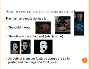
- 2. HOW DID WE ESTABLISH A BRAND IDENTITY? The main and most obvious isŌĆ” ’éó The child ŌĆō Arran ’éó The other ŌĆō the antagonist (which is me) ’éó As both of them are featured across the trailer, poster and the magazine front cover
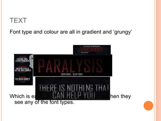
- 3. TEXT Font type and colour are all in gradient and ŌĆśgrungyŌĆÖ Which is easily-recognisible to audience when they see any of the font types.
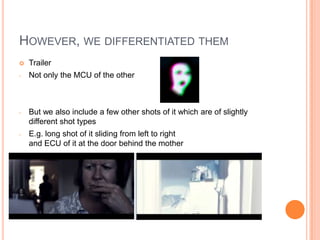
- 4. HOWEVER, WE DIFFERENTIATED THEM ’éó Trailer - Not only the MCU of the other - But we also include a few other shots of it which are of slightly different shot types - E.g. long shot of it sliding from left to right and ECU of it at the door behind the mother
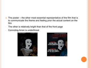
- 5. ’éó The poster ŌĆō the other most essential representative of the film that is to communicate the theme and feeling prior the actual content on the film - The other is relatively bright than that of the front page - Connoting Arran is underthreat
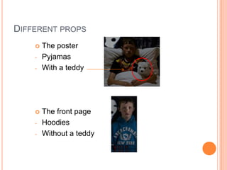
- 6. DIFFERENT PROPS ’éó The poster - Pyjamas - With a teddy ’éó The front page - Hoodies - Without a teddy
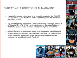
- 7. ŌĆśCREATINGŌĆÖ A HORROR FILM MAGAZINE ’éó Instead of producing a front cover of a normal film magazine like ŌĆśEMPIREŌĆÖ and ŌĆśTOTAL FILMŌĆÖ, we decided to create a niche magazine that is dedicated only for horror films ’éó E.g. according to my research on ŌĆśCohesive Marketing CampaignŌĆÖ, I based it on ŌĆśSHOCK TILL YOU DROPŌĆÖ, a niche website only specialised for horror films to the favour of niche audience who specifically love horror films ’éó Although horror is a mass market genre, a niche magazine may allow us to - target or attract more audience who perhaps might ŌĆślove just the horror filmsŌĆÖ - also to secure the ŌĆśwatchabilityŌĆÖ of the film which means there must be audience that would like to watch ŌĆśParalysisŌĆÖ
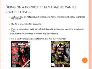
- 8. BEING ON A HORROR FILM MAGAZINE CAN BE ARGUED THATŌĆ” ’éó Audience that are not particularly interested in horror films may deliberately skip/ignore the section ’éó But if it is on a niche film magazine ’éó Every audience that read it will definitely look at it and have an idea if the film attracts the, ( of course the actual interest in the film may be subjective ) ’éó but at least ŌĆśParalysisŌĆÖ is one of the film that they may remember
- 9. IT COULD ALSO BE ARGUED THATŌĆ” ’éó By not publishing in a mass-market magazine might alternatively lower the appearance of the film to film audience which may like to be popular/grab hold other genre-audienceŌĆÖs attention
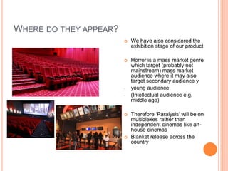
- 10. WHERE DO THEY APPEAR? ’éó We have also considered the exhibition stage of our product ’éó Horror is a mass market genre which target (probably not mainstream) mass market audience where it may also target secondary audience y - young audience - (Intellectual audience e.g. middle age) ’éó Therefore ŌĆśParalysisŌĆÖ will be on multiplexes rather than independent cinemas like art- house cinemas ’éó Blanket release across the country
- 11. ’éó The trailer will be shown/advertised in most TV channels (except kidŌĆÖs channel) to increase appearance thus securing the popularity ’éó It will also be advertised via web 2.0 (e.g. - As they are below-the-line which means they are free - May further develop popularity / get more attention especially from digital natives whom are grown in this technologically proliferated world
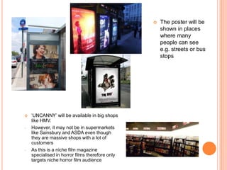
- 12. ’éó The poster will be shown in places where many people can see e.g. streets or bus stops ’éó ŌĆśUNCANNYŌĆÖ will be available in big shops like HMV. - However, it may not be in supermarkets like Sainsbury and ASDA even though they are massive shops with a lot of customers - As this is a niche film magazine specialised in horror films therefore only targets niche horror film audience
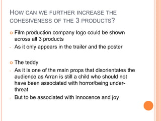
- 13. HOW CAN WE FURTHER INCREASE THE COHESIVENESS OF THE 3 PRODUCTS? ’éó Film production company logo could be shown across all 3 products - As it only appears in the trailer and the poster ’éó The teddy - As it is one of the main props that disorientates the audience as Arran is still a child who should not have been associated with horror/being under- threat - But to be associated with innocence and joy