Question 1
- 1. Question 1 Magazine Cover In what ways does your media products use, develop and challenge forms and conventions of real media products?
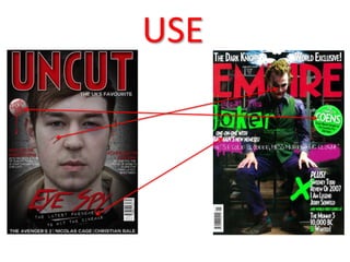
- 2. USE
- 3. USE âĒ I created a similar âstickerâ icon to that which was used by Empire. I used a two layer icon and made sure all the features of the sticker were coloured to match my colour scheme. âĒ I also used the layout of my film title and slug line. I made sure that I use a font that related to my genre and trailer as well as layering them on top of one another. However I did move it to the centre of the page instead of the left hand side. âĒ I also used make up to help project my genre and help link the magazine cover to my poster and trailer.
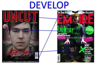
- 4. DEVELOP
- 5. DEVELOP âĒ I used a similar font for my masthead called Crystal Deco. However, I added an âinner shadowâ blending option along with a white stroke to make it different. I also made it slightly bigger because I didnât include a header. This way, I was able to create a very similar masthead with my own twist on it to make it more unique. âĒ For my sticker icon, I added a gradient effect to make it more three dimensional as well as a blood dribble so that it made a stronger link to my genre. I also made it slightly smaller than the sticker featured in Empire magazine so that it didnât cover up my models face or have too large an impact on my cover. âĒ Instead of using a header, I decided to add a footer to the bottom of the page so that my masthead stood out more and didnât touch my modelâs face. I also used the footer to show what would feature in my magazine instead of putting more emphasis on my film. âĒ I also liked the way the magazine used spray painted icons on the magazine and I tried to recreate this style in the font choice for my film title. I decided to add a drop shadow to the text as well as making it the red that featured in my colour scheme so that it helped tie the page together.
- 6. CHALLENGE
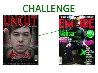
- 7. CHALLENGE For the areas where I have challenged this magazine, I use a close up of my modelâs face instead of a long-shot that was used in the Empire cover I analyzed. I used a close up so I could emphasise the cuts and bruises on his face which would be lost if I used a long shot. This differs from the Empire magazine cover because they use the iconic make up of The Dark Knightâs (2008) âThe Jokerâ.