Quick email best practices overview
- 1. Design Tips for 2012 Quick email best practices overview
- 2. BILL POWELL Inspiration Specialist @billpowell LISA WESTER Intelligence Officer @inboxorange
- 3. BEST PRACTICES WHAT is the point WHY should they care HOW do they take action People donŌĆÖt read, they scan.
- 4. FIVE STAGES OF VIEWING EMAILS 1. from name 2. subject line 3. preview pane 4. open (pre-scroll) 5. full open
- 5. FROM NAME B2B company monthly newsletter test: Unique Open Rate comparing the Sales Representative to the Company name was 2.82% higher after a rela- tionship was formed. The Trend line below shows growth in a B2C company where purchase behavior played a role in deciding who to send from which resulted in a 2% and eventually 3% increase in open rate. More significant is the consistent decrease in the unsubscribe rate over time.
- 6. cff SUBJECT LINES cfff best practices ŌĆōIntrigue ŌĆōAvoid spammy words ŌĆōFocus on benefits ŌĆōUse pyramid writing ŌĆōGrab them with first 15 characters
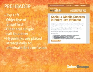
- 9. PREHEADER ŌĆōTop Left ŌĆōObjective of email first ŌĆōClear and simple call to action ŌĆōHyperlinks are placed strategically to eliminate link confusion
- 10. PREHEADER
- 11. PREVIEW PANE
- 12. PREVIEW PANE best practices ŌĆōSell the next step ŌĆōMake effecient use of space ŌĆōMove non-critical things down ŌĆōKey on top left of email ŌĆōUse alt tags ŌĆōBrand yourself
- 13. BODY OF EMAIL best practices ŌĆōUse a template ŌĆōUse compelling headlines ŌĆōPictures! With Alt Tags!! ŌĆōLess is so much more. ŌĆōDonŌĆÖt make them think ŌĆōRemember the text version
- 14. BODY OF EMAIL
- 16. BASIC MOBILE READY ŌĆōKey on subject line and preheader ŌĆōKeep your layout simple ŌĆōDesign for fat fingers ŌĆōEnlarge fonts ŌĆōUse ŌĆśaltŌĆÖ tags ŌĆōBe obvious on what they should do ŌĆōFewer images is better Image courtesy of http://webdesignerwall.com
- 18. KEY TAKEAWAYS 1. Subject line is first thought, not last. 2. Plan for less, not more. 3. Mobile use is growingŌĆöconsider every decision with mobile in mind. 4. Provide good content. 5. Use engagement to measure
- 19. Demonstration Next Webinar: Tuesday, January 24 ŌĆ£Writing to the PointŌĆØ Presented by Christina Noll, Influence Architect and Lisa Wester, Intelligence Director 11:00 - 12:00 EST


