

![» An implementation
<div data-picture data-alt="Frameworks Timber - Timber Framing" id="home-background">
<div data-src=/slideshow/responsive-images-fcip-july-2013/24418594/"/wp-content/themes/fwt/images/home-background-600-n1.jpg"></div>
<div data-src="/wp-content/themes/fwt/images/home-background-800-n1.jpg" data-
media="(min-width: 601px) and (max-width: 800px)"></div>
<div data-src="/wp-content/themes/fwt/images/home-background-1200m.jpg" data-
media="(min-width: 801px) and (max-width: 1200px)"></div>
<div data-src="/wp-content/themes/fwt/images/home-background-1500m.jpg" data-
media="(min-width: 1201px) and (max-width: 1500px)"></div>
<div data-src="/wp-content/themes/fwt/images/home-background-2000m.jpg" data-
media="(min-width: 1501px) and (max-width: 2000px)"></div>
<div data-src="/wp-content/themes/fwt/images/home-background-5000.jpg" data-
media="(min-width: 2001px)"></div>
<!--[if (lte IE 9) & (!IEMobile)]>
<div data-src="/wp-content/themes/fwt/images/home-background-2000m.jpg"></div>
<![endif]-->
<noscript>
<img src="/wp-content/themes/fwt/images/home-background-600.jpg"
alt="Frameworks Timber - Timber Framing">
</noscript>
</div>](https://image.slidesharecdn.com/responsiveimagesfcipjuly2013-130719054142-phpapp02/85/Responsive-Images-FCIP-July-2013-14-320.jpg)


![» A magic bullet
code.google.com/p/css3-mediaqueries-js/
âą IE5 â IE8
âą Firefox 1 & 2
âą Safari 2
âą Legacy, if you only care about IE5 â IE8:
<!--[if lt IE 9]>
<script type="text/javascript" src=/slideshow/responsive-images-fcip-july-2013/24418594/"js/css3-mediaqueries.js"></script>
<![endif]-->](https://image.slidesharecdn.com/responsiveimagesfcipjuly2013-130719054142-phpapp02/85/Responsive-Images-FCIP-July-2013-24-320.jpg)
Responsive Images FCIP July 2013
- 1. » Responsive ImagesResponsive Images Fort Collins Internet ProfessionalsFort Collins Internet Professionals July 18, 2013July 18, 2013
- 2. » Goal 1: Scaling Images
- 3. » Goal 1: Scaling Images ⹠Auto-scaling ⹠as viewport is resized ⹠for different devices (different screen widths)
- 4. » The Key to Responsive Images img { max-width: 100%; } âą Important: in the HTML, donât specify height and width attributes on images
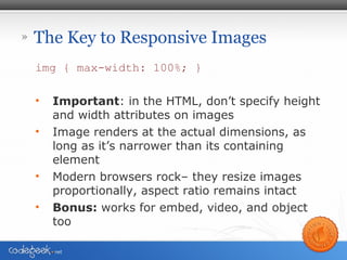
- 5. » The Key to Responsive Images img { max-width: 100%; } âą Important: in the HTML, donât specify height and width attributes on images âą Image renders at the actual dimensions, as long as itâs narrower than its containing element âą Modern browsers rockâ they resize images proportionally, aspect ratio remains intact
- 6. » The Key to Responsive Images img { max-width: 100%; } âą Important: in the HTML, donât specify height and width attributes on images âą Image renders at the actual dimensions, as long as itâs narrower than its containing element âą Modern browsers rockâ they resize images proportionally, aspect ratio remains intact âą Bonus: works for embed, video, and object too
- 7. » Implementation Example img { max-width: 100%; } img.responsive-31 { width:31%;} http://www.frameworkstimber.com/ > About > Stewardship
- 8. » Goal 2: Responsible Images
- 9. » Goal 2: Responsible Images âą AKA â Treat your children well âą Respect the bandwidth issues of your mobile visitors â Slower download speeds (in many cases) â May be paying by the bit! (in $ome cases)
- 10. » The Situation âą Want to use images with small file sizes for mobile visitors âą Want to serve beautiful high-res images with larger file sizes to those with 3000px displays âą But, whatever you do you donât want mobile devices to be downloading any more images than necessary âą How?
- 11. » One Technique: picturefill.js âą Scott Jehl âą https://github.com/scottjehl/picturefill âą A Responsive Images approach that mimics the proposed picture element. More info: â http://usecases.responsiveimages.org/ â Use cases and requirements for standardizing responsive images, under development by the Responsive Image Community Group
- 12. » One Technique: picturefill.js <span data-picture data-alt="A giant stone face at The Bayon temple in Angkor Thom, Cambodia"> <span data-src=/slideshow/responsive-images-fcip-july-2013/24418594/"small.jpg"></span> <span data-src="medium.jpg" data-media="(min-width: 400px)"></span> <span data-src="large.jpg" data-media="(min-width: 800px)"></span> <span data-src="extralarge.jpg" data-media="(min- width: 1000px)"></span> <!-- Fallback content for non-JS browsers. Same img src as the initial, unqualified source element. --> <noscript> <img src="external/imgs/small.jpg" alt="A giant stone face at The Bayon temple in Angkor Thom, Cambodia"> </noscript> </span>
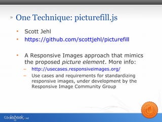
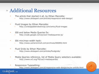
- 13. » An Implemenation ⹠Home page background image for frameworkstimber.com
- 14. » An implementation <div data-picture data-alt="Frameworks Timber - Timber Framing" id="home-background"> <div data-src=/slideshow/responsive-images-fcip-july-2013/24418594/"/wp-content/themes/fwt/images/home-background-600-n1.jpg"></div> <div data-src="/wp-content/themes/fwt/images/home-background-800-n1.jpg" data- media="(min-width: 601px) and (max-width: 800px)"></div> <div data-src="/wp-content/themes/fwt/images/home-background-1200m.jpg" data- media="(min-width: 801px) and (max-width: 1200px)"></div> <div data-src="/wp-content/themes/fwt/images/home-background-1500m.jpg" data- media="(min-width: 1201px) and (max-width: 1500px)"></div> <div data-src="/wp-content/themes/fwt/images/home-background-2000m.jpg" data- media="(min-width: 1501px) and (max-width: 2000px)"></div> <div data-src="/wp-content/themes/fwt/images/home-background-5000.jpg" data- media="(min-width: 2001px)"></div> <!--[if (lte IE 9) & (!IEMobile)]> <div data-src="/wp-content/themes/fwt/images/home-background-2000m.jpg"></div> <![endif]--> <noscript> <img src="/wp-content/themes/fwt/images/home-background-600.jpg" alt="Frameworks Timber - Timber Framing"> </noscript> </div>
- 15. » Span vs. Div âą You may have noticed that the Jehl example uses spans and my example uses divs. âą v1 of picturefill.js uses divs âą Newer versions use spans for a few reasons, one of which is that since the <img> tag is an inline element by default, <span> is a better fit as itâs also an inline element compared with <div> which is a block element.
- 16. » Additional Resources âą The article that started it all, by Ethan Marcotte: â http://www.alistapart.com/articles/responsive-web-design/ âą Fluid Images by Ethan Marcotte: â http://unstoppablerobotninja.com/entry/fluid-images âą IE8 and below Media Queries fix: â http://code.google.com/p/css3-mediaqueries-js/ âą IE6 min/max-width hack: â http://www.cameronmoll.com/archives/000892.html âą Fluid Grids by Ethan Marcotte: â http://www.alistapart.com/articles/fluidgrids/ âą Media Queries reference, list of Media Query selectors available: â http://www.w3.org/TR/css3-mediaqueries/ âą Responsive Typesetting: â http://www.alistapart.com/d/responsive-web-design/ex/ex-article.html
- 17. » Where to find me âą @ron_z â follow me on Twitter âą ronz@codegeek.net âą codegeek.net âą IgniteFortCollins.com and @IgniteFC âą The Fort Collins Hive: HiveFC.com
- 18. » Thank YouThank You Fort Collins Internet ProfessionalsFort Collins Internet Professionals July 18, 2013July 18, 2013
- 19. » Media Queries? First, Media Types, which you already know: <link rel="stylesheet" media="screen" href="c.css" /> <link rel="stylesheet" media=âprint" href="c.css" />
- 20. » CSS3 Media Queries In your HTML: <link rel="stylesheet" media="screen and (max-width:340px)â href=âc.cssâ /> Or more commonly, in your CSS: @media screen and (max-width:340px) { Styles applicable for viewports 340px and narrower ⊠}
- 21. » CSS3 Media Queries ⹠min-width (refers to viewport dimensions) ⹠min-device-width refers to display dimensions of the device (maybe safe for identifying the device, iPad, iPhone, etc.) ⹠can select based on dpi or dpcm, not just width ⹠can select based on color depth
- 22. » More Media Queries http://www.w3.org/TR/css3-mediaqueries/ ⹠width ⹠height ⹠device-width ⹠device-height ⹠orientation ⹠aspect-ratio ⹠device-aspect-ratio ⹠color ⹠color-index ⹠monochrome ⹠resolution ⹠scan ⹠grid
- 23. » Browser Support ⹠Opera 9.5+ ⹠Firefox 3.5+ ⹠Safari 3+ ⹠Chrome ⹠IE9 + ⹠Mobile Webkit ⹠Opera Mobile ~
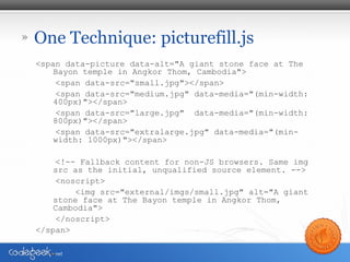
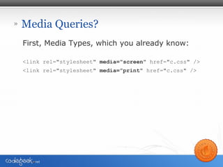
- 24. » A magic bullet code.google.com/p/css3-mediaqueries-js/ âą IE5 â IE8 âą Firefox 1 & 2 âą Safari 2 âą Legacy, if you only care about IE5 â IE8: <!--[if lt IE 9]> <script type="text/javascript" src=/slideshow/responsive-images-fcip-july-2013/24418594/"js/css3-mediaqueries.js"></script> <![endif]-->