Responsive web design
2 likes762 views

This document discusses responsive web design (RWD), which allows websites to adapt to different screen sizes and devices. RWD involves building flexible layouts with grids, images, and media queries so a site can work on any device without needing separate mobile or desktop versions. Content is key in RWD - it must be structured, fluid, and consistent across devices. Common challenges include images, videos, navigation, and third-party content on different screens. Examples of RWD in higher education are provided.
1 of 16
Downloaded 43 times
Ad
Recommended
Get responsive in 30 minutes (WordCamp Sofia)
Get responsive in 30 minutes (WordCamp Sofia)Nickolay Ninarski
╠²
The document discusses approaches to making websites mobile-friendly, emphasizing responsive design and separate mobile versions. It details steps for diagnosing and fixing issues with existing websites, including identifying breakpoints and using tools like Chrome Web Dev Tools. Additionally, it provides resources for further learning on web design and development techniques.Metro Metro Metro
Metro Metro MetroSam Basu
╠²
The document discusses the design principles of Metro, the design language developed by Microsoft for the Windows Phone interface. It summarizes the inspirations behind Metro from modern design movements like Bauhaus and Swiss design as well as motion design. It then discusses key Metro principles like reducing elements to the essential, using typography beautifully, bringing content to life through motion, and creating an authentically digital experience. The document encourages applying these principles to everyday work and mantras.Ustream Annual Report 2013
Ustream Annual Report 2013Bal├Īzs Keresk├®nyi
╠²
The document discusses the collaborative effort to create a visually engaging annual report, comparing it to industry standards set by companies like Airbnb and Mailchimp. It reflects on design challenges, teamwork, and the importance of creating a consistent brand image. Feedback from various team members highlights the success and excitement surrounding the project, as well as lessons learned for future endeavors.Responsive Web Design Overview 2013
Responsive Web Design Overview 2013Will Jayroe
╠²
Responsive web design is a flexible approach that allows web content to adapt to different screen sizes and devices. It involves using a flexible grid layout, flexible images and media, and media queries. With a flexible grid based on percentages instead of pixels, fluid images and media that resize to fit different screens, and CSS media queries that apply different styling based on screen width, a responsive design can adapt to various browsers and devices from mobile phones to desktop computers.The Drop and The Word: Structured Content in WordPress and Drupal
The Drop and The Word: Structured Content in WordPress and DrupalJohn Eckman
╠²
This document outlines John Eckman's presentation on structured content in Drupal and WordPress. In Drupal, custom content types can be created through modules and configurations, allowing complex sites to be built without coding. WordPress also enables custom post types, taxonomies, and fields through code or plugins to provide structured content. The presentation discusses lessons each system can learn from the other, such as Drupal improving simplicity and WordPress adopting a unified field API.Developer's meetup wordpress presentation
Developer's meetup wordpress presentationMelody Sharp Web Design
╠²
This document discusses the benefits of using WordPress and the Thesis framework for building websites. It outlines why WordPress is a good content management system because it is free, has excellent documentation, and is easy to extend with over 22,000 plugins. The document also explains why the author prefers Thesis as a framework, as it allows for easy customization of a site's columns, fonts, colors, and more, and has good support through documentation and forums.Successful Social Networking in Construction
Successful Social Networking in ConstructionSu Butcher
╠²
The document discusses effective social networking in the construction industry, highlighting the evolution from Web 1.0 to Web 2.0 and the importance of online conversation and collaboration. It emphasizes the need for auditing, planning, training, and measuring to integrate social media into construction practices. The content also includes various resources and links to enhance understanding and implementation of social networking strategies.Responsive Vs Mobile Development in Magento - Kimberly Thomas - @MagentoGirl
Responsive Vs Mobile Development in Magento - Kimberly Thomas - @MagentoGirlMeet Magento Spain
╠²
This document discusses responsive vs mobile themes in Magento. A responsive theme uses the same codebase with fluid layouts and media queries to adapt to different screen sizes. A mobile theme is a separate codebase optimized for mobile. It takes 75% less time to create a responsive theme compared to a separate mobile theme. Whether a responsive or mobile theme is better depends on the specific website and its users. Examples are provided of sites where responsive vs mobile themes make more sense. Technologies for responsive design like Bootstrap and strategies like mobile-first are also covered. The document provides examples of implementing responsive and mobile themes in Magento.FIU Web Content Management System (CMS)
FIU Web Content Management System (CMS)Web Communications at Florida International University
╠²
A content management system (CMS) provides infrastructure for multiple people to collaboratively create, manage, publish, and archive information over its lifecycle. FIU has chosen the Hannon Hill Cascade Server CMS, which is used by about 120 universities. Its benefits include browser-based use, enforcing accessibility and web standards, content reuse, and unlimited licensing. Services include initial onsite training, phone/email support, and an annual user conference. For follow up, contact Matt Herzberger.Campus change agent - building a campus web community where there is none
Campus change agent - building a campus web community where there is noneMatt Herzberger
╠²
Matt Herzberger, the Director of Web Communications at Florida International University, discusses building a cohesive web community on campus despite challenges like decentralization and lack of leadership. He emphasizes the importance of collaboration, open-source tools, and maintaining strong relationships among web professionals. Herzberger advocates for engaging professional development and unified branding to enhance the overall web presence in higher education.FIU Web Communications
FIU Web CommunicationsWeb Communications at Florida International University
╠²
The document discusses the mission and goals of FIU's Web Communications team. The team aims to lead FIU's web presence and make the university viewed as premier. They will provide tools and resources to benefit FIU, including web standards, templates, and assisting other departments. Their main objectives are to redesign FIU's website to be more user-focused based on feedback, select a new content management system, and launch new university-wide tools.Why you need a CMS
Why you need a CMSMatt Herzberger
╠²
A content management system (CMS) is a web-based application that enables users to create, edit, and manage website content independently, reducing reliance on web developers for simple updates. It allows content creators to easily make timely changes while ensuring structured content management and role-based access. Common misconceptions about CMS include the belief that they are free, turnkey solutions that replace the need for web professionals or resolve internal process issues.Hands on higher ed google analytics
Hands on higher ed google analyticsMatt Herzberger
╠²
The document outlines the setup and installation of Google Analytics for higher education, including tracking code installation, event tracking, and goal conversion setup. It provides definitions for key analytics terms such as visits, pageviews, and bounce rates, and offers examples for event tracking like outbound links and file downloads. Additionally, it emphasizes the importance of establishing clear goals for website performance and provides a structure for tracking progression towards these goals.What's in a brand
What's in a brandMatt Herzberger
╠²
Branding is not just a logo - it is a reflection of how people perceive an entity based on conscious choices to alter perception through a particular lens. Branding can change the words, emotions and overall perception people associate with an image simply by adding a brand mark like Nike or FIU.How to Plan For and Manage a Successful Web Redesign Project
How to Plan For and Manage a Successful Web Redesign Project Matt Herzberger
╠²
The document outlines a comprehensive process for planning and managing a successful web redesign project, emphasizing the importance of stakeholder communication and aligning redesign efforts with institutional goals. It covers key stages including research, usability testing, content strategy, wireframing, design, and post-launch maintenance, highlighting a structured approach to achieve a functional and appealing website. Additionally, it provides resources and a checklist to guide practitioners through the redesign process.SEO for writers
SEO for writersMatt Herzberger
╠²
This document provides tips for writers on search engine optimization (SEO). It notes that 30% of traffic comes from search engines, with 82% from Google. Keywords are crucial for SEO and should be researched and included in titles, content, and other elements. Title tags should be concise, newsworthy, and keyword rich. Content is the most important factor, and should be written to be valuable and shareable. The three main factors for SEO are using the right keywords, having compelling content, and gaining incoming links from other sites.Stocktwits & Responsive Web Design, social network meets flexible framework
Stocktwits & Responsive Web Design, social network meets flexible frameworkJohn Strott
╠²
The document discusses Stocktwits' implementation of responsive web design (RWD) to optimize user experience across various devices, including mobile and desktop. It outlines the processes of research, design, coding, and iteration involved in creating a responsive platform that supports real-time financial communications. Additionally, it addresses the importance of user feedback and metrics in evolving the design to better meet the needs of the investing community.Responsive web design
Responsive web designGopinath Ambothi
╠²
The document discusses responsive web design (RWD). RWD allows a website to automatically adapt its layout to different screen sizes and devices like mobile phones, tablets, laptops and desktops. It explains that RWD was created to provide a good user experience across all devices with one unified website, rather than separate mobile sites. The document covers how to make a website responsive using fluid grids, flexible images and CSS media queries to detect screen sizes and apply different styling. It provides tips for mobile-first design and techniques like Adaptive Images to optimize images for different screens.Responsive Design and Joomla!
Responsive Design and Joomla!JoomlaChicago - Loop
╠²
The document presents an extensive overview of responsive design, emphasizing its definition, methodologies, and importance in modern web development. It discusses adaptive layouts, CSS3 media queries, and the necessity of a holistic approach that includes content strategy and user experience. Various expert opinions, examples, and frameworks for implementing responsive design are highlighted throughout the document.Two approaches to RWD: Pure & Hybrid. Brendan Falkowski
Two approaches to RWD: Pure & Hybrid. Brendan Falkowski MeetMagentoNY2014
╠²
This document discusses two approaches to responsive web design: pure RWD and hybrid approaches using techniques like responsive proxies, adaptive layouts, and responsive design with server-side components (RESS). It provides an overview and comparison of these techniques, including insights from a survey of RESS users. Key advantages of pure RWD include a single URL, no redirects, and better crawler efficiency, though other hybrid approaches can also be viable depending on a site's needs and resources.Adapting Content for Mobile Devices - tcworld 2017, Scott DeLoach, ClickStart
Adapting Content for Mobile Devices - tcworld 2017, Scott DeLoach, ClickStartScott DeLoach
╠²
The document outlines best practices for adapting content for mobile devices, emphasizing a mobile-first design approach. It covers responsive web design (RWD) techniques, user goals for mobile consumption, and tips for rewriting content to enhance mobile experience. Additionally, it provides code examples for media queries and mentions recommended literature for further reading.Theming for mobile devices recent
Theming for mobile devices recentArtem Shymko
╠²
This document discusses strategies for theming mobile websites. It covers responsive vs adaptive design, using viewport meta tags and media queries to adapt layouts, grid systems, and Drupal themes and modules that facilitate mobile theming. The key aspects are determining the client's needs, whether to use a separate site/theme or a responsive/adaptive approach, and tools like Context and Mobile Detector that can simplify the process in Drupal. The goal is to think from a mobile perspective and adapt content and interfaces for different devices and capabilities.Responsive Web Design & the Library
Responsive Web Design & the Libraryariannaschlegel
╠²
Responsive web design is a web development approach that creates dynamic changes to the layout of a website depending on the screen size and orientation of the device being used to view the website. It allows a single website to be accessed seamlessly on any device. The document discusses the basics of responsive web design including what it is, why it is used, examples of responsive websites, and why the author's organization should adopt responsive design. Options for implementing responsive design such as using HTML, CSS, content management systems or JavaScript frameworks are also presented.Getting Down & Dirty with Responsive Web Design
Getting Down & Dirty with Responsive Web Designmartinridgway
╠²
This document provides an overview of responsive web design. It begins by noting the increasing diversity of devices used to access websites. It then introduces responsive web design as a solution, allowing one website to adapt to different screens through a flexible grid, flexible images and media, and media queries. Examples of responsive sites are shown. Some criticisms of the approach are addressed. The business case for a responsive approach is made. Finally, the document gets into the technical details of implementing a responsive design through flexible grids, images, and media queries. It provides code examples and tips for supporting older browsers. Frameworks to help with responsive design are also mentioned.Responsivedesign 7-3-2012
Responsivedesign 7-3-2012Thomas Carney
╠²
The document is a presentation by Tom Carney about responsive web design. It discusses Carney's background in web development for over 10 years and experience with mobile and responsive design for 18 months. The presentation covers the introduction of responsive design, responsive design techniques like grids, media queries and plugins, transitioning websites to responsive design, responsive design workflows, and examples of responsive design. It addresses setting separate mobile sites versus responsive design and takes questions from the audience.Responsive Web Design - more than just a buzzword
Responsive Web Design - more than just a buzzwordRuss Weakley
╠²
The document discusses the evolution and principles of responsive web design (RWD) as introduced by Ethan Marcotte, emphasizing its key components: flexible layouts, images, and CSS3 media queries. It contrasts RWD with adaptive web design and the broader 'responsive' concept, citing various design strategies for mobile navigation and the potential benefits of server-side responsive design (RESS). Additionally, it advocates for a 'mobile first' approach to ensure optimal user experience across all devices.Responsive Web Design_2013
Responsive Web Design_2013Achieve Internet
╠²
This document discusses responsive web design (RWD). RWD allows websites to automatically adjust their layout depending on the user's screen size using media queries. It is important for accessibility and usability as most internet users now access the web on mobile devices. The document recommends using a mobile-first and progressive enhancement approach where basic content and functionality work on all browsers and advanced features are progressively added. It provides examples of RWD techniques and tools to test responsive designs.Context-Aware and User-Centered Design: The Lost Battle Between Desktop and M...
Context-Aware and User-Centered Design: The Lost Battle Between Desktop and M...UX Riga
╠²
The document emphasizes the importance of responsive web design as a current trend, advocating for an adaptive approach to accommodate various devices rather than creating separate designs for each. It highlights 'context-aware design,' which utilizes environmental and user data to enhance the mobile experience, suggesting that understanding user context can lead to more effective applications. It concludes by encouraging designers to prioritize user needs and context over mere device specifications.Proactive Responsive Design
Proactive Responsive DesignNathan Smith
╠²
The document discusses responsive web design (RWD), which adapts web content to various screen sizes using fluid grids and CSS media queries. It highlights the importance of RWD's mainstream adoption among notable websites and offers best practices for its implementation, including considerations for user experience on mobile versus desktop. Additionally, it touches on the challenges of responsive design, such as handling images and providing concise content for mobile users.Everything You Know is Not Quite Right Anymore: Rethinking Best Practices to ...
Everything You Know is Not Quite Right Anymore: Rethinking Best Practices to ...Dave Olsen
╠²
The document emphasizes the need for higher education institutions to rethink their web strategies and embrace responsive design as mobile traffic is increasing rapidly. It highlights the importance of mobile optimization, planning, and testing to deliver effective user experiences across devices. Furthermore, the authors stress that colleges should proactively adapt to changing technology and user behaviors for successful digital engagement.More Related Content
Viewers also liked (8)
FIU Web Content Management System (CMS)
FIU Web Content Management System (CMS)Web Communications at Florida International University
╠²
A content management system (CMS) provides infrastructure for multiple people to collaboratively create, manage, publish, and archive information over its lifecycle. FIU has chosen the Hannon Hill Cascade Server CMS, which is used by about 120 universities. Its benefits include browser-based use, enforcing accessibility and web standards, content reuse, and unlimited licensing. Services include initial onsite training, phone/email support, and an annual user conference. For follow up, contact Matt Herzberger.Campus change agent - building a campus web community where there is none
Campus change agent - building a campus web community where there is noneMatt Herzberger
╠²
Matt Herzberger, the Director of Web Communications at Florida International University, discusses building a cohesive web community on campus despite challenges like decentralization and lack of leadership. He emphasizes the importance of collaboration, open-source tools, and maintaining strong relationships among web professionals. Herzberger advocates for engaging professional development and unified branding to enhance the overall web presence in higher education.FIU Web Communications
FIU Web CommunicationsWeb Communications at Florida International University
╠²
The document discusses the mission and goals of FIU's Web Communications team. The team aims to lead FIU's web presence and make the university viewed as premier. They will provide tools and resources to benefit FIU, including web standards, templates, and assisting other departments. Their main objectives are to redesign FIU's website to be more user-focused based on feedback, select a new content management system, and launch new university-wide tools.Why you need a CMS
Why you need a CMSMatt Herzberger
╠²
A content management system (CMS) is a web-based application that enables users to create, edit, and manage website content independently, reducing reliance on web developers for simple updates. It allows content creators to easily make timely changes while ensuring structured content management and role-based access. Common misconceptions about CMS include the belief that they are free, turnkey solutions that replace the need for web professionals or resolve internal process issues.Hands on higher ed google analytics
Hands on higher ed google analyticsMatt Herzberger
╠²
The document outlines the setup and installation of Google Analytics for higher education, including tracking code installation, event tracking, and goal conversion setup. It provides definitions for key analytics terms such as visits, pageviews, and bounce rates, and offers examples for event tracking like outbound links and file downloads. Additionally, it emphasizes the importance of establishing clear goals for website performance and provides a structure for tracking progression towards these goals.What's in a brand
What's in a brandMatt Herzberger
╠²
Branding is not just a logo - it is a reflection of how people perceive an entity based on conscious choices to alter perception through a particular lens. Branding can change the words, emotions and overall perception people associate with an image simply by adding a brand mark like Nike or FIU.How to Plan For and Manage a Successful Web Redesign Project
How to Plan For and Manage a Successful Web Redesign Project Matt Herzberger
╠²
The document outlines a comprehensive process for planning and managing a successful web redesign project, emphasizing the importance of stakeholder communication and aligning redesign efforts with institutional goals. It covers key stages including research, usability testing, content strategy, wireframing, design, and post-launch maintenance, highlighting a structured approach to achieve a functional and appealing website. Additionally, it provides resources and a checklist to guide practitioners through the redesign process.SEO for writers
SEO for writersMatt Herzberger
╠²
This document provides tips for writers on search engine optimization (SEO). It notes that 30% of traffic comes from search engines, with 82% from Google. Keywords are crucial for SEO and should be researched and included in titles, content, and other elements. Title tags should be concise, newsworthy, and keyword rich. Content is the most important factor, and should be written to be valuable and shareable. The three main factors for SEO are using the right keywords, having compelling content, and gaining incoming links from other sites.Similar to Responsive web design (20)
Stocktwits & Responsive Web Design, social network meets flexible framework
Stocktwits & Responsive Web Design, social network meets flexible frameworkJohn Strott
╠²
The document discusses Stocktwits' implementation of responsive web design (RWD) to optimize user experience across various devices, including mobile and desktop. It outlines the processes of research, design, coding, and iteration involved in creating a responsive platform that supports real-time financial communications. Additionally, it addresses the importance of user feedback and metrics in evolving the design to better meet the needs of the investing community.Responsive web design
Responsive web designGopinath Ambothi
╠²
The document discusses responsive web design (RWD). RWD allows a website to automatically adapt its layout to different screen sizes and devices like mobile phones, tablets, laptops and desktops. It explains that RWD was created to provide a good user experience across all devices with one unified website, rather than separate mobile sites. The document covers how to make a website responsive using fluid grids, flexible images and CSS media queries to detect screen sizes and apply different styling. It provides tips for mobile-first design and techniques like Adaptive Images to optimize images for different screens.Responsive Design and Joomla!
Responsive Design and Joomla!JoomlaChicago - Loop
╠²
The document presents an extensive overview of responsive design, emphasizing its definition, methodologies, and importance in modern web development. It discusses adaptive layouts, CSS3 media queries, and the necessity of a holistic approach that includes content strategy and user experience. Various expert opinions, examples, and frameworks for implementing responsive design are highlighted throughout the document.Two approaches to RWD: Pure & Hybrid. Brendan Falkowski
Two approaches to RWD: Pure & Hybrid. Brendan Falkowski MeetMagentoNY2014
╠²
This document discusses two approaches to responsive web design: pure RWD and hybrid approaches using techniques like responsive proxies, adaptive layouts, and responsive design with server-side components (RESS). It provides an overview and comparison of these techniques, including insights from a survey of RESS users. Key advantages of pure RWD include a single URL, no redirects, and better crawler efficiency, though other hybrid approaches can also be viable depending on a site's needs and resources.Adapting Content for Mobile Devices - tcworld 2017, Scott DeLoach, ClickStart
Adapting Content for Mobile Devices - tcworld 2017, Scott DeLoach, ClickStartScott DeLoach
╠²
The document outlines best practices for adapting content for mobile devices, emphasizing a mobile-first design approach. It covers responsive web design (RWD) techniques, user goals for mobile consumption, and tips for rewriting content to enhance mobile experience. Additionally, it provides code examples for media queries and mentions recommended literature for further reading.Theming for mobile devices recent
Theming for mobile devices recentArtem Shymko
╠²
This document discusses strategies for theming mobile websites. It covers responsive vs adaptive design, using viewport meta tags and media queries to adapt layouts, grid systems, and Drupal themes and modules that facilitate mobile theming. The key aspects are determining the client's needs, whether to use a separate site/theme or a responsive/adaptive approach, and tools like Context and Mobile Detector that can simplify the process in Drupal. The goal is to think from a mobile perspective and adapt content and interfaces for different devices and capabilities.Responsive Web Design & the Library
Responsive Web Design & the Libraryariannaschlegel
╠²
Responsive web design is a web development approach that creates dynamic changes to the layout of a website depending on the screen size and orientation of the device being used to view the website. It allows a single website to be accessed seamlessly on any device. The document discusses the basics of responsive web design including what it is, why it is used, examples of responsive websites, and why the author's organization should adopt responsive design. Options for implementing responsive design such as using HTML, CSS, content management systems or JavaScript frameworks are also presented.Getting Down & Dirty with Responsive Web Design
Getting Down & Dirty with Responsive Web Designmartinridgway
╠²
This document provides an overview of responsive web design. It begins by noting the increasing diversity of devices used to access websites. It then introduces responsive web design as a solution, allowing one website to adapt to different screens through a flexible grid, flexible images and media, and media queries. Examples of responsive sites are shown. Some criticisms of the approach are addressed. The business case for a responsive approach is made. Finally, the document gets into the technical details of implementing a responsive design through flexible grids, images, and media queries. It provides code examples and tips for supporting older browsers. Frameworks to help with responsive design are also mentioned.Responsivedesign 7-3-2012
Responsivedesign 7-3-2012Thomas Carney
╠²
The document is a presentation by Tom Carney about responsive web design. It discusses Carney's background in web development for over 10 years and experience with mobile and responsive design for 18 months. The presentation covers the introduction of responsive design, responsive design techniques like grids, media queries and plugins, transitioning websites to responsive design, responsive design workflows, and examples of responsive design. It addresses setting separate mobile sites versus responsive design and takes questions from the audience.Responsive Web Design - more than just a buzzword
Responsive Web Design - more than just a buzzwordRuss Weakley
╠²
The document discusses the evolution and principles of responsive web design (RWD) as introduced by Ethan Marcotte, emphasizing its key components: flexible layouts, images, and CSS3 media queries. It contrasts RWD with adaptive web design and the broader 'responsive' concept, citing various design strategies for mobile navigation and the potential benefits of server-side responsive design (RESS). Additionally, it advocates for a 'mobile first' approach to ensure optimal user experience across all devices.Responsive Web Design_2013
Responsive Web Design_2013Achieve Internet
╠²
This document discusses responsive web design (RWD). RWD allows websites to automatically adjust their layout depending on the user's screen size using media queries. It is important for accessibility and usability as most internet users now access the web on mobile devices. The document recommends using a mobile-first and progressive enhancement approach where basic content and functionality work on all browsers and advanced features are progressively added. It provides examples of RWD techniques and tools to test responsive designs.Context-Aware and User-Centered Design: The Lost Battle Between Desktop and M...
Context-Aware and User-Centered Design: The Lost Battle Between Desktop and M...UX Riga
╠²
The document emphasizes the importance of responsive web design as a current trend, advocating for an adaptive approach to accommodate various devices rather than creating separate designs for each. It highlights 'context-aware design,' which utilizes environmental and user data to enhance the mobile experience, suggesting that understanding user context can lead to more effective applications. It concludes by encouraging designers to prioritize user needs and context over mere device specifications.Proactive Responsive Design
Proactive Responsive DesignNathan Smith
╠²
The document discusses responsive web design (RWD), which adapts web content to various screen sizes using fluid grids and CSS media queries. It highlights the importance of RWD's mainstream adoption among notable websites and offers best practices for its implementation, including considerations for user experience on mobile versus desktop. Additionally, it touches on the challenges of responsive design, such as handling images and providing concise content for mobile users.Everything You Know is Not Quite Right Anymore: Rethinking Best Practices to ...
Everything You Know is Not Quite Right Anymore: Rethinking Best Practices to ...Dave Olsen
╠²
The document emphasizes the need for higher education institutions to rethink their web strategies and embrace responsive design as mobile traffic is increasing rapidly. It highlights the importance of mobile optimization, planning, and testing to deliver effective user experiences across devices. Furthermore, the authors stress that colleges should proactively adapt to changing technology and user behaviors for successful digital engagement.Everything You Know is Not Quite Right Anymore: Rethinking Best Web Practices...
Everything You Know is Not Quite Right Anymore: Rethinking Best Web Practices...Doug Gapinski
╠²
This document discusses the necessity for higher education institutions to rethink their approaches to mobile web design, noting that mobile traffic is on the rise and may soon surpass desktop usage. It emphasizes the importance of responsive design, planning, optimization, and testing to enhance user experience across multiple devices. Additionally, statistics and insights highlight the significance of mobile accessibility for prospective students and the need for institutions to adapt to these changing trends.Responsive web design with various grids and frameworks comparison
Responsive web design with various grids and frameworks comparisonDhrubaJyoti Dey
╠²
This document discusses responsive web design and compares several frameworks that can be used to implement responsive design. It defines responsive web design and explains its benefits. It then describes four frameworks - Twitter Bootstrap, Foundation, Skeleton, and HTML5 Boilerplate. For each framework, it outlines key features and limitations. It concludes by comparing various aspects of the frameworks, such as grids, plugins, licensing, and recommending Twitter Bootstrap for most use cases due to its balance of features and lightweight code.Responsive Web Design: How the mobile web has changed the way we think and work
Responsive Web Design: How the mobile web has changed the way we think and workvq20
╠²
The document summarizes a meetup on responsive web design hosted by Nick Weaver and Vidal Quevedo. They discussed the challenges of native mobile apps and earlier responsive approaches at UW-Madison. They advocated for a "one-web" philosophy using responsive design to provide a consistent experience across devices. The basics of responsive design like fluid layouts, responsive images, and media queries were covered. Challenges of testing and managing responsive designs were also noted. Case studies of responsive sites at UW-Madison were presented and resources for learning more about responsive design were provided.Responsive Web Design (HeadStart TechTalks)
Responsive Web Design (HeadStart TechTalks)Tirthesh Ganatra
╠²
The document discusses responsive web design (RWD), which is an approach to building websites that dynamically adapt their layout to different screen sizes and devices. It covers the key features of RWD, including flexible grids, images, and using CSS3 media queries to detect screen sizes and orientations. The benefits of RWD are also summarized, such as improved performance, saving time and money. Popular RWD frameworks like Foundation and Bootstrap are also mentioned.Ready to go Mobile? Today's Mobile Landscape: Responsive, Adaptive, Hybrid, a...
Ready to go Mobile? Today's Mobile Landscape: Responsive, Adaptive, Hybrid, a...Jeremy Johnson
╠²
The document discusses strategies for optimizing mobile experiences, highlighting the importance of context, content preparation, and prototyping in mobile design. It emphasizes the need for responsive design that accommodates various user contexts and encourages the use of agile methods to enhance collaboration with users. Additionally, it outlines the benefits of native, hybrid, and web approaches to mobile application development, stressing the necessity of user experience in ranking on platforms like Google.Skill Session - Web Multi Device
Skill Session - Web Multi Devicefilirom1
╠²
The document discusses responsive web design and developing for multiple devices. It recommends creating a single responsive website that adapts to different screens through techniques like fluid grids, flexible images, and media queries. It also suggests considering hybrid approaches that incorporate both web and native capabilities to deliver high-quality experiences across all devices.Ad
Recently uploaded (20)
MuleSoft for AgentForce : Topic Center and API Catalog
MuleSoft for AgentForce : Topic Center and API Catalogshyamraj55
╠²
This presentation dives into how MuleSoft empowers AgentForce with organized API discovery and streamlined integration using Topic Center and the API Catalog. Learn how these tools help structure APIs around business needs, improve reusability, and simplify collaboration across teams. Ideal for developers, architects, and business stakeholders looking to build a connected and scalable API ecosystem within AgentForce.Information Security Response Team Nepal_npCERT_Vice_President_Sudan_Jha.pdf
Information Security Response Team Nepal_npCERT_Vice_President_Sudan_Jha.pdfICT Frame Magazine Pvt. Ltd.
╠²
Artificial Intelligence (AI) is rapidly changing the face of cybersecurity across the globe. In Nepal, the shift is already underway. Vice President of the Information Security Response Team Nepal (npCERT) and Information Security Consultant at One Cover Pvt. Ltd., Sudan Jha, recently presented an in-depth workshop on how AI can strengthen national security and digital defenses.The Future of AI Agent Development Trends to Watch.pptx
The Future of AI Agent Development Trends to Watch.pptxLisa ward
╠²
The Future of AI Agent Development: Trends to Watch explores emerging innovations shaping smarter, more autonomous AI solutions for businesses and technology.
UserCon Belgium: Honey, VMware increased my bill
UserCon Belgium: Honey, VMware increased my billstijn40
╠²
VMwareŌĆÖs pricing changes have forced organizations to rethink their datacenter cost management strategies. While FinOps is commonly associated with cloud environments, the FinOps Foundation has recently expanded its framework to include ScopesŌĆöand Datacenter is now officially part of the equation. In this session, weŌĆÖll map the FinOps Framework to a VMware-based datacenter, focusing on cost visibility, optimization, and automation. YouŌĆÖll learn how to track costs more effectively, rightsize workloads, optimize licensing, and drive efficiencyŌĆöall without migrating to the cloud. WeŌĆÖll also explore how to align IT teams, finance, and leadership around cost-aware decision-making for on-prem environments. If your VMware bill keeps increasing and you need a new approach to cost management, this session is for you!Cluster-Based Multi-Objective Metamorphic Test Case Pair Selection for Deep N...
Cluster-Based Multi-Objective Metamorphic Test Case Pair Selection for Deep N...janeliewang985
╠²
the slides of the MP selection approach CMPSGenAI Opportunities and Challenges - Where 370 Enterprises Are Focusing Now.pdf
GenAI Opportunities and Challenges - Where 370 Enterprises Are Focusing Now.pdfPriyanka Aash
╠²
GenAI Opportunities and Challenges - Where 370 Enterprises Are Focusing NowTech-ASan: Two-stage check for Address Sanitizer - Yixuan Cao.pdf
Tech-ASan: Two-stage check for Address Sanitizer - Yixuan Cao.pdfcaoyixuan2019
╠²
A presentation at Internetware 2025.PyCon SG 25 - Firecracker Made Easy with Python.pdf
PyCon SG 25 - Firecracker Made Easy with Python.pdfMuhammad Yuga Nugraha
╠²
Explore the ease of managing Firecracker microVM with the firecracker-python. In this session, I will introduce the basics of Firecracker microVM and demonstrate how this custom SDK facilitates microVM operations easily. We will delve into the design and development process behind the SDK, providing a behind-the-scenes look at its creation and features. While traditional Firecracker SDKs were primarily available in Go, this module brings a simplicity of Python to the table.AI vs Human Writing: Can You Tell the Difference?
AI vs Human Writing: Can You Tell the Difference?Shashi Sathyanarayana, Ph.D
╠²
This slide illustrates a side-by-side comparison between human-written, AI-written, and ambiguous content. It highlights subtle cues that help readers assess authenticity, raising essential questions about the future of communication, trust, and thought leadership in the age of generative AI.Securing Account Lifecycles in the Age of Deepfakes.pptx
Securing Account Lifecycles in the Age of Deepfakes.pptxFIDO Alliance
╠²
Securing Account Lifecycles in the Age of DeepfakesAI VIDEO MAGAZINE - June 2025 - r/aivideo
AI VIDEO MAGAZINE - June 2025 - r/aivideo1pcity Studios, Inc
╠²
AI VIDEO MAGAZINE - r/aivideo community newsletter ŌĆō Exclusive Tutorials: How to make an AI VIDEO from scratch, PLUS: How to make AI MUSIC, Hottest ai videos of 2025, Exclusive Interviews, New Tools, Previews, and MORE - JUNE 2025 ISSUE -Wenn alles versagt - IBM Tape sch├╝tzt, was z├żhlt! Und besonders mit dem neust...
Wenn alles versagt - IBM Tape sch├╝tzt, was z├żhlt! Und besonders mit dem neust...Josef Weingand
╠²
IBM LTO10FIDO Seminar: Perspectives on Passkeys & Consumer Adoption.pptx
FIDO Seminar: Perspectives on Passkeys & Consumer Adoption.pptxFIDO Alliance
╠²
FIDO Seminar: Perspectives on Passkeys & Consumer AdoptionFIDO Seminar: Targeting Trust: The Future of Identity in the Workforce.pptx
FIDO Seminar: Targeting Trust: The Future of Identity in the Workforce.pptxFIDO Alliance
╠²
FIDO Seminar: Targeting Trust: The Future of Identity in the WorkforceCapCut Pro Crack For PC Latest Version {Fully Unlocked} 2025
CapCut Pro Crack For PC Latest Version {Fully Unlocked} 2025pcprocore
╠²
¤æēØŚĪØŚ╝ØśüØŚ▓:ØŚ¢ØŚ╝ØŚĮØśå ØŚ╣ØŚČØŚ╗ØŚĖ & ØŚĮØŚ«ØśĆØśüØŚ▓ ØŚČØŚ╗ØśüØŚ╝ ØŚÜØŚ╝ØŚ╝ØŚ┤ØŚ╣ØŚ▓ ØŚ╗ØŚ▓Øśä ØśüØŚ«ØŚ»> https://pcprocore.com/ ¤æłŌŚĆ
CapCut Pro Crack is a powerful tool that has taken the digital world by storm, offering users a fully unlocked experience that unleashes their creativity. With its user-friendly interface and advanced features, itŌĆÖs no wonder why aspiring videographers are turning to this software for their projects.cnc-processing-centers-centateq-p-110-en.pdf
cnc-processing-centers-centateq-p-110-en.pdfAmirStern2
╠²
ū×ū©ūøū¢ ūóūÖūæūĢūōūÖūØ ū¬ūóū®ūÖūÖū¬ūÖ ūæūóū£ 3/4/5 ū”ūÖū©ūÖūØ, ūóūō 22 ūöūŚū£ūżūĢū¬ ūøū£ūÖūØ ūóūØ ūøū£ ūÉūżū®ū©ūĢūÖūĢū¬ ūöūóūÖūæūĢūō ūöūōū©ūĢū®ūĢū¬.╠²ūæūóū£ ū®ūśūŚ ūóūæūĢūōūö ūÆūōūĢū£ ūĢū×ūŚū®ūæ ūĀūĢūŚ ūĢū¦ū£ ū£ūöūżūóū£ūö ūæū®ūżūö ūöūóūæū©ūÖū¬/ū©ūĢūĪūÖū¬/ūÉūĀūÆū£ūÖū¬/ūĪūżū©ūōūÖū¬/ūóū©ūæūÖū¬ ūĢūóūĢūō..
ū×ūĪūĢūÆū£ ū£ūæū”ūó ūżūóūĢū£ūĢū¬ ūóūÖūæūĢūō ū®ūĢūĀūĢū¬ ūöū×ū¬ūÉūÖū×ūĢū¬ ū£ūóūĀūżūÖūØ ū®ūĢūĀūÖūØ: ū¦ūÖūōūĢūŚ ūÉūĀūøūÖ, ūÉūĢūżū¦ūÖ, ūĀūÖūĪūĢū©, ūĢūøū©ūĪūĢūØ ūÉūĀūøūÖ."How to survive Black Friday: preparing e-commerce for a peak season", Yurii ...
"How to survive Black Friday: preparing e-commerce for a peak season", Yurii ...Fwdays
╠²
We will explore how e-commerce projects prepare for the busiest time of the year, which key aspects to focus on, and what to expect. WeŌĆÖll share our experience in setting up auto-scaling, load balancing, and discuss the loads that Silpo handles, as well as the solutions that help us navigate this season without failures.FIDO Seminar: Evolving Landscape of Post-Quantum Cryptography.pptx
FIDO Seminar: Evolving Landscape of Post-Quantum Cryptography.pptxFIDO Alliance
╠²
FIDO Seminar: Evolving Landscape of Post-Quantum CryptographyInformation Security Response Team Nepal_npCERT_Vice_President_Sudan_Jha.pdf
Information Security Response Team Nepal_npCERT_Vice_President_Sudan_Jha.pdfICT Frame Magazine Pvt. Ltd.
╠²
Ad
Responsive web design
- 1. Responsive web design Design once and done Matt Herzberger FIU Web Communications
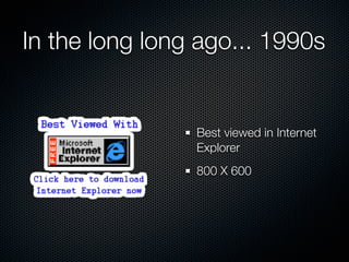
- 2. In the long long ago... 1990s Best viewed in Internet Explorer 800 X 600
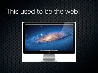
- 3. This used to be the web
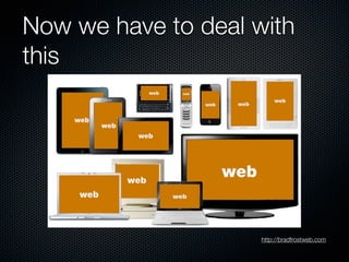
- 4. Now we have to deal with this http://bradfrostweb.com
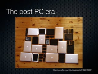
- 5. The post PC era http://www.’¼éickr.com/photos/adactio/6152947625/
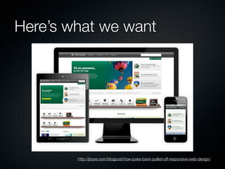
- 6. HereŌĆÖs what we want http://jboye.com/blogpost/how-jyske-bank-pulled-off-responsive-web-design/
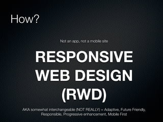
- 7. How? Not an app, not a mobile site RESPONSIVE WEB DESIGN (RWD) AKA somewhat interchangeable (NOT REALLY) = Adaptive, Future Friendly, Responsible, Progressive enhancement, Mobile First
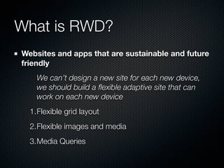
- 8. What is RWD? Websites and apps that are sustainable and future friendly We canŌĆÖt design a new site for each new device, we should build a ’¼éexible adaptive site that can work on each new device 1.Flexible grid layout 2.Flexible images and media 3.Media Queries
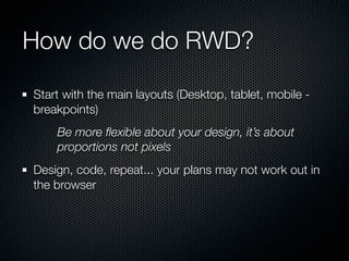
- 9. How do we do RWD? Start with the main layouts (Desktop, tablet, mobile - breakpoints) Be more ’¼éexible about your design, itŌĆÖs about proportions not pixels Design, code, repeat... your plans may not work out in the browser
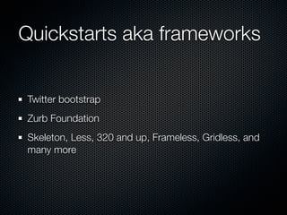
- 10. Quickstarts aka frameworks Twitter bootstrap Zurb Foundation Skeleton, Less, 320 and up, Frameless, Gridless, and many more
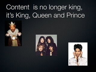
- 11. Content is no longer king, itŌĆÖs King, Queen and Prince
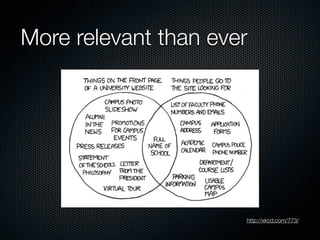
- 12. More relevant than ever http://xkcd.com/773/
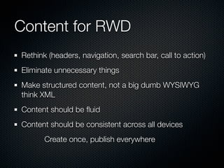
- 13. Content for RWD Rethink (headers, navigation, search bar, call to action) Eliminate unnecessary things Make structured content, not a big dumb WYSIWYG think XML Content should be ’¼éuid Content should be consistent across all devices Create once, publish everywhere
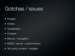
- 14. Gotchas / issues Images Videos Typography Content Menus / navigation RESS / server = performance 3rd party content / widgets
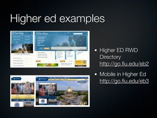
- 15. Higher ed examples Higher ED RWD Directory http://go.’¼üu.edu/eb2 Mobile in Higher Ed http://go.’¼üu.edu/eb3