Rio2007 Look
2 likes621 views

The document summarizes information about the 2007 Pan American Games hosted in Rio de Janeiro, Brazil. Over 5,500 athletes from 42 countries competed in 41 sports. The Games attracted over 1 million fans and were broadcast to more than 150 countries. The branding and identity for the 2007 Games was designed to convey the spontaneity and warmth of Rio while also representing the modernity of sports. Key elements of the branding included a dynamic visual language inspired by the city's landscape and people.
![The Rio 2007 Pan and Parapan-American
Games Look and Feel Programme is
ac k nowledged even today, several
p r o d u c t s h a ve a p p e a r e d in m a j o r
national design exhibitions and it is often
used as an example by publications in
Brazil and internationally.
âžť Selected for the Exhibition âžť Published on the website âžť Rio 2007 Medals âžť Licensing Manual âžť Rio 2007 Brand
“Brazilian Design Today: www.designbrasil.org.br Selected for the 9 th Selected for the 8th Published in the book
Frontiers” – São Paulo [Brazil, 2007] Biennial of Graphic Biennial of Graphic “Logo Design” - Taschen
Museum of Modern Art Design [Brazil, 2009] Design [Brazil, 2006] [Germany, 2007]
âžť Parapan Brand
[Brazil, 2009]
Selected for the 9 th âžť Rio 2007 Mascot âžť Official Poster Rio 2007 âžť Rio 2007 Pictograms
âžť Published in Identity Biennial of Graphic Selected for the 9 th
Selected for the 8 Biennial
th
Published in the book
– Branding and Design Design [Brazil, 2009] Biennial of Graphic of Graphic Design [Brazil, “Logo Design” - Taschen
Journal [Russia, 2008] Design [Brazil, 2009] 2006] and published in [Germany, 2007]
âžť Tocha Brand Rio 2007
the book “Logo Design”
âžť Published in the magazine Selected for the 9 th âžť Official Mascot
– Taschen [Germany, 2007]
Design Gráfico, year 13, Biennial of Graphic Poster Rio 2007
nÂş 98 [Brazil, 2008] Design [Brazil, 2009] Selected for the 9 th âžť Rio 2007 Manuals
Biennial of Graphic Published in the book
Design [Brazil, 2009] “Logo Design” - Taschen
[Germany, 2007]](https://image.slidesharecdn.com/rio2007look-12496673164163-phpapp03/85/Rio2007-Look-3-320.jpg)
![BRAND ARQUITECTURE
1 2
3 4 5 6 7 8
1] RIO 2007 PAN AMERICAN GAMES
2] RIO 2007 PARAPAN AMERICAN GAMES
3] RIO 2007 PARAPAN AMERICAN GAMES CLUB
4] RIO 2007 PAN AMERICAN GAMES BUSINESS FAIR
5] RIO 2007 PAN AMERICAN GAMES MEDICAL MEETING
6] I AM RIO 2007
7] WORK FORCE RIO 2007
8] TORCH RIO 2007
9] RIO 2007 CALENDAR EVENT
9 10
10] RIO 2007 OFFICIAL LICENSED PRODUCT](https://image.slidesharecdn.com/rio2007look-12496673164163-phpapp03/85/Rio2007-Look-6-320.jpg)
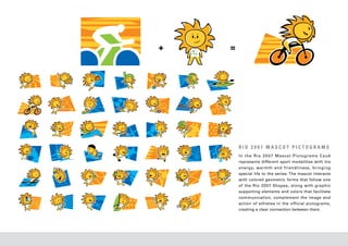
![RIO 2007 PICTOGRAMS
The creation of Rio 2007 Pictograms were inspired by the mosaics
that are present in Rio’s landscape and in the everyday lives of
Cariocas, beautifully decorating the sidewalks of Copacabana by
the sea, the stairs that go up to the neighborhood of Santa Teresa
and the glass work in churches.
The result was a series of mosaic pictograms integrated by the
main concepts used in the Rio 2007 Brand.
While the borders of each colored bird in the Rio 2007 Brand
form the shape of the Sugar Loaf Mountain against their white
background on the outside, in the Rio 2007 Pictograms this same
resource was applied reversely: the colored mosaic pieces outline
a white space representing athletes in movement.
This original solution permits the full representation of different
sports modalities [including the triathlon and the pentathlon], is
easy to understand and keeps the athlete’s performance in focus.](https://image.slidesharecdn.com/rio2007look-12496673164163-phpapp03/85/Rio2007-Look-15-320.jpg)
Rio2007 Look
- 2. CASE RIO 2007 THE PAN AMERICAN GAMES WERE CREATED AS A CONTINENTAL VERSION OF THE OLYMPIC GAMES. THEY HAPPEN EVERY 4 YEARS SINCE 1951. DURING THE 2007 EDITION, 5,500 ATHLETES FROM 42 DIFFERENT COUNTRIES IN THE AMERICAS COMPETED FOR THE GOLD MEDAL IN 41 DIFFERENT SPORT MODALITIES. THE RIO 20 07 EVENT GATHERED OVER 1 MILLION FANS AND WAS TRANSMITTED TO MORE THAN 150 COUNTRIES. THE RIO 2007 BRAND WAS DESIGNED TO CONVEY THE SPONTANEITY, WARMTH AND FRIENDLINESS OF CARIOCAS (RIO DE JANEIRO NATIVES) AS WELL AS THE MODERNITY OF SPORTS AND THE COLORS THAT REFLECT THE CITY’S EXUBERANT NATURAL BEAUTY. THE OLYMPIC VALUES OF EQUALITY AND DIVERSITY WERE ALSO EXPRESSED THROUGHOUT THE CREATIVE PROCESS DUE TO THEIR RELEVANCE TO THE PROJECT. THE IDENTITY OF THE XV PAN AMERICAN GAMES IS UNIFIED BY THESE KEY CREATIVE CONCEPTS. THEY ARE TRANSLATED INTO A DYNAMIC VISUAL LANGUAGE THAT RENEWS ITSELF AND SURPRISES IN EACH EXPRESSION OF THE BRAND - CREATED TO PROPERLY COMMUNICATE ONE OF THE MOST IMPORTANT SPORT EVENTS IN THE WORLD.
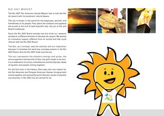
- 3. The Rio 2007 Pan and Parapan-American Games Look and Feel Programme is ac k nowledged even today, several p r o d u c t s h a ve a p p e a r e d in m a j o r national design exhibitions and it is often used as an example by publications in Brazil and internationally. ➝ Selected for the Exhibition ➝ Published on the website ➝ Rio 2007 Medals ➝ Licensing Manual ➝ Rio 2007 Brand “Brazilian Design Today: www.designbrasil.org.br Selected for the 9 th Selected for the 8th Published in the book Frontiers” – São Paulo [Brazil, 2007] Biennial of Graphic Biennial of Graphic “Logo Design” - Taschen Museum of Modern Art Design [Brazil, 2009] Design [Brazil, 2006] [Germany, 2007] ➝ Parapan Brand [Brazil, 2009] Selected for the 9 th ➝ Rio 2007 Mascot ➝ Official Poster Rio 2007 ➝ Rio 2007 Pictograms ➝ Published in Identity Biennial of Graphic Selected for the 9 th Selected for the 8 Biennial th Published in the book – Branding and Design Design [Brazil, 2009] Biennial of Graphic of Graphic Design [Brazil, “Logo Design” - Taschen Journal [Russia, 2008] Design [Brazil, 2009] 2006] and published in [Germany, 2007] ➝ Tocha Brand Rio 2007 the book “Logo Design” ➝ Published in the magazine Selected for the 9 th ➝ Official Mascot – Taschen [Germany, 2007] Design Gráfico, year 13, Biennial of Graphic Poster Rio 2007 nº 98 [Brazil, 2008] Design [Brazil, 2009] Selected for the 9 th ➝ Rio 2007 Manuals Biennial of Graphic Published in the book Design [Brazil, 2009] “Logo Design” - Taschen [Germany, 2007]
- 4. RIO 2007 BRAND The Rio 2007 logo has the movements and angles language of stopwatches and scoreboards. Its of every sport, the boldness of flight and the vertical design makes allusions to recording overcoming of challenges. It exalts team concept time, to lanes, tracks and courts with the numbers and concentration on a par ticular objective. “2”, “0” and “0.” It is a way of giving weight to The bird, a key element of the logo, is inspired the word “Rio” and highlighting the “7”, which by cutouts of the Rio landscape and contains in resembles a trophy. its outline the Sugar Loaf Mountain, one of the The result has great impact. It joins a symbol postcard views of the city. having a strong emotional charge with a rational/ The repetition of this element in movement, technological lettering with the same dynamic different colors, sizes and positions represents balance in which these two qualities must coexist equality in the gathering of the different cultures in sports today. of the Americas in fellowship and unity. In addition to this, the Rio 2007 logo is beautiful It has the c ongenialit y and spontaneit y of by nature, charismatic and makes a strong appeal the people of Rio, the delight of confetti and to brotherhood. It is as if Liberty has opened her the color s of nature during a Rio summer. wings over Rio, soaring aloft for humanity to The lettering is urban and modern like the digital celebrate a time of peace through sports.
- 5. PA R A PA N R I O 2 0 0 7 B R A N D At the Rio 2007 Parapan American Games, above by the masters of the Playful Art, like Miró, and all, each athlete is a star shining in their own light that takes the shape our imagination desires. – sometimes for a lifetime. While crossing tracks, The Parapan is a complementary part of the Rio courts, and pools in an impressive performance, 2007 project, its logo bears all the conceptual these athletes are teaching us something: substance of the Rio 2007 logo: it represents the that there is overcoming; that persistence is city-headquarters and makes reference to sports worthwhile; that dreams can come true. and the Olympic spirit. It has the same graphic The Rio 2007 Parapan American Games logo language and something more, different: the honors these stars with a symbol that is loved special brightness of the Parapan Rio 2007 star.
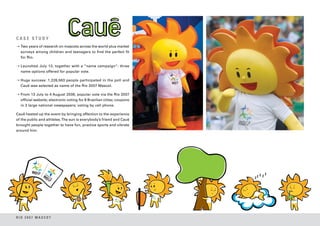
- 6. BRAND ARQUITECTURE 1 2 3 4 5 6 7 8 1] RIO 2007 PAN AMERICAN GAMES 2] RIO 2007 PARAPAN AMERICAN GAMES 3] RIO 2007 PARAPAN AMERICAN GAMES CLUB 4] RIO 2007 PAN AMERICAN GAMES BUSINESS FAIR 5] RIO 2007 PAN AMERICAN GAMES MEDICAL MEETING 6] I AM RIO 2007 7] WORK FORCE RIO 2007 8] TORCH RIO 2007 9] RIO 2007 CALENDAR EVENT 9 10 10] RIO 2007 OFFICIAL LICENSED PRODUCT
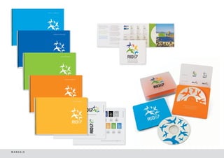
- 7. MANUALS
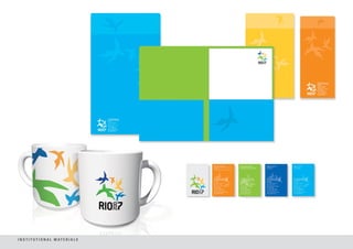
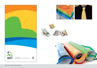
- 8. I N S T I T U T I O N A L M AT E R I A L S
- 9. I N S T I T U T I O N A L M AT E R I A L S
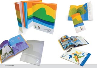
- 10. P U B L I C AT I O N S
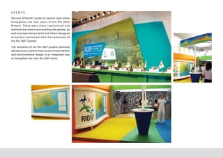
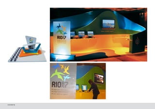
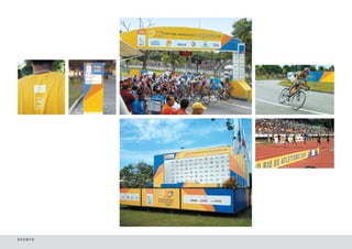
- 11. EVENTS Various dif ferent types of events took place throughout the four year s of the Rio 20 07 Project. There were many institutional and promotional events surrounding the games, as well as preparatory events and others designed to become permanent after the conclusion of the Rio 2007 Games. The versatility of the Rio 2007 graphic elements allowed every event to have its own brand identity and environmental design in an integrated way to strengthen the main Rio 2007 event.
- 12. EVENTS
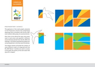
- 13. P R E PA R AT O R Y E V E N T S The application of the Look’s graphic elements to the Preparatory Events also established awareness and a connection with the Rio 2007 event without taking away its surprise element. Only three of the official five logo colors were used in each event and applied in dif ferent visual elements derived from the Rio 2007 bird drawings – all of which would also be present as a connecting element in the final Look of the Games. This design solution permitted the creation of many different Looks, all integrated with the Rio 2007 Brand. It worked very well to convey to the public the quality of the main event that was still to happen. EVENTS
- 14. EVENTS
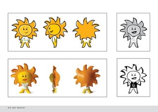
- 15. RIO 2007 PICTOGRAMS The creation of Rio 2007 Pictograms were inspired by the mosaics that are present in Rio’s landscape and in the everyday lives of Cariocas, beautifully decorating the sidewalks of Copacabana by the sea, the stairs that go up to the neighborhood of Santa Teresa and the glass work in churches. The result was a series of mosaic pictograms integrated by the main concepts used in the Rio 2007 Brand. While the borders of each colored bird in the Rio 2007 Brand form the shape of the Sugar Loaf Mountain against their white background on the outside, in the Rio 2007 Pictograms this same resource was applied reversely: the colored mosaic pieces outline a white space representing athletes in movement. This original solution permits the full representation of different sports modalities [including the triathlon and the pentathlon], is easy to understand and keeps the athlete’s performance in focus.
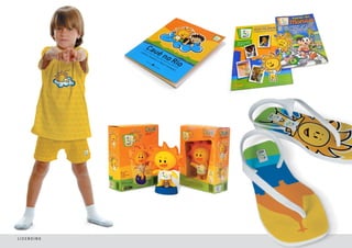
- 16. RIO 2007 MASCOT The Rio 2007 Pan American Games Mascot had to look like Rio de Janeiro with its exuberant, natural beauty. The city is known in the world for the happiness, warmth, and friendliness of its people. They adore the outdoors and applaud the sunset at the end of each beautiful day: the sun is Rio and Brazil’s trademark. Since the Rio 2007 Brand already had five birds our research pointed to a different direction to develop the mascot. We wanted an innovative mascot, different from an animal and that could interact with the Rio 2007 Brand. The Sun, as a concept, was the solution and our inspiration because it translates the same key concepts present in the Rio 2007 Brand. And the Rio 2007 birds love the sun. T h e s un r e p r e s e n t s t h e a t hle t e ’s e n e r g y an d p ul s e, t h e encouragement and warmth of fans, the gold medal to be won. It is a celebration of victory, embodies fire and the Olympic ideals of equality and people coming together. For the first time in the history, there was only one mascot for the Pan American and Parapan American Games, bringing both events together and exemplifying the Olympic values of equality and diversity. In Rio 2007, the sun shined for all.
- 17. CASE STUDY ➝ Two years of research on mascots across the world plus market surveys among children and teenagers to find the perfect fit for Rio. ➝ Launched July 13, together with a “name campaign”: three name options offered for popular vote. ➝ Huge success: 1,226,563 people participated in the poll and Cauê was selected as name of the Rio 2007 Mascot. ➝ From 13 July to 4 August 2006, popular vote via the Rio 2007 official website; electronic voting for 8 Brazilian cities; coupons in 3 large national newspapers; voting by cell phone. Cauê heated up the event by bringing affection to the experience of the public and athletes. The sun is everybody’s friend and Cauê brought people together to have fun, practice sports and vibrate around him. RIO 2007 MASCOT
- 18. RIO 2007 MASCOT
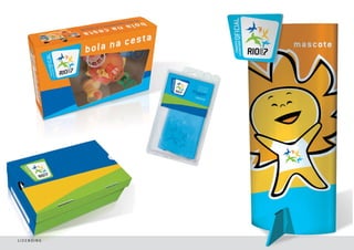
- 19. INSTITUTIONAL PRODUCTS WITH MASCOT AND PICTOGRAMS
- 20. + = RIO 2007 MASCOT PICTOGRAMS In the Rio 20 07 Mascot Pictograms CauĂŞ represents different sport modalities with his energy, warmth and friendliness, bringing special life to the series. The mascot interacts with colored geometric forms that follow one of the Rio 20 07 Shapes, along with graphic supporting elements and colors that facilitate communication, complement the image and action of athletes in the official pictograms, creating a clear connection between them.
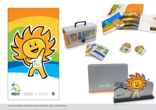
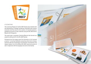
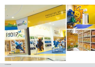
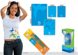
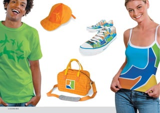
- 21. LICENSING The Licensing Project for the Rio 2007 Games was initiated with the development of Design Guidelines illustrated with product examples and final arts for the creation of licensed products, packaging and point of sale materials using the Rio 2007 Brand, Mascot and Pictograms. The result was a complete Licensing Manual that served as a powerful selling tool for the Rio 2007 Games. Following this first stage came the evaluation of all licensed projects, including feedback proposing alternative design solutions with the coordination of production of production and design creation for all the Official Rio 2007 stores and points of sale in alignment with the signage and Look of the Games.
- 22. LICENSING
- 23. LICENSING
- 24. LICENSING
- 25. LICENSING
- 26. LICENSING
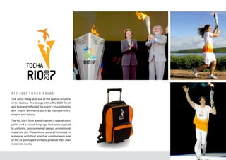
- 27. R I O 2 0 0 7 T O R C H R E L AY The Torch Relay was one of the special projects of the Games. The design of the Rio 2007 Torch and its brand reflected the event’s visual identity and brand elements such as transparency, shapes and colors. The Rio 2007 Torch Brand inspired a special color pallet and a visual language that were applied to uniforms, environmental design, promotional materials etc. These items were all included in a manual with final arts that enabled each one of the 42 participant cities to produce their own materials locally.
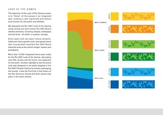
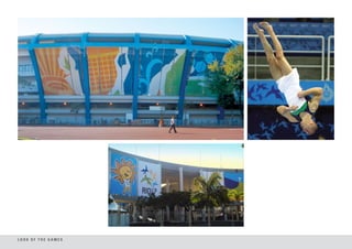
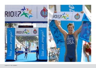
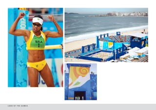
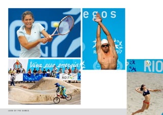
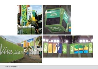
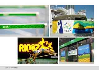
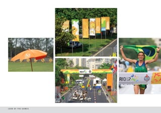
- 28. LOOK OF THE GAMES The objective of the Look of The Games project AMARELO is to “dress” all the venues in an integrated way, creating a well signalized and festive environment for the public and athletes. MATIZ LARANJA We designed the Rio 2007 Look of the Games LARANJA using strong and well known Rio 2007 Brand identity elements, including: shapes, landscapes and the birds - all within a modular concept. Every sport and non-sport venue (airports, VERDE CLARO hotels etc) had a specific color and special items that incorporated important Rio 2007 Brand elements such as the event’s slogan, mascot and pictograms. MATIZ VERDE VERDE ESCURO More than 12,000 integrated items were made for the Rio 2007 Look of the Games, decorating over fifty venues and the entire city especially for the event. Another highlight is that the entire Look was designed to be easily adapted to the Rio 2007 Parapan Games by simply exchanging AZUL CLARO the brands. It was the first time in the history of the Pan American Games that both events took place in the same venues. MATIZ AZUL AZUL ESCURO
- 29. LOOK OF THE GAMES
- 30. LOOK OF THE GAMES
- 31. LOOK OF THE GAMES
- 32. LOOK OF THE GAMES
- 33. LOOK OF THE GAMES
- 34. LOOK OF THE GAMES
- 35. LOOK OF THE GAMES
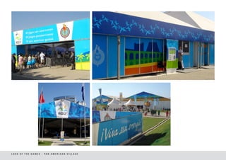
- 36. L O O K O F T H E G A M E S - PA N A M E R I C A N V I L L A G E
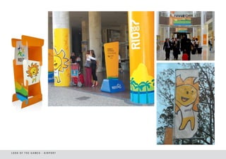
- 37. LOOK OF THE GAMES - AIRPORT
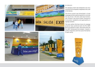
- 38. SIGNAGE The signage project was designed to be very functional and completely integrated to the Look of the Games. The entire projec t was developed in three languages and we used pictograms to minimize the use of tex t. The font used was Conduit, also utilized in the entire project, because of its excellent readabilit y and applicabilit y in signage projects. The color yellow (the best choice for signage projec t s ) was combined with the Rio 20 07 Blue and applied to signs. And along with the Rio 2007 landscapes and shapes, created a perfect integration with the Look of the Games in each venue.
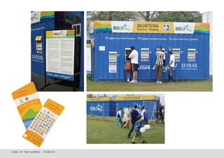
- 39. LOOK OF THE GAMES - TICKETS
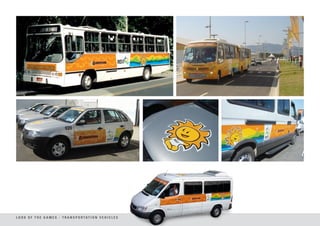
- 40. L O O K O F T H E G A M E S - T R A N S P O R TAT I O N V E H I C L E S
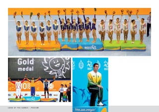
- 41. LOOK OF THE GAMES - PODIUM
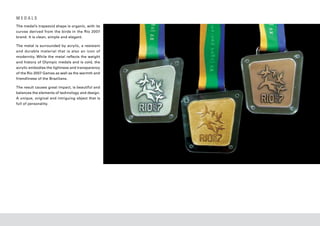
- 42. MEDALS The medal’s trapezoid shape is organic, with its curves derived from the birds in the Rio 2007 brand. It is clean, simple and elegant. The metal is surrounded by acrylic, a resistant and durable material that is also an icon of modernity. While the metal reflects the weight and history of Olympic medals and is cold, the acrylic embodies the lightness and transparency of the Rio 2007 Games as well as the warmth and friendliness of the Brazilians. The result causes great impact, is beautiful and balances the elements of technology and design. A unique, original and intriguing object that is full of personality.
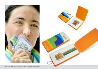
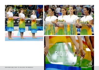
- 43. W I N N I N G A N D PA R T I C I PAT I O N M E D A L S A N D T H E I R C A S E S
- 44. U N I F O R M A N D T R AY T O D E L I V E R T H E M E D A L S
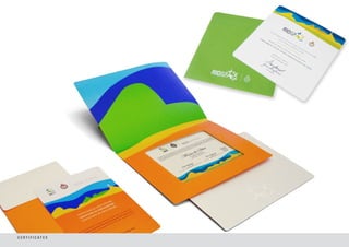
- 45. C E R T I F I C AT E S
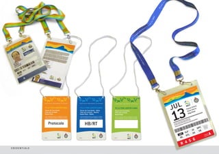
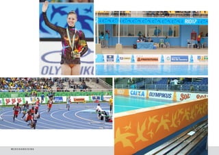
- 46. CREDENTIALS
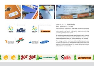
- 47. C O M M E R C I A L PA R T N E R S AND MERCHANDISING The commercial partnerships of the 2007 Pan American Games involved the three levels of Brazilian government, official sponsors, partners and suppliers. An innovative design solution was developed in order to integrate all commercial partners’ brands to the Look of the Games in an esthetically pleasing way and without distracting the athletes. This design solution was inspired by the Olympic values of equality and harmony and differentiates the Rio 2007 Games from previous Pan American Games. The brands had perfect visibility without being overpowering.
- 48. MERCHANDISING
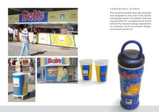
- 49. CONVENIENCE STORES The convenience stores were also decorated and integrated to the Look of the Games and signage project. This specific look also incorporated the concessionaire’s brand with all the necessary design applications o n u n i f o r m s , s t o r e e nv i r o n m e n t d e s i g n , promotional pieces etc.