Sample Portfolio of Data Visualizations
9 likes3,391 views

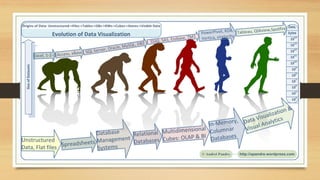
The document showcases a portfolio of data visualizations created by Andrei Pandre using tools like Tableau, QlikView, and Spotfire. It includes a variety of projects such as federal deficit timelines, sales dashboards, and visual analytics for HR data, along with links to demos and additional resources. Andrei also highlights different visualization techniques, including heatmaps, motion charts, and time series analyses.
1 of 22

Ad
Recommended
Trello
TrelloMichelle Cruz
Ėý
Trello is a free online app that allows users to organize projects visually using boards, lists, cards, checklists, and labels. It can be used solo or with teams to collaborate on projects of any size. Users can create boards to organize tasks, share updates, and track progress by moving cards between lists as tasks are completed. Trello offers versatile uses like managing personal projects, team workflows, and more across different platforms and devices.HACC-York Basic computer skills workshop
HACC-York Basic computer skills workshopLisa Hartman
Ėý
This document provides an overview of a basic computer skills workshop covering topics such as using a mouse and keyboard, Windows basics, files and folders, email, and troubleshooting. The workshop includes demonstrations of using a mouse, parts of the mouse, basic mouse clicks and drags, saving and opening files, organizing files into folders, common file types, and sending emails with attachments. It also reviews troubleshooting tips such as saving work frequently, checking passwords and connections, and restarting computers when programs freeze.simple exercises in Macromedia flash 8
simple exercises in Macromedia flash 8srividhyasowrirajan
Ėý
This document provides instructions for creating 7 different animations using Macromedia Flash 8:
1. A moving car with rotating wheels
2. A bouncing ball
3. A "piano effect" animation of letters of a word moving individually
4. A flying butterfly with enlarging and shrinking wings
5. A rotating windmill with fans rotating repeatedly
6. A growing moon that enlarges from a crescent to a full moon
7. A diving man animation with a bus hitting a man who rotates into a diving positionLesson 15 Using What If Analysis
Lesson 15 Using What If Analysisguevarra_2000
Ėý
This document explains how to use the What-If Analysis tool Goal Seek in Excel to determine unknown variables. Specifically, it walks through using Goal Seek to find the interest rate needed to achieve a $400 monthly car payment on a $20,000 loan over 5 years. It describes inserting the PMT function to calculate payments, accessing Goal Seek from the Data tab, and setting the desired payment cell and interest rate cell to determine the 7% interest rate that produces the $400 payment.Ms word
Ms wordsaurabh sen sky
Ėý
The document describes Microsoft Word 2007 and its interface. It discusses the different ribbons (Home, Insert, Page Layout, References, Mailings, Review), groups within each ribbon, and their functions. For example, the Home ribbon contains groups for formatting text like font and paragraph styles. The Page Layout ribbon allows configuring page setup, backgrounds, and object positioning.All about shortcut keys
All about shortcut keysNilabh Verma
Ėý
This document provides an overview of many common keyboard shortcuts across different operating systems and applications. It discusses shortcuts for Windows, MacOS, Linux, Internet Explorer/Mozilla Firefox, Microsoft Office applications like Excel, Word, Outlook and more. It also provides tips on how to create custom keyboard shortcuts for programs and applications. The document serves as a useful reference guide for many essential keyboard shortcuts.#3RdTT_What is social media management?
#3RdTT_What is social media management?The Post Institute: Center for Life-Long Learning
Ėý
The document outlines social media management (SMM), emphasizing the importance of creating a coherent strategy across platforms to improve organization and efficiency. It provides detailed steps for developing a social media management plan, including campaign creation, content planning, and measurement of success. Additionally, it lists various tools and resources beneficial for effective SMM.e-Governance
e-Governancessuserdbda46
Ėý
e-Government refers to the use of information and communication technologies in government operations to enhance transparency, efficiency, accountability, and citizen participation. e-Governance is a broader concept that deals with how citizens relate to government through technology, bringing new concepts of citizenship. Key differences are that e-Government focuses on internal government systems while e-Governance emphasizes citizen empowerment and two-way communication between government and citizens. Successful e-Governance requires infrastructure, security, universal standards, digitization of information, and support from leadership.OneNote 2013 - Top features deepdive
OneNote 2013 - Top features deepdiveMuawiyah Shannak
Ėý
The document is a presentation by Muawiyah Shannak on the top features of OneNote 2013, highlighting its ability to synchronize notes across devices and share content. It includes demonstrations of adding and editing content, drawing, and integrating with the Office suite, as well as real-world applications for personal organization. The presentation concludes with a Q&A session to discuss practical uses of OneNote.social media
social mediaMaliha Firdous
Ėý
Social media refers to websites and applications that allow users to share content and communicate. Facebook has the most users worldwide, with over 1.5 billion. Social media is widely used, with over half of the global population being active on mobile social platforms. It is used for various purposes like staying connected with others, sharing ideas and reviews, and raising awareness for causes. While it has benefits like education and connectivity, it also has some negative effects like addiction, privacy issues, and cyberbullying.OpenOffice.org Writer: The Basics
OpenOffice.org Writer: The BasicsCzarli Evangelista
Ėý
The document provides an introduction to using OpenOffice Writer. It discusses what Writer is, how to get started, how to work with documents and text, formatting options, inserting tables and graphics, and using styles. Key sections include how to create, open, and save documents; selecting, copying, cutting and pasting text; inserting page numbers, bullets and numbering; and changing text to different predefined styles like Title, Heading 1, and Subtitle.presentation on data science with python
presentation on data science with pythonKhushbujaim
Ėý
The document discusses a seminar on data science with Python. It defines data science as using insights from data to help business leaders make better decisions. Python is described as a popular and free tool for data analysis, visualization, and machine learning tasks in data science. The seminar covers Python basics like data types, looping, and libraries like NumPy for mathematics and Pandas for working with table-like data. Real-world applications of data science are also mentioned.Introduction to Scratch Programming
Introduction to Scratch ProgrammingStorytimeSteph
Ėý
Scratch is a free programming tool that allows kids to create games, stories and art. It was developed by MIT. To use Scratch, you visit the website and click "Try it Out". You can then choose a sprite and background. Programming in Scratch involves dragging blocks representing commands like motion, looks, sound and pen into the scripts area. Clicking the flag runs the program. The document provides examples of using different block commands to program a sprite's movement, appearance and add sound.An Introduction of Microsoft Office .pptx
An Introduction of Microsoft Office .pptxChristianClienAbejo
Ėý
This document provides an introduction to the Microsoft Office suite, including MS Word, PowerPoint, and Excel. It discusses what each program is, how to open it, and some key features. MS Word is a word processing program used to create documents, letters, reports, etc. PowerPoint is a presentation software used to create slideshows. Excel is a spreadsheet program used to record and analyze data in tables. The document explains how to open each program and lists some common features and functions like formatting text, inserting images, designing slides, and calculating formulas.Microsoft Teams Tutorial
Microsoft Teams TutorialFocusU Engage
Ėý
This document provides instructions for various features in Microsoft Teams meetings and channels. It explains how to schedule a Teams meeting, start a meeting and share the invite link, change member settings, add channels and invite people, make participants presenters or attendees, use features like raise hand and polls during meetings.Getting started with Adobe Photoshop 7.0
Getting started with Adobe Photoshop 7.0Najma Alam
Ėý
This document provides an overview of how to use Adobe Photoshop. It discusses starting Photoshop, opening and saving files, understanding the interface with tools, palettes and layers. Key functions covered include using help, viewing and printing documents, and closing a Photoshop session. The document also outlines some introductory tasks and an assignment on object rendering.Microsoft word - teaching slides
Microsoft word - teaching slidesMiss-Short
Ėý
This document outlines learning objectives and tasks for a Microsoft Word course. It covers topics like keyboard shortcuts, formatting tables, creating documents, smart art, mail merges, and showcasing skills. The objectives focus on understanding important Word skills like using shortcuts, formatting text and tables, adding headers/footers, and creating professional documents. Learners are assigned tasks like creating documents and mail merges to practice these skills. They are also instructed to update a tracker sheet to log their progress and skill level.Gimp
Gimprmanimaran
Ėý
Gimp is a free and open source photo editing program. It provides various tools for editing images, including tools for cropping, resizing, drawing, cloning, and adjusting colors and lighting. The document outlines the basic tools in Gimp and provides instructions for cutting, copying, and pasting selections as well as changing an old image to a new one.Sentiment Analysis using Twitter Data
Sentiment Analysis using Twitter DataHari Prasad
Ėý
The document outlines a sentiment analysis guide focusing on analyzing sentiments from Twitter data regarding electronic products. It compares an existing knowledge-based classification system with a proposed data mining approach using algorithms like NaÃŊve Bayes and Support Vector Machine (SVM), highlighting the advantages of the latter in terms of accuracy and efficiency. The proposed system emphasizes preprocessing techniques for effective sentiment analysis, ultimately visualizing results through word clouds and pie charts.Photo Editor Apps
Photo Editor AppsMax Agarwal
Ėý
The document outlines various free photo editing apps, including PhotoFunia, Pho.to Lab, Picsplay, Meme Rage Photo Editor, Pic Collage, Instaframe, PicsArt, and TextCutie. Each app offers unique features such as fun effects, collages, meme creation, and text editing, making it easy for users to enhance their photos and unleash their creativity. The document provides app descriptions along with their locations on the Google Play Store.Word 2016 module 1 ppt presentation
Word 2016 module 1 ppt presentationdgdotson
Ėý
The document outlines the module objectives for Word 2016, which include understanding word processing software, exploring the Word window, starting and saving documents, selecting and formatting text, using document templates, and navigating documents. The module contains 27 slides that provide instruction on the features and functions of Word 2016 through explanations, screenshots and examples.Human computer interaction
Human computer interactionMayuresh Singh
Ėý
Human-computer interaction (HCI) is a multidisciplinary field that studies the design and use of computer technology and aims to ensure that systems are easy to use and meet the needs of users. HCI draws from both computer sciences like computer vision and programming as well as human sciences like cognitive psychology and ergonomics. Researchers in HCI develop new interaction methods, prototype systems, and explore paradigms to improve the interaction between humans and machines.Introduction to Microsoft Office
Introduction to Microsoft OfficeCik Na Shohaili
Ėý
Microsoft Office is a suite of desktop applications, servers and services introduced in 1989. It originally included Word, Excel and PowerPoint. Over time, Office applications have integrated shared features.
The current versions are Office 2013 for Windows and Office 2011 for Mac. Office 2013 was released in October 2012 and includes updated versions of Word, Excel, PowerPoint and other applications.
Word is a word processor that was previously the main Office application. It saves documents in the .docx format and is available for Windows and Mac. The first version of Word was released in 1983 for MS-DOS and introduced the mouse.Intro to Data warehousing Lecture 06
Intro to Data warehousing Lecture 06AnwarrChaudary
Ėý
The document discusses various types of Online Analytical Processing (OLAP) implementations, focusing on Multidimensional OLAP (MOLAP) and its cube-like data structure for analytics. It outlines the advantages and drawbacks of MOLAP, address issues related to maintenance and storage, and compares it with Relational OLAP (ROLAP) and Hybrid OLAP (HOLAP). Key operations such as drill-down, rollup, and pivoting are also explained, alongside the importance of cube partitioning and the challenges of scalability.OLAPCUBE.pptx
OLAPCUBE.pptxDrJANANIA1
Ėý
OLAP cubes organize and represent large volumes of data in a multidimensional structure to facilitate efficient analysis across dimensions like time, product, and location. Key features include multidimensional structure, measures, aggregation, slicing and dicing, and drill-down. OLAP cubes are used in business intelligence, financial analysis, retail, healthcare, manufacturing, and e-commerce. They involve collecting, transforming, and aggregating data before users query and analyze the cube using OLAP tools or BI platforms.DWO -Pertemuan 1
DWO -Pertemuan 1Abrianto Nugraha
Ėý
This document discusses data warehousing and online analytic processing (OLAP). It introduces key concepts such as data warehouses, OLAP, multidimensional data models, dimension hierarchies, and OLAP queries including roll-up, drill-down, pivoting, slicing and dicing. It also covers implementation issues such as indexing techniques and view maintenance to enable interactive queries for OLAP.Qlik View Ase 2009
Qlik View Ase 2009Alex Barbulescu
Ėý
The document discusses topics related to business intelligence (BI) and data analysis software QlikView. It provides an overview of the agenda which includes introductions to BI basics, AQL technology compared to OLAP, QlikView deployment examples, the implementation process, and advanced visual design techniques. The document also includes sections on dimensional data models, QlikView features for dynamic data analysis, and best practices for visualization design.Building a semantic/metrics layer using Calcite
Building a semantic/metrics layer using CalciteJulian Hyde
Ėý
The document discusses the creation of a semantic or metrics layer utilizing Apache Calcite, which serves as an intermediary between business users and databases, facilitating query composition and data governance. Key topics include enhancing SQL with measures, the differences between relational and dimensional models, and machine-learning patterns within data querying. The session, led by Julian Hyde from Google, also addresses challenges and solutions in forecasting and clustering within data analytics.Business visualisation
Business visualisationNiharika Varshney
Ėý
This document describes a case study for an analyst at a toy manufacturing company, Megacorp, to analyze the company's data source. The data source includes information on Megacorp's manufacturing facilities across the US, production units at each facility, products produced, and financial metrics like expenses, revenue, and profit. The analyst is asked to create various visualizations and reports to answer questions about the relationships between variables in the data like unit capacity and yield, unit age and reliability, expenses and profitability by facility, and trends over time.More Related Content
What's hot (16)
e-Governance
e-Governancessuserdbda46
Ėý
e-Government refers to the use of information and communication technologies in government operations to enhance transparency, efficiency, accountability, and citizen participation. e-Governance is a broader concept that deals with how citizens relate to government through technology, bringing new concepts of citizenship. Key differences are that e-Government focuses on internal government systems while e-Governance emphasizes citizen empowerment and two-way communication between government and citizens. Successful e-Governance requires infrastructure, security, universal standards, digitization of information, and support from leadership.OneNote 2013 - Top features deepdive
OneNote 2013 - Top features deepdiveMuawiyah Shannak
Ėý
The document is a presentation by Muawiyah Shannak on the top features of OneNote 2013, highlighting its ability to synchronize notes across devices and share content. It includes demonstrations of adding and editing content, drawing, and integrating with the Office suite, as well as real-world applications for personal organization. The presentation concludes with a Q&A session to discuss practical uses of OneNote.social media
social mediaMaliha Firdous
Ėý
Social media refers to websites and applications that allow users to share content and communicate. Facebook has the most users worldwide, with over 1.5 billion. Social media is widely used, with over half of the global population being active on mobile social platforms. It is used for various purposes like staying connected with others, sharing ideas and reviews, and raising awareness for causes. While it has benefits like education and connectivity, it also has some negative effects like addiction, privacy issues, and cyberbullying.OpenOffice.org Writer: The Basics
OpenOffice.org Writer: The BasicsCzarli Evangelista
Ėý
The document provides an introduction to using OpenOffice Writer. It discusses what Writer is, how to get started, how to work with documents and text, formatting options, inserting tables and graphics, and using styles. Key sections include how to create, open, and save documents; selecting, copying, cutting and pasting text; inserting page numbers, bullets and numbering; and changing text to different predefined styles like Title, Heading 1, and Subtitle.presentation on data science with python
presentation on data science with pythonKhushbujaim
Ėý
The document discusses a seminar on data science with Python. It defines data science as using insights from data to help business leaders make better decisions. Python is described as a popular and free tool for data analysis, visualization, and machine learning tasks in data science. The seminar covers Python basics like data types, looping, and libraries like NumPy for mathematics and Pandas for working with table-like data. Real-world applications of data science are also mentioned.Introduction to Scratch Programming
Introduction to Scratch ProgrammingStorytimeSteph
Ėý
Scratch is a free programming tool that allows kids to create games, stories and art. It was developed by MIT. To use Scratch, you visit the website and click "Try it Out". You can then choose a sprite and background. Programming in Scratch involves dragging blocks representing commands like motion, looks, sound and pen into the scripts area. Clicking the flag runs the program. The document provides examples of using different block commands to program a sprite's movement, appearance and add sound.An Introduction of Microsoft Office .pptx
An Introduction of Microsoft Office .pptxChristianClienAbejo
Ėý
This document provides an introduction to the Microsoft Office suite, including MS Word, PowerPoint, and Excel. It discusses what each program is, how to open it, and some key features. MS Word is a word processing program used to create documents, letters, reports, etc. PowerPoint is a presentation software used to create slideshows. Excel is a spreadsheet program used to record and analyze data in tables. The document explains how to open each program and lists some common features and functions like formatting text, inserting images, designing slides, and calculating formulas.Microsoft Teams Tutorial
Microsoft Teams TutorialFocusU Engage
Ėý
This document provides instructions for various features in Microsoft Teams meetings and channels. It explains how to schedule a Teams meeting, start a meeting and share the invite link, change member settings, add channels and invite people, make participants presenters or attendees, use features like raise hand and polls during meetings.Getting started with Adobe Photoshop 7.0
Getting started with Adobe Photoshop 7.0Najma Alam
Ėý
This document provides an overview of how to use Adobe Photoshop. It discusses starting Photoshop, opening and saving files, understanding the interface with tools, palettes and layers. Key functions covered include using help, viewing and printing documents, and closing a Photoshop session. The document also outlines some introductory tasks and an assignment on object rendering.Microsoft word - teaching slides
Microsoft word - teaching slidesMiss-Short
Ėý
This document outlines learning objectives and tasks for a Microsoft Word course. It covers topics like keyboard shortcuts, formatting tables, creating documents, smart art, mail merges, and showcasing skills. The objectives focus on understanding important Word skills like using shortcuts, formatting text and tables, adding headers/footers, and creating professional documents. Learners are assigned tasks like creating documents and mail merges to practice these skills. They are also instructed to update a tracker sheet to log their progress and skill level.Gimp
Gimprmanimaran
Ėý
Gimp is a free and open source photo editing program. It provides various tools for editing images, including tools for cropping, resizing, drawing, cloning, and adjusting colors and lighting. The document outlines the basic tools in Gimp and provides instructions for cutting, copying, and pasting selections as well as changing an old image to a new one.Sentiment Analysis using Twitter Data
Sentiment Analysis using Twitter DataHari Prasad
Ėý
The document outlines a sentiment analysis guide focusing on analyzing sentiments from Twitter data regarding electronic products. It compares an existing knowledge-based classification system with a proposed data mining approach using algorithms like NaÃŊve Bayes and Support Vector Machine (SVM), highlighting the advantages of the latter in terms of accuracy and efficiency. The proposed system emphasizes preprocessing techniques for effective sentiment analysis, ultimately visualizing results through word clouds and pie charts.Photo Editor Apps
Photo Editor AppsMax Agarwal
Ėý
The document outlines various free photo editing apps, including PhotoFunia, Pho.to Lab, Picsplay, Meme Rage Photo Editor, Pic Collage, Instaframe, PicsArt, and TextCutie. Each app offers unique features such as fun effects, collages, meme creation, and text editing, making it easy for users to enhance their photos and unleash their creativity. The document provides app descriptions along with their locations on the Google Play Store.Word 2016 module 1 ppt presentation
Word 2016 module 1 ppt presentationdgdotson
Ėý
The document outlines the module objectives for Word 2016, which include understanding word processing software, exploring the Word window, starting and saving documents, selecting and formatting text, using document templates, and navigating documents. The module contains 27 slides that provide instruction on the features and functions of Word 2016 through explanations, screenshots and examples.Human computer interaction
Human computer interactionMayuresh Singh
Ėý
Human-computer interaction (HCI) is a multidisciplinary field that studies the design and use of computer technology and aims to ensure that systems are easy to use and meet the needs of users. HCI draws from both computer sciences like computer vision and programming as well as human sciences like cognitive psychology and ergonomics. Researchers in HCI develop new interaction methods, prototype systems, and explore paradigms to improve the interaction between humans and machines.Introduction to Microsoft Office
Introduction to Microsoft OfficeCik Na Shohaili
Ėý
Microsoft Office is a suite of desktop applications, servers and services introduced in 1989. It originally included Word, Excel and PowerPoint. Over time, Office applications have integrated shared features.
The current versions are Office 2013 for Windows and Office 2011 for Mac. Office 2013 was released in October 2012 and includes updated versions of Word, Excel, PowerPoint and other applications.
Word is a word processor that was previously the main Office application. It saves documents in the .docx format and is available for Windows and Mac. The first version of Word was released in 1983 for MS-DOS and introduced the mouse.Similar to Sample Portfolio of Data Visualizations (20)
Intro to Data warehousing Lecture 06
Intro to Data warehousing Lecture 06AnwarrChaudary
Ėý
The document discusses various types of Online Analytical Processing (OLAP) implementations, focusing on Multidimensional OLAP (MOLAP) and its cube-like data structure for analytics. It outlines the advantages and drawbacks of MOLAP, address issues related to maintenance and storage, and compares it with Relational OLAP (ROLAP) and Hybrid OLAP (HOLAP). Key operations such as drill-down, rollup, and pivoting are also explained, alongside the importance of cube partitioning and the challenges of scalability.OLAPCUBE.pptx
OLAPCUBE.pptxDrJANANIA1
Ėý
OLAP cubes organize and represent large volumes of data in a multidimensional structure to facilitate efficient analysis across dimensions like time, product, and location. Key features include multidimensional structure, measures, aggregation, slicing and dicing, and drill-down. OLAP cubes are used in business intelligence, financial analysis, retail, healthcare, manufacturing, and e-commerce. They involve collecting, transforming, and aggregating data before users query and analyze the cube using OLAP tools or BI platforms.DWO -Pertemuan 1
DWO -Pertemuan 1Abrianto Nugraha
Ėý
This document discusses data warehousing and online analytic processing (OLAP). It introduces key concepts such as data warehouses, OLAP, multidimensional data models, dimension hierarchies, and OLAP queries including roll-up, drill-down, pivoting, slicing and dicing. It also covers implementation issues such as indexing techniques and view maintenance to enable interactive queries for OLAP.Qlik View Ase 2009
Qlik View Ase 2009Alex Barbulescu
Ėý
The document discusses topics related to business intelligence (BI) and data analysis software QlikView. It provides an overview of the agenda which includes introductions to BI basics, AQL technology compared to OLAP, QlikView deployment examples, the implementation process, and advanced visual design techniques. The document also includes sections on dimensional data models, QlikView features for dynamic data analysis, and best practices for visualization design.Building a semantic/metrics layer using Calcite
Building a semantic/metrics layer using CalciteJulian Hyde
Ėý
The document discusses the creation of a semantic or metrics layer utilizing Apache Calcite, which serves as an intermediary between business users and databases, facilitating query composition and data governance. Key topics include enhancing SQL with measures, the differences between relational and dimensional models, and machine-learning patterns within data querying. The session, led by Julian Hyde from Google, also addresses challenges and solutions in forecasting and clustering within data analytics.Business visualisation
Business visualisationNiharika Varshney
Ėý
This document describes a case study for an analyst at a toy manufacturing company, Megacorp, to analyze the company's data source. The data source includes information on Megacorp's manufacturing facilities across the US, production units at each facility, products produced, and financial metrics like expenses, revenue, and profit. The analyst is asked to create various visualizations and reports to answer questions about the relationships between variables in the data like unit capacity and yield, unit age and reliability, expenses and profitability by facility, and trends over time.Sap lumira training
Sap lumira trainingbidwhm
Ėý
The document outlines the features and capabilities of SAP Lumira, a data visualization application that allows users to manipulate and report on data. It provides information on acquiring and editing data, creating various types of charts, and performing forecasting and analysis using historical data. Additionally, the document lists training and technical support options available for users of the software.ReactJS for Dashboards and Data Visualization: An Exceptional Choice
ReactJS for Dashboards and Data Visualization: An Exceptional ChoiceKaty Slemon
Ėý
The document discusses how ReactJS is well-suited for building dashboards and data visualizations due to its reusable component architecture, virtual DOM, isomorphic JavaScript capabilities, and large ecosystem of charts and tools. Some key benefits highlighted include fast rendering, continuous library development, and the ability to create interactive and customizable visualizations. Examples of different types of dashboards built with ReactJS are provided, such as marketing, sales, executive, and mobile dashboards. Key performance indicators and metrics that can be tracked using ReactJS dashboards are also mentioned.Introduction to OLAP and OLTP Concepts - DBMS
Introduction to OLAP and OLTP Concepts - DBMSVasudha Rao
Ėý
The document compares Online Transaction Processing (OLTP) and Online Analytical Processing (OLAP), highlighting their key characteristics and use cases. It explains data mining as a method for knowledge discovery and details the organization of data in data warehouses to support OLAP and data mining tasks. The document also discusses advanced querying techniques, such as aggregation, drilling down, rolling up, and the use of cube and rollup operators for efficient data analysis.IT301-Datawarehousing (1) and its sub topics.pptx
IT301-Datawarehousing (1) and its sub topics.pptxReneeClintGortifacio
Ėý
The document discusses data warehousing and the star schema. It defines a data warehouse as a repository of integrated information available for queries and analysis. The data comes from heterogeneous sources and can be queried together. It describes how a star schema organizes data into a central fact table surrounded by dimension tables. The fact table contains keys linking to attributes in the dimension tables. Star queries are processed by first using bitmap indexes on the fact table keys to retrieve relevant rows, then joining the results to the dimension tables.Rick Watkins Power Point presentation
Rick Watkins Power Point presentationrickwatkins
Ėý
This document provides a summary of the author's professional experience and skills in category management, retail planning, and data analysis. They have extensive experience with retail planning and analytical software, as well as expertise in working with retail data. Their skills include developing assortment plans, creating analytical reports, and automating processes through Excel macros and VBA coding. They aim to maximize efficiency and provide meaningful analysis to support business decisions.Multidimensional Data Analysis with Ruby (sample)
Multidimensional Data Analysis with Ruby (sample)Raimonds Simanovskis
Ėý
This document discusses using Ruby to perform multidimensional data analysis on relational databases. It introduces Mondrian, an open-source OLAP engine that allows for multidimensional analysis on top of SQL databases using the MDX query language. A new Ruby gem called mondrian-olap will integrate Mondrian and provide a Ruby DSL and ActiveRecord-like query interface for defining OLAP schemas and performing analytical queries on relational data in a simpler way than SQL. Examples show how to write multidimensional queries in MDX and the Ruby interface to analyze sales data across dimensions like time, products, and customers.Visual guidance for power bi redmond sql sat 2019
Visual guidance for power bi redmond sql sat 2019Berkovich Consulting
Ėý
The document provides guidance on designing effective Power BI reports, emphasizing UI/UX principles and the importance of governance. Key topics include navigating Power BI tools, creating intuitive designs, using appropriate visualizations, and organizational branding. The presentation also explores advanced features like custom visuals and the significance of clarity and simplicity in data reporting.DW-lecture2.ppt
DW-lecture2.pptAnilGupta681764
Ėý
This document discusses multidimensional data models and cube operations. It introduces key concepts like facts and measures, dimensions and hierarchies. It describes star and snowflake schemas for structuring multidimensional data in a relational database. The document also covers cube operations like roll-up, drill-down, slice and dice that allow interactive analysis of aggregated data across multiple dimensions.OLAP Basics and Fundamentals by Bharat Kalia
OLAP Basics and Fundamentals by Bharat Kalia Bharat Kalia
Ėý
The document discusses online analytical processing (OLAP) and the need for OLAP capabilities beyond basic data analysis. It describes how OLAP uses multidimensional data models and pre-computed aggregates to provide fast and interactive analysis of data across multiple dimensions. Different approaches for implementing OLAP like ROLAP, MOLAP, and hybrid systems are covered.A.Asgharian.Portfolio
A.Asgharian.Portfolioaasgharian
Ėý
This document contains summaries of multiple SQL projects including a bank database, SSIS/SSRS packages on AdventureWorks data, and a movie rental store database. The bank database project involved creating features for customers, accounts, transactions, ATM and teller inquiries. The SSIS/SSRS project used packages to import data from CSV files into tables and reports on vendor sales and ship methods. The movie rental store project designed a video chain with online and store access, using views, stored procedures, SSIS packages, and SSRS reports for check in/out/returns, batch processing, and management reporting.Building a Graph-based Analytics Platform
Building a Graph-based Analytics PlatformKenny Bastani
Ėý
The document outlines the development of a graph-based analytics platform utilizing Neo4j and Meetup.com data to analyze trends in meetup group growth through various questions and reporting metrics. It discusses the challenges faced in data acquisition, API design, and visualization, while providing methods for generating time series data and creating interactive dashboards. Additionally, it includes URLs for demo applications and references to further documentation for deeper insights into the project.Apache Kylin @ Big Data Europe 2015
Apache Kylin @ Big Data Europe 2015Seshu Adunuthula
Ėý
The document discusses Apache Kylin, an open source distributed analytics engine that provides SQL interface and multi-dimensional analysis (OLAP) on Hadoop for extremely large datasets. It provides an overview of Kylin's features such as sub-second query latency, ANSI SQL support, and seamless integration with BI tools. The document also covers Kylin's architecture, cube storage in HBase, query processing using Calcite, and optimization techniques for cube building.Project report aditi paul1
Project report aditi paul1guest9529cb
Ėý
This document provides an overview of online analytical processing (OLAP). It defines OLAP as a process for analyzing multidimensional data to help decision makers. OLAP uses data warehouses to store historical data in a structured format. It allows for analytical queries and operations like aggregation, roll-up, drill-down and slicing and dicing of data. SQL extensions and OLAP functions further aid analysis. OLAP systems can be MOLAP, ROLAP or HOLAP based on their architecture and data storage methods. Commercial OLAP systems include IBM, Oracle and Microsoft products.Rick Watkins Power Point Presentation on Automation efficiencies
Rick Watkins Power Point Presentation on Automation efficienciesrickwatkins
Ėý
This document provides a summary of the author's professional experience and skills in category management, retail planning, and data analysis. It highlights extensive experience using various retail planning and analytical software, as well as expertise in allocating inventory, creating assortment plans, and producing analytical reports using Excel macros and other tools. The author has skills in automating processes, extracting and cleaning data, and implementing improvements to workflows.Ad
Recently uploaded (20)
Oh, the Possibilities - Balancing Innovation and Risk with Generative AI.pdf
Oh, the Possibilities - Balancing Innovation and Risk with Generative AI.pdfPriyanka Aash
Ėý
Oh, the Possibilities - Balancing Innovation and Risk with Generative AIAI VIDEO MAGAZINE - June 2025 - r/aivideo
AI VIDEO MAGAZINE - June 2025 - r/aivideo1pcity Studios, Inc
Ėý
AI VIDEO MAGAZINE - r/aivideo community newsletter â Exclusive Tutorials: How to make an AI VIDEO from scratch, PLUS: How to make AI MUSIC, Hottest ai videos of 2025, Exclusive Interviews, New Tools, Previews, and MORE - JUNE 2025 ISSUE -The Future of Technology: 2025-2125 by Saikat Basu.pdf
The Future of Technology: 2025-2125 by Saikat Basu.pdfSaikat Basu
Ėý
A peek into the next 100 years of technology. From Generative AI to Global AI networks to Martian Colonisation to Interstellar exploration to Industrial Nanotechnology to Artificial Consciousness, this is a journey you don't want to miss. Which ones excite you the most? Which ones are you apprehensive about? Feel free to comment! Let the conversation begin!A Constitutional Quagmire - Ethical Minefields of AI, Cyber, and Privacy.pdf
A Constitutional Quagmire - Ethical Minefields of AI, Cyber, and Privacy.pdfPriyanka Aash
Ėý
A Constitutional Quagmire - Ethical Minefields of AI, Cyber, and PrivacyLessons Learned from Developing Secure AI Workflows.pdf
Lessons Learned from Developing Secure AI Workflows.pdfPriyanka Aash
Ėý
Lessons Learned from Developing Secure AI WorkflowsQuantum AI: Where Impossible Becomes Probable
Quantum AI: Where Impossible Becomes ProbableSaikat Basu
Ėý
Imagine combining the "brains" of Artificial Intelligence (AI) with the "super muscles" of Quantum Computing. That's Quantum AI!
It's a new field that uses the mind-bending rules of quantum physics to make AI even more powerful.Mastering AI Workflows with FME by Mark DoĖring
Mastering AI Workflows with FME by Mark DoĖringSafe Software
Ėý
Harness the full potential of AI with FME: From creating high-quality training data to optimizing models and utilizing results, FME supports every step of your AI workflow. Seamlessly integrate a wide range of models, including those for data enhancement, forecasting, image and object recognition, and large language models. Customize AI models to meet your exact needs with FMEâs powerful tools for training, optimization, and seamless integrationOpenPOWER Foundation & Open-Source Core Innovations
OpenPOWER Foundation & Open-Source Core InnovationsIBM
Ėý
penPOWER offers a fully open, royalty-free CPU architecture for custom chip design.
It enables both lightweight FPGA cores (like Microwatt) and high-performance processors (like POWER10).
Developers have full access to source code, specs, and tools for end-to-end chip creation.
It supports AI, HPC, cloud, and embedded workloads with proven performance.
Backed by a global community, it fosters innovation, education, and collaboration."Scaling in space and time with Temporal", Andriy Lupa.pdf
"Scaling in space and time with Temporal", Andriy Lupa.pdfFwdays
Ėý
Design patterns like Event Sourcing and Event Streaming have long become standards for building real-time analytics systems. However, when the system load becomes nonlinear with fast and often unpredictable spikes, it's crucial to respond quickly in order not to lose real-time operating itself.
In this talk, Iâll share my experience implementing and using a tool like Temporal.io. We'll explore the evolution of our system for maintaining real-time report generation and discuss how we use Temporal both for short-lived pipelines and long-running background tasks." How to survive with 1 billion vectors and not sell a kidney: our low-cost c...
" How to survive with 1 billion vectors and not sell a kidney: our low-cost c...Fwdays
Ėý
Let's talk about our history. How we started the project with a small vector database of less than 2 million records. Later, we received a request for +100 million records, then another +100... And so gradually we reached almost 1 billion. Standard tools were quickly running out of steam - we were running into performance, index size, and very limited resources. After a long series of trials and errors, we built our own low-cost cluster, which today stably processes thousands of queries to more than 1B vectors.Wenn alles versagt - IBM Tape schÞtzt, was zÃĪhlt! Und besonders mit dem neust...
Wenn alles versagt - IBM Tape schÞtzt, was zÃĪhlt! Und besonders mit dem neust...Josef Weingand
Ėý
IBM LTO10GenAI Opportunities and Challenges - Where 370 Enterprises Are Focusing Now.pdf
GenAI Opportunities and Challenges - Where 370 Enterprises Are Focusing Now.pdfPriyanka Aash
Ėý
GenAI Opportunities and Challenges - Where 370 Enterprises Are Focusing NowCurietech AI in action - Accelerate MuleSoft development
Curietech AI in action - Accelerate MuleSoft developmentshyamraj55
Ėý
CurieTech AI in Action â Accelerate MuleSoft Development
Overview:
This presentation demonstrates how CurieTech AIâs purpose-built agents empower MuleSoft developers to create integration workflows faster, more accurately, and with less manual effort
linkedin.com
+12
curietech.ai
+12
meetups.mulesoft.com
+12
.
Key Highlights:
Dedicated AI agents for every stage: Coding, Testing (MUnit), Documentation, Code Review, and Migration
curietech.ai
+7
curietech.ai
+7
medium.com
+7
DataWeave automation: Generate mappings from tables or samplesâ95%+ complete within minutes
linkedin.com
+7
curietech.ai
+7
medium.com
+7
Integration flow generation: Auto-create Mule flows based on specificationsâspeeds up boilerplate development
curietech.ai
+1
medium.com
+1
Efficient code reviews: Gain intelligent feedback on flows, patterns, and error handling
youtube.com
+8
curietech.ai
+8
curietech.ai
+8
Test & documentation automation: Auto-generate MUnit test cases, sample data, and detailed docs from code
curietech.ai
+5
curietech.ai
+5
medium.com
+5
Why Now?
Achieve 10Ã productivity gains, slashing development time from hours to minutes
curietech.ai
+3
curietech.ai
+3
medium.com
+3
Maintain high accuracy with code quality matching or exceeding manual efforts
curietech.ai
+2
curietech.ai
+2
curietech.ai
+2
Ideal for developers, architects, and teams wanting to scale MuleSoft projects with AI efficiency
Conclusion:
CurieTech AI transforms MuleSoft development into an AI-accelerated workflowâletting you focus on innovation, not repetition.Raman Bhaumik - Passionate Tech Enthusiast
Raman Bhaumik - Passionate Tech EnthusiastRaman Bhaumik
Ėý
A Junior Software Developer with a flair for innovation, Raman Bhaumik excels in delivering scalable web solutions. With three years of experience and a solid foundation in Java, Python, JavaScript, and SQL, she has streamlined task tracking by 20% and improved application stability.You are not excused! How to avoid security blind spots on the way to production
You are not excused! How to avoid security blind spots on the way to productionMichele Leroux Bustamante
Ėý
We live in an ever evolving landscape for cyber threats creating security risk for your production systems. Mitigating these risks requires participation throughout all stages from development through production delivery - and by every role including architects, developers QA and DevOps engineers, product owners and leadership. No one is excused! This session will cover examples of common mistakes or missed opportunities that can lead to vulnerabilities in production - and ways to do better throughout the development lifecycle.10 Key Challenges for AI within the EU Data Protection Framework.pdf
10 Key Challenges for AI within the EU Data Protection Framework.pdfPriyanka Aash
Ėý
10 Key Challenges for AI within the EU Data Protection FrameworkEIS-Webinar-Engineering-Retail-Infrastructure-06-16-2025.pdf
EIS-Webinar-Engineering-Retail-Infrastructure-06-16-2025.pdfEarley Information Science
Ėý
As AI reshapes expectations in retail and B2B commerce, organizations are recognizing a critical reality: meaningful AI outcomes depend on well-structured, adaptable infrastructure. In this session, Seth Earley is joined by Phil Ryan - AI strategist, search technologist, and founder of Glass Leopard Technologies - for a candid conversation on what it truly means to engineer systems for scale, agility, and intelligence.
Phil draws on more than two decades of experience leading search and AI initiatives for enterprise organizations. Together, he and Seth explore the challenges businesses face when legacy architectures limit personalization, agility, and real-time decisioning - and what needs to change to support agentic technologies and next-best-action capabilities.
Key themes from the webinar include:
Composability as a prerequisite for AIĖý- Why modular, loosely coupled systems are essential for adapting to rapid innovation and evolving business needs
Search and relevance as foundational to AIĖý- How techniques honed-in enterprise search have laid the groundwork for more responsive and intelligent customer experiences
From MDM and CDP to agentic systemsĖý- How data platforms are evolving to support richer customer context and dynamic orchestration
Engineering for business alignmentĖý- Why successful AI programs require architectural decisions grounded in measurable outcomes
The conversation is practical and forward-looking, connecting deep technical understanding with real-world business needs. Whether youâre modernizing your commerce stack or exploring how AI can enhance product discovery, personalization, or customer journeys, this session provides a clear-eyed view of the capabilities, constraints, and priorities that matter most.Cracking the Code - Unveiling Synergies Between Open Source Security and AI.pdf
Cracking the Code - Unveiling Synergies Between Open Source Security and AI.pdfPriyanka Aash
Ėý
Cracking the Code - Unveiling Synergies Between Open Source Security and AIYou are not excused! How to avoid security blind spots on the way to production
You are not excused! How to avoid security blind spots on the way to productionMichele Leroux Bustamante
Ėý
Ad
Sample Portfolio of Data Visualizations
- 1. Sample Portfolio of Data Visualizations Andrei Pandre Tools: Tableau, Qlikview, Spotfire, Omniscope, Google Charts Andreiâs Blog: http://apandre.wordpress.com/
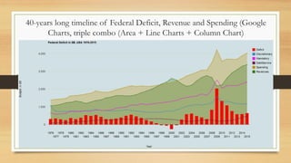
- 2. 40-years long timeline of Federal Deficit, Revenue and Spending (Google Charts, triple combo (Area + Line Charts + Column Chart)
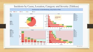
- 3. Incidents by Cause, Location, Category and Severity (Tableau)
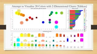
- 4. Attempt to Visualize 20 Colors with 2-Dimensional Charts (Tableau)
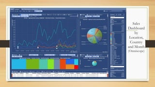
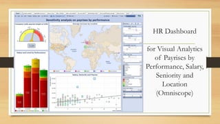
- 6. HR Dashboard for Visual Analytics of Payrises by Performance, Salary, Seniority and Location (Omniscope)
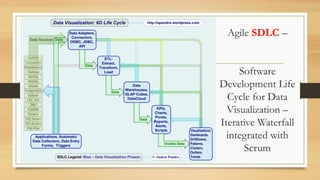
- 7. Agile SDLC â Software Development Life Cycle for Data Visualization â Iterative Waterfall integrated with Scrum
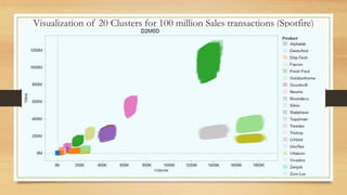
- 8. Visualization of 20 Clusters for 100 million Sales transactions (Spotfire)
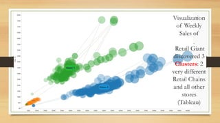
- 9. Visualization of Weekly Sales of Retail Giant discovered 3 Clusters: 2 very different Retail Chains and all other stores (Tableau)
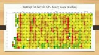
- 10. Heatmap for Serverâs CPU hourly usage (Tableau)
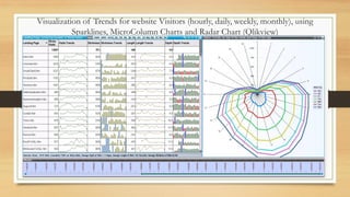
- 11. Visualization of Trends for website Visitors (hourly, daily, weekly, monthly), using Sparklines, MicroColumn Charts and Radar Chart (Qlikview)
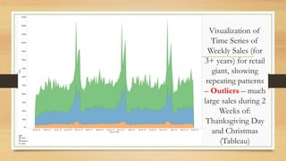
- 13. Visualization of Time Series of Weekly Sales (for 3+ years) for retail giant, showing repeating patterns â Outliers â much large sales during 2 Weeks of: Thanksgiving Day and Christmas (Tableau)
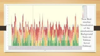
- 14. Near Realtimeline Visualization of the simultaneous Background Tasks on Tableau Server (Tableau)
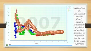
- 16. Motion Chart (5dimensional Bubble Chart), showing dynamically population of multiple countries by population size, income, fertility, year (Qlikview)
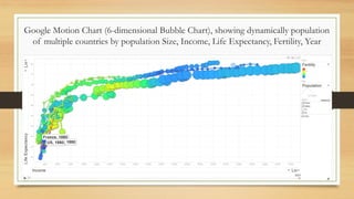
- 17. Google Motion Chart (6-dimensional Bubble Chart), showing dynamically population of multiple countries by population Size, Income, Life Expectancy, Fertility, Year
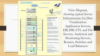
- 18. Visio Diagram, showing typical Server Infrastructure for Data Visualization: Application Servers, DB, DW, ETL and File Servers, Analytical and Monitoring Servers, Routers, Switches and Load Balancers
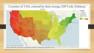
- 19. Counties of USA, colored by their average ZIP Code (Tableau)
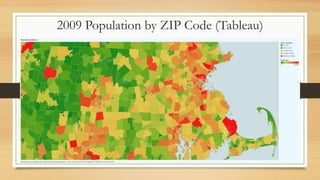
- 20. 2009 Population by ZIP Code (Tableau)
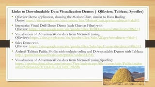
- 21. Links to Downloadable Data Visualization Demos ( Qlikview, Tableau, Spotfire) âĒ Qlikview Demo application, showing the Motion Chart, similar to Hans Rosling âĒ âĒ âĒ âĒ âĒ Demo: https://sites.google.com/site/pandre/files/MotionChart.qvw?attredirects=0&d=1 Interactive Visual Drill-Down Demo (each Chart as Filter) with Qlikview: https://sites.google.com/site/pandre/files/DrillDown.qvw?attredirects=0&d=1 Visualization of AdventureWorks data from Microsoft (using Qlikview): https://sites.google.com/site/pandre/files/SalesAW.qvw?attredirects=0&d=1 Sales Demo with Qlikview: https://sites.google.com/site/pandre/files/SalesApp11.qvw?attredirects=0&d=1 Andreiâs Tableau Public Profile with multiple online and Downloadable Demos with Tableau: http://public.tableausoftware.com/profile/andrei5435#/ Visualization of AdventureWorks data from Microsoft (using Spotfire): https://spotfire.cloud.tibco.com/private/ViewAnalysis.aspx?file=/users/a9p/Public/aw&w aid=e902e6a62d2f1f134216b-2311469709b58b