Skills development journal - College Magazine
Download as pptx, pdf0 likes254 views

The student created a magazine cover and contents page in Photoshop using various design elements like fonts, images, shapes and colors to establish a consistent house style between the two pages. For the cover, a masthead was made along with cover lines, a barcode, headings and graphics. Colors and textures were adjusted to match. The contents page also featured a matching gradient background, date, magazine name and article listings to maintain the style set by the cover.
Skills development journal - College Magazine
- 1. Skills Development Journal College Magazine
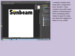
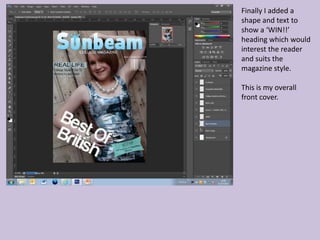
- 2. I created a simple mast head with a simple font from ŌĆśda fontŌĆÖ. I then created a Sun with some shapes on Photoshop to form something which makes it easier to make put what the magazine is when it is on a shelf.
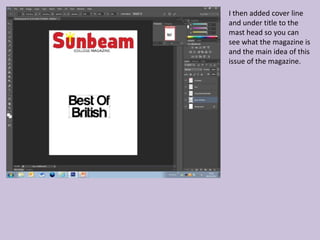
- 3. I then added cover line and under title to the mast head so you can see what the magazine is and the main idea of this issue of the magazine.
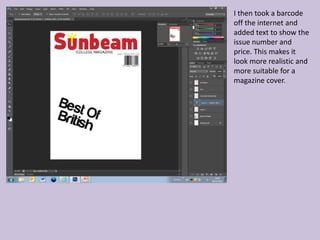
- 4. I then took a barcode off the internet and added text to show the issue number and price. This makes it look more realistic and more suitable for a magazine cover.
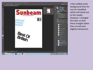
- 5. I then added some background lines for use of a headline which will stand out to the reader. However I changed this later so that there straight rather than curved and slightly translucent.
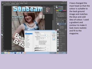
- 6. I have changed the mast head so that the colour is suitable to the back ground image and matches the blue and cold idea of colour. I used a gradient and contour to make it look more realistic and fit to the magazine.
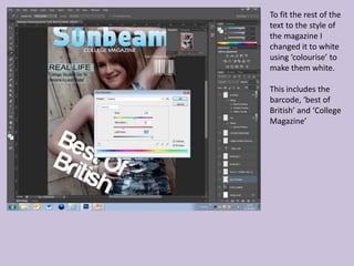
- 7. To fit the rest of the text to the style of the magazine I changed it to white using ŌĆścolouriseŌĆÖ to make them white. This includes the barcode, ŌĆśbest of BritishŌĆÖ and ŌĆśCollege MagazineŌĆÖ
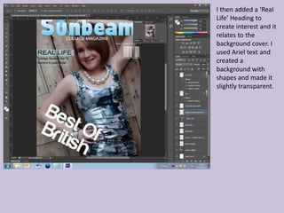
- 8. I then added a ŌĆśReal LifeŌĆÖ Heading to create interest and it relates to the background cover. I used Ariel text and created a background with shapes and made it slightly transparent.
- 9. Finally I added a shape and text to show a ŌĆśWIN!!ŌĆÖ heading which would interest the reader and suits the magazine style. This is my overall front cover.
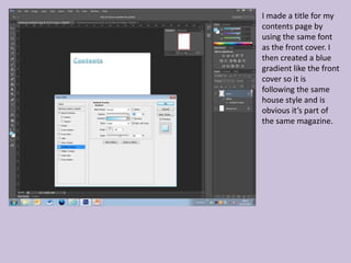
- 10. I made a title for my contents page by using the same font as the front cover. I then created a blue gradient like the front cover so it is following the same house style and is obvious itŌĆÖs part of the same magazine.
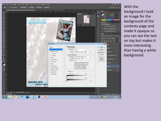
- 11. With the background I took an image for the background of the contents page and made it opaque so you can see the text on top but makes it more interesting than having a white background.
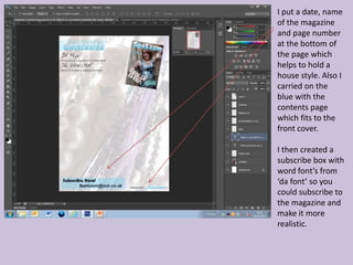
- 12. I put a date, name of the magazine and page number at the bottom of the page which helps to hold a house style. Also I carried on the blue with the contents page which fits to the front cover. I then created a subscribe box with word fontŌĆÖs from ŌĆśda fontŌĆÖ so you could subscribe to the magazine and make it more realistic.
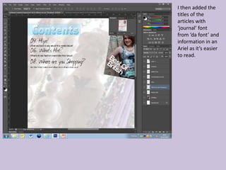
- 13. I then added the titles of the articles with ŌĆśjournalŌĆÖ font from ŌĆśda fontŌĆÖ and information in an Ariel as itŌĆÖs easier to read.
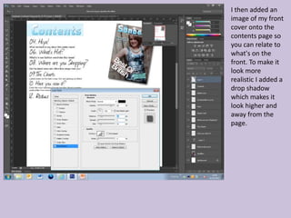
- 14. I then added an image of my front cover onto the contents page so you can relate to what's on the front. To make it look more realistic I added a drop shadow which makes it look higher and away from the page.
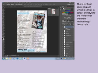
- 15. This is my final contents page which is similar in colour and style to the front cover, therefore maintaining a house style.