бғ“бғҳбғҗбғ’бғ бғҗбғӣбғҳбғЎ бғЁбғ”бғӨбғҗбғЎбғ”бғ‘бғҗ
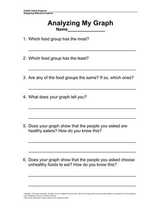
- 1. IntelВ® Teach Program Designing Effective Projects Analyzing My Graph Name________________ 1. Which food group has the most? ______________________________________________ 2. Which food group has the least? ______________________________________________ 3. Are any of the food groups the same? If so, which ones? ______________________________________________ 4. What does your graph tell you? ______________________________________________ ______________________________________________ 5. Does your graph show that the people you asked are healthy eaters? How do you know this? ______________________________________________ ______________________________________________ 6. Does your graph show that the people you asked choose unhealthy foods to eat? How do you know this? ______________________________________________ ______________________________________________ Copyright В© 2010 Intel Corporation. All rights reserved. Adapted with permission. Intel, the Intel logo and the Intel Education Initiative are trademarks of Intel Corporation or its subsidiaries in the U.S. and other countries. *Other names and brands may be claimed as the property of others.

