


Stat12t 0202
- 1. Section 2.2-1Copyright ÂĐ 2014, 2012, 2010 Pearson Education, Inc. Lecture šÝšÝßĢs Elementary Statistics Twelfth Edition and the Triola Statistics Series by Mario F. Triola
- 2. Section 2.2-2Copyright ÂĐ 2014, 2012, 2010 Pearson Education, Inc. Chapter 2 Summarizing and Graphing Data 2-1 Review and Preview 2-2 Frequency Distributions 2-3 Histograms 2-4 Graphs that Enlighten and Graphs that Deceive
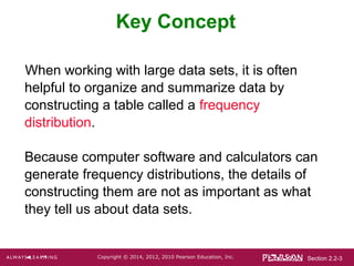
- 3. Section 2.2-3Copyright ÂĐ 2014, 2012, 2010 Pearson Education, Inc. Key Concept When working with large data sets, it is often helpful to organize and summarize data by constructing a table called a frequency distribution. Because computer software and calculators can generate frequency distributions, the details of constructing them are not as important as what they tell us about data sets.
- 4. Section 2.2-4Copyright ÂĐ 2014, 2012, 2010 Pearson Education, Inc. ïķ Frequency Distribution (or Frequency Table) shows how a data set is partitioned among all of several categories (or classes) by listing all of the categories along with the number (frequency) of data values in each of them. Definition
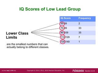
- 5. Section 2.2-5Copyright ÂĐ 2014, 2012, 2010 Pearson Education, Inc. IQ Score Frequency 50-69 2 70-89 33 90-109 35 110-129 7 130-149 1 IQ Scores of Low Lead Group Lower Class Limits are the smallest numbers that can actually belong to different classes.
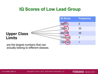
- 6. Section 2.2-6Copyright ÂĐ 2014, 2012, 2010 Pearson Education, Inc. IQ Score Frequency 50-69 2 70-89 33 90-109 35 110-129 7 130-149 1 IQ Scores of Low Lead Group Upper Class Limits are the largest numbers that can actually belong to different classes.
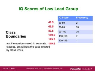
- 7. Section 2.2-7Copyright ÂĐ 2014, 2012, 2010 Pearson Education, Inc. IQ Score Frequency 50-69 2 70-89 33 90-109 35 110-129 7 130-149 1 IQ Scores of Low Lead Group Class Boundaries are the numbers used to separate classes, but without the gaps created by class limits. 49.5 69.5 89.5 109.5 129.5 149.5
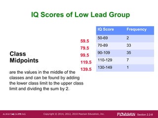
- 8. Section 2.2-8Copyright ÂĐ 2014, 2012, 2010 Pearson Education, Inc. IQ Score Frequency 50-69 2 70-89 33 90-109 35 110-129 7 130-149 1 IQ Scores of Low Lead Group Class Midpoints are the values in the middle of the classes and can be found by adding the lower class limit to the upper class limit and dividing the sum by 2. 59.5 79.5 99.5 119.5 139.5
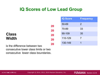
- 9. Section 2.2-9Copyright ÂĐ 2014, 2012, 2010 Pearson Education, Inc. IQ Score Frequency 50-69 2 70-89 33 90-109 35 110-129 7 130-149 1 IQ Scores of Low Lead Group Class Width is the difference between two consecutive lower class limits or two consecutive lower class boundaries. 20 20 20 20 20
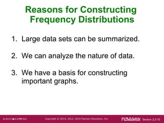
- 10. Section 2.2-10Copyright ÂĐ 2014, 2012, 2010 Pearson Education, Inc. 1. Large data sets can be summarized. 2. We can analyze the nature of data. 3. We have a basis for constructing important graphs. Reasons for Constructing Frequency Distributions
- 11. Section 2.2-11Copyright ÂĐ 2014, 2012, 2010 Pearson Education, Inc. 3. Starting point: Choose the minimum data value or a convenient value below it as the first lower class limit. 4. Using the first lower class limit and class width, proceed to list the other lower class limits. 5. List the lower class limits in a vertical column and proceed to enter the upper class limits. 6. Take each individual data value and put a tally mark in the appropriate class. Add the tally marks to get the frequency. Constructing A Frequency Distribution 1. Determine the number of classes (should be between 5 and 20). 2. Calculate the class width (round up). class width (maximum value) â (minimum value) number of classes â
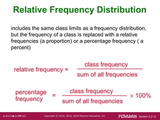
- 12. Section 2.2-12Copyright ÂĐ 2014, 2012, 2010 Pearson Education, Inc. Relative Frequency Distribution relative frequency = class frequency sum of all frequencies includes the same class limits as a frequency distribution, but the frequency of a class is replaced with a relative frequencies (a proportion) or a percentage frequency ( a percent) percentage frequency class frequency sum of all frequencies à 100%=
- 13. Section 2.2-13Copyright ÂĐ 2014, 2012, 2010 Pearson Education, Inc. Relative Frequency Distribution IQ Score Frequency Relative Frequency 50-69 2 2.6% 70-89 33 42.3% 90-109 35 44.9% 110-129 7 9.0% 130-149 1 1.3%
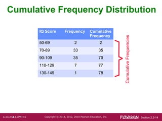
- 14. Section 2.2-14Copyright ÂĐ 2014, 2012, 2010 Pearson Education, Inc. Cumulative Frequency Distribution CumulativeFrequencies IQ Score Frequency Cumulative Frequency 50-69 2 2 70-89 33 35 90-109 35 70 110-129 7 77 130-149 1 78
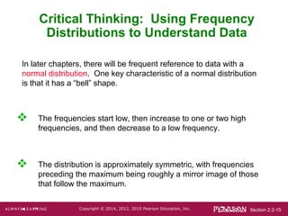
- 15. Section 2.2-15Copyright ÂĐ 2014, 2012, 2010 Pearson Education, Inc. Critical Thinking: Using Frequency Distributions to Understand Data In later chapters, there will be frequent reference to data with a normal distribution. One key characteristic of a normal distribution is that it has a âbellâ shape. ïķ The frequencies start low, then increase to one or two high frequencies, and then decrease to a low frequency. ïķ The distribution is approximately symmetric, with frequencies preceding the maximum being roughly a mirror image of those that follow the maximum.
- 16. Section 2.2-16Copyright ÂĐ 2014, 2012, 2010 Pearson Education, Inc. Gaps ïķ Gaps The presence of gaps can show that we have data from two or more different populations. However, the converse is not true, because data from different populations do not necessarily result in gaps.
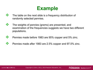
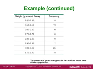
- 17. Section 2.2-17Copyright ÂĐ 2014, 2012, 2010 Pearson Education, Inc. Example ïķ The table on the next slide is a frequency distribution of randomly selected pennies. ïķ The weights of pennies (grams) are presented, and examination of the frequencies suggests we have two different populations. ïķ Pennies made before 1983 are 95% copper and 5% zinc. ïķ Pennies made after 1983 are 2.5% copper and 97.5% zinc.
- 18. Section 2.2-18Copyright ÂĐ 2014, 2012, 2010 Pearson Education, Inc. Example (continued) The presence of gaps can suggest the data are from two or more different populations.