Statistical Literacy
- 1. Statistical Literacy Anthony J. Evans Professor of Economics, ESCP Europe www.anthonyjevans.com (cc) Anthony J. Evans 2019 | http://creativecommons.org/licenses/by-nc-sa/3.0/
- 2. How to be an effective consumer of statistical analysis • The purpose of this presentation is to discuss some of the common ways in which people are misled by statistics 2
- 3. How big is big? 1 million seconds = 1 billion seconds = 1 trillion seconds = 11 days 32 years 317 centuries 3See “The Powers of 10” (1977) [https://youtu.be/0fKBhvDjuy0]
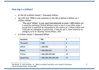
- 4. How big is a billion? • In the US a billion meant 1 thousand million • Up until the 1970s it was common in the UK to define a billion as 1 million million – “The word “billion” is now used internationally to mean 1,000 million and it would be confusing if British Ministers were to use it in any other sense. I accept that it could still be interpreted in this country as 1 million million and I shall ask my colleagues to ensure that, if they do use it, there should be no ambiguity as to its meaning” Harold Wilson, 1974 • A trillion means 1 thousand billion 4See Bolton, P., and Cracknell, R., "What is a billion? And other units" House of Commons Library Standard Note, January 2009 Hundred 100 3 Thousand 1,000 4 Million 1,000,000 6 Billion 1,000,000,000 9 Trillion 1,000,000,000,000 12 Quadrillion 1,000,000,000,000,000 15
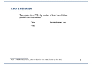
- 5. Is that a big number? "Every year since 1950, the number of American children gunned down has doubled” From a 1995 PhD dissertation, cited in “Damned Lies and Statistics” by Joel Best Year Gunned down kids 1950 1 1951 2 1952 4 1953 8 1954 16 … … 1960 1024 … … 1995 35 trillion 5
- 6. Is that a big number? “In 1997 the Labour government said it would spend an extra £300m over five years to create a million new childcare places” • 300m/1m = £300 per place • 300/5 = £60 per year • 60/52 = Only £1.15 per week Source: Blastland & Dilnot p.7 6
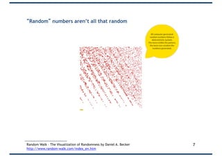
- 7. “Random” numbers aren’t all that random 7Random Walk – The Visualization of Randomness by Daniel A. Becker http://www.random-walk.com/index_en.htm
- 8. Choose a random number between 1 and 10 8Source: https://www.reddit.com/r/dataisbeautiful/comments/889zik/asking_100_people_for_a_random_number_from_1_to/
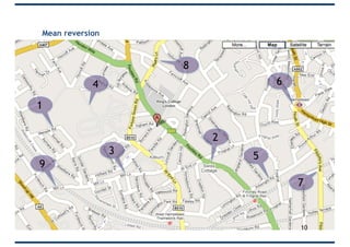
- 9. Mean reversion • Imagine that 9 volunteers are observing traffic. • They each roll 2 die and the combined score is the number of accidents. • Which are the accident black-spots? • We place a speed camera at these black-spots • Now, let’s roll again • How effective are the speed cameras? 9
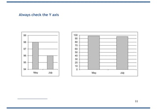
- 11. Always check the Y axis 94 95 96 97 98 99 May July 0 10 20 30 40 50 60 70 80 90 100 May July 11
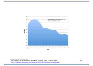
- 12. 12See “Charts can be deceiving”, Erik Kain, Ordinary Times, July 16th 2009 http://ordinary-gentlemen.com/blog/2009/07/16/charts-can-be-deceiving/
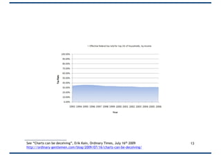
- 13. 13See “Charts can be deceiving”, Erik Kain, Ordinary Times, July 16th 2009 http://ordinary-gentlemen.com/blog/2009/07/16/charts-can-be-deceiving/
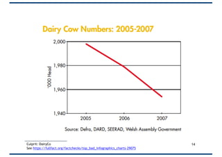
- 15. 15
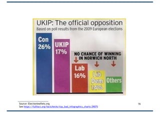
- 16. 16Source: Electionleaflets.org See https://fullfact.org/factchecks/top_bad_infographics_charts-29075
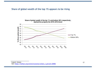
- 17. Share of global wealth of the top 1% appears to be rising 17Culprit: Oxfam See: https://fullfact.org/article/economy/oxfam_1_percent-38483
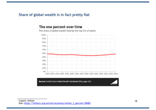
- 18. Share of global wealth is in fact pretty flat 18Culprit: Oxfam See: https://fullfact.org/article/economy/oxfam_1_percent-38483
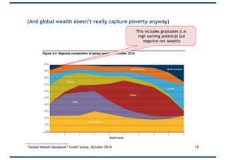
- 19. (And global wealth doesn’t really capture poverty anyway) 19 This includes graduates (i.e. high earning potential but negative net wealth) “Global Wealth Databook” Credit Suisse, October 2014
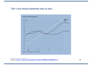
- 20. The Y axis should sometimes start at zero 20Source: https://twitter.com/felixsalmon/status/979080517290258433?s=11
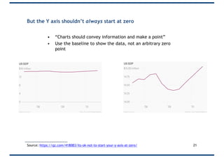
- 21. But the Y axis shouldn’t always start at zero • “Charts should convey information and make a point” • Use the baseline to show the data, not an arbitrary zero point 21Source: https://qz.com/418083/its-ok-not-to-start-your-y-axis-at-zero/
- 22. Who has a fever, Sara or Bob? 22Source: https://qz.com/418083/its-ok-not-to-start-your-y-axis-at-zero/ Also see “Shut up about the y-axis. It shouldn’t always start at zero” Vox [https://youtu.be/14VYnFhBKcY]
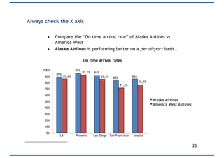
- 23. • Compare the “On time arrival rate” of Alaska Airlines vs. America West • Alaska Airlines is performing better on a per airport basis… 89% 95% 91% 83% 86%85,6% 92,1% 85,5% 71,3% 76,7% 0% 10% 20% 30% 40% 50% 60% 70% 80% 90% 100% LA Phoenix San Diego San Francisco Seattle Alaska Airlines America West Airlines On time arrival rates 23 Always check the X axis
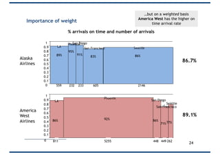
- 24. Importance of weight 811 5255 448 449 2620 Alaska Airlines 89% LA 95% Phoenix 91% 83% San Francisco 86% Seattle 0 0.1 0.2 0.3 0.4 0.5 0.6 0.7 0.8 0.9 1 605232 233559 2146 86% LA 92% Phoenix 86% San Diego 71% San Francisco 77% Seattle 0.1 0.2 0.3 0.4 0.5 0.6 0.7 0.8 0.9 1 America West Airlines 89.1% 86.7% % arrivals on time and number of arrivals …but on a weighted basis America West has the higher on time arrival rate 24
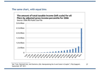
- 25. Be wary of histograms • Generally speaking “bins” should be: – Not too many – Not too few – Of equal size – Consecutive – Non-overlapping 25
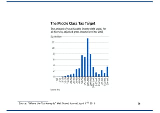
- 26. 26Source: “Where the Tax Money Is” Wall Street Journal, April 17th 2011
- 27. The same chart, with equal bins 27See “Lies, Damned Lies, and Statistics (36): Manipulating the X-axis Scale in Graphs”, Filip Spagnoli, September 30th 2011
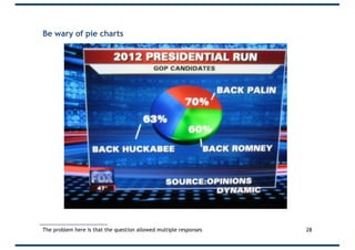
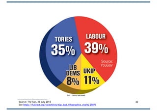
- 28. Be wary of pie charts 28The problem here is that the question allowed multiple responses
- 30. 30Source: The Sun, 25 July 2013 See https://fullfact.org/factchecks/top_bad_infographics_charts-29075
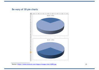
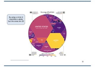
- 31. Be wary of 3D pie charts 31Source: https://www.mrexcel.com/legacy/images/mec14200.jpg
- 32. 32 By using a circle it resembles a globe but the areas are 2D
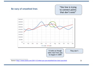
- 33. Be wary of smoothed lines 33Source: http://www.vizwiz.com/2011/12/when-you-use-smoothed-line-chart-your.html “the line is trying to connect points that don’t exist” It looks as though sales rose from July to August in 2009 They don’t
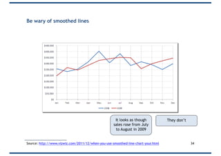
- 34. Be wary of smoothed lines 34Source: http://www.vizwiz.com/2011/12/when-you-use-smoothed-line-chart-your.html It looks as though sales rose from July to August in 2009 They don’t
- 35. Don’t use smoothed lines • “Smoothed lines are abused. If you are plotting measured data, the only valid connecting curve between points is a straight line (or a line which is fitted to a function that comes from a physical model of the data). A smoothed curve implies that the data goes places where it has not been measured. Smoothed lines without points are even worse, because the person trying to interpret the chart doesn’t even know what points on the smoothed curve belong there.” Jon Peltier 35Source: http://www.vizwiz.com/2011/12/when-you-use-smoothed-line-chart-your.html
- 36. • This presentation forms part of a free, online course on analytics • http://econ.anthonyjevans.com/courses/analytics/ 36


![How big is big?
1 million seconds =
1 billion seconds =
1 trillion seconds =
11 days
32 years
317 centuries
3See “The Powers of 10” (1977) [https://youtu.be/0fKBhvDjuy0]](https://image.slidesharecdn.com/statisticalliteracys-181220093744/85/Statistical-Literacy-3-320.jpg)


![Who has a fever, Sara or Bob?
22Source: https://qz.com/418083/its-ok-not-to-start-your-y-axis-at-zero/
Also see “Shut up about the y-axis. It shouldn’t always start at zero” Vox [https://youtu.be/14VYnFhBKcY]](https://image.slidesharecdn.com/statisticalliteracys-181220093744/85/Statistical-Literacy-22-320.jpg)
