ºÝºÝߣ

ºÝºÝߣShare a Scribd company logo
THE MAKING OF MY POSTER
RAW IMAGE


            I used this photo for the poster
DRAFT POSTER


At first I went with the flow and created this…
BLANK DOCUMENT


        So with the research I had, I decided to make a new one properly…
Since the film was in black and white I will make the poster black and white but this
                           time using a black background.
BEGINNING OF CREATION


I then used the same photo from the previous poster, because I like the idea of the tortoise posing as
      the victor saying ‘ I won’ while the hare looks disappointed and sad due to being the loser.
          I used the magnetic lasso tool to cut these to characters out onto the black ground.
CAPTION BORDER


I wanted to make it more related to the film so I decided to use the border
                     from the captions in the film.
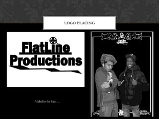
LOGO PLACING


Added in the logo …
STROKE


I put a stroke around the text and the characters so its more visible…
ADJUSTMENTS


I thought I should make it my poster look more conventional by using circles
                       as frames for the pictures…
SIN CITY EFFECT


I made the circles of the characters smaller , then decided to stick to a colour scheme
of red, black and white, so I changed the logo to red, added the title of the film at the
                             bottom and made ‘The’ – red.
CREATORS SPACE


I used this photo of me and my partner so the poster gives us credit and it informs
  the view who created the film. I used the ‘poster edges’ filter so the photo loses
  quality, I put it in a iris and then I ‘desaturated’ it for the black and white theme.
FINAL POSTER

More Related Content

The making of my poster production log

  • 1. THE MAKING OF MY POSTER
  • 2. RAW IMAGE I used this photo for the poster
  • 3. DRAFT POSTER At first I went with the flow and created this…
  • 4. BLANK DOCUMENT So with the research I had, I decided to make a new one properly… Since the film was in black and white I will make the poster black and white but this time using a black background.
  • 5. BEGINNING OF CREATION I then used the same photo from the previous poster, because I like the idea of the tortoise posing as the victor saying ‘ I won’ while the hare looks disappointed and sad due to being the loser. I used the magnetic lasso tool to cut these to characters out onto the black ground.
  • 6. CAPTION BORDER I wanted to make it more related to the film so I decided to use the border from the captions in the film.
  • 7. LOGO PLACING Added in the logo …
  • 8. STROKE I put a stroke around the text and the characters so its more visible…
  • 9. ADJUSTMENTS I thought I should make it my poster look more conventional by using circles as frames for the pictures…
  • 10. SIN CITY EFFECT I made the circles of the characters smaller , then decided to stick to a colour scheme of red, black and white, so I changed the logo to red, added the title of the film at the bottom and made ‘The’ – red.
  • 11. CREATORS SPACE I used this photo of me and my partner so the poster gives us credit and it informs the view who created the film. I used the ‘poster edges’ filter so the photo loses quality, I put it in a iris and then I ‘desaturated’ it for the black and white theme.