The Perception of Speed
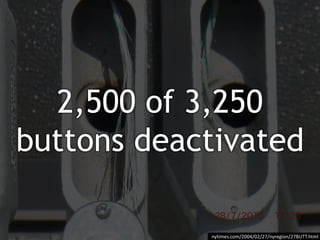
- 4. 2,500 of 3,250 buttons deactivated nytimes.com/2004/02/27/nyregion/27BUTT.html
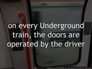
- 5. on every Underground train, the doors are operated by the driver londonist.com/2013/04/why-are-there-buttons-on-tube-train-doors.php
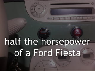
- 7. half the horsepower of a Ford Fiesta
- 9. increased distance from gate to bags 6x nytimes.com/2012/08/19/opinion/sunday/why-waiting-in-line-is-torture.html
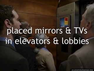
- 11. placed mirrors & TVs in elevators & lobbies uie.com/articles/download_time/
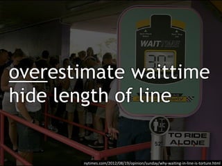
- 12. overestimate waittime hide length of line nytimes.com/2012/08/19/opinion/sunday/why-waiting-in-line-is-torture.html
- 15. update coin count at slower rate news.ycombinator.com/item?id=2007385
- 17. uie.com/articles/download_time/ “Amazon.com, rated as one of the fastest sites by users, was really the slowest”
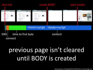
- 19. connect DNS time to first byte content previous page isn’t cleared until BODY is created click link create BODY start render stevesouders.com/blog/2012/12/05/clear-current-page-ux/ <html><script <body><script
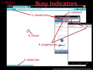
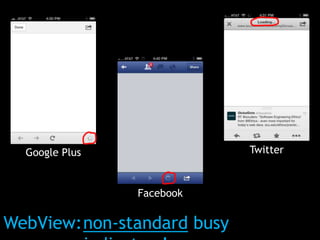
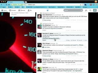
- 20. 1. tab icon 5. reload icon 2. status bar 6. network 4. progress bar 3. cursor stevesouders.com/blog/2013/06/16/browser-busy-indicators/ Busy Indicators
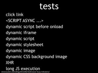
- 21. stevesouders.com/blog/2013/06/16/browser-busy-indicators/ tests click link <SCRIPT ASYNC ...> dynamic script before onload dynamic iframe dynamic script dynamic stylesheet dynamic image dynamic CSS background image XHR long JS execution
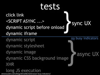
- 22. stevesouders.com/blog/2013/06/16/browser-busy-indicators/ tests click link <SCRIPT ASYNC ...> dynamic script before onload dynamic iframe dynamic script dynamic stylesheet dynamic image dynamic CSS background image XHR long JS execution } } sync UX async UX no busy indicators
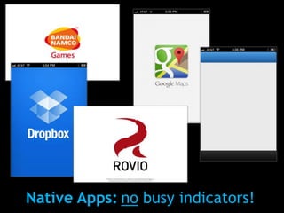
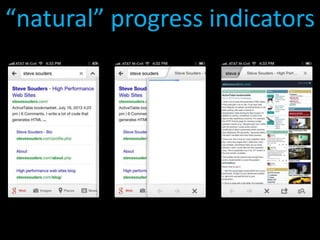
- 24. Native Apps: no busy indicators!
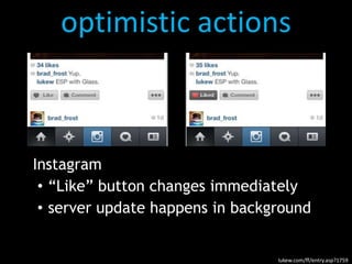
- 31. optimistic actions Instagram • “Like” button changes immediately • server update happens in background lukew.com/ff/entry.asp?1759
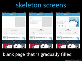
- 32. skeleton screens blank page that is gradually filled lukew.com/ff/entry.asp?1797
Editor's Notes
- http://www.flickr.com/photos/photohype/288124023/
- http://www.flickr.com/photos/shashachu/443215138/
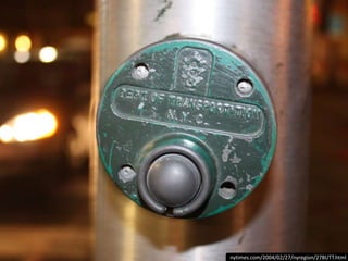
- http://www.flickr.com/photos/35094885@N08/4390813150/in/photolist-7G14M1-d6BXUy75%+ disconnected according to NYC Dept of Transporation (2,500 of 3,250)mechanical placebos leftover from switch to computer-controlled signals in 1980sThe city deactivated most of the pedestrian buttons long ago with the emergence of computer-controlled traffic signals, even as an unwitting public continued to push on, according to city Department of Transportation officials. More than 2,500 of the 3,250 walk buttons that still exist function essentially as mechanical placebos, city figures show. Any benefit from them is only imagined.Most of the buttons scattered through the city, mainly outside of Manhattan, are relics of the 1970's, before computers began tightly choreographing traffic signal patterns on major arteries. They were installed at a time when traffic was much lighter, said Michael Primeggia, deputy commissioner of traffic operations for the city's Transportation Department.Typically, semi-actuated signals were positioned at intersections of a major thoroughfare and a minor street. The major road would have a green light until someone pressed the button or a sensor in the roadway detected a car on the minor street. Then, after 90 seconds or so, the light would change.By the late 1980's, most of the buttons had been deactivated, their steel exteriors masking the lie within. But city officials say they do not remember ever publishing an obituary, and the white and black signs stayed up, many of them looking as new and official as ever.
- http://www.flickr.com/photos/escapefromyonkers/4847397650/75%+ disconnected according to NYC Dept of Transporation (2,500 of 3,250)mechanical placebos leftover from switch to computer-controlled signals in 1980sThe city deactivated most of the pedestrian buttons long ago with the emergence of computer-controlled traffic signals, even as an unwitting public continued to push on, according to city Department of Transportation officials. More than 2,500 of the 3,250 walk buttons that still exist function essentially as mechanical placebos, city figures show. Any benefit from them is only imagined.Most of the buttons scattered through the city, mainly outside of Manhattan, are relics of the 1970's, before computers began tightly choreographing traffic signal patterns on major arteries. They were installed at a time when traffic was much lighter, said Michael Primeggia, deputy commissioner of traffic operations for the city's Transportation Department.Typically, semi-actuated signals were positioned at intersections of a major thoroughfare and a minor street. The major road would have a green light until someone pressed the button or a sensor in the roadway detected a car on the minor street. Then, after 90 seconds or so, the light would change.By the late 1980's, most of the buttons had been deactivated, their steel exteriors masking the lie within. But city officials say they do not remember ever publishing an obituary, and the white and black signs stayed up, many of them looking as new and official as ever.
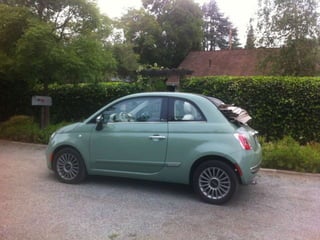
- 1.4 liter, 101 hp0-60 in 12.4 secondsFord Fiesta: 1.6L, 197 hpHonda Fit: 1.5L, 117 hpSmart Passion: 1L, 70 hp“Engaging Sport mode does quicken throttle response and tightens up the electric power steering, giving the 500 an even zippier feel” - http://www.motorweek.org/reviews/road_tests/2012_fiat_500
- 1.4 liter, 101 hp0-60 in 12.4 secondsFord Fiesta: 1.6L, 197 hpHonda Fit: 1.5L, 117 hpSmart Passion: 1L, 70 hp“Engaging Sport mode does quicken throttle response and tightens up the electric power steering, giving the 500 an even zippier feel” - http://www.motorweek.org/reviews/road_tests/2012_fiat_500
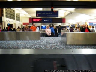
- http://www.flickr.com/photos/dougww/2608181637/Houston Airportbefore: 1 min walk to baggage claim, 7 min wait for bagsafter: 6 min walk, 2 min wait
- http://www.flickr.com/photos/hdz/8292495879/Houston Airportbefore: 1 min walk to baggage claim, 7 min wait for bagsafter: 6 min walk, 2 min wait
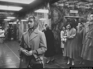
- http://www.asktog.com/basics/03Performance.htmlA classic example occurred in the 1930s in New York City, where "users" in a large new high-rise office building consistently complained about the wait times at the elevators. Engineers consulted concluded that there was no way to either speed up the elevators or to increase the number or capacity of the elevators. A designer was then called in, and he was able to solve the problem.What the designer understood was that the real problem was not that wait time was too long, but that the wait time was perceived as too long. The designer solved the perception problem by placing floor-to-ceiling mirrors all around the elevator lobbies. People now engaged in looking at themselves and in surreptitiously looking at others, through the bounce off multiple mirrors. Their minds were fully occupied and time flew by.
- http://www.medialifemagazine.com/your-clients-message-rising-to-the-top/
- http://megowan.wordpress.com/2011/01/04/the-secret-objectives-of-queues/Waiting less than expected makes people happier. => so Disney overestimates the wait timeAnd people are more concerned about the LENGTH of a line than how fast it moves. => so Disney hides the length of lines by wrapping them around buildings“Disney…overestimates times for rides.”“beating expectations buoys our mood.”“people who wait less than they anticipated leave happier than those who wait longer than expected”“we are more concerned with how long a line is than how fast it’s moving. Given a choice between a slow-moving short line and a fast-moving long one, we will often opt for the former, even if the waits are identical. (This is why Disney hides the lengths of its lines by wrapping them around buildings and using serpentine queues.)
- http://www.flickr.com/photos/laughingsquid/2744068499/Jeff Veen – redesigning Blogger – the blog wizard was TOO fast
- http://www.flickr.com/photos/calamity_hane/4655070224/Customers thought it was impossible for a machine to count change accurately at such a high rate. => Displayed results at a slower rate. => Sound of change counting is a recording.The machine is able to calculate the total change deposited almost instantly. Yet, during testing the company learned that consumers did not trust the machines. Customers though it was impossible for a machine to count change accurately at such a high rate.Faced with the issues of trust and preconceived expectations of necessary effort, the company began to rework the user experience.The solution was fairly simple. The machine still counted at the same pace but displayed the results at a significantly slower rate. In fact, the sound of change working the way through the machine is just a recording that is played through a speaker.
- http://soslocksmithny.com/
- http://www.flickr.com/photos/dullhunk/3930915541/
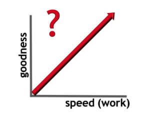
- “There was still another surprising finding from our study: a strong correlation between perceived download time and whether users successfully completed their tasks on a site.”“when people accomplish what they set out to do on a site, they perceive that site to be fast.”“When users are complaining about the download speed of your site, what are they actually complaining about? Are you better off making the site load faster or ensuring that users complete their tasks?”
- http://www.flickr.com/photos/shashachu/443215138/
- Opera and Chrome also have a timeout, so sometimes they’ll clear the screen BEFORE the body is created.
- The network indicator is only applicable for Mobile Safari.The progress bar indicator is only applicable for Opera, Safari, Android, Chrome Mobile, and Mobile Safari.Mobile browsers don’t have tabs, status bars, nor cursors (currently) so those indicators aren’t applicable.
- Many of the test cases didn’t trigger any of the browser busy indicators.(Except on iOS the network spinner was triggered for every test that involved an HTTP request.)sync – get mailasync – update stock quotes or friends’ statusGOOD NEWS for all those image beacons!
- The network indicator is only applicable for Mobile Safari.The progress bar indicator is only applicable for Opera, Safari, Android, Chrome Mobile, and Mobile Safari.Mobile browsers don’t have tabs, status bars, nor cursors (currently) so those indicators aren’t applicable.
- The network indicator is only applicable for Mobile Safari.The progress bar indicator is only applicable for Opera, Safari, Android, Chrome Mobile, and Mobile Safari.Mobile browsers don’t have tabs, status bars, nor cursors (currently) so those indicators aren’t applicable.
- The network indicator is only applicable for Mobile Safari.The progress bar indicator is only applicable for Opera, Safari, Android, Chrome Mobile, and Mobile Safari.Mobile browsers don’t have tabs, status bars, nor cursors (currently) so those indicators aren’t applicable.
- iPhone4 iOS6
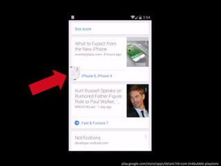
- https://play.google.com/store/apps/details?id=com.linkbubble.playstore
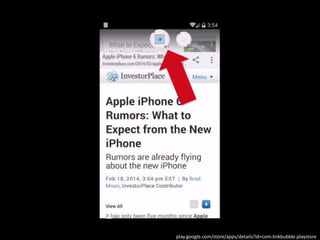
- https://play.google.com/store/apps/details?id=com.linkbubble.playstore
- Google Search App on iOS
- Instragram co-founder Mike Krieger calls this technique “performing actions optimistically”.
- Instragram co-founder Mike Krieger calls this technique “performing actions optimistically”.
- Thanks to Emily Nakashima for this example.
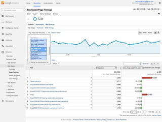
- https://www.google.com/analytics/web/?et=reset#report/content-site-speed-overview/a15026169w31046415p30049615/
- flickr.com/photos/66176388@N00/3804806568/Otherideas: - clicked linkfeedback - clearpage on paint (NOT body created) - JS API to getpercentage of resourcesdownloaded for betterprogressbars
- http://thomaspluck.com/2008/07/24/80s-trash-of-the-week-night-shift-2/
- "thank you" by nj dodge: http://flickr.com/photos/nj_dodge/187190601/Verrazano-Narrows Bridge
