Tva en 2
âĒDownload as PPTX, PDFâĒ
0 likesâĒ434 views

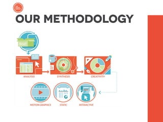
This document contains summaries of various companies' uses of data visualization and infographics for communication and reporting purposes, including: - Eni's use of an annual report with video and interactive application to communicate sustainability projects. - Luxottica's internal communication on environmental impacts using a poster, video, and intranet application. - Cerved's use of interactive reports and downloads to communicate financial information.

Tva en 2
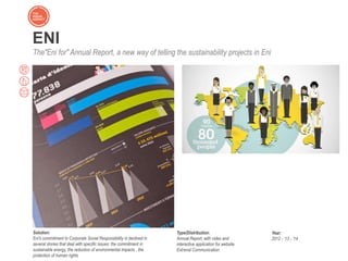
- 9. ENI The"Eni for" Annual Report, a new way of telling the sustainability projects in Eni Solution: Eni's commitment to Corporate Social Responsibility is declined in several stories that deal with specific issues: the commitment in sustainable energy, the reduction of environmental impacts , the protection of human rights Type/Distribution: Annual Report, with video and interactive application for website Extrenal Communication Year: 2012 - â13 - â14
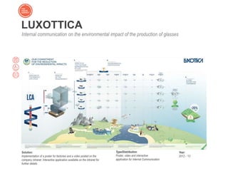
- 10. Solution: Implementation of a poster for factories and a video posted on the company intranet. Interactive application available on the intranet for further details Type/Distribution: Poster, video and interactive application for Internal Communication Year: 2012 - â13 LUXOTTICA Internal communication on the environmental impact of the production of glasses
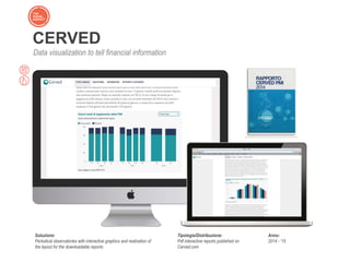
- 11. CERVED Data visualization to tell financial information Soluzione: Periodical observatories with interactive graphics and realization of the layout for the downloadable reports Tipologia/Distribuzione: Pdf interactive reports published on Cerved.com Anno: 2014 - â15
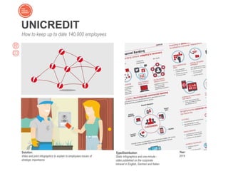
- 12. UNICREDIT How to keep up to date 140,000 employees Solution: Video and print infographics to explain to employees issues of strategic importance Type/Distribution: Static Infographics and one-minute - video published on the corporate intranet in English, German and Italian Year: 2014
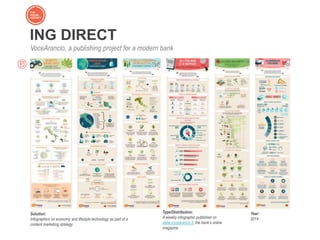
- 13. ING DIRECT VoceArancio, a publishing project for a modern bank Solution: Infographics on economy and lifestyle technology as part of a content marketing strategy Type/Distribution: A weekly infographic published on www.vocearancio.it, the bankâs online magazine Year: 2014
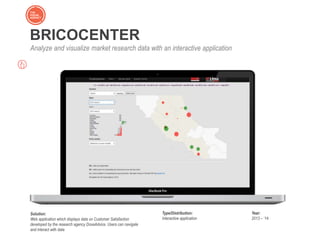
- 14. BRICOCENTER Analyze and visualize market research data with an interactive application Solution: Web application which displays data on Customer Satisfaction developed by the research agency DoxaAdvice. Users can navigate and interact with data Type/Distribution: Interactive application Year: 2013 â â14
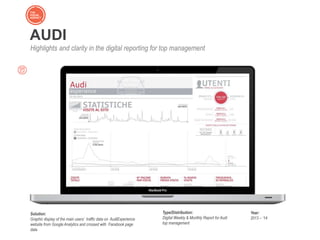
- 15. Sintesi e chiarezza dei dati di Google Analytics e Facebook AUDI Highlights and clarity in the digital reporting for top management Solution: Graphic display of the main usersâ traffic data on AudiExperience website from Google Analytics and crossed with Facebook page data Type/Distribution: Digital Weekly & Monthly Report for Audi top management Year: 2013 â â14
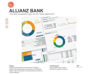
- 16. ALLIANZ BANK The data visualization gets into the "bank statements" Solution: Restyling of bank statement, with an approach to simplify the analysis of the financial position of the customer via sophisticated graphics. Video communication for financial advisors to promote the new bank statement Type/Distribution: Data visualization layout and java development of graphics component Year: 2013 â â14
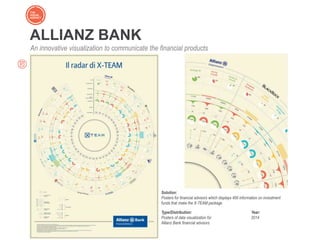
- 17. ALLIANZ BANK An innovative visualization to communicate the financial products Solution: Posters for financial advisors which displays 400 information on investment funds that make the X-TEAM package Type/Distribution: Posters of data visualization for Allianz Bank financial advisors Year: 2014
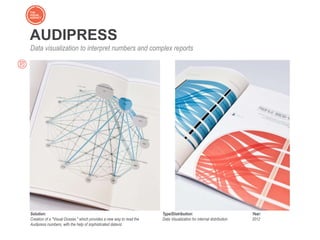
- 18. AUDIPRESS Data visualization to interpret numbers and complex reports Solution: Creation of a "Visual Dossier," which provides a new way to read the Audipress numbers, with the help of sophisticated dataviz Type/Distribution: Data Visualization for internal distribution Year: 2012
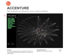
- 19. ACCENTURE Data visualization per interpretare numeri e relazioni complesse Soluzione: For its clients, Accenture gathers online informaton which need to be visualised and analaysed, through an application, to find clusters and relevant relations. Tipologia/Distribuzione: Application for Accentureâ internal network Anno: 2014
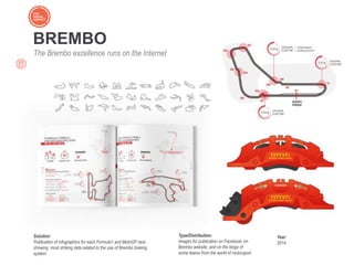
- 20. BREMBO The Brembo excellence runs on the Internet Solution: Publication of infographics for each Formula1 and MotoGP race showing most striking data related to the use of Brembo braking system. Type/Distribution: Images for publication on Facebook, on Brembo website, and on the blogs of some teams from the world of motorsport Year: 2014
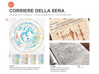
- 21. CORRIERE DELLA SERA Infographics for "LaLettura " , Sunday supplement of " Corriere della Sera " Solution: The data visualization as a tool to explain the economy, culture, current events in support of articles published in "LaLettura" Tipologia: Infographics published on ÂŦLa LetturaÂŧ the weekly cultural supplement of ÂŦIl Corriere della SeraÂŧ newspaper Year: 2013 â â15
- 22. The Visual Agency srl Via Panizza 7 20144 Milano +39.02.4678.631 info@thevisualagency.com www.thevisualagency.com
- 23. Visit our BLOG and subscribe to our newsletter to be updated on news and trends from the world of infographics thevisualagency.com/blog