Ello: some suggestion for even better user experience
ŌĆó
1 likeŌĆó1,035 views

We like Ello! Beautiful design meets beautiful content. But sime small things can be improved, to deliver an even better user experience. Here are some suggestions.
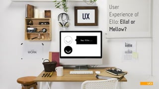
![UX OFELLO
ELLO! ORMELLOW?
ELLO SAYS:
ŌĆ£Ellois a simple, beautiful, and ad-free social network [ŌĆ”].ŌĆØ
WE SAY:
We like Ello! Its straightforward design and the clear navigation are appealing. The Ellovision and its user experiencemake a good match. Tip to the hat, chaps!
Sorry, however, and even if that sounds old-fashioned: There are some usability flaws left.
https://ello.co/wtf/post/about](https://image.slidesharecdn.com/uiduserexperienceofello-141013093634-conversion-gate01/85/Ello-some-suggestion-for-even-better-user-experience-2-320.jpg)


Ello: some suggestion for even better user experience
- 1. UX User Experience ofEllo: Ello! orMellow?
- 2. UX OFELLO ELLO! ORMELLOW? ELLO SAYS: ŌĆ£Ellois a simple, beautiful, and ad-free social network [ŌĆ”].ŌĆØ WE SAY: We like Ello! Its straightforward design and the clear navigation are appealing. The Ellovision and its user experiencemake a good match. Tip to the hat, chaps! Sorry, however, and even if that sounds old-fashioned: There are some usability flaws left. https://ello.co/wtf/post/about
- 3. Simple design ŌĆōsimple challenges
- 4. USERS FEEDBACK 34 respondents (Non ElloUsers) had a short look at Ellosprivacy settings and answered one simple question: Which of the switch button below do you think is saying ŌĆ£YESŌĆØ? UX OFELLO OPINION POLL: PRIVACY SETTINGS or https://ello.co/settings
- 5. OPINION POLL: PRIVACY SETTINGS 68% 32% 0% 10% 20% 30% 40% 50% 60% 70% 80% grey (activated) white (activated) UX OFELLO RESEARCH FACT Only 68 % of participants stated that the grey coloured switch button is activated. So one third of all users in our random sample was wrong or at least insecure about the actual privacy settings. ’ĆŁTHE REASON: Lacking self-descriptiveness of the button design ’ĆŁTHE RISK: The UX might be weakened by this gap between the Ellovision and its design reality. SUGGESTION The design of switch buttons is frequently discussed in the design community. We assume that less errors would occur when the contrast is higher or if the activated buttons are highlighted. Which ŌĆ£Switch ButtonŌĆ£ do you believe is activated?
- 6. UX OFELLO REGISTRATION PROCESS REVISITED We did not attempt to review the whole UX of Ello. It intrigued us, however, if the ŌĆśopen sesameŌĆÖ AKA ŌĆśregistration processŌĆÖ reflects the Ellovision ŌĆōor if it needs veritable gate crashing qualities to enter.
- 7. UX OFELLO REGISTRATION WE THINKŌĆ” ŌĆöDuring registration, it can happen that users make errors whenŌĆ” ┬╗the user name wasnŌĆÖt available anymore ┬╗the password didnŌĆÖt match security requirements ŌĆöNone of this was obvious first, so we had to try again and again. ŌĆöNo helpful feedback what was wrong, was providedFun. Not. xxxxxxxxxxxxxx xxxxx https://ello.co/enter
- 8. UX OFELLO REGISTRATION WE THINKŌĆ” ’ĆŁThe ŌĆ£prove you are a humanŌĆ£ game rigorously breaks with Ellosvisual style. It thus does not appear to be part of the process and can be overseen despite its visual dominance. A sudden stop at registration can be the result. ┬╗We saw users struggling and stop the sign up, because they did not see the game ┬╗So, will users sign up, once they have to stop for a few seconds? ŌĆöOnce this barrier is taken, the ŌĆ£Create AccountŌĆ£ button seems to lack affordance. ┬╗The game is fun, and draws a lot of attention. ┬╗Will users step out of the game and resume the sign-up process? Will they see the ŌĆ£Create AccountŌĆØ button? xxxxxxxxxxxxxx xxxxx https://ello.co/enter
- 9. UX OF ELLO 100 % AWESOME RESPONSIVE DESIGN ’ĆŁWe tried Elloon different devices and OS. On all mobiles it is amazing. ’ĆŁIn our experience, ElloŌĆÖsresponsive design is state-of-the-art. We can easily recognize key features across devices, feel at home immediately and donŌĆÖt have to learn many new interactions. Thank you, Ellofor responsive design and flexibility.
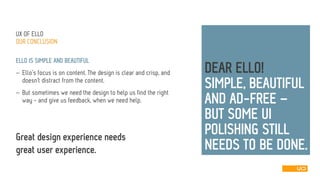
- 10. UX OFELLO OURCONCLUSION ELLO IS SIMPLE AND BEAUTIFUL ’ĆŁElloŌĆÖsfocus is on content. The design is clear and crisp, and doesnŌĆśt distract from the content. ’ĆŁBut sometimes we need the design to help us find the right way -and give us feedback, when we need help. DEARELLO! SIMPLE, BEAUTIFUL AND AD-FREE ŌĆō BUT SOME UI POLISHING STILL NEEDS TO BE DONE. . Great design experienceneedsgreatuserexperience.
- 11. www.uid.com Malte Kr├Čkel USABILITY ENGINEER malte.kroekel@uid.com Tobias Limbach TEAM MANAGER USER EXPERIENCE DESIGN tobias.limbach@uid.com
- 12. UX OFELLO SOURCESFORPICTURES 1)https://ello.co/friends(ŌĆ×sayElloŌĆ£ on slide1) 2)https://ello.co/wtf/post/about(Abouton slide2) 3)https://ello.co/settings(Settings on slide4) 4)https://ello.co/enter(Registration processon slide6 and 7) 5)║▌║▌▀Ż 8 ┬® Tobias Limbach