Unit -3.pptx
- 1. UNIT - 3 FUNDAMENTALS OF DESIGN Presented by Agilandeeswari. R
- 3. FRAMING AND FORM ? The rule of thirds is one of the most common rules in photography. ? The four intersection points of these lines, and the four lines themselves, are where subjects, or strong compositional lines of a photograph, can be placed to create a strong, balanced image. ? The rule of thirds is a composition guideline that places your subject in the left or right third of an image, leaving the other two thirds more open.
- 5. ? A center of interest is that part of the picture which attracts the mind. ? Focal point, focal area, area of dominance, center of dominance, area of interest, etc. These terms all refer to the same thing: the area of greatest contrast in a painting where the eye goes to rest and focus. ? Placement. The location of the center of interest in generally determined by a centuries old compositional structure commonly known as the "Golden Section" or "Rule of Thirds." ? This compositional guide divides the painting surface into equal thirds both vertically and horizontally.
- 6. GESTALTS THEORY OF VISUAL COMPOSITION
- 7. ? Gestalt Principles are principles/laws of human perception that describe how humans group similar elements, recognize patterns and simplify complex images when we perceive objects. ? Designers use the principles to organize content on websites and other interfaces so it is aesthetically pleasing and easy to understand. ? Gestalt psychology is a theory that looks at human perception. It originated in Austria and Germany during the early 20th century as a counter to the principles of elementalist and structuralist psychology. There are seven Gestalt design principles: 1.Principle of proximity 2.Principle of closure 3.Principle of similarity 4.Principle of continuity 5.Principles of Figure/Ground 6.Principle of Symmetry and order 7.Principle of Common Fate
- 8. Principle of proximity ? Proximity refers to how close elements are to one another. The strongest proximity relationships are those between overlapping subjects, but just grouping objects into a single area can also have a strong proximity effect. ? Visually, distance defines relatedness. Objects that are close together are seen as related, while objects that are far apart °≠ aren°Øt. ? An example of proximity in design is the Girl Scouts logo, with its three faces clustered in profile (two green, one white).
- 9. Humans prefer complete shapes, so they automatically fill in gaps between elements to perceive a complete image. Iconic logos such as IBM°Øs and the World Wildlife Fund°Øs are examples of applied closure°™IBM°Øs comprising blue horizontal lines arranged in three stacks; the WWF°Øs consisting of a cluster of black shapes set against a white background to reveal the familiar form of a panda. Principle of closure
- 10. Principle of similarity ?Similarity (also known as Invariance): The human eye tends to build a relationship between similar elements within a design. Similarity can be achieved using basic elements such as shapes, colors, and size. ? Similarity can be used to tie together elements that might not be right next to each other in a design.
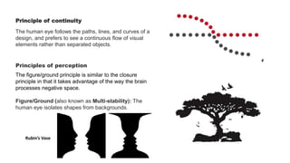
- 11. Principle of continuity The human eye follows the paths, lines, and curves of a design, and prefers to see a continuous flow of visual elements rather than separated objects. Principles of perception The figure/ground principle is similar to the closure principle in that it takes advantage of the way the brain processes negative space. Figure/Ground (also known as Multi-stability): The human eye isolates shapes from backgrounds. Rubin°Øs Vase
- 12. Symmetry and Order ?The design should be balanced and complete; otherwise, the user will spend time and effort trying to perceive an overall picture. Our brain will interpret the image on the left as a rectangle, circle, and triangle, even when the outlines of each are incomplete because those are simpler shapes than the overall image.
- 13. Common Fate While common fate was not originally included in gestalt theory, it has since been added. In UX design, its usefulness can°Øt be overlooked. This principle states that people will group together things that point to or are moving in the same direction. In nature, we see this in things like flocks of birds or schools of fish. They are made up of a bunch of individual elements, but because they move seemingly as one, our brains group them together and consider them a single stimulus.


