UX of a Sandwich
- 1. The UX of Sandwiches Suzi Shapiro 2018 How is Making a Great Sandwich like Designing Usable Software
- 2. The problem: Hungry! I need food, but I need to leave for a meeting Fast Portable
- 3. The requirements: 1. Available in my kitchen 2. Filling and sustaining 3. Tastes good 4. Quick to prepare 5. I can carry it with me & eat in the car
- 4. Idea generation: No matter what we are designing, we think about the new product in terms of what we already know. What comes easily to mind?
- 5. My first idea Sandwich (Peanut butter & jelly)
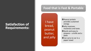
- 6. Satisfaction of Requirements: Food that is Fast & Portable ?Peanut protein provides sustained energy ?Jelly improves moistness and taste. ?Quick and easy to prepare ¨C a knife and a plate ?Can carry to car in a paper towel I have bread, peanut butter, and jelly
- 7. Evaluation: Is this the best solution to my problem?
- 8. Bread The only bread I have is a multigrain that is not really appropriate for sandwiches. It is a bit dry and prone to having large holes.
- 9. Peanut Butter The peanut butter is my favorite kind. Simple - Just peanuts and salt.
- 10. Jelly Nice apricot jelly . . . but the bread has so many holes that I canˇŻt get an even layer over the entire sandwich
- 11. The Sandwich! Some bites donˇŻt have enough bread. Some have too much. Holes have no jelly or the jelly drips out. It is dry & it doesnˇŻt go down easily.
- 12. Have you ever used a product like this? Does it satisfy the need? Yes, but . . . Does this sound like some of the software you use? It kind of works, but not very well.
- 13. LetˇŻs put some UX goodness into this sandwich! (Software?)
- 14. Review the requirements: 1. Available in my kitchen 2. Filling and sustaining 3. Tastes good 4. Quick to prepare 5. I can carry it with me & eat in the car I may be missing something important if I think of the requirements as a simple checklist.
- 15. Knowing the Limits No matter what the final product might be, everything operates within limits.
- 16. For SOFTWARE I may need to: ? Make my new product compatible with an older version. ? Make it look like or work like another product. ? Use a programming language which limits some functions or how the software looks. ? Design for a mobile device.
- 17. For a SANDWICH I may need to: ? Find out what is available ? Take preferences and allergies into account ? Assure that it is portable
- 18. Prototypes or Trial Designs Sometimes it is OK to try something and fail. I learned that PBJ sandwiches can be dry & not very tasty A bad PBJ is really not worth eating (unless there is no other option)
- 19. Now I have a better idea of what to look for in my solution to the problem. It isnˇŻt just about meeting the need, it is about meeting the need in a good way! That sorry PBG sandwich? Not worth it!
- 20. What is Possible? (What do I have in my refrigerator? ) ? Ham ? Cheese ? Milk? ? Mustard? ? Mayo? ? What about avocado? This will spoil if I donˇŻt use it soon. ? Something to give it some ˇ°crunch.ˇ± Water chestnuts? Pickles? ? Any lettuce? Nope.
- 21. The Benefit of Limits Understanding your limits is important when making a sandwich, AND when designing software.
- 22. Research about People Doing research about the people who will eat the sandwich (or use the software) is essential before trying to come up with the design for the product.
- 23. Research about People You need to know about the people ˇ°consumingˇ± the product. Are they allergic to peanuts? Do they eat wheat, meat, or . . . Do they prefer reading or images? Can they tell the difference between red and green? I canˇŻt just build what I want unless I am designing ONLY for myself.
- 24. There is a difference between sandwiches and software. Most software is used by more than one person, and most of the people using it are not like the people who designed and developed it!. When making a sandwich for myself, I know what the person eating my sandwich likes, because it is for me.
- 25. Lots of Options Then we choose what is important for this product and begin to find ways to make these options work well together.
- 26. The Container Why do we need bread? The bread is a container for the other elements. This is like the basic look and feel of a software product. Even an ugly web site can work well if the features meet needs of the people using it.
- 27. The Features We can just add all the options, but this is not the best approach. We need to think about ˇ°why,ˇ± ˇ°when,ˇ± ˇ°where,ˇ± and ˇ°howˇ± for each of the options.
- 28. Why sliced ham? Meat first and last. The meat provides the protein that will keep me from getting hungry too soon. (It fulfils one of the requirements.) Ham, in my sandwich also functions as a barrier, keeping the other components inside. A needed software feature implemented well can make a big difference in how well the final product works.
- 29. Mayo and then the pickles The pickles are sliced thin & flat & glued in with mayo so that they donˇŻt roll around. (A feature may need to be in a different form) In software, features should be designed to work well with the other components. There are functional reasons for their location & shape or size. Good products have features that make the interface easier to use.
- 30. What about the avocado? The thick avocado slices create lumps on one side of the sandwich. Sometimes a new software feature gets added and it doesnˇŻt really fit. Rather than just accepting the not-quite-useful format, we should try to make all of the features work well together.
- 31. Smaller chunks of avocado? Better, but still too thick. Kind of like that cool feature that takes two menus and five clicks to get to.
- 32. Mash it? Not as pretty, but it stays in the sandwich, adding avocado to every bite! This consistency across the sandwich ¨C excuse me ¨C the software, can make it easier to use (eat). There are fewer surprises, because all parts work in a similar manner.
- 33. Last, but not least ¨C the cheese! Putting the cheese on top of the avocado makes it stick to the ham-and-avocado side AND this makes it easier to flip this side of the sandwich without losing anything. The right feature in the right place makes many things easier.
- 34. The Result A sandwich that is tasty & easy to eat. Software that works well & is a pleasure to use. The final product fulfills needs More value is added with very little addition Everyone is happier.


