際際滷

際際滷Share a Scribd company logo
#UX
                              See                Laurie
                             Speak             Kalmanson
                                                      #BCN11UX
                             Share

                                                  1


Saturday, October 15, 2011

UX has a specialized vocabulary, but its really very simple: Be kind. Be clear. Be yourself /
your brand.
#UX #CX


                             Delight
                             people              Solve
                                               problems

                                               2
Saturday, October 15, 2011

People like things that are wonderful, gracious and helpful. We dont like things that arent.
Give people
                                        things
                                       theyve
                                     never seen
                                          #coolstuff #whoa


                                            3
Saturday, October 15, 2011

What can you imagine? What have you seen that is beyond your imagining?
Give people
                                          things
                                         theyve
                                      never seen
                                       ...or imagined
                                             4
Saturday, October 15, 2011

What can you give your users and customers that they havent seen before?
#interfaces
                                 are
                                songs


                                              5
Saturday, October 15, 2011

An interface has a rhythm. It has a beat. It can be synth/drums/bass, it can be what you hear
when youre lost at the supermarket -- but it has a sound and a mood.
Mobile has
                             a beat
                           you can
                          dance to.

                                              6
Saturday, October 15, 2011

What are the steps for the dance your interface does? What dance should your clients
interface have?
Mobile goes
                               vroom
                               vroom
                             beep beep.

                                              7
Saturday, October 15, 2011

Mobile has unique constraints and opportunities. The focus is intense. The space is small.
How can you add delight with motion? MiniCooper uses wiggles and bounces.
#videoof
                             catplaying
                              withiPad
                                           #videoof
                                           babyusing
                                            iPhone
                                          8
Saturday, October 15, 2011

We know the jokes and we know the punchlines. #magazinesareiPadsthatarebroken
9
Saturday, October 15, 2011

Two characters and one iconic device can tell a story.
10
Saturday, October 15, 2011

When humans feel things, we want to share things.
HOW
                             And you    do I
                              may ask work
                             yourself,   this?

                                           11
Saturday, October 15, 2011

There are two kinds of experiences: Good experiences and not-good experiences.
#howdoiworkthis?


                                           12
Saturday, October 15, 2011

These are not-good experiences: Facebook error messages are rude and the opposite of
helpful. Dont do this.
#howdoiworkthis?


                                            13
Saturday, October 15, 2011

A two-鍖oor elevator should have simple buttons that say 1,2 or Up/Down, or a simple toggle.
Dont do this.
#howdoiworkthis?


                                            14
Saturday, October 15, 2011

These four experiences are good and not-good, each in their own ways. Take the good.
Leave the bad.
#howdoiworkthis?


                                              15
Saturday, October 15, 2011

This is the user鍖ow for Facebook privacy settings. This is the opposite of a good experience.
#engagementarchitecture
               #mobile #website
            #ux #ia #contentstrategy
             #branding #visualdesign
                  #lookandfeel

                                           16
Saturday, October 15, 2011

These buzzwords and hashtags for the jargon and methodology of user experience are easy
to research and easy to learn. Do that. Then take what you need and leave the rest.
#user鍖ows #storyboards
             #personas #contentaudit
                 #usernarratives
                  #wireframes

                             17
Saturday, October 15, 2011

Same here.
18


Saturday, October 15, 2011
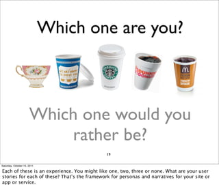
Which one are you?


                      Which one would you
                          rather be?
                                              19

Saturday, October 15, 2011

Each of these is an experience. You might like one, two, three or none. What are your user
stories for each of these? Thats the framework for personas and narratives for your site or
app or service.
Saturday, October 15, 2011

Be kind. Do good work. Its pretty much that simple.
Thank you.
                           @lauriekalmanson
                         slideshare.net/lauriek

                                   21
Saturday, October 15, 2011

More Related Content

UX: See, Speak, Share

  • 1. #UX See Laurie Speak Kalmanson #BCN11UX Share 1 Saturday, October 15, 2011 UX has a specialized vocabulary, but its really very simple: Be kind. Be clear. Be yourself / your brand.
  • 2. #UX #CX Delight people Solve problems 2 Saturday, October 15, 2011 People like things that are wonderful, gracious and helpful. We dont like things that arent.
  • 3. Give people things theyve never seen #coolstuff #whoa 3 Saturday, October 15, 2011 What can you imagine? What have you seen that is beyond your imagining?
  • 4. Give people things theyve never seen ...or imagined 4 Saturday, October 15, 2011 What can you give your users and customers that they havent seen before?
  • 5. #interfaces are songs 5 Saturday, October 15, 2011 An interface has a rhythm. It has a beat. It can be synth/drums/bass, it can be what you hear when youre lost at the supermarket -- but it has a sound and a mood.
  • 6. Mobile has a beat you can dance to. 6 Saturday, October 15, 2011 What are the steps for the dance your interface does? What dance should your clients interface have?
  • 7. Mobile goes vroom vroom beep beep. 7 Saturday, October 15, 2011 Mobile has unique constraints and opportunities. The focus is intense. The space is small. How can you add delight with motion? MiniCooper uses wiggles and bounces.
  • 8. #videoof catplaying withiPad #videoof babyusing iPhone 8 Saturday, October 15, 2011 We know the jokes and we know the punchlines. #magazinesareiPadsthatarebroken
  • 9. 9 Saturday, October 15, 2011 Two characters and one iconic device can tell a story.
  • 10. 10 Saturday, October 15, 2011 When humans feel things, we want to share things.
  • 11. HOW And you do I may ask work yourself, this? 11 Saturday, October 15, 2011 There are two kinds of experiences: Good experiences and not-good experiences.
  • 12. #howdoiworkthis? 12 Saturday, October 15, 2011 These are not-good experiences: Facebook error messages are rude and the opposite of helpful. Dont do this.
  • 13. #howdoiworkthis? 13 Saturday, October 15, 2011 A two-鍖oor elevator should have simple buttons that say 1,2 or Up/Down, or a simple toggle. Dont do this.
  • 14. #howdoiworkthis? 14 Saturday, October 15, 2011 These four experiences are good and not-good, each in their own ways. Take the good. Leave the bad.
  • 15. #howdoiworkthis? 15 Saturday, October 15, 2011 This is the user鍖ow for Facebook privacy settings. This is the opposite of a good experience.
  • 16. #engagementarchitecture #mobile #website #ux #ia #contentstrategy #branding #visualdesign #lookandfeel 16 Saturday, October 15, 2011 These buzzwords and hashtags for the jargon and methodology of user experience are easy to research and easy to learn. Do that. Then take what you need and leave the rest.
  • 17. #user鍖ows #storyboards #personas #contentaudit #usernarratives #wireframes 17 Saturday, October 15, 2011 Same here.
  • 19. Which one are you? Which one would you rather be? 19 Saturday, October 15, 2011 Each of these is an experience. You might like one, two, three or none. What are your user stories for each of these? Thats the framework for personas and narratives for your site or app or service.
  • 20. Saturday, October 15, 2011 Be kind. Do good work. Its pretty much that simple.
  • 21. Thank you. @lauriekalmanson slideshare.net/lauriek 21 Saturday, October 15, 2011